
すべて · 広告・ポスター · 飲食店
191店外用とんかつポスター
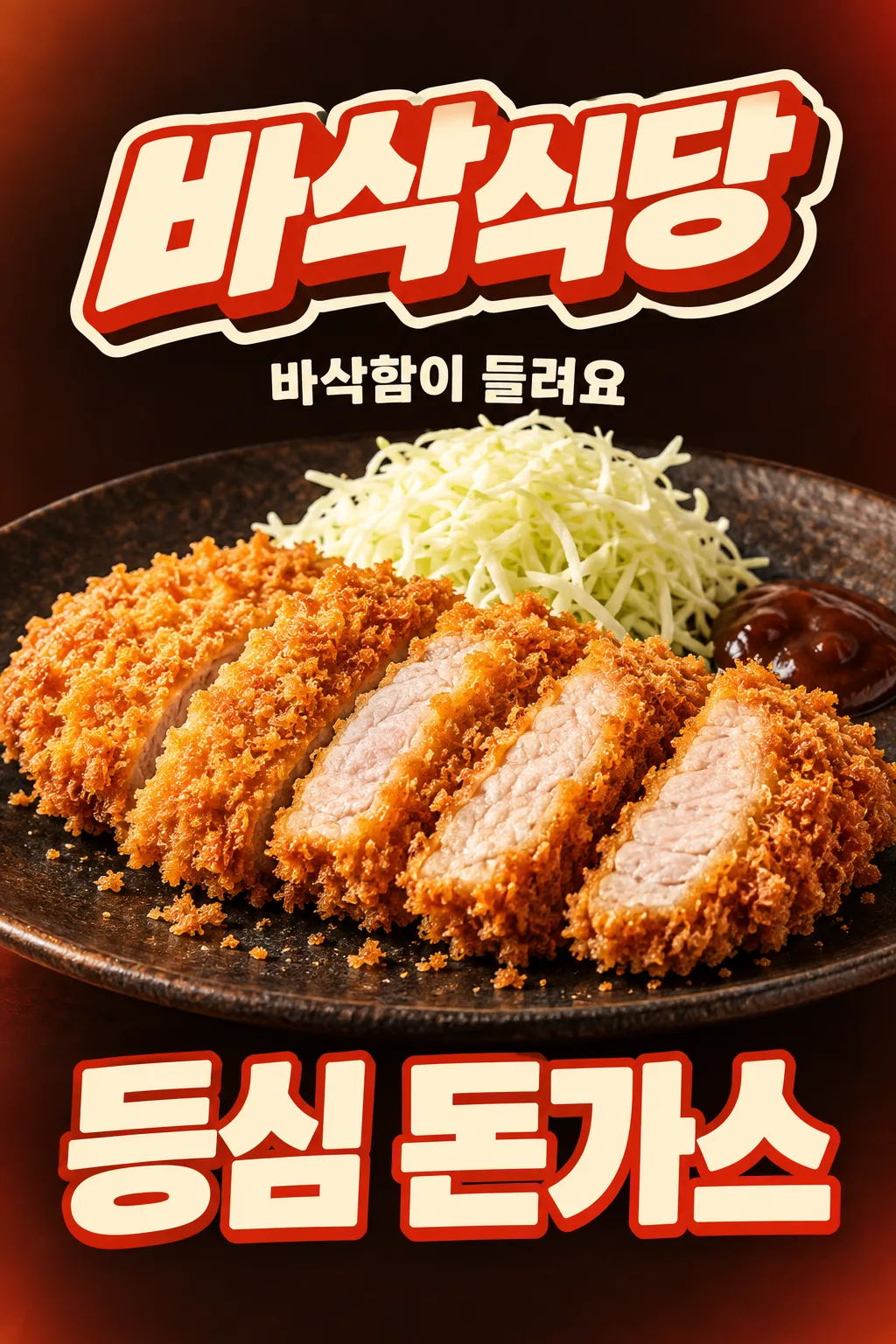
店外に向けた窓やチラシに使う一枚。強いコントラスト、大きな料理写真、店名ロゴと料理名で、価格を載せずに遠くから伝えます。
完成物 店外の窓・チラシ用の一枚 · 大きな料理・店名ロゴ・料理名、価格なし
項目を入力
- 1項目を入力します
- 2プロンプトをコピーします
- 3GPTのチャットに実際に販売するとんかつの写真1枚とプロンプトを一緒に送ります
- 4写真と文章の両方が入っていることを確認します
プロンプト全文を見る 5,346文字
Generate ONE finished raster image now, directly, without questions or explanation.
出力サイズは2480×3508ピクセル、A4縦、300dpiの印刷用ポスターにしてください。
[OUTWARD-FACING WINDOW OR FLYER — FIXED HIGH-CONTRAST FOOD AD]
Create a vertical outdoor shop advertisement for a glass window viewed from the street or a handout flyer. Communicate one dish and one store in a three-second glance from across the road. This is a different composition from an SNS collage: quiet background, huge food, strong type contrast, no paper scraps or scattered stickers.
[REAL FOOD IS THE HERO]
Use the attached merchant-owned food photograph as the only food reference. Preserve the actual serving size, slice count, irregular slice arrangement, meat thickness, coating and cooked interior. Keep an unsliced cutlet unsliced. The food stays photographic: golden coarse irregular bread flakes, a thin fried edge, moist pale fully cooked pork with fine fibers. A cross-section is visible only if it exists in the source. Preserve the actual vessel and existing sides. Do not add another serving, cheese, rice, drinks, new sides, packaging or a third-party logo. Warm soft side light and crisp close detail make the real food appetizing; never make identical repeated slices, a bread sandwich or a hollow fried shell.
[EXACT SHORT COPY]
Print the menu exactly once: "【料理名】". Do not abbreviate it.
Short copy input: "【短いひとこと】". If it equals "おまかせで選んで", use "サクサクが聞こえる" only when the visible texture supports it; otherwise choose one equally short sensory phrase. Print the final phrase once. Never print field labels, placeholder braces or option names.
Render all lettering in Japanese, preserving every supplied character and space.
[STORE NAME AS A DESIGNED LOGO — UPPER AREA]
Store name exactly "【店名】", printed once, mandatory and prominent. Make the whole name a custom logo-shaped block in the upper area, never plain small type or a copied existing brand logo. Design choice: "【店名のデザイン】".
If "やわらかく": rounded handwritten lettering on a soft pastel ribbon with folded ends and a smooth cream keyline.
If "インパクト強く": very bold slightly slanted connected display letters, a thick cream outline and a short hard-offset dark extrusion; a compact impactful sign or sticker silhouette.
If "レタリングロゴ": bespoke lettering where the letters themselves form an illustrated restaurant logo, with restrained crumb-shaped stroke terminals and one integrated underline. Keep every glyph legible, never replace a character with a food icon.
If "おまかせで選んで": choose the bold-impact logo above for this composition. Apply this choice ONLY to the store-name block. Keep the same finished image type, food, menu placement, background and other decorations. Output one image, not a logo sheet or alternate layouts.
[DISTANCE-FIRST COMPOSITION]
Use a nearly black cocoa background with a restrained warm vermilion edge glow and a single flat cream accent. The store-name logo is large in the upper area. Put the short copy on one clear cream line immediately under the logo. One extremely large cutlet-and-plate photograph fills almost the whole width through the center; use a low close camera angle so the real crisp coating and an existing cross-section face the street. Crop the outer vessel rim if needed, never the edible serving. Natural warm side light separates the golden food from the dark field. Only a few natural crumbs may sit near the food; keep broad calm negative space around the logo. No arrows, speech bubbles, extra stickers or collage texture.
[HUGE LOWER MENU — NO PRICE SLOT]
The exact menu name fills the lower 25–30% in bold warm cream lettering with a restrained vermilion outline. Use one line if it fits, or a balanced two-line title for a long name. Keep high contrast and an immediately readable silhouette. No horizontal information strip. No price, currency, digits, discount, percentage or reserved price space. Print only the store name, short sensory line and menu. Adapt the same vertical design to the aspect ratio supplied by the site's common ratio selector; do not ask for a paper-size field.
[FULL CANVAS AND THUMBNAIL ADAPTATION]
Fill the canvas edge to edge; no outer border, white mat, photographed paper, device or wall mockup. At normal display ratios the upper logo stays fully inside x7–93%, y8–26%; food occupies the central y30–68%; the lower menu area fills y70–98%.
For a 2:3 site thumbnail only, protect the site's overlays: all essential ink, outlines and shadows must lie inside x7–93%, y14–84% (at 1024×1536, y215–1290). The lower menu region still uses the full lower 25–30% of the usable safe composition, around y64–84%; surrounding background and decorative shapes continue to the bottom edge. Keep the menu large by shortening the upper caption and allowing the plate rim to crop; never put the menu into a tiny strip. At 4:5 and print ratios retain the large lower menu region without a blank footer.
Deliver exactly one finished image. No watermark, franchise imitation, artist signature or instructions to assemble it.

[Final output format]
出力サイズは2480×3508ピクセル、A4縦、300dpiの印刷用ポスターにしてください。
This selected output format takes priority over any fixed canvas size or aspect ratio elsewhere in this template. Adapt the composition, text zones and margins to the selected canvas without stretching or cropping essential content. Device safe areas apply only when a device is selected. Never print these format instructions on the image.
結果はどうでしたか?
こちらのカードも人気です




使い方・よくある質問
外向きの窓とチラシに
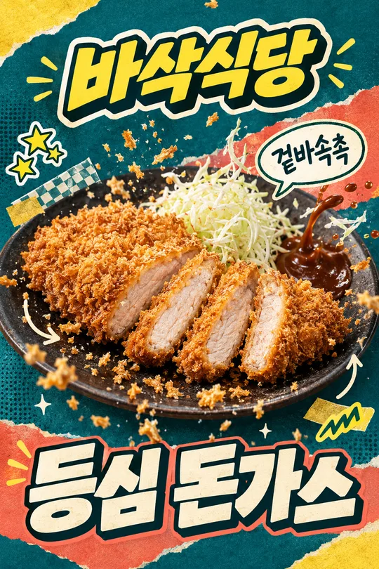
通行人に店と料理を短い時間で伝える縦型広告です。暗い背景に大きな黄金色のとんかつを置き、上に店名ロゴと短い言葉、下に大きな料理名を配置します。SNSのコラージュより背景を静かにし、明暗差を強くします。価格・数字・割引は載せません。
店名をデザインする
店名は必須です。「サクサク食堂」は架空の例です。丸い手書き文字とパステルリボン、太い立体文字と縁取り、文字自体で構成するレタリングロゴから選べます。おまかせはインパクト型です。変えるのは上の店名部分だけで、大きな料理と下部の料理名、静かな背景は同じ構成を求めます。
短い文句と実物写真
料理名は実際のメニュー通りに入力し、短い言葉は食感が伝わる表現にします。販売する料理の写真も添付してください。切れ数・肉の厚さ・加熱した断面・提供量を保ちます。器の縁は一部切れても料理は切りません。用紙の大きさは別の入力欄を作らず、サイト共通の比率選択でA4またはA3を選びます。
貼る前に縮小確認
画像を縮小し、店名・料理・料理名がすぐ分かるか見ます。窓の反射や逆光で読みにくくなるため、貼る場所でもコントラストを確認してください。価格が増えたら削除を依頼します。表紙は構図確認用のAPI生成案で、印刷品質や集客効果を実測した結果ではありません。