
All · Ads & posters · Restaurants
191Outdoor pork cutlet poster
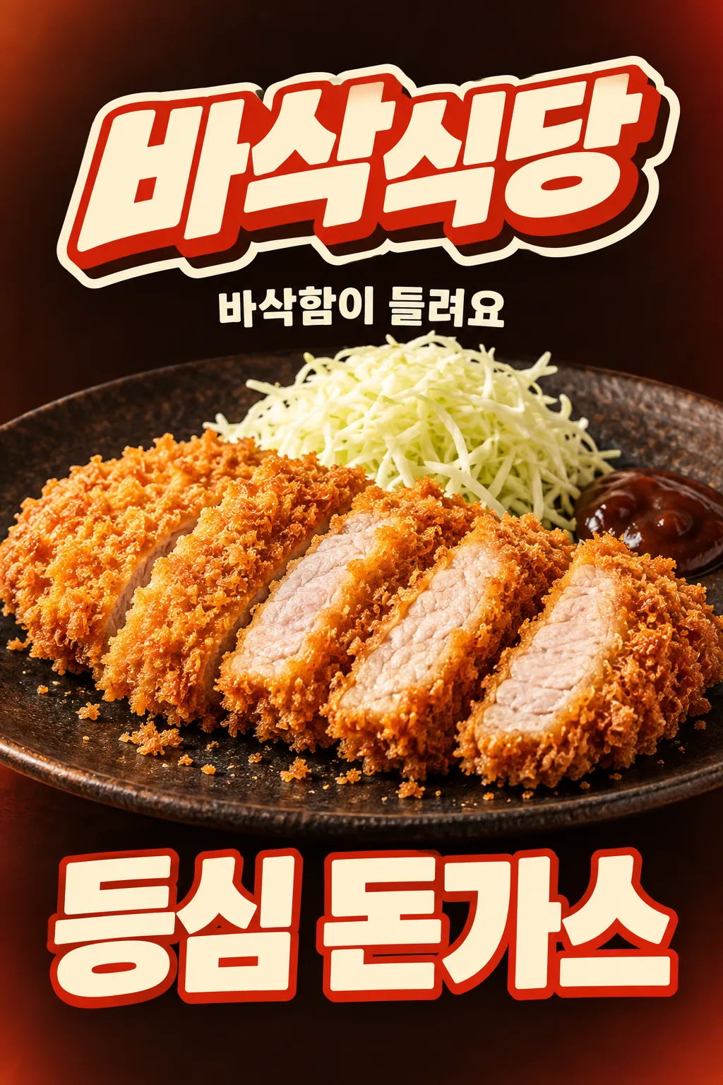
For an outward-facing window or flyer: strong contrast, a huge cutlet, a store logo and a large menu name, with no price.
Result One window or flyer poster · huge food, store logo and large menu name, no price
Fill in the fields
- 1Fill in the fields
- 2Copy the prompt
- 3Upload One photo of the pork cutlet you actually sell and paste the prompt into your GPT chat
- 4Check that both the photo and prompt are attached, then send
Full prompt 5,418 characters
Generate ONE finished raster image now, directly, without questions or explanation.
Output size 2480x3508 pixels, A4 portrait, 300dpi, print-ready poster.
[OUTWARD-FACING WINDOW OR FLYER — FIXED HIGH-CONTRAST FOOD AD]
Create a vertical outdoor shop advertisement for a glass window viewed from the street or a handout flyer. Communicate one dish and one store in a three-second glance from across the road. This is a different composition from an SNS collage: quiet background, huge food, strong type contrast, no paper scraps or scattered stickers.
[REAL FOOD IS THE HERO]
Use the attached merchant-owned food photograph as the only food reference. Preserve the actual serving size, slice count, irregular slice arrangement, meat thickness, coating and cooked interior. Keep an unsliced cutlet unsliced. The food stays photographic: golden coarse irregular bread flakes, a thin fried edge, moist pale fully cooked pork with fine fibers. A cross-section is visible only if it exists in the source. Preserve the actual vessel and existing sides. Do not add another serving, cheese, rice, drinks, new sides, packaging or a third-party logo. Warm soft side light and crisp close detail make the real food appetizing; never make identical repeated slices, a bread sandwich or a hollow fried shell.
[EXACT SHORT COPY]
Print the menu exactly once: "【Menu name】". Do not abbreviate it.
Short copy input: "【Short exclamation】". If it equals "Let AI choose", use "Hear the crunch" only when the visible texture supports it; otherwise choose one equally short sensory phrase. Print the final phrase once. Never print field labels, placeholder braces or option names.
Render all lettering in English, preserving every supplied character and space.
[STORE NAME AS A DESIGNED LOGO — UPPER AREA]
Store name exactly "【Store name】", printed once, mandatory and prominent. Make the whole name a custom logo-shaped block in the upper area, never plain small type or a copied existing brand logo. Design choice: "【Store name design】".
If "Soft and rounded": rounded handwritten lettering on a soft pastel ribbon with folded ends and a smooth cream keyline.
If "Bold impact": very bold slightly slanted connected display letters, a thick cream outline and a short hard-offset dark extrusion; a compact impactful sign or sticker silhouette.
If "Lettering logo": bespoke lettering where the letters themselves form an illustrated restaurant logo, with restrained crumb-shaped stroke terminals and one integrated underline. Keep every glyph legible, never replace a character with a food icon.
If "Let AI choose": choose the bold-impact logo above for this composition. Apply this choice ONLY to the store-name block. Keep the same finished image type, food, menu placement, background and other decorations. Output one image, not a logo sheet or alternate layouts.
[DISTANCE-FIRST COMPOSITION]
Use a nearly black cocoa background with a restrained warm vermilion edge glow and a single flat cream accent. The store-name logo is large in the upper area. Put the short copy on one clear cream line immediately under the logo. One extremely large cutlet-and-plate photograph fills almost the whole width through the center; use a low close camera angle so the real crisp coating and an existing cross-section face the street. Crop the outer vessel rim if needed, never the edible serving. Natural warm side light separates the golden food from the dark field. Only a few natural crumbs may sit near the food; keep broad calm negative space around the logo. No arrows, speech bubbles, extra stickers or collage texture.
[HUGE LOWER MENU — NO PRICE SLOT]
The exact menu name fills the lower 25–30% in bold warm cream lettering with a restrained vermilion outline. Use one line if it fits, or a balanced two-line title for a long name. Keep high contrast and an immediately readable silhouette. No horizontal information strip. No price, currency, digits, discount, percentage or reserved price space. Print only the store name, short sensory line and menu. Adapt the same vertical design to the aspect ratio supplied by the site's common ratio selector; do not ask for a paper-size field.
[FULL CANVAS AND THUMBNAIL ADAPTATION]
Fill the canvas edge to edge; no outer border, white mat, photographed paper, device or wall mockup. At normal display ratios the upper logo stays fully inside x7–93%, y8–26%; food occupies the central y30–68%; the lower menu area fills y70–98%.
For a 2:3 site thumbnail only, protect the site's overlays: all essential ink, outlines and shadows must lie inside x7–93%, y14–84% (at 1024×1536, y215–1290). The lower menu region still uses the full lower 25–30% of the usable safe composition, around y64–84%; surrounding background and decorative shapes continue to the bottom edge. Keep the menu large by shortening the upper caption and allowing the plate rim to crop; never put the menu into a tiny strip. At 4:5 and print ratios retain the large lower menu region without a blank footer.
Deliver exactly one finished image. No watermark, franchise imitation, artist signature or instructions to assemble it.

[Final output format]
Output size 2480x3508 pixels, A4 portrait, 300dpi, print-ready poster.
This selected output format takes priority over any fixed canvas size or aspect ratio elsewhere in this template. Adapt the composition, text zones and margins to the selected canvas without stretching or cropping essential content. Device safe areas apply only when a device is selected. Never print these format instructions on the image.
How did it turn out?
You may also like




How to use it · FAQ
For a window facing the street or a flyer
This vertical advertisement tells passing customers which store sells which dish at a glance. A dark background separates the huge golden cutlet from its surroundings. A designed store logo and one short line sit above the food; a large menu name fills the bottom. Its quiet, high-contrast layout is different from the busy social collage. It contains no price, digits or discounts.
Make the name a logo
The store name is required. Crisp Corner is a fictional example. Choose rounded handwriting on a pastel ribbon, bold outlined letters with shallow depth, or bespoke lettering that forms a logo. Let AI choose uses the bold option. The choice affects only the upper store-name block, while the big food, quiet background and lower menu remain the same type of advertisement.
Use short copy and your real photograph
Enter the actual menu name and a brief sensory phrase such as Hear the crunch. Attach a photo of the dish you actually sell. Preserve the real number of slices, cooked interior, portion and side dishes. The vessel rim may crop, but the edible portion must remain visible. Use the site's common ratio selector for A4 or A3; there is no separate paper-size field.
Inspect at a distance
Reduce the image on screen and check that the store, food and menu are recognizable quickly. Check contrast at the intended window position, where reflection or backlighting may reduce readability. Ask for a larger short line if needed and remove any invented price. The cover is an API-generated layout example; it does not establish print quality, street visibility or sales impact.