
すべて · 広告・ポスター · ロゴ・ブランド
056エンブレムロゴ
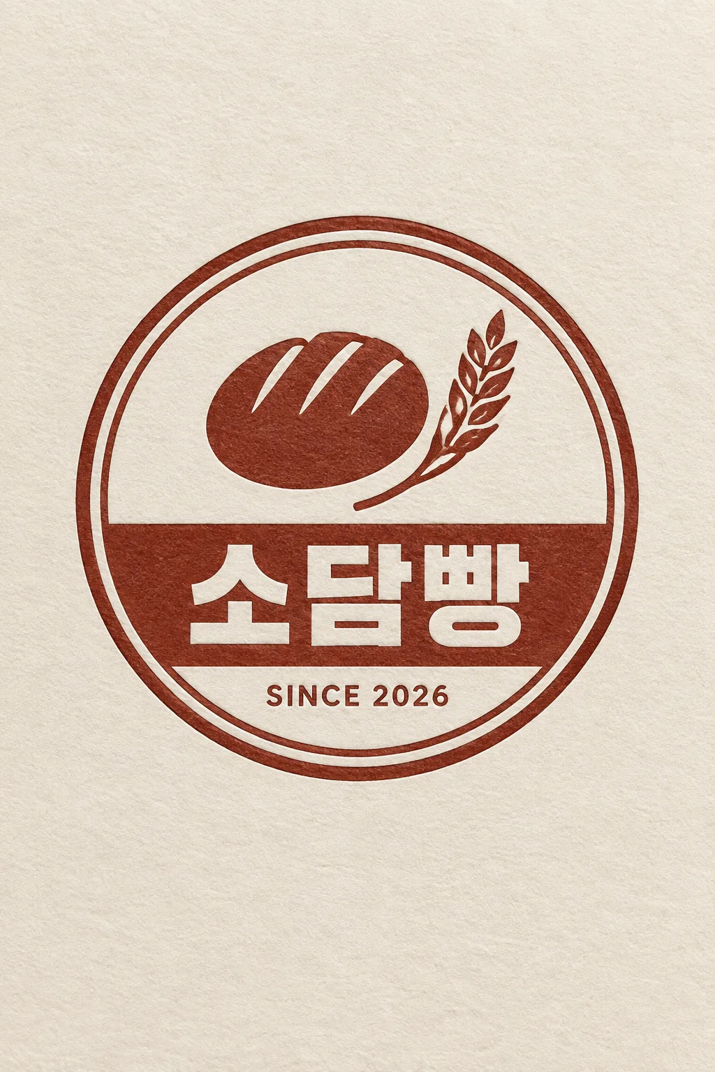
円形バッジの中に絵を入れ、まっすぐな帯に短い名前と小さなSINCE年号を添えます。
受け取れるもの
- 簡単な絵の入った二重円のバッジ
- 曲線ではなくまっすぐな帯のお店の名前
- 小さなSINCE年号を含むロゴ一枚
ChatGPT 無料 OK
項目を入力
- 1項目を入力します
- 2コピーを押します
- 3GPTのチャットに貼り付けます
- 4そのまま送ると、サムネイルの例のような画像になります
- 5カードに合う実際の写真を一緒に入れると反映されます。背景カードなら背景の写真、人物・料理カードならその写真 任意
プロンプト全文を見る 5,793文字
Generate this image now. Return exactly ONE finished logo image itself; draw it directly, without explanations or questions.
出力サイズは1080×1080ピクセル、1:1の正方形にしてください。文字を読みやすく配置してください。
The result is one resolved identity in one material, never an options sheet or multiple applications. Keep the entire logo in the central area, about 65-75% of canvas width. Leave generous quiet margins, with all essential lettering below the top 12% and above the bottom 15% of the canvas. Adapt this same identity to the chosen ratio.
Make an original professional brand identity, never imitate an existing brand's recognizable logo, mascot or typography. No slogan, unrelated writing, field labels, watermarks or trademark symbols. No props, hands, devices or collage. The substrate fills the image edge to edge.

[INPUTS FOR THIS IMAGE]
Brand name selected: "【お店・ブランド名】"
Set BRAND_NAME to this input. Copy its original script, exact spelling, case, spaces and punctuation once; never romanize or translate it. If explicitly asked to choose, invent one short original name. Do not print the field label.
Badge illustration selected: "【バッジ内の絵】"
Draw one simple flat illustration inside the upper part of the circular badge. If asked to choose or absent, use a round bread with three score marks and one wheat stalk. The drawing stays simple and secondary to the readable name.
Opening year selected: "【開業年】"
Use only the supplied four-digit YEAR in a small SINCE YEAR line inside the lower ring. The default 2026 is an editable demonstration value, never evidence of a real opening date. If this line is absent or blank, omit the entire SINCE line rather than invent a year.
Material selected: "【素材】"
MATERIAL controls the actual finish and substrate. Metallic foil uses its physical metal color; keep the chosen palette in the substrate or ink rather than painting over metal. A flat finish uses the chosen palette directly.
Interpret the selected choice as follows (use only the selected one):
- ベージュ壁に黒い金属サイン: raised satin-black metal, crisp bevels and soft cast shadows on a warm beige plaster wall.
- 緑の紙に金箔: real gold foil hot stamping slightly debossed into deep forest-green textured paper.
- 黒い紙に銀箔: silver foil pressed into thick matte black cotton paper, tiny edge highlights and a fine paper grain.
- クリーム紙に活版印刷: the chosen logo ink color pressed slightly into thick cream cotton paper, visible paper fibres and precise ink edges.
- 半透明アクリルサイン: frosted acrylic on a cool light concrete wall, colored translucent logo and letters, restrained real depth and diffuse highlights; one continuous surface, no decorative frame.
- フラット: crisp opaque vector-like flat artwork on a clean solid background, no material lighting, no mockup, no gradients.
If the selection line is absent or empty, use クリーム紙に活版印刷 only.
Colors selected: "【配色】"
Use only this restrained palette plus necessary substrate tones. The selected material keeps its real physical color.
Interpret the selected choice as follows (use only the selected one):
- 赤茶+クリーム: dark warm red-brown ink on cream.
- 紺+白: navy ink on white.
- 緑+ベージュ: forest-green ink on beige.
- 黒+クリーム: black ink on cream.
- 金+紺: gold on navy.
If the selection line is absent or empty, use 赤茶+クリーム only.
Name typeface selected: "【名前の書体】"
The typeface may change, but never redesign, fuse or ornament multiple letters at once; spelling and readability come first.
Interpret the selected choice as follows (use only the selected one):
- 端正な明朝・セリフ: refined high-contrast serif for Latin, elegant Myeongjo for Hangul, Mincho for Japanese, readable generous spacing.
- すっきりしたゴシック: clean contemporary sans serif, balanced weight and optical kerning.
- 太い丸文字: bold friendly rounded display lettering with open counters and intact characters.
- 太い角文字: bold squared display lettering, clear letter structure, strong sign readability.
If the selection line is absent or empty, use 太い角文字 only.
Ring weight selected: "【円の太さ】"
Keep one circular double-ring badge. Change ring weight only, never change its shape into a shield or an oval.
Interpret the selected choice as follows (use only the selected one):
- 細い: two clean thin circular rings.
- 中くらい: two clear medium-weight circular rings.
- 太い: two bold circular rings with enough space between them.
If the selection line is absent or empty, use 中くらい only.

[RESOLVED DESIGN]
ONE circular EMBLEM, double-ring border, simple flat single-color line-art illustration in its upper interior, a straight solid horizontal ribbon across the lower-middle interior, and small SINCE YEAR inside the lowest part of the ring when a year was supplied. BRAND_NAME is printed once on the STRAIGHT ribbon, with generous contrast and clear intact characters; never use curved lettering. Give the ribbon enough height and width for the exact name, reduce the illustration if necessary, do not compress or drop characters. Short names are preferred but every supplied character is retained. Default bold angular type can be replaced by the selected typeface. Apply the single selected material realistically to the complete badge; default dark red-brown letterpress slightly pressed into cream cotton paper. One badge fills about 65-70% of width; no external ornaments, no food scene, no secondary words.
Before returning, compare every visible name character with BRAND_NAME, one by one, including Hangul final consonants and Japanese characters; repair spelling without changing the design. Print the name exactly once.

[Final output format]
出力サイズは1080×1080ピクセル、1:1の正方形にしてください。文字を読みやすく配置してください。
This selected output format takes priority over any fixed canvas size or aspect ratio elsewhere in this template. Adapt the composition, text zones and margins to the selected canvas without stretching or cropping essential content. Device safe areas apply only when a device is selected. Never print these format instructions on the image.
結果はどうでしたか?
こちらのカードも人気です






使い方・よくある質問
お店を一つのバッジに
パン屋・麺料理店・茶房・工房など、長く使える円形ロゴに向いています。二重円の中に簡単な絵、下側のまっすぐな帯に名前、その下に小さなSINCE年号を入れます。作例は丸パンと麦穂を赤茶の活版印刷でクリーム紙に仕上げたもの。名前を円に沿って曲げません。
帯の名前は短めに
必須は名前とバッジ内の絵。短い名前なら帯の文字が大きく読めます。長い名前も省略しませんが、文字が小さくなるので確認してください。絵は切れ目のあるパン、箸のある器など、対象一つと特徴を短く書きます。候補や「おまかせ」も使えます。
開業年は実際の値へ
2026は作例用の初期値です。使う前に実際の開業年へ変更します。空にすればSINCE行ごと省略し、年を勝手に作りません。素材六つ、配色五つ、書体四つ、円の太さ三つを選べます。任意欄を空にすると赤茶とクリームの活版印刷、太い角文字、中くらいの二重円になります。
一文字ずつ確認
写真なしでGPTやGeminiへ送れます。名前を一文字ずつ確認し、韓国語の名前なら最後の子音まで入力と照合してください。誤字は帯だけ修正、名前が小さい場合は帯を広げて絵を縮めるよう頼みます。スタンプにするなら実際のサイズで線が残るか確認し、紙の影を含めないフラットな図案を別途整えます。
商用利用前にKIPRISおよび利用する国の商標データベースで検索し、大きく使うときはベクターで描き直してください。