
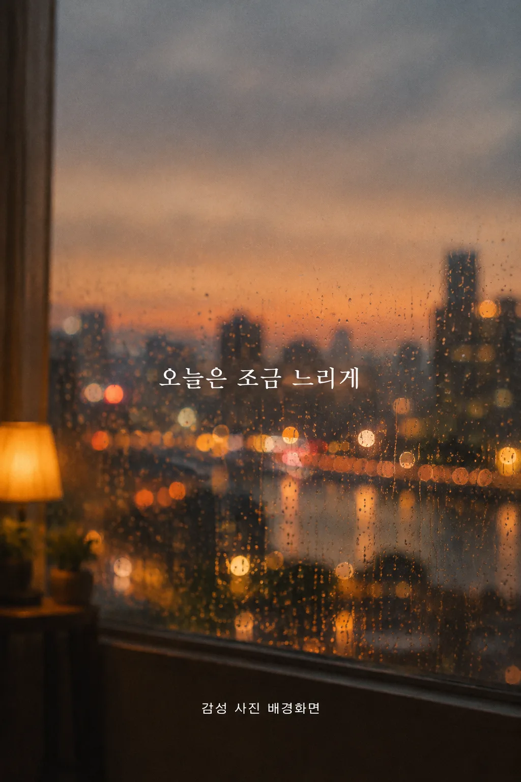
전체 · 배경화면 · 폰 배경화면 · 계절·풍경
060감성 사진 배경화면
장면과 색감을 고르면 필름 카메라로 찍은 듯한 사진을 내 휴대폰 잠금·홈 화면에 맞춰 만들어요.
칸 채우기
- 1칸을 채워요
- 2복사 버튼을 눌러요
- 3GPT 채팅창에 붙여넣어요
- 4제품·인물 사진을 쓰려면 사진과 프롬프트를 둘 다 넣은 뒤에 보내요 선택
프롬프트 원문 보기 8,750자
Generate this image now. Draw it directly - do not describe it, explain it, or ask questions.
Target screen: "【기종 또는 비율】". If this is an aspect ratio such as 9:16, create a portrait wallpaper at exactly that ratio; use 1080x1920 pixels for 9:16 when an exact pixel size is needed. Otherwise it names a device: before drawing, look up that device's native screen resolution and aspect ratio, its lock-screen clock and camera-cutout positions, and its home-screen dock or gesture area. For a foldable, use the named main or cover screen; if neither is named, use its main screen. Make the flat image at that native aspect ratio and resolution. Adapt the quiet zones below to the actual device instead of forcing a generic crop. Do not describe the lookup or ask a question.

[Purpose]
Create one finished, original, photographic phone wallpaper for a person to use on both a lock screen and a home screen. It should also look attractive when the person shares the saved wallpaper in a story with their own caption later. Deliver just the edge-to-edge image, ready to save, without a device frame, screenshot interface, mockup, or explanation. The wallpaper is a personally chosen view of a place and a moment, not a quote card or an illustration. Its visual appeal must come from a credible photo and deliberate empty space, so it remains satisfying even when the optional sentence is absent.

[Scene]
The requested scene is "【장면】". If that value is exactly "알아서 골라줘", do not depict or print those words. Choose one of these grounded photographic scenes yourself: rain on a window with a quiet view beyond it, a sea at sunset, a city just before sunrise, an autumn woodland path, or a snow-covered neighborhood lane. Choose only ONE coherent place and time, with a believable camera viewpoint. The scene must feel observed rather than assembled: accurate perspective, sensible scale, physically plausible weather and reflections, small natural irregularities, and no impossible objects or repeated patterns. For rain, give the droplets and view different focus planes; for the sea, keep the horizon and wave scale credible; for the city, use ordinary architecture and restrained lights; for woods, vary the leaf and tree shapes; for snow, preserve the subtle edges and footprints of a real lane. Never mix the five options into a collage.

Use "【색감】" as a color-grading direction, never as printed text. "따뜻하게" means gentle amber or honey light with natural neutral shadows; "차갑게" means quiet blue-gray or silver light with believable shadow detail; "필름 사진" means slightly muted color, nuanced skin-free earth and sky tones, restrained grain, and soft but clear contrast. Any choice must preserve the actual materials and weather of the selected scene. Do not color every object the same tint. The image should look like one photograph from one camera and one exposure, not a digital painting, composite, staged travel advertisement, or AI fantasy landscape.

Compose around the phone interface. Reserve the top 0-25% of canvas height for the lock-screen clock, status icons, and camera cutout. Keep this entire band low contrast and free of a face, sign, bright sun, sharp horizon, prominent branch, large raindrop, or other focal detail. Reserve the bottom 80-100% for the home-screen dock, lock-screen controls, and gesture bar; keep it equally calm with a low-detail continuation of the photo. Place the main photographic interest in the middle, roughly 30-75%, but let it breathe so app icons and any existing widgets remain legible on a home screen. The first and last few percent at every edge should tolerate slight device cropping. Adjust these approximate percentages after checking the actual named device, especially when a foldable main screen has a different clock or widget arrangement. Do not create a blank colored bar: safe space must remain part of the same photograph.

[Attached photo]
No user photo is required. Build an original scene from the chosen words alone. Do not invent a recognizable person, named landmark, trademarked storefront, product packaging, album art, film still, or another photographer's composition. If the user later attaches a personal photo, treat it as reference for the user's own place and preserve its basic geography while keeping the photographic wallpaper and interface-safe composition.

[Text layout]
Use full canvas height as the coordinate system. The picture itself is primary; text is optional and always secondary. Keep the 0-25% clock band and 80-100% dock band free of all lettering. Any sentence must fit with wide side margins in a naturally quiet portion of the middle 40-65%, never over a horizon, lights, branches, heavy rain, or a busy path. Set it in one short horizontal line when possible, or two balanced lines at natural Korean phrase boundaries. Use a readable at a glance on a phone lock screen: Korean letter height about 4-5% of the canvas height (clearly legible, not tiny), clean and elegant Korean type treatment with enough contrast for reading on the actual photo, without a plaque, sticker, label, opaque box, or strong shadow.
- 40-65%: Render this exact Korean sentence once, without quotation marks: "【한 줄 문구】". Do not change its syllables, spacing, or punctuation. If the supplied value is exactly "알아서 골라줘", never print that phrase; instead write your own short, warm, encouraging Korean line (about 6-14 syllables) that fits the scene, and render that.

[Style]
Photorealistic, intimate film-camera photography. Use a believable lens perspective, selective but not extreme depth of field, a fine organic grain structure, restrained halation only where real highlights warrant it, and delicate tonal roll-off. Allow tiny imperfections such as uneven rain trails, soft sea haze, subtle film color variation, or irregular snow texture. Maintain enough sharp, recognizable detail in the middle to establish the real place. The result should resemble an unposed personal photograph worth keeping as a background, with a contemporary quiet mood. Avoid the stock-photo habit of exaggerated foreground props, cinematic teal-orange grading, or a uniformly blurred background.

[Visual hierarchy]
First: the lived-in photographic moment in the middle of the screen. Second: quiet light, weather, and palette. Third, only if supplied: the small sentence. A viewer should understand the place immediately and want to keep looking without needing to read anything. The top clock zone and bottom dock zone should carry the image atmosphere but no competing subject. Balance light and dark patches so white or dark interface icons can remain visible; do not draw those icons into the wallpaper. If the optional sentence is absent, preserve the negative space naturally and leave the result as a complete photographic wallpaper.

[Lighting and texture]
Match illumination to the scene's actual time and weather: diffuse gray daylight at the rainy window, low warm sun at the sea, dim pre-dawn city light, broken soft light along the autumn path, or overcast snow light in the lane. Keep exposure plausible, with detail in highlights and shadows. A gentle film grain should be visible when viewed closely but not look like digital noise at phone size. Avoid HDR halos, waxy smoothing, excessive bokeh circles, fake light leaks, crunchy sharpening, artificial fog, burned highlights, and black crushed shadows. Let the screen-safe bands stay calm through framing and light rather than obvious blur or a gradient overlay.

[Text rules]
If the optional sentence line above is absent, render absolutely no text: no made-up quote, English caption, date, location, camera label, film border, watermark, or signature. If the sentence is present, render only that exact Korean sentence once. Preserve every syllable and space, check complete consonant and vowel strokes, and keep it fully inside the central safe area. Do not translate, paraphrase, complete, attribute, or decorate it. Do not print the chosen scene name, color direction, target device, or the words "알아서 골라줘". Any story caption belongs in the person's own story editor later, outside this wallpaper image.

[Avoid]
No phone mockup, phone frame, lock-screen clock, time, date, battery, signal bar, notification, widget, app icon, home-screen dock, flashlight button, camera button, gesture bar, interface overlay, poster border, text box, brand, logo, watermark, person, celebrity, character, or legible shop sign. No illustration, painterly filter, synthetic repeated droplets, duplicate leaves, impossible reflections, overfilled foreground, neon, lens flare, glitter, dramatic sunburst, or high-contrast object in the clock and dock safe zones. No extra text or invented typography. Produce one wallpaper image only.
이 카드도 많이 사용해요

쓰는 법 · 자주 묻는 것
이런 때 쓰세요
휴대폰을 켤 때마다 같은 기본 배경이 조금 지루하게 느껴질 때, 내가 좋아하는 한 장면을 사진처럼 만들어 잠금화면과 홈 화면에 넣어 보세요. 비 오는 날 창가, 바다에 남은 노을, 새벽의 도시처럼 분위기가 분명한 곳 하나를 고르면 훨씬 오래 보고 싶은 그림이 됩니다. 이번 카드는 문구를 중심에 두는 일반 배경화면과 달리, 필름 카메라로 찍은 듯한 실제 사진의 질감을 주인공으로 삼아요. 문구 없이 만들어도 완성된 배경화면이 되며, 마음에 드는 결과는 인스타 스토리에 직접 「오늘 바꾼 배경」이라고 적어 공유할 수 있습니다.
칸 채우는 법
- 기종 또는 비율: 휴대폰 모델을 직접 적으세요. 폴더블은 「메인 화면」인지 「커버 화면」인지 꼭 구분해 주세요. 모델을 모르면 「9:16」을 적으면 됩니다. 이 칸으로 그림의 비율을 정하므로 별도의 크기 칸을 채울 필요가 없어요.
- 장면: 실제로 그곳에 서서 카메라를 들었다고 생각할 수 있는 장면 하나를 고르세요. 보기에는 비 오는 창가, 노을 바다, 새벽 도시, 가을 숲길, 눈 오는 골목이 들어 있습니다. 못 고르겠다면 「알아서 골라줘」를 누르면 이 다섯 장면 중 하나를 골라 줍니다. 그 말이 그림에 찍히지는 않아요.
- 색감: 따뜻하게, 차갑게, 필름 사진 중 마음에 가까운 쪽을 누르세요. 이것은 사진의 빛과 색을 조절하는 지시이지, 색감 이름을 그림에 적는 칸이 아닙니다. 한 장면을 다른 색감으로 다시 만들어 비교해 봐도 좋아요.
- 한 줄 문구: 꼭 넣고 싶은 짧은 말이 있을 때만 쓰세요. 비우면 글자 없는 사진 배경화면으로 완성됩니다. 문구를 넣으면 화면 가운데의 조용한 곳에 한눈에 읽히는 크기로 배치합니다. 쓸 말이 떠오르지 않으면 「알아서 골라줘」를 누르세요 — 장면에 맞는 한 줄을 GPT가 직접 씁니다.
칸을 채운 뒤 프롬프트를 복사해 GPT에 붙여넣으세요. 별도의 사진은 올리지 않아도 됩니다. 기종을 적었다면 화면 해상도와 시계·카메라 위치를 확인해 그 기종에 맞추도록 지시해 두었습니다. 기종 정보를 찾을 수 없는 환경이라면 원하는 화면 비율을 직접 적어 다시 만들면 됩니다.
잠금화면과 홈 화면에 맞춘 이유
잠금화면의 윗부분에는 시계와 상태 표시가, 홈 화면의 아랫부분에는 앱 독과 제스처 표시가 놓입니다. 예쁜 사진이라도 그 자리에 가장 밝은 태양이나 선명한 피사체가 있으면 화면에서 서로 부딪힙니다. 그래서 위 25%와 아래 20%는 사진 속 하늘·벽·길 같은 조용한 부분으로 남기고, 눈길이 가는 장면은 가운데에 두도록 했어요. 텅 빈 단색 띠를 붙이는 방식이 아니라 한 장의 사진 안에서 자연스럽게 여백을 만들도록 한 점이 중요합니다. 실제 기종에서 시계나 위젯 위치가 다르면 그 위치에 맞게 여백도 조정합니다.
그림이 나오면 꼭 볼 것
첫째, 전체가 사진처럼 보여야 합니다. 빗방울이나 나뭇잎이 같은 모양으로 반복되거나, 바다의 수평선이 휘거나, 빛이 여러 방향에서 들어오면 다시 고쳐 달라고 하세요. 둘째, 완성 그림을 휴대폰에 저장해 잠금화면과 홈 화면 미리보기에서 각각 확인하세요. 시계·카메라 구멍·앱 독이 장면의 중요한 부분을 가리지 않아야 합니다. 문구를 적었다면 한 글자씩 원문과 같은지 읽고, 비웠다면 그림 어디에도 임의의 글씨가 없어야 해요. 스토리에 올릴 때는 배경화면을 저장한 뒤 스토리 편집기에서 글을 따로 얹으면 됩니다.
틀린 곳 고치는 법
처음 만든 채팅에서 문제를 구체적으로 말해 주세요. 예를 들어 「윗부분의 밝은 해가 시계와 겹쳐요. 해를 가운데 아래로 옮기고 위 25%는 조용한 하늘로 다시 만들어 주세요」처럼 실제 겹친 자리를 알려 주면 됩니다. 사진이 그림처럼 보인다면 「붓질과 매끈한 합성 느낌을 없애고, 자연스러운 필름 입자와 실제 카메라 초점으로 다시 찍은 듯이 만들어 주세요」라고 적어 보세요. 문구가 틀렸다면 정확한 원문을 다시 붙여 한 글자도 바꾸지 말라고 요청하세요.
자주 묻는 것
- 기종을 몰라도 되나요? 네. 「기종 또는 비율」에 9:16을 입력하면 일반적인 세로 배경화면 비율로 만들 수 있어요.
- 사진을 꼭 올려야 하나요? 아니요. 장면과 색감만으로 새로운 사진풍 배경화면을 만드는 카드예요.
- 문구를 비우면 빈자리가 어색하지 않나요? 문구가 없어도 장면 자체가 완성되도록 가운데의 빛과 구도를 잡습니다. 빈 문구를 대신할 글자를 임의로 만들지 않아요.
- 잠금화면과 홈 화면에 모두 쓸 수 있나요? 네. 다만 휴대폰에서 두 화면의 시계·위젯·아이콘 배치가 다르니, 저장 후 각각 미리보기에서 가려지는 곳을 확인해 주세요.
- 스토리에는 어떻게 올리나요? 저장한 그림을 스토리 사진으로 고르고, 「오늘 바꾼 배경」 같은 말은 스토리 편집기에서 직접 적으세요. 배경화면 원본에는 그 문구가 찍히지 않습니다.