
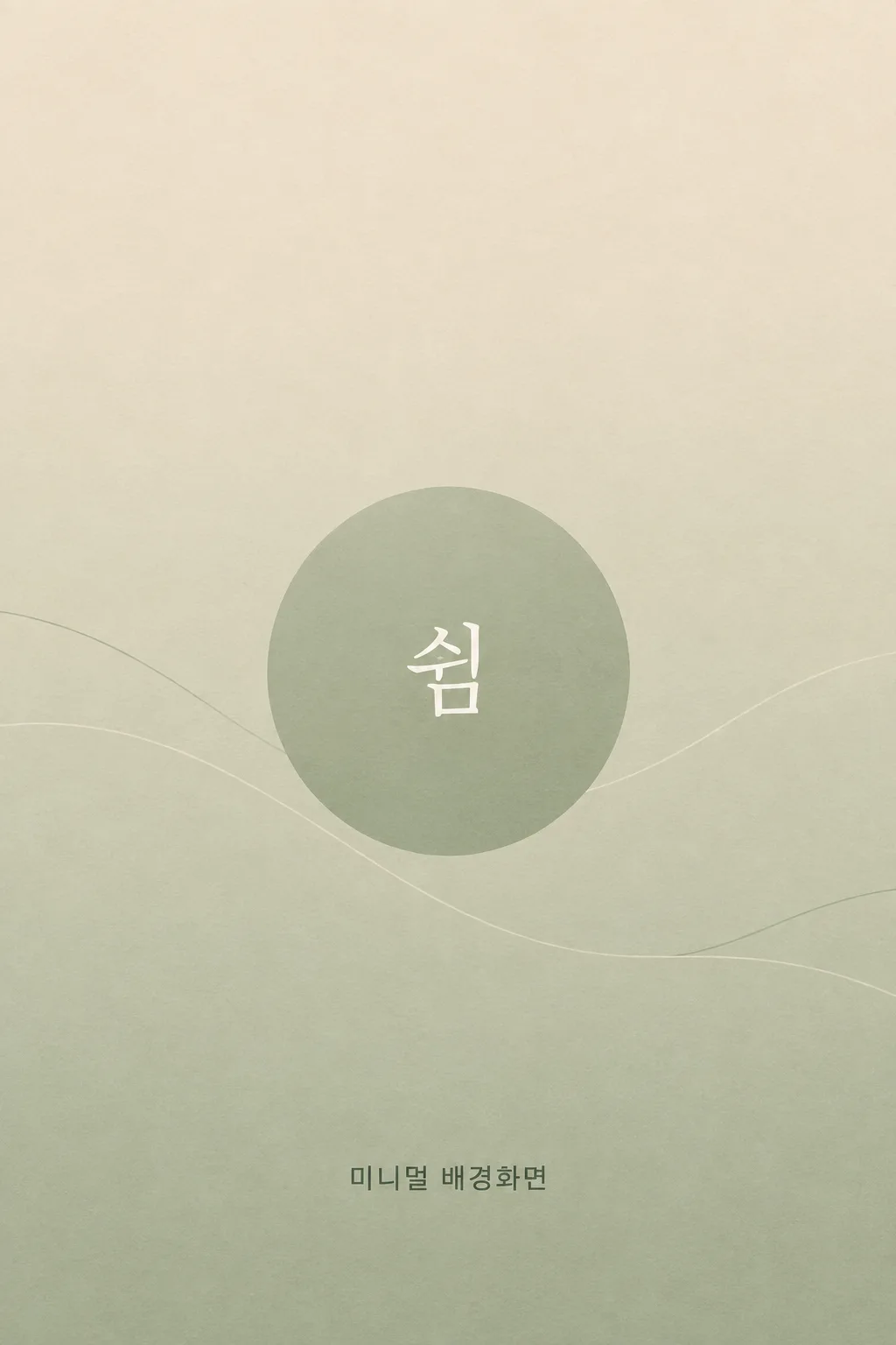
전체 · 배경화면 · 폰 배경화면
061미니멀 배경화면
색과 도형 하나를 골라 아이콘과 위젯이 잘 보이는 조용한 휴대폰 배경화면을 만들어요.
칸 채우기
- 1칸을 채워요
- 2복사 버튼을 눌러요
- 3GPT 채팅창에 붙여넣어요
- 4제품·인물 사진을 쓰려면 사진과 프롬프트를 둘 다 넣은 뒤에 보내요 선택
프롬프트 원문 보기 7,795자
Generate this image now. Draw it directly - do not describe it, explain it, or ask questions.
Target screen: "【기종】". If this is an aspect ratio such as 9:16, create a portrait wallpaper at exactly that ratio; use 1080x1920 pixels for 9:16 if exact pixel dimensions are needed. Otherwise, before drawing, look up the named device's native resolution and aspect ratio, camera cutout, lock-screen clock position, likely widget area, and home-screen dock or gesture area. For a foldable, use the named main or cover display; if neither is specified, use its main display. Render at the native aspect ratio and resolution. Adjust all safe areas below to the actual device. Do not describe the lookup or ask a question.

[Purpose]
Create one finished, original minimalist phone wallpaper for both a real home screen and a lock screen. The owner has organized their apps and wants a calm background that lets app icons, labels, widgets, the clock, and controls remain easy to see. Deliver only the flat, edge-to-edge wallpaper image, ready to save. It should also look quietly intentional when the owner shares a screenshot of the organized home screen in a story later. The story caption belongs in the story editor, not inside this wallpaper. The design must feel complete even without the optional tiny word: careful color and negative space carry the image.

[Scene]
Use "【색】" as a palette instruction, never as printed lettering. Interpret "베이지" as warm sand and cream; "세이지" as muted gray-green; "먹색" as soft ink-black with visible mid-dark detail; "하늘" as pale dusted blue; "라벤더" as desaturated gray-violet. If the value is exactly "알아서 골라줘", choose ONE of these five restrained palettes yourself and do not print those words. Keep the canvas within one coherent hue family and vary lightness only slightly. Avoid dazzling white and featureless pure black. In a dark palette, use matte deep gray rather than crushed black. The shape and ground must have low contrast, while the optional word may use only just enough contrast for close reading.

Treat "【모양】" as one mutually exclusive design choice, never as text to draw. For "단색 그라데이션", use one hue with a very smooth, gentle lightness shift and no separate object. For "큰 원 하나", use exactly one broad, softly bounded geometric circle, offset within the middle half, in a nearby tone; it must not look like a glowing moon or a button. For "물결 선", use one or two thin, widely spaced, slow curves crossing part of the middle or lower-middle area, with no repeated waves or sharp peaks. For "작은 점 무늬", use very sparse small dots of one consistent size, placed with generous gaps mostly near the side margins; they should almost disappear at thumbnail size. Do not combine the four treatments. A row of app icons or a medium widget must remain legible over every part of the design.

Reserve roughly the upper 0-25% for the lock-screen clock, status area, camera cutout, and possible top widget. Keep it an uninterrupted, low-detail continuation of the same background: no circle edge, wave, dot cluster, or word there. Keep the broad middle 25-75% calm too because widget and icon positions vary. Reserve roughly the bottom 80-100% for the dock, lock-screen controls, and gesture area, without a focal element. Leave a little crop tolerance at every edge. After checking the chosen device, adapt these approximate zones, especially for a wide foldable main screen. Negative space must be part of the composition rather than a sharp empty bar pasted over it.

[Attached photo]
No photo is required. Draw original flat graphic artwork from the chosen palette and shape alone. Do not infer a portrait, landscape, product, room, photograph, brand, or existing wallpaper collection. If a photo is incidentally attached, do not paste it into the wallpaper or turn this card into a photo edit.

[Text layout]
The background is primary; text is optional and always secondary. Leave the clock zone at the top and dock zone at the bottom free of all lettering. If the optional line below is present, set exactly that supplied Korean character or single short word once, readable at a glance on a phone lock screen: Korean letter height about 4-5% of the canvas height (clearly legible, not tiny), clean and elegant, around 68-75% of canvas height in a quiet open pocket with wide side margins. Move it slightly within that middle-lower pocket if needed to avoid the chosen shape and likely home-screen icons. Use a simple, well-formed Korean sans-serif for Korean text or a restrained sans-serif for Latin text, in a nearby tone with just enough contrast to read when inspected. Do not use a badge, label, box, underline, drop shadow, or large headline.
- 68-75%: Render this exact supplied character or word once, without quotation marks: "【한 글자나 한 단어】". If the supplied value is exactly "알아서 골라줘", never print that phrase; instead write your own short, warm, encouraging Korean line (one short word, 1-4 syllables) that fits the scene, and render that.

[Style]
Precise contemporary minimal graphic design. Prefer a clean matte color field, controlled spacing, simple geometry, and subtle tonal transitions. Make the image feel intentional through placement and proportion rather than texture, illustration, or decorative detail. An almost invisible paper-like softness may keep the fill from feeling sterile, but it must not add visible grain behind app labels. The circle, line, or dots should retain recognizable geometric character at full phone size while staying quiet behind interface elements.

[Visual hierarchy]
First, effortless legibility of the icons, labels, widgets, and clock the phone itself will overlay. Second, the selected color as a calm atmosphere. Third, one understated shape treatment. Last, if supplied, the tiny word. A person should be able to scan a busy first home-screen page without the wallpaper appearing to add more apps or widgets. Keep the shape away from the clock and dock bands, and do not create a strong central focal point competing with a real widget. If the optional word line is absent, keep that place as natural negative space and render no substitute lettering.

[Lighting and texture]
This is flat graphic design: no simulated sun, cast shadow, photographic depth of field, bevel, glass, or metallic finish. Any gradient must be smooth, without visible banding or a hard stripe. Avoid hotspots that could make white icon labels vanish on one side and dark labels vanish on the other. Preserve subtle separation between neighboring tones across the screen; the result should feel gentle rather than washed out. At normal phone viewing distance, the selected shape should read as background structure, not an illustration or a notification-like mark.

[Text rules]
If the optional word line above is absent, render absolutely no text, initial, symbol pretending to be a letter, or signature. If it is present, render only that exact supplied character or word once. Preserve Korean syllable strokes and spacing, or the Latin letters' case exactly. Do not extend a one-character value into a phrase, translate it, invent a second word, or print the selected device, palette, shape, or "알아서 골라줘". The words 「홈 화면 정리 끝」 are for the owner's later story caption and must never appear in the wallpaper itself.

[Avoid]
No phone frame, mockup, screenshot, clock, date, notification, status icon, battery, app icon, widget, dock, gesture bar, camera cutout drawing, button, logo, watermark, brand, character, person, scenery, photograph, quote card, poster border, or caption. No extra circles, dense pattern, checkerboard, starfield, confetti, repeated waves, gradients with multiple hues, neon, glow, glossy 3D, high-contrast edge, sharp stripe, busy texture, or added text. Produce exactly one wallpaper image.
이 카드도 많이 사용해요
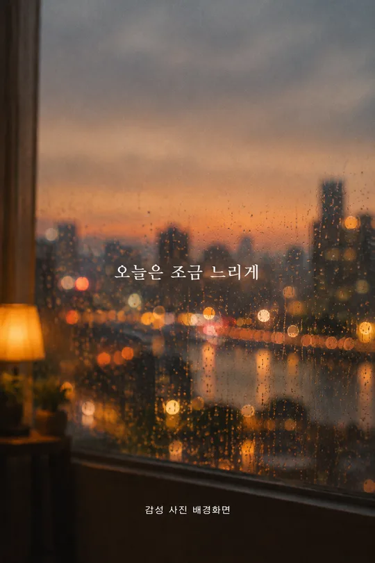
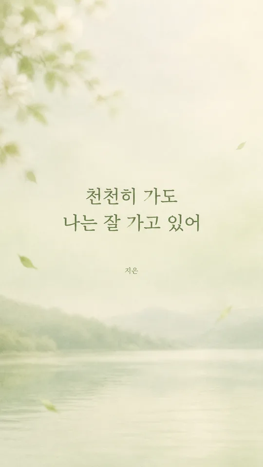
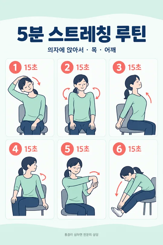
쓰는 법 · 자주 묻는 것
이런 때 쓰세요
홈 화면에서 앱을 정리했는데 배경 그림 때문에 아이콘이 다시 복잡해 보인다면, 이 카드로 색과 도형을 줄인 배경화면을 만들어 보세요. 한 가지 색 계열 안에서 명도만 살짝 바꾸고, 모양도 하나만 씁니다. 앱 이름과 위젯 내용을 읽는 일이 먼저라서 그림은 뒤에 조용히 남도록 지시했습니다. 정리한 홈 화면을 캡처해 스토리에 올릴 때도 배경이 시선을 빼앗지 않아요. 「홈 화면 정리 끝」이라는 말은 나중에 스토리 편집기에서 직접 넣으면 됩니다.
칸 채우는 법
- 기종: 사용하는 휴대폰 모델을 적으세요. 폴더블이라면 메인 화면인지 커버 화면인지까지 고르세요. 모델을 모르면 보기에 있는 9:16을 쓰면 됩니다. 이 칸 하나로 화면 비율과 시계·독 자리를 정하므로 크기 칸을 따로 채우지 않습니다.
- 색: 베이지, 세이지, 먹색, 하늘, 라벤더 중 오래 보아도 편안한 계열을 고르세요. 결정하기 어렵다면 「알아서 골라줘」를 누르세요. 그 문구가 그림에 쓰이는 것은 아니고, 다섯 색 중 한 가지를 골라 달라는 뜻입니다.
- 모양: 단색 그라데이션은 도형 없이 색 변화만, 큰 원 하나는 넓은 원 하나만 씁니다. 물결 선은 느린 곡선 한두 줄, 작은 점 무늬는 간격이 넓은 점으로 만듭니다. 여러 모양을 섞으면 아이콘 뒤가 어수선해져서 한 가지 방식만 골라요.
- 한 글자나 한 단어: 꼭 넣고 싶은 짧은 말이 있을 때만 적으세요. 한눈에 읽히는 크기로 조용한 자리에 한 번 들어갑니다. 떠오르지 않으면 「알아서 골라줘」를 누르세요. 비워 두면 글자 줄이 빠지고 그림만 남습니다. 긴 문장이나 이름표처럼 보이는 문구보다 「쉼」 같은 짧은 말이 잘 어울려요.
칸을 채운 뒤 프롬프트를 복사해 GPT에 붙여넣으면 됩니다. 사진은 올리지 않아도 돼요. 그림만 받으면 휴대폰에 저장하고 배경화면으로 지정하세요.
시계와 위젯 자리를 비운 이유
잠금화면 위쪽에는 시계와 상태 표시가 올라오고, 홈 화면에는 사람마다 다른 위치에 앱과 위젯이 놓입니다. 그래서 위쪽 약 25%와 아래쪽 약 20%에는 글자나 눈에 띄는 도형을 두지 않도록 했습니다. 가운데도 빈 칸처럼 뚝 잘라 두는 대신, 같은 색이 자연스럽게 이어지면서 원이나 선이 작게 느껴지도록 만듭니다. 기종을 적으면 화면 비율과 시계·카메라·독 위치를 확인해 이 여백을 조정하도록 프롬프트에 적었습니다.
그림이 나오면 꼭 볼 것
완성된 이미지를 먼저 잠금화면과 홈 화면에 각각 적용해 보세요. 시계 뒤에 선이나 점이 겹치지 않는지, 자주 쓰는 앱 이름과 위젯 글자가 쉽게 읽히는지 확인하는 게 가장 정확합니다. 먹색을 골랐다면 검정 덩어리처럼 뭉개지지 않았는지, 밝은 색을 골랐다면 아이콘이 흐려 보이지 않는지 살펴보세요. 한 글자나 한 단어를 적었다면 원문과 한 글자씩 비교하고, 비웠다면 임의의 글자나 서명이 없는지 확인하세요.
틀린 곳 고치는 법
같은 대화에서 문제 부분만 짚어 다시 그려 달라고 해 보세요. 예를 들어 「원 테두리가 시계에 걸리니 원을 화면 가운데 아래로 조금 내리고 위 25%는 조용히 비워 줘」라고 말할 수 있습니다. 아이콘이 잘 안 보이면 「도형과 바탕의 대비를 더 낮춰 줘. 색 계열과 구성은 유지해 줘」라고 요청하세요. 작은 글자가 틀렸다면 정확한 원문을 따옴표로 주고 그 글자만 고쳐 달라고 하면 됩니다.
자주 묻는 것
- 사진이 필요한가요? 아니요. 색과 단순한 도형만으로 만드는 배경화면이라 사진 없이 만들 수 있습니다.
- 기종을 모르면 어떻게 하나요? 기종 칸에서 9:16을 고르세요. 일반적인 세로 휴대폰 비율로 만들 수 있습니다.
- 잠금화면 시계나 앱 아이콘도 그려 주나요? 아니요. 시계와 아이콘은 휴대폰 화면이 표시합니다. 그림에는 그 자리를 위한 차분한 배경만 남깁니다.
- 말을 꼭 넣어야 하나요? 아니요. 마지막 칸을 비우면 글자 없는 미니멀 배경화면으로 완성됩니다.
- 스토리용 글은 어디에 넣나요? 배경화면을 적용하고 홈 화면을 캡처한 뒤, 스토리 편집 화면에서 「홈 화면 정리 끝」 같은 말을 직접 얹으세요.