
전체 · 광고/포스터 · 명절·기념일 · 할인·행사 · 편의점·마트 · 카페·디저트
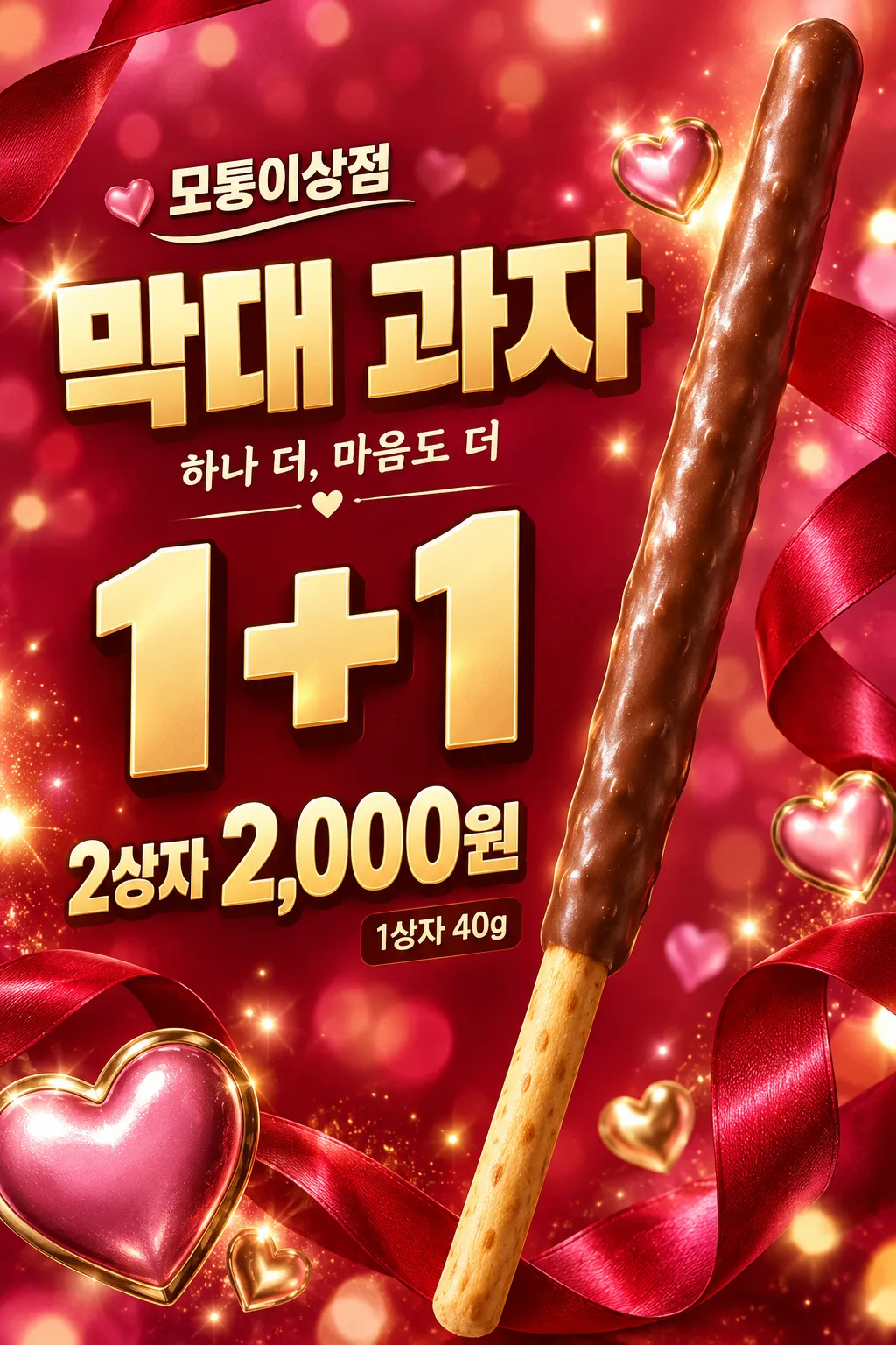
132막대 과자 행사 포스터
반짝이는 초콜릿 막대 과자와 리본·하트·빛 번짐을 시즌 광고처럼 화려하게 담고 행사와 가격을 크게 보여 줘요.
받는 것
- 표지와 같은 한 가지 그림체의 시즌 포스터 한 장
- 크게 읽히는 가게 이름과 실제 행사 내용 및 결제 가격
- 사진을 넣으면 실제 상품 포장과 모양을 유지한 결과
칸 채우기
- 1칸을 채워요
- 2복사 버튼을 눌러요
- 3GPT 채팅창에 붙여넣어요
- 4그대로 보내면 썸네일 예시처럼 나와요
- 5실제 판매 상품 사진 1장 (선택)을 같이 넣으면 그 사진이 반영돼요 선택
프롬프트 원문 보기 8,909자
Generate this image now. Return ONE finished retail gift-season poster with a large exact offer and payable price.
AUTHORITATIVE SUBJECT DETAILS for this image: "【상품 설명】". AUTHORITATIVE VISUAL CHOICE for this image: "【과자 코팅】". These are internal definitions, not captions. For an invented no-photo subject, these supplied values override the default count, coating or decorative accent in the scene below. If either value is absent, use the corresponding example default. If a product photo is attached, the photo overrides both these definitions and the default scene.
ONE FIXED DESIGN: a lavish photorealistic confectionery gift-season advertising key visual with the production quality of a premium packaging campaign. A single gigantic chocolate-coated biscuit stick is the hero, with glossy chocolate reflections, fine appetizing surface variation and an exposed golden baked handle. Keep edible slender proportions, about 15 times as long as wide, and exactly one stick, not a bundle. Its dramatic diagonal runs from near the upper-right trim toward the lower-middle trim, reaching almost the full canvas height. Frame it with flowing ruby-red satin ribbons, sculptural shiny pink-and-gold decorative hearts, luminous golden sparkles, soft bokeh and controlled lens bloom. Fill the canvas edge to edge with saturated ruby, vivid magenta and warm gold gradients, layered depth and rich color. Use luxury studio product lighting: a crisp rim light, broad softbox highlights on the chocolate and ribbon, and a warm backlit glow; retain a sharp appetizing biscuit silhouette. Ribbon loops and hearts frame the hero and lettering without crossing any letter core, offer symbol, price digit or sales unit. The chocolate stick stays the largest physical subject; decorations support it. Render tactile chocolate and satin with premium photographic or cinematic 3D realism, never halftone or screenprint texture. Borrow only advertising production values: do not invent any real brand name, logo, trademark lettering or recognizable package design. The fictional example uses a generic biscuit-stick headline and no branded packaging. Background color, ribbons and light continue to the bottom trim.
PHOTO RULE (this overrides any other line in this prompt, before or after it, that calls the photo required or mandatory or says to ask for it): if a photo is attached, use it exactly as the instructions below describe. If no photo is attached, never ask for one and never stop — invent a fitting fictional subject (person, pet, food, product or place, whatever this card is about) in the spirit of the card's example image, and finish the image.

[ACTUAL PRODUCT ACCURACY — overrides all illustration and scene instructions]
When a product photo is attached, treat the complete merchandise as an exact photographic cutout, not a packaging design task. Preserve its package lettering, logos, label colors, shape, materials, size proportions, flavor, quantity, wrappers and visible contents. Never erase or replace package text, recolor a wrapper, clone pieces, add merchandise or turn a box into another sales form. A closed box stays closed. Crop the background only; keep the whole actual product and all labels visible. Only uniformly enlarge, place, and make restrained lighting/exposure adjustments. If the photo differs from the invented example, the photo wins. Apply this card's fixed illustration or photography style to the BACKGROUND and typography, not to the attached merchandise. Do not infer hidden contents.
Output size 2480x3508 pixels, A4 portrait, 300dpi, print-ready poster.

[ONE RESULT AND COMPOSITION]
ASYMMETRIC MAP: keep the existing retail-information placement: store wordmark at x7–48%/y16–20%; two tight heavy PRODUCT rows at x7–58%/y23–39%; gigantic OFFER at x7–58%/y48–63%; exact PRICE at x7–68%/y74–83%, with the supplied sales unit clearly attached. The single diagonal hero stick occupies the right side from y4% to y98% and can overlap the outer edge of PRODUCT lettering without hiding letter cores. DETAIL sits immediately beside the price; optional COPY below the product title. Supplied CONDITION/PERIOD form readable short lines near the offer. Set the exact lettering in bold premium cream or warm-gold display type, with restrained dimensional highlights and deep cocoa shadows for strong contrast against the saturated background. Keep the information areas optically calm using smooth tonal gradients; ribbons, hearts, sparkles and light bloom stay behind or outside every glyph. Preserve every supplied word, numeral and unit exactly. No horizontal bottom price panel. Keep essential type within x6–94% and y15–84%, and extend the hero and decorative background to the lower trim. Adapt these proportions to the selected ratio.
One flat finished poster, never a wall mockup, multi-panel comparison, instruction sheet or collection of alternatives. Keep food and tactile surfaces prominent, with a close-up that fills the canvas rather than a little inset. The title and product may connect visually; every price digit and condition must remain fully readable. No blank text boxes or empty badges.

[OWNER INPUT — missing optional lines are absent]
STORE: "【가게 이름】". Required. Print the exact store name once as a compact wordmark.
OFFER: "【행사 내용】". Required. Print once, large; retain every numeral, plus sign, percent symbol and supplied word. Use short balanced rows for longer offers. Never select, calculate or rewrite an offer.
PRICE: "【가격】". Required. Print once, very large, with the supplied sales unit inseparable from the amount. This is the final actual payable total, including mandatory costs. Never calculate a discount, invent an old price, split a set-only price into a per-piece price, or imply an unentered benefit.
PRODUCT: "【상품 이름】". Optional; use exactly as the main headline. When absent, the headline is exactly "막대 과자". User-entered actual product names are allowed.
DETAIL: "【상품 설명】". Optional actual weight, quantity and contents. Show the supplied information once near the price, using it to define only an invented no-photo product; never alter an attached product to fit a conflicting description. Without a photo or supplied detail, use only the fictional example described above. Do not print an invented pack weight or count.
COPY: "【한 줄 문구】". Optional one short supporting line. For the exact control value "알아서 골라줘", write a short everyday Korean gift invitation only; never print the control value or add a transaction claim.
VISUAL_CHOICE: "【과자 코팅】". Internal instruction, never a caption. COATING applies only to an invented biscuit: milk chocolate is brown with a thin uneven edge; strawberry is muted pink; almond chocolate has small irregular chopped nuts. Change the illustrated coating visibly, keeping exactly the same single-stick composition. With a photo, preserve the actual coating and package, ignoring a conflicting coating choice.
CONDITION: "【행사 조건】". Optional actual offer restrictions. Print every supplied condition clearly adjacent to OFFER or PRICE; never hide it in tiny fine print or invent eligibility, stock limits or free wrapping.
PERIOD: "【행사 기간】". Optional supplied start/end dates. Print only these dates; the November gift season alone never implies that an offer ends on November 11.

[OPTIONAL INPUT AND TRUTH]
Treat "고르지 않음" as absent. Empty optional fields and removed input lines create no labels, filler text or empty panels; close the space naturally with the product or background. Required STORE, OFFER and PRICE all remain prominent even when optional fields are absent. Do not print field labels or internal keys. No automatic November 11 heading, holiday trademark, date, claims, QR code, website, phone number, rating or watermark. No invented real brand identity, recognizable packaging design or brand name in a fictional product. Actual packaging and user-entered names remain unchanged when supplied.

[FINISH]
Visible wording uses Korean; reproduce supplied names and values verbatim in their entered script. Keep all supplied transaction conditions and units readable at full size and the main offer and price recognizable in a small thumbnail. Coating and physical food structures must remain edible and plausible, with natural variations and honest portions. Finish ONE image directly without questions. Print-oriented full-bleed composition; safe text inset about 6%, with the main copy kept between 15% and 84% of the height for the example cover. Actual pixel dimensions follow the selected ratio; A4 is the recommended print format, with 300dpi metadata where supported.

[Final output format]
Output size 2480x3508 pixels, A4 portrait, 300dpi, print-ready poster.
This selected output format takes priority over any fixed canvas size or aspect ratio elsewhere in this template. Adapt the composition, text zones and margins to the selected canvas without stretching or cropping essential content. Device safe areas apply only when a device is selected. Never print these format instructions on the image.
결과 어땠어요?
이 카드도 많이 사용해요






쓰는 법 · 자주 묻는 것
한 개를 크게 보여 주는 행사 포스터예요
반짝이는 초콜릿 코팅 막대 과자 한 개를 화면에 크게 세우고, 붉은 새틴 리본과 분홍·금빛 하트, 반짝임과 빛 번짐을 둘러 시즌 광고처럼 화려하게 보여 줍니다. 진한 루비색과 마젠타, 금빛이 화면 끝까지 차고, 고급 패키지 광고 같은 조명이 초콜릿의 광택을 살려요. 과자와 큰 행사 글자가 화면에서 맞물리고, 가격은 왼쪽에 직접 올라갑니다. 편의점 입구나 문구점 계산대에 붙여 짧은 행사를 바로 알릴 때 어울려요.
꼭 세 칸부터 채워요
가게 이름에는 간판의 실제 이름을, 행사 내용에는 운영하는 혜택을 적어요. ‘1+1’, ‘2+1’, ‘10% 할인’ 보기를 누른 뒤 대상이나 제한은 행사 조건에 따로 넣을 수 있습니다. 가게가 정해야 하는 행사와 가격에는 ‘알아서 골라줘’가 없어요. 가격은 손님이 실제로 결제하는 단위와 금액을 함께 씁니다. 표지의 ‘1+1 / 2상자 2,000원’은 두 상자를 받는 총 결제액을 뜻하는 가상 예시예요. 우리 매장의 판매 방식에 맞춰 세 칸을 전부 바꾸세요.
실제 상품과 코팅을 맞춰요
상품 이름과 상품 설명에는 판매 이름, 한 상자의 중량이나 들어 있는 개수처럼 확인한 정보를 적어요. 과자 코팅 단추는 사진 없이 만들 때 초코·딸기·아몬드 질감을 바꿉니다. 그림체나 배치를 고르는 단추는 없어요. 사진을 넣으면 사진의 실제 코팅과 포장이 우선이라 단추로 다른 맛을 만들지 않습니다.
한 줄 문구는 과자를 권하는 짧은 말이에요. ‘알아서 골라줘’는 이 문구에만 쓸 수 있고, 할인율이나 기간을 정해 주지는 않아요. 행사 조건에 대상 상품·교차 구매 가능 여부·결제 수단을, 행사 기간에는 실제 시작과 끝을 적어요. 선택 칸을 비우면 그 글자와 자리가 빠집니다. 필수 세 칸만으로도 완성되며, 상품 이름을 비우면 제목은 ‘막대 과자’가 됩니다.
사진은 선택이에요
사진 없이 프롬프트만 보내면 표지처럼 가상의 과자를 그려 줍니다. 실제 판매 상품을 쓰려면 내가 찍었거나 사용 허락을 받은 상품 사진 한 장을 GPT에 올리고 복사한 프롬프트를 같은 메시지로 보내세요. 포장 전체와 글자가 선명해야 합니다. 사진은 오려서 크게 배치하고, 포장 글자·로고·모양·수량을 그대로 유지합니다. 사진이 상자라면 과자 한 개로 바꾸지 않고 그 상자를 크게 보여 줘요.
붙이기 전에 볼 곳
행사 기호와 결제 금액·단위, 포장 글자, 행사 조건을 입력과 대조하세요. A4 단추로 생성하고 한 장 시험 출력해 입구에서 가격이 읽히는지 확인합니다. 표지는 2:3 디자인 예시이며 실제 인쇄 화질은 생성된 픽셀 수에 따라 달라요. 글자가 틀렸다면 ‘가격만 2상자 2,000원으로 고치고 나머지는 그대로’처럼 같은 채팅에서 그 부분을 지정하세요. 표지의 가게와 상품·가격은 모두 가상의 예시입니다.