
전체 · 광고/포스터 · 신메뉴·신상품 · 음식점·식당
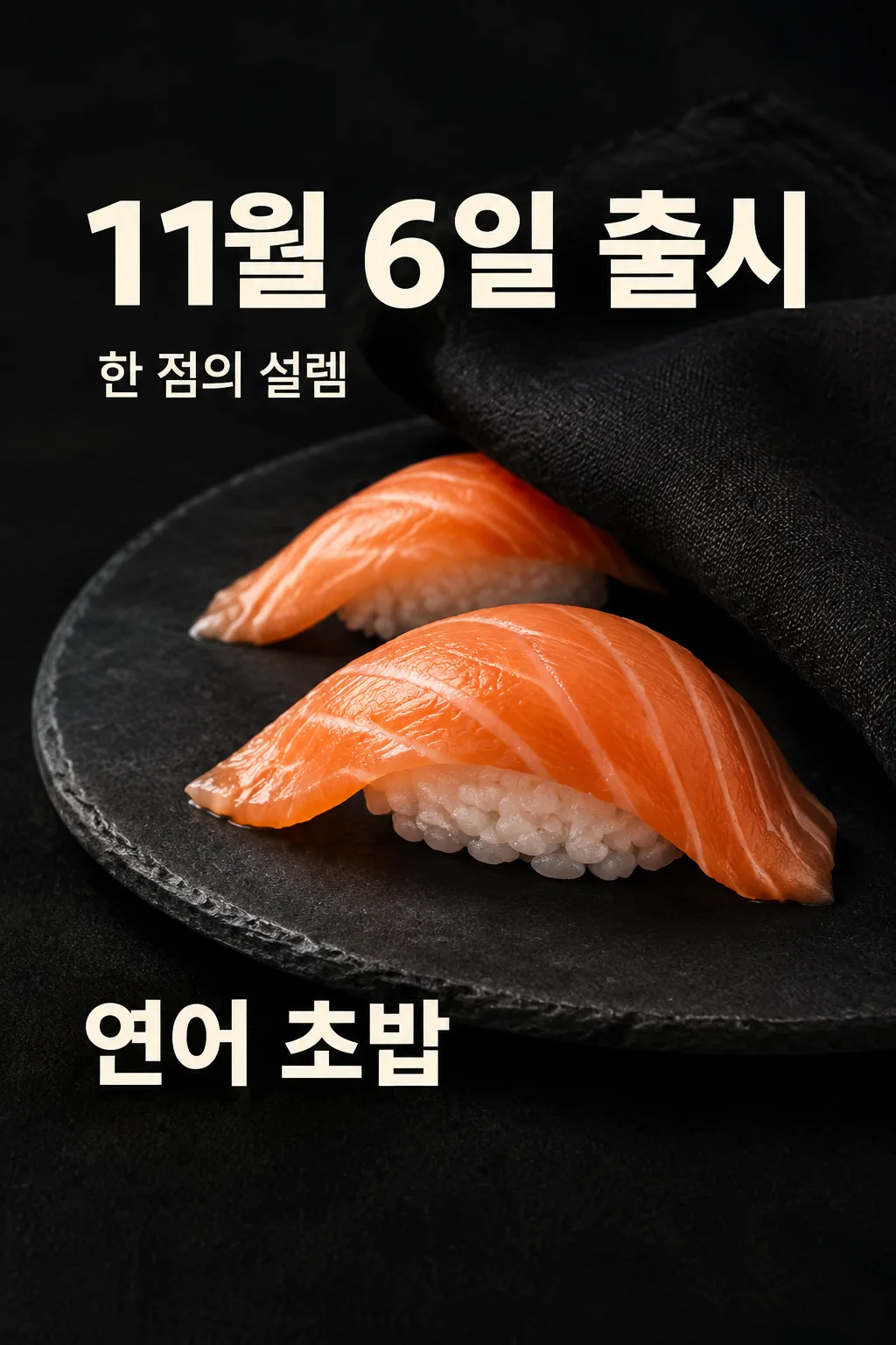
199초밥 출시 티저
초밥 가게가 실제 메뉴 사진과 확정 출시일로 출입문·SNS에 예고 한 장을 올려요.
칸 채우기
- 1칸을 채워요
- 2복사 버튼을 눌러요
- 3GPT 채팅창에 우리 가게 초밥 사진 한 장 필수을 올리고, 프롬프트를 같이 붙여넣어요
- 4우리 가게 초밥 사진 한 장 필수과 프롬프트가 둘 다 들어간 걸 보고 보내요
프롬프트 원문 보기 5,205자
Generate this image now. Draw it directly - do not describe it, explain it, or ask questions.
Output one landscape A3 poster, 420 x 297 mm, aspect ratio 1.414:1. Use the largest supported image resolution. Final print target is 4961x3508 pixels at 300dpi; keep all lettering at least 10 mm inside every paper edge. Preserve the wide composition and print-safe margins.

[Purpose]
One finished launch-teaser poster for a Korean sushi shop, suitable for its entrance or social feed. This is a sushi-only card with a fixed restrained ink-black photographic design: a revealed appetizing foreground bite, partly concealed plate and a prominent supplied launch date. No discount poster or menu board.
[Scene]
One actual sushi dish on its own plate, at a close low three-quarter angle. A folded matte black linen cloth partly conceals the REAR upper-right of the plate, suggesting a reveal. The foreground fish and rice remain clear and appetizing. The concealment is part of this finished image; the viewer does not cut or assemble anything. Do not invent a second dish or add sushi pieces to fill space.
[Attached photo]
A clear photo of the user's actual sushi is REQUIRED. Preserve the actual topping, rice mound, proportions and visible ingredients. Keep slices naturally uneven and the rice hand-formed, not geometric cubes. Fish lies over rice rather than floating. Do not duplicate identical pieces, substitute another fish, add garnish, remove supplied ingredients or imply a serving quantity absent from the input. If the supplied fish is raw, show gentle moist translucency without steam or flames. Use authentic salmon's irregular pale fat lines and discrete short rice grains when the photo shows salmon. Food accuracy has priority over the decorative veil.
[Text layout]
Exact dish name: "【메뉴 이름】". Exact owner-confirmed launch date: "【출시일】". Render the date followed by "출시" only once in Korean, at x10-90%,y14-24%,as the largest ivory bold sans-serif text. Use the date exactly as given, no invented year, weekday or countdown. The supporting line "【예고 한마디】" at y26-30% must be short and readable. If it is "알아서 골라줘", invent one brief sensory anticipation line in Korean, without factual claims about sourcing, preparation, health, sales or popularity. The actual dish occupies x15-93%,y33-73%. Dish name appears at x10-80%,y74-81%,large but secondary to the date.
Optional shop name only: "【가게 이름】" at x10-36%,y33-36%,small readable sans-serif. No fictional shop name when blank.
[Style]
One fixed premium food photograph on deep ink-black linen and charcoal slate. Ivory type, orange color comes only from the actual salmon if present. No frame behind text, no price badge, neon, starburst, sale sticker, illustration, fake packaging or logo. The teaser shows some food detail, not an empty silhouette or all-black plate.
[Visual hierarchy]
Real fish and rice should look delicious before the viewer reads details; then the large launch date is unmistakable. Title is a date announcement, not a huge adjective. Distinguish this teaser from a simple menu-and-price poster: price, discount, capacity, quantity limits, booking method and minimum purchase conditions are absent. No hidden fine print. Important text fully within y14-82%; upper12% and lower15% have no essential lettering.
[Lighting and texture]
Soft warm side illumination models fresh fish, a few separate rice grains and the matte plate edge. The image must not make raw fish steaming, dry, plastic, woven, overly glossy or mechanically repeated. Veil material has visible linen folds and stays behind the edible foreground. No diners or foreign signage.

[Text rules]
Use only the requested visible copy in the target language. Resolve an automatic-copy instruction into an original short line; never print the instruction itself. Preserve user-supplied names, spelling, numbers and punctuation. Input labels, section headings and placeholders are not visible copy. Every optional field stays on its own instruction line so that leaving it empty removes only that item. Never add a date, price, discount, quantity, prize, origin, business condition, scientific statistic or claim about a real person that the user did not provide. Personal inputs affect content only; keep this one art medium, one layout and one finished result type.

[Avoid and delivery]
Return exactly ONE complete raster image directly. All requested elements belong on the same canvas. Do not run code, provide an explanation instead of an image, create separate panels as separate files, require another message, offer variants, or ask the user to cut and assemble anything. No device mockup, promotional wrapper, brand logo, packaging imitation, existing fictional character, artist signature, celebrity or watermark. Finish the selected canvas edge to edge. Maintain the fixed composition when the selected aspect ratio changes by adapting spacing, without cutting important parts or adding a second result.

[Legibility]
Keep essential lettering inside x7-93% and y14-84% of the image. The upper12% and lower15% contain no important text. At a1024x1536 cover, all essential ink is below y215 and above y1290. Use clearly connected natural letters, comfortable spacing and strong contrast. Do not let faces, decorative marks, food highlights or shadows obscure the words. Large lettering must still identify this result in a three-column list. Handwritten copy is legible pencil handwriting, never tiny ornamental cursive.
이 카드도 많이 사용해요




쓰는 법 · 자주 묻는 것
아직 판매 전인 초밥을 예고해요
새 초밥을 준비한 가게가 확정한 출시일을 문 앞이나 SNS에 먼저 알리는 티저입니다. 먹색 바탕에 접시 일부를 검은 천으로 가리고, 앞쪽 초밥의 생선 결과 밥알은 맛있게 드러냅니다. 큰 날짜와 작은 메뉴 이름만으로 무엇을 언제 만날 수 있는지 보여 줍니다. 메뉴 사진과 가격을 모두 펼치는 심플 포스터나 할인 행사판과는 다른 결과로 고정했습니다.
음식 사진은 꼭 넣어 주세요
이 카드에는 실제로 판매할 우리 메뉴 사진 한 장이 필요합니다. 사진에서 보이는 생선 종류와 밥 양, 토핑이 결과의 기준입니다. 다른 가게의 메뉴 사진을 내 메뉴인 것처럼 넣지 마세요. 연어라면 주황빛 살에 불규칙한 흰 지방선이 있고, 짧은 밥알이 살 아래에 붙어 있어야 합니다. 날생선에 뜨거운 김이나 불꽃이 생기지 않도록 했습니다. 표지 음식은 구조를 확인한 가상 예시이며 실제 상품 사진이 아닙니다.
날짜는 사장님이 확정한 값만 써요
출시일에는 준비가 끝나 실제로 판매를 시작할 날을 입력합니다. 예시의 11월 6일은 형식을 보여 주는 값이니 그대로 공개하지 말고 확정일로 바꾸세요. GPT가 날짜를 임의로 정하거나 요일과 디데이를 붙이지 않도록 했습니다. 아직 출시일을 정하지 않았다면 먼저 날짜를 확정한 뒤 이 카드를 사용하세요. 할인율, 수량 한정, 예약 혜택이나 최소 주문 조건은 자동으로 생기지 않습니다.
메뉴 이름과 짧은 기대 문장을 넣어요
메뉴 이름은 실제 판매 이름을 적습니다. 예고 한마디는 “알아서 골라줘”로 시작할 수 있고, 그러면 짧은 기대 문장이 만들어집니다. “당일 손질”, “지역 1위”, “건강에 좋은”처럼 사진만 보고 확인할 수 없는 사실은 자동 문구에 넣지 않습니다. 직접 입력하는 경우에도 두세 단어 정도가 날짜를 가리지 않아 좋습니다. 가게 이름은 선택이며 비우면 작은 상호 줄만 빠집니다. 가짜 상호를 추천하지 않습니다.
사진과 글을 같은 메시지에 보내요
초밥 사진을 GPT 입력창에 올리고 아직 보내지 마세요. 이 페이지에서 칸을 채운 프롬프트를 복사해 같은 입력창에 붙여넣고, 사진과 글이 둘 다 있는지 확인해 한 번 보냅니다. 사진만 먼저 보냈다면 끝에 “위 사진으로 그려줘”를 붙입니다. 가려진 접시와 드러난 초밥이 한 그림에 함께 완성되므로 여러 장 만들기나 코드, 잘라 붙이기가 필요하지 않습니다.
사진과 출시일을 한 번 더 대조하세요
완성본에서는 음식이 실제 메뉴와 같은지 먼저 봐 주세요. 연어 지방선이 바둑판처럼 반복되거나 밥이 한 덩어리 플라스틱처럼 보이면 프롬프트를 고쳐야 합니다. 천이 앞쪽 음식까지 가리거나 복제된 초밥이 추가되면 이 티저의 결과와 다릅니다. 날짜와 메뉴 이름의 철자도 원래 입력과 대조하고, 손님에게 없는 혜택이나 조건이 표시되지 않았는지 확인한 뒤 게시합니다.
틀린 곳을 구체적으로 고쳐요
음식이 바뀌었다면 원본 사진의 생선, 토핑과 조각 형태를 그대로 유지하도록 지정하세요. 날짜 오류는 정확한 날짜를 따옴표로 적어 바꾸면 됩니다. 가격을 새로 넣기보다는 이 카드는 예고 한 장으로 두고 실제 판매 안내는 별도로 만드세요. 정상 사용에서 두 번째 요청을 요구하는 방식은 아닙니다.
자주 묻는 것
- 음식 없이 실루엣만 나오나요? 아니요. 앞쪽 초밥이 먹음직스럽게 보이고 접시 뒤만 일부 가립니다.
- 가격이 자동으로 붙나요? 아니요. 이 티저에는 가격이나 할인 칸이 없습니다.
- 표지 날짜가 실제 행사인가요? 아니요. 입력 형식을 보여 주는 가상 예시입니다.