
전체 · 광고/포스터 · 로고·브랜드
180흑백 스티커 로고
굵은 흑백 그림과 이름, 하프톤, 한 덩어리의 흰 다이컷 테두리로 강렬한 스티커를 만들어요.
받는 것
- 굵은 외곽과 하프톤의 흑백 그림
- 크고 또렷한 이름
- 연결된 흰 다이컷 테두리의 스티커 한 장
ChatGPT 무료 OK
칸 채우기
- 1칸을 채워요
- 2복사 버튼을 눌러요
- 3GPT 채팅창에 붙여넣어요
- 4그대로 보내면 썸네일 예시처럼 나와요
- 5카드에 맞는 실제 사진을 같이 넣으면 그 사진이 반영돼요 — 배경 카드는 배경 사진, 인물 · 음식 카드는 그 사진 선택
프롬프트 원문 보기 4,723자
Generate this image now. Return exactly ONE finished image itself; draw it directly without explanations or questions.
Output size 1080x1080 pixels, 1:1 square card. Keep the same top-to-bottom order but compress the zones to fit the square: the illustration becomes smaller and every text line stays fully readable.
Exactly one original BLACK-AND-WHITE DIE-CUT STICKER logo, centered at 72-80% of width. One bold graphic above one oversized exact name. A single continuous white cutline encloses both as one physical matte-vinyl sticker on a plain black surface. No sticker sheet, badge circle, extra copy or application mockup.
Use original brand artwork. Preserve the input name in its original script, spelling, case, spaces and punctuation; never translate or romanize it. Korean and Latin names are both supported. Keep characters readable, including Hangul final consonants. Do not imitate recognizable existing logos, characters or signature marks.
The background fills the canvas edge to edge. Keep essential lettering and all key elements below the top 12% and above the bottom 15%; adapt the spacing to the chosen ratio. No watermark, trademark symbol, field labels, extra sales copy or invented contact details.

[INPUTS FOR THIS IMAGE]
BRAND_NAME selected: "【가게 이름】"
Set BRAND_NAME to the exact input. Print once in large intact characters, preserving the original script.
BUSINESS selected: "【업종】"
Use this business to inform the graphic attitude; never print it as a subtitle.
GRAPHIC selected: "【스티커 그림】"
Draw one original simplified graphic with broad silhouettes, strong readable negative-space cuts and no tiny detached parts. If asked to choose, infer one simple subject from BUSINESS.
CONTRAST selected: "【흑백 대비】"
Artwork uses black and white inks only. Gray-looking shading must come from black dots on white, never a gray gradient or third ink.
Interpret only the selected choice:
- 검정 면 + 흰 틈: dominant black silhouette with bold white negative-space cuts
- 흰 얼굴 + 검정 선: mostly white face with heavy black contour and solid dark accents
- 반반 대비: roughly balanced black masses and white openings, intentional asymmetric lighting shapes
If this selection line is missing or empty, use 검정 면 + 흰 틈 only.
HALFTONE selected: "【하프톤】"
Use halftone dots only in selected broad graphic shadows. Keep letters and outer cutline solid and clear.
Interpret only the selected choice:
- 굵은 점 조금: sparse coarse halftone shading in one or two broad areas
- 중간 점 넉넉히: medium halftone screens in larger shadow areas, never across eyes or letters
- 점 없이: solid black-and-white shapes only
If this selection line is missing or empty, use 굵은 점 조금 only.
CUTLINE selected: "【흰 테두리】"
Maintain exactly one connected white border wrapping both graphic and name. Bridge small gaps cleanly, without blocking letter counters or symbol openings.
Interpret only the selected choice:
- 두꺼운 테두리: a generous thick white die-cut border, roughly 22-28 pixels at 1024-wide output
- 중간 테두리: a clear medium white border, roughly 14-18 pixels at 1024-wide output
- 아주 두꺼운 테두리: an extra-thick white border, roughly 32-38 pixels at 1024-wide output
If this selection line is missing or empty, use 두꺼운 테두리 only.
TYPEFACE selected: "【이름 글꼴】"
Use bold readable letters below the graphic, with white faces and black separation. No script lettering, slogans or compressed unreadable kerning.
Interpret only the selected choice:
- 굵은 압축 고딕: bold condensed sans serif with large open counters
- 각진 스포츠 글씨: angular athletic display lettering with intact character shapes
- 둥근 굵은 글씨: bold rounded display lettering with open counters
If this selection line is missing or empty, use 굵은 압축 고딕 only.

[RESOLVED DESIGN]
A strong original sticker tailored to BUSINESS: the selected GRAPHIC in large broad shapes using CONTRAST, crisp black-and-white boundaries and the selected HALFTONE in broad shadow areas only. Exact BRAND_NAME beneath in oversized white lettering using TYPEFACE, with black separation and intact counters. Graphic and name form one cohesive white-bordered silhouette using CUTLINE, with no detached pieces or separate text sticker. The matte white vinyl edge has tiny believable depth and a restrained shadow on a plain black surface. Use strict black and white artwork, no color accents, gradients, excessive scratch distress or imitation of existing sports-team mascots.
Before returning, compare every rendered name character with BRAND_NAME and repair any misspelling. Keep the same resolved design while correcting letters. Print BRAND_NAME exactly once.

[Final output format]
Output size 1080x1080 pixels, 1:1 square card. Keep the same top-to-bottom order but compress the zones to fit the square: the illustration becomes smaller and every text line stays fully readable.
This selected output format takes priority over any fixed canvas size or aspect ratio elsewhere in this template. Adapt the composition, text zones and margins to the selected canvas without stretching or cropping essential content. Device safe areas apply only when a device is selected. Never print these format instructions on the image.
결과 어땠어요?
이 카드도 많이 사용해요





쓰는 법 · 자주 묻는 것
두 색만으로 강한 인상을 만들어요
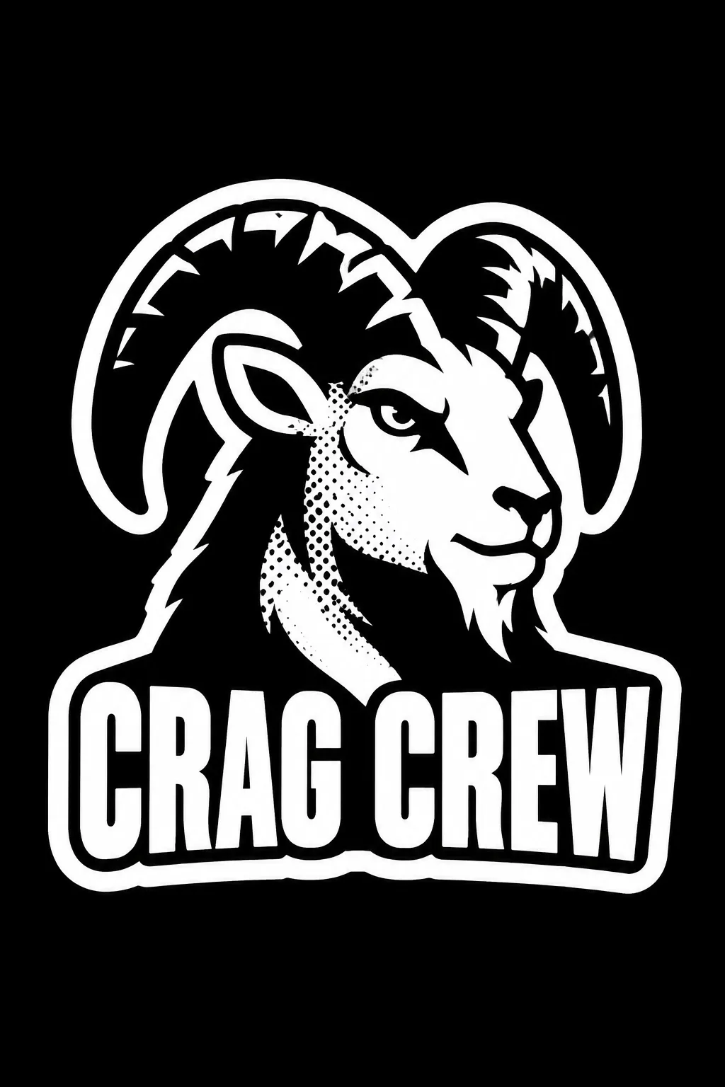
볼더링 클럽·스케이트 팀·타투 작업실처럼 힘 있는 표식을 원할 때 씁니다. 굵은 그림과 큰 이름, 제한된 하프톤을 흰 테두리 하나로 묶어요. 표지는 가상의 볼더링 클럽 CRAG CREW, 굵은 뿔의 산양 머리, 검정 면과 흰 틈, 조금 넣은 굵은 점과 두꺼운 흰 테두리입니다.
큰 그림 하나를 써요
가게 이름은 한글·영문 그대로 넣습니다. 업종은 그림 분위기에만 쓰고 부제처럼 찍히지 않아요. 스티커 그림은 ‘굵은 뿔의 산양 머리’처럼 외곽으로 기억할 수 있는 대상을 적습니다. 보기나 ‘알아서 골라줘’를 눌러도 됩니다. 작게 떨어진 조각이나 여러 캐릭터는 한 장 스티커에서 복잡해져요.
대비·점·테두리를 조절해요
검정 면 중심, 흰 얼굴 중심, 반반 대비를 고릅니다. 하프톤은 굵은 점 조금·중간 점 넉넉히·없음으로 바꿔요. 점은 그림 음영에만 넣고 이름과 테두리는 또렷하게 둡니다. 흰 테두리와 이름 글꼴도 고릅니다. 비우면 표지의 검정 면, 적은 굵은 점, 두꺼운 테두리, 굵은 압축 고딕으로 만듭니다.
한 장으로 붙일 수 있는 모양인지
사진 없이 1:1로 GPT나 Gemini에 보냅니다. 표지는 2:3 예시예요. 흰 테두리가 그림과 이름을 함께 감싸는지, 뿔과 이름이 따로 떨어지지 않는지 확인하세요. 분리되면 ‘그림과 이름을 하나의 흰 다이컷 테두리로 연결해 줘’라고 고칩니다. 작은 크기에서 점이 검정 덩어리가 되면 하프톤을 줄여요. 흰 테두리는 디자인 표현이며 인쇄소의 실제 칼선·재단 여백·투명 배경 도안은 별도 규격으로 준비합니다.
상업용 전 키프리스(KIPRIS) 상표 검색 · 크게 쓸 땐 벡터로 다시 그리기