
전체 · SNS/카드뉴스 · 밈·공감
089사진 한 장 그림일기
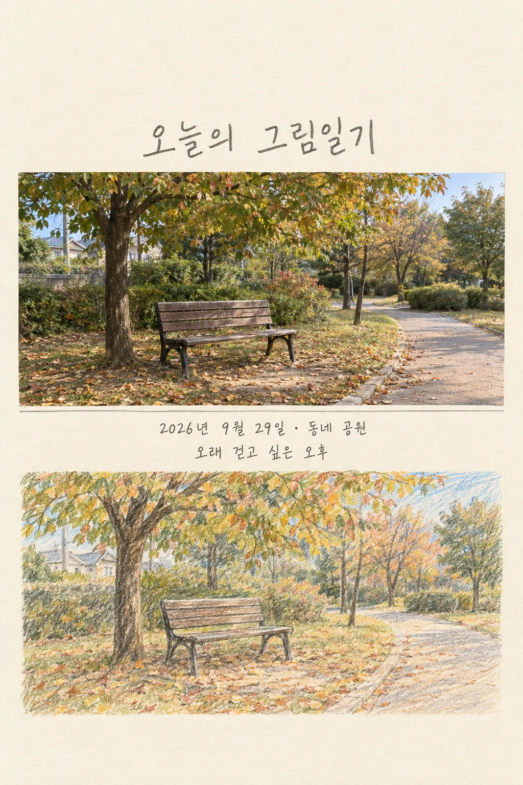
사진을 찍은 사람이 원본과 색연필 그림을 한 장에 담아 인스타·스레드에 그날의 기억을 올려요.
칸 채우기
- 1칸을 채워요
- 2복사 버튼을 눌러요
- 3GPT 채팅창에 내 사진 1장을 올리고, 프롬프트를 같이 붙여넣어요
- 4내 사진 1장과 프롬프트가 둘 다 들어간 걸 보고 보내요
프롬프트 원문 보기 5,728자
Generate this image now. Draw it directly - do not describe it, explain it, or ask questions.
Output size 2480x3508 pixels, A4 portrait, 300dpi, print-ready poster.

[Purpose]
Create exactly ONE finished Korean photo-and-drawing diary image for the owner to share as one Instagram or Threads post. The user supplies ONE real personal photograph and this prompt in the SAME message. Inputs: date "【기록 날짜】", place "【장소】", and short line "【한 줄 문구】". The image must be complete as delivered: no series, no separate pages, no crop instructions, no app editing, no code, and no second generation. Preserve the supplied event rather than inventing a more dramatic one. This is a personal memory, not a generic pretty landscape.

[Scene]
Make one vertical full-bleed diary page with two connected visual regions on the same canvas. The upper region is a faithful, recognizable rendition of the uploaded photo with its people, objects, architecture, weather and composition intact. The lower region is a hand-drawn reinterpretation of THAT SAME moment using uneven colored-pencil lines, light crayon strokes and real paper grain. Its viewpoint and main subjects should correspond clearly to the photo above, so anyone can instantly see a photo becoming a drawn memory. A narrow hand-drawn graphite divider or a soft torn-paper transition may separate the regions. Do not add a second unrelated scene, impossible landmark, new pet, extra person, invented gesture or duplicated human limb. Keep the hand drawing large enough to be a full scene, not a tiny icon. The page should feel kept in a real sketch diary.

[Attached photo]
Use the attached photo as the sole factual source for visible people and surroundings. Preserve faces and identifying features where visible; do not beautify, de-age, change clothing, change the number of people or turn a real person into a known character. Render ordinary objects faithfully rather than replacing them with aspirational props. If the source photo contains writing or logos, simplify unimportant marks instead of fabricating a new brand; preserve any essential user-supplied wording only if clearly legible. If no photo is attached, ask for that one photo and do not generate a fabricated memory. Do not infer location from the image when it conflicts with the user's supplied place. The user's place is a diary label, not proof of where the photo was taken.

[Text layout]
Leave the ENTIRE upper 20% blank paper, with the handwritten title beginning only below that empty zone. There must be NO lettering within the upper 12% or lower 15%, where the site places overlays. Place the large title "오늘의 그림일기" at 21% to 28% of height. Fit the faithful photo around 29% to 49%. Put BOTH text lines in a quiet cream band BETWEEN the photo and drawing: "【기록 날짜】 · 【장소】" at 50% to 54%, then "【한 줄 문구】" at 55% to 59%. Fit the matching colored-pencil drawing around 61% to 84%, with no text beneath it. Never put a caption beneath the drawing. If the last input is exactly "알아서 골라줘", silently write one short, warm, observational Korean sentence based only on visible details; never print the instruction phrase itself. If the image does not show a clear mood, use a neutral memory line rather than inventing what someone felt or said. All letters must fit inside the central safe area, with ample breathing space on a phone.

[Style]
Use warm ivory diary paper, graphite writing, softened real-photo colors and a lower illustration with distinct waxy pencil marks. Let the source photo decide accent colors: foliage may be muted green, a dusk sky peach, a rainy street blue-gray. Avoid a fixed neon palette. The handwriting should feel human and lightly uneven yet be big and legible in a small card listing. The photograph and drawing are an editorial pair within ONE page, not two outputs or a template mockup. The final asset should look ready to post without another caption being required.

[Visual hierarchy]
First read is the transformation from actual photograph to drawing. Second read is the large diary title. Third read is date, place and one sentence. Keep the photo and illustration aligned in content, not merely similar in color. If a face is too small in the reference to reproduce reliably, keep it small in both regions rather than inventing detail. Make a clear visual rhythm with no repeated panels or ornamental frames that steal room from the memory. Do not place a phone silhouette or social-media controls around the page.

[Lighting and texture]
Match the upper image to the source's actual light direction and time-of-day appearance. On the lower drawing, use visible hand pressure changes, lightly overlapping strokes, paper tooth and small imperfections. Preserve recognizable silhouettes while simplifying only fine detail. No plastic 3D render, airbrushed skin, glossy stickers, uniform vector outlines, artificial bokeh, fake photographic watermark or random doodles unrelated to the photo.

[Text rules]
Render the Korean date, place and chosen short line accurately and only once. Do not print field names as labels, braces, English filler, a second date, guessed weekday, unverified weather, made-up quote or extra hashtags. If the user wrote a line, retain its meaning and spelling. If the date is ambiguous, use the supplied string verbatim; never silently replace a memory date with today's date. Do not add a signature or logo. Respect the site-safe margins without drawing visible guides.

[Avoid]
No multiple results, no four-panel comic, no slideshow, no separate original image file, no crop guide, no invented family relationship or emotion, no copyrighted character style, no stock face, no fantasy background, no extra people or animals, no action absent from the photo, and no explanation instead of the requested image.
이 카드도 많이 사용해요
쓰는 법 · 자주 묻는 것
이런 때 쓰세요
산책길, 여행지, 집 앞 풍경처럼 직접 찍은 사진이 있는데 그날의 느낌을 조금 다르게 남기고 싶을 때 쓰는 카드입니다. 사진을 그대로 보여 주는 윗부분과 같은 장면을 색연필로 다시 그린 아랫부분이 세로 이미지 한 장에 붙습니다. 인스타그램 피드나 스레드에 하루 기록으로 올리고, 함께 찍은 사람에게 메시지로 보내기에도 좋습니다. 같은 장소를 다시 방문했을 때 새 사진으로 한 장 더 만들 수 있어요. 그림은 새 사건을 꾸며 내는 장치가 아니라 실제 사진에 담긴 순간을 다시 바라보는 방식입니다.
칸 채우는 법
기록 날짜에는 사진을 찍은 날짜를 적으세요. 오늘 찍은 사진이 아니어도 됩니다. 장소에는 다른 사람이 읽어도 부담 없는 이름을 쓰세요. 집 주소 같은 자세한 위치는 공개 게시물에 넣지 않는 편이 좋습니다. 한 줄 문구에는 사진을 떠올리게 하는 짧은 말을 적거나 「알아서 골라줘」를 누르세요. 그 값을 고르면 GPT가 보이는 장면에 어울리는 한 문장을 직접 고릅니다. 감정이나 대화를 사실처럼 지어내지 않도록 프롬프트가 안내합니다.
사진을 넣는 순서
- 내가 찍었거나 사용할 권한이 있는 사진 한 장을 GPT 입력창에 올리세요. 아직 보내지 마세요. 사람이 알아볼 수 있다면 공개해도 되는지 먼저 확인하세요.
- 같은 입력창에 이 카드에서 복사한 프롬프트를 붙여넣으세요. 사진과 프롬프트가 둘 다 들어간 것을 보고 한 번만 보내세요.
- 결과 이미지 한 장에서 위쪽 사진과 아래쪽 그림이 같은 순간을 가리키는지 살펴보세요. 사진을 따로 저장하거나 두 장을 이어 붙일 필요는 없습니다.
그림이 나오면 꼭 볼 것
사람 수, 옷, 건물 모양, 큰 물건이 원본과 맞는지 확인하세요. 날짜와 장소, 문구가 바르게 들어갔는지도 휴대폰 크기로 읽어 보세요. 색연필 글씨는 손으로 쓴 듯해야 하지만 지나치게 작으면 공유 이미지에서 읽기 어렵습니다. 사진에 없는 동물이나 대화 장면이 그려졌다면 그 결과는 쓰지 말고 원본이 더 뚜렷한 사진을 골라 다시 시작하는 편이 좋습니다. 타인의 얼굴이 보이는 사진은 공유 범위를 당사자와 상의하세요.
자주 묻는 것
- 사진이 꼭 필요한가요? 네. 실제 사진이 있어야 위아래가 같은 기억을 보여 줍니다.
- 결과가 두 장인가요? 아니요. 사진과 색연필 그림이 한 장의 세로 이미지 안에 있습니다.
- 얼굴도 만화처럼 바뀌나요? 아래쪽은 손그림이지만 위쪽 사진과 누구인지 알아볼 수 있는 특징을 유지하도록 지시합니다.
- 날짜가 오래전이어도 되나요? 네. 칸에 적은 촬영 날짜를 그대로 사용하며 현재 날짜로 바꾸지 않습니다.