
전체 · SNS/카드뉴스 · 정보·꿀팁
084둘 중 하나 비교 카드
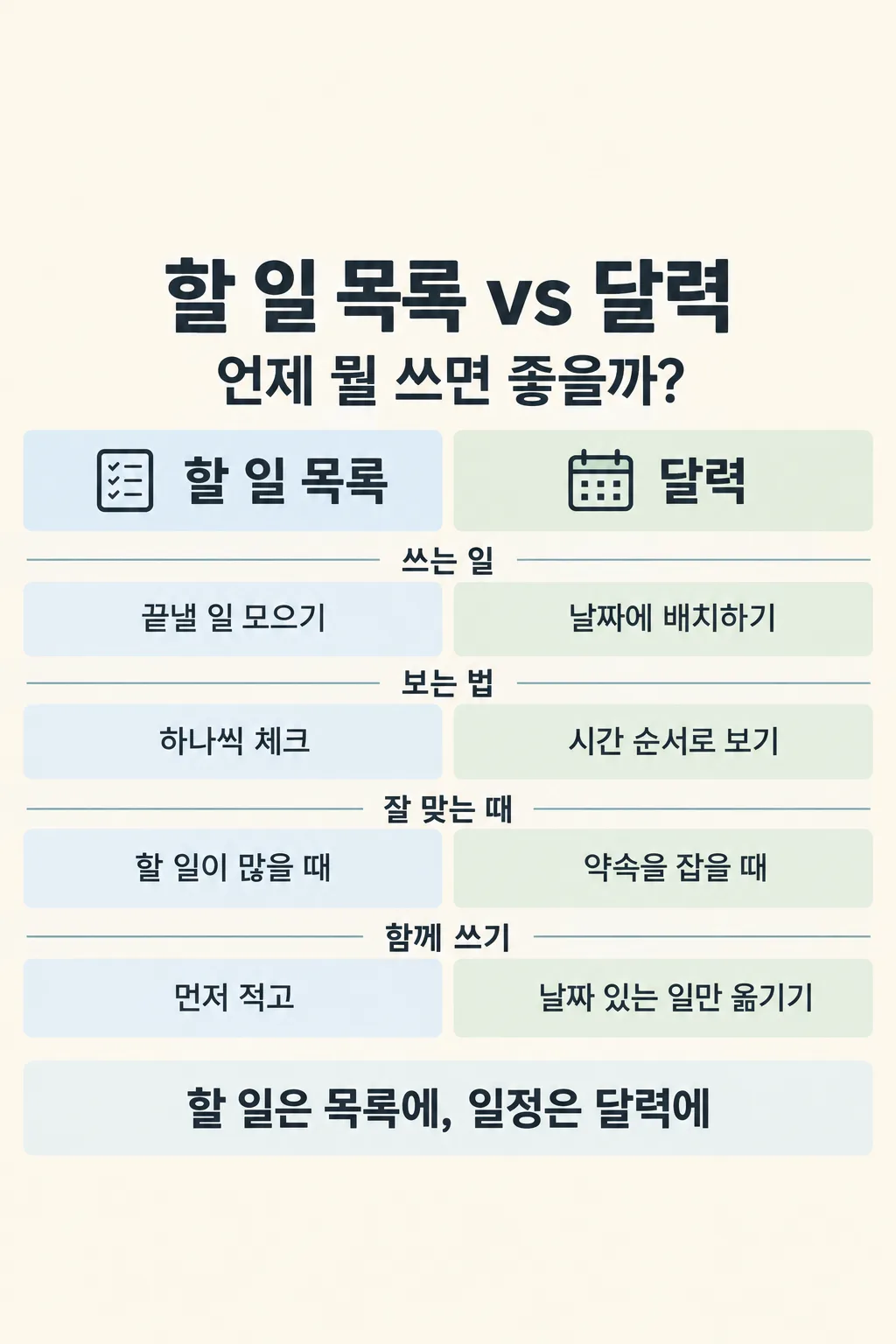
인스타 정보 계정 운영자가 독자가 헷갈리는 두 선택지를 나란히 비교해 저장용 한 장으로 올려요.
칸 채우기
- 1칸을 채워요
- 2복사 버튼을 눌러요
- 3GPT 채팅창에 붙여넣어요
- 4제품·인물 사진을 쓰려면 사진과 프롬프트를 둘 다 넣은 뒤에 보내요 선택
프롬프트 원문 보기 6,951자
Generate this image now. Draw it directly - do not describe it, explain it, or ask questions.
Output size 2480x3508 pixels, A4 portrait, 300dpi, print-ready poster.

[Purpose]
Create exactly ONE finished Korean side-by-side decision card for an Instagram information account. The viewer should save this single image to choose between "【선택지 A】" and "【선택지 B】" for a real situation. Audience, if supplied: "【읽는 사람】". Question or desired copy: "【비교 질문】". Account signature, if supplied: "【계정 이름】". The result is one complete 2:3 vertical image with two aligned columns and 4 to 6 paired rows. It is a practical comparison, not a 5-to-7-point list, slideshow, app screen, or research plan.

[Research and judgment before drawing]
Quietly decide the narrow decision a real reader faces, then check whether A and B can fairly be compared on the same criteria. If the question input is exactly "알아서 골라줘", compose one short, specific Korean question about when to choose A or B. Never print the instruction words. For technical, current, health, money, legal, product or service claims, search the live web, open primary authoritative sources and verify the date, geography, version, scope and conditions before drawing. Do not rely on search snippets. If a claim cannot be verified, choose a simpler accurate contrast or omit that row; never invent a price, speed, percentage, ranking, capability, policy, safety result, guarantee or expert citation. Avoid a fake winner: strengths depend on purpose. If the two items are not real alternatives, frame the useful question as how they work together rather than forcing a winner. If browsing is genuinely unavailable and no adequate reliable facts can be established, explain the limitation briefly in chat instead of drawing misleading information. For a purely practical, nontechnical choice such as a task list versus a calendar, compare their obvious functions in plain words without pretend statistics or fake sources.

[Content plan]
Write the full Korean image copy before generating. Use a large title naming BOTH alternatives and a single short question beneath it. Select 4 to 6 comparison criteria that genuinely help a person decide. Each criterion gets one horizontal band spanning two equal columns: the left cell says something specific about A, the right cell says the corresponding thing about B. Use the same unit, time horizon, conditions and level of detail on both sides. Suitable criteria depend on the actual subjects; examples include main purpose, how it is used, when it helps, what to prepare, limitations, and what to check. Do not force a generic criterion that is irrelevant to one side. Mark conditions in the appropriate cell instead of hiding them in a tiny footnote. Use one short bottom conclusion that tells the reader which to consider for which need. If the verified facts do not support any universal winner, say the answer depends on the reader's stated priority. Place a small readable source credit only for opened sources actually used. Give direct supporting links in a short chat message after the image, tied to row names; those links are not a second image.

[Scene]
Use the full, opaque 2:3 canvas edge to edge. Build an original editorial comparison page with no photo and no realistic object as the main subject. From the top, show one broad headline, one concise question, two clearly labeled column headers, 4 to 6 horizontal comparison bands, one firm summary strip, then a restrained source and optional account line. The left A column and right B column stay equal width and aligned across every row. Give each row a tiny plain-language criterion label in a narrow middle or upper rail so the viewer can pair the two facts at a glance. Use thin dividers and alternating very pale tints to keep dense information legible. Simple original flat icons for the two alternatives may sit in their respective header zones; icons must explain, not replace, the words. Never create a phone mockup, poster on a wall, separate slides, or an unrelated decorative hero photo.

[Text layout]
Keep the top 12% and bottom 15% clear of essential text for site overlays. At roughly 15-25% place the title "【선택지 A】 vs 【선택지 B】" in large Korean sans-serif lettering, allowing a clean line break if needed. Directly beneath it place the final chosen question, either the entered "【비교 질문】" or the short question you devised. At about 29-37% label the two columns "【선택지 A】" and "【선택지 B】" once each, without reproducing a field name like 선택지 A. Use the middle 39-75% for 4 to 6 compact paired comparison bands. At 77-83% use one plain Korean conclusion, not a ranking badge. Put a small, legible actual source line and, if supplied, "【계정 이름】" near the bottom of the central safe area. If source credit needs room, reduce decorative icons or row count before reducing Korean lettering. Every row's paired facts and any necessary qualification must remain readable at phone size. No large title, criterion, conclusion or source letter is clipped.

[Visual system]
Let the topic choose its own restrained palette. A comparison of paper and digital tools may use cream and ink blue; transit choices may use urban graphite and muted green. Keep both alternatives equally prominent. Distinguish the two columns with light related tints, not a red bad/green good judgment unless evidence supports it. Text is deep charcoal on light cells or white on genuinely dark header cells. Use balanced gutters, consistent criterion labels, tidy left alignment, and generous spacing between Korean syllables. Numbers only appear if verified and useful. The page should feel like a practical desk reference worth saving, with enough visual rhythm to read in a fast social feed.

[Accuracy and text rules]
Preserve supplied names, spelling and question exactly unless the question asks you to choose. Never print "알아서 골라줘" or field labels. If the question asks for a recommendation, tie the conclusion to explicit needs or conditions, not an invented universal winner. For health, legal, financial or safety subjects, qualify jurisdiction and effective date where needed, avoid personal advice and never promise results. For food or drink subjects, if any real item is pictured, first inspect real photographs on the web and draw anatomically plausible forms; avoid netlike noodles, flat bread, cloned servings and fake packaging. Prefer small flat icons to food photography so the paired text remains readable. Use only real source names and years, with no fabricated studies or raw URL printed across the artwork. No brand logos, copied interface, copyrighted character, celebrity likeness, fake data visualization, watermark, or tiny English filler.

[Output]
Return one image file directly. The entire comparison lives on this image, with no instruction to crop, stitch, run code, ask for the next page, or make more images. After the image you may provide a compact linked source list in chat text if research was used; do not add an extra design or editing step.
이 카드도 많이 사용해요

쓰는 법 · 자주 묻는 것
이런 때 쓰세요
독자가 두 가지를 자꾸 헷갈릴 때 쓰세요. 예를 들어 할 일 목록과 달력, 종이책과 전자책처럼 목적이 비슷해 보여도 쓰는 상황이 다른 선택지를 한 장에 나란히 놓습니다. 인스타그램에서 비교 글을 운영하는 사람이 게시물 한 장으로 올리고, 보는 사람은 저장해 두었다가 고를 때 다시 볼 수 있습니다. 058번이 한 주제의 핵심 5~7개를 세로로 정리한다면, 이 카드는 두 열의 같은 줄에서 A와 B를 바로 대조합니다. 표와 결론이 한 그림에 있어 다음 장을 넘길 필요가 없습니다.
칸 채우는 법
- 선택지 A·B에는 독자가 실제로 둘 중 고민하는 이름을 적으세요. 너무 넓은 말보다 같은 기준으로 비교할 수 있는 두 대상을 고르면 유용합니다.
- 비교 질문은 글 맨 위에 나올 한 줄입니다. 질문이 떠오르지 않으면 「알아서 골라줘」를 누르세요. GPT가 두 대상에 맞는 물음을 고릅니다. 정한 답을 억지로 끼워 넣지는 않습니다.
- 읽는 사람을 적으면 쉬운 말의 정도와 필요한 조건을 맞춥니다. 비워 두면 일반 독자를 기준으로 합니다.
- 계정 이름은 맨 아래 작은 서명입니다. 비우면 서명을 넣지 않습니다.
한 번에 만드는 법
칸을 채우고 복사한 프롬프트를 이미지 생성이 되는 무료 GPT에 한 번 붙여넣으세요. GPT가 비교할 항목을 고르고, 현재 정보가 필요한 주제라면 출처를 확인한 뒤, 두 열이 짝을 이루는 완성 이미지 한 장을 만듭니다. 별도로 표를 만들거나 자를 필요가 없습니다. 두 선택지가 서로 다른 물건이라도 “어떤 목적일 때 어느 쪽이 맞는가”처럼 공통 질문을 잡아야 읽는 사람에게 도움이 됩니다.
그림이 나오면 꼭 볼 것
모든 줄에서 왼쪽과 오른쪽이 같은 기준을 설명하는지 보세요. 가격, 시간, 법규, 건강 정보가 있다면 출처와 현재 적용 조건도 확인하세요. 한쪽을 무조건 좋다고 쓰거나 없는 수치를 넣었다면 그대로 올리지 마세요. 글자가 작아진 열은 특히 휴대폰으로 확인하세요. 결론이 표 안의 내용과 반대로 쓰이지 않았는지 마지막으로 읽어 보세요. 사진이 들어간 주제라면 실제 음식·제품의 구조와 표시도 확인해야 합니다.
자주 묻는 것
- 두 주제를 동시에 넣어도 되나요? 네. 두 선택지를 같은 항목으로 나란히 비교하는 카드입니다.
- 결과가 여러 장 나오나요? 아니요. 제목, 두 열, 비교 줄, 결론이 세로 이미지 한 장에 들어갑니다.
- 무조건 한쪽을 골라 주나요? 근거와 목적에 따라 조건부로 안내합니다. 둘을 같이 쓰는 편이 맞다면 그 결론을 보여 줍니다.
- 출처는 어떻게 확인하나요? 자료가 필요한 비교라면 그림의 짧은 출처 표기와 채팅의 원문 링크를 대조하세요.