
전체 · 광고/포스터 · 카페·디저트
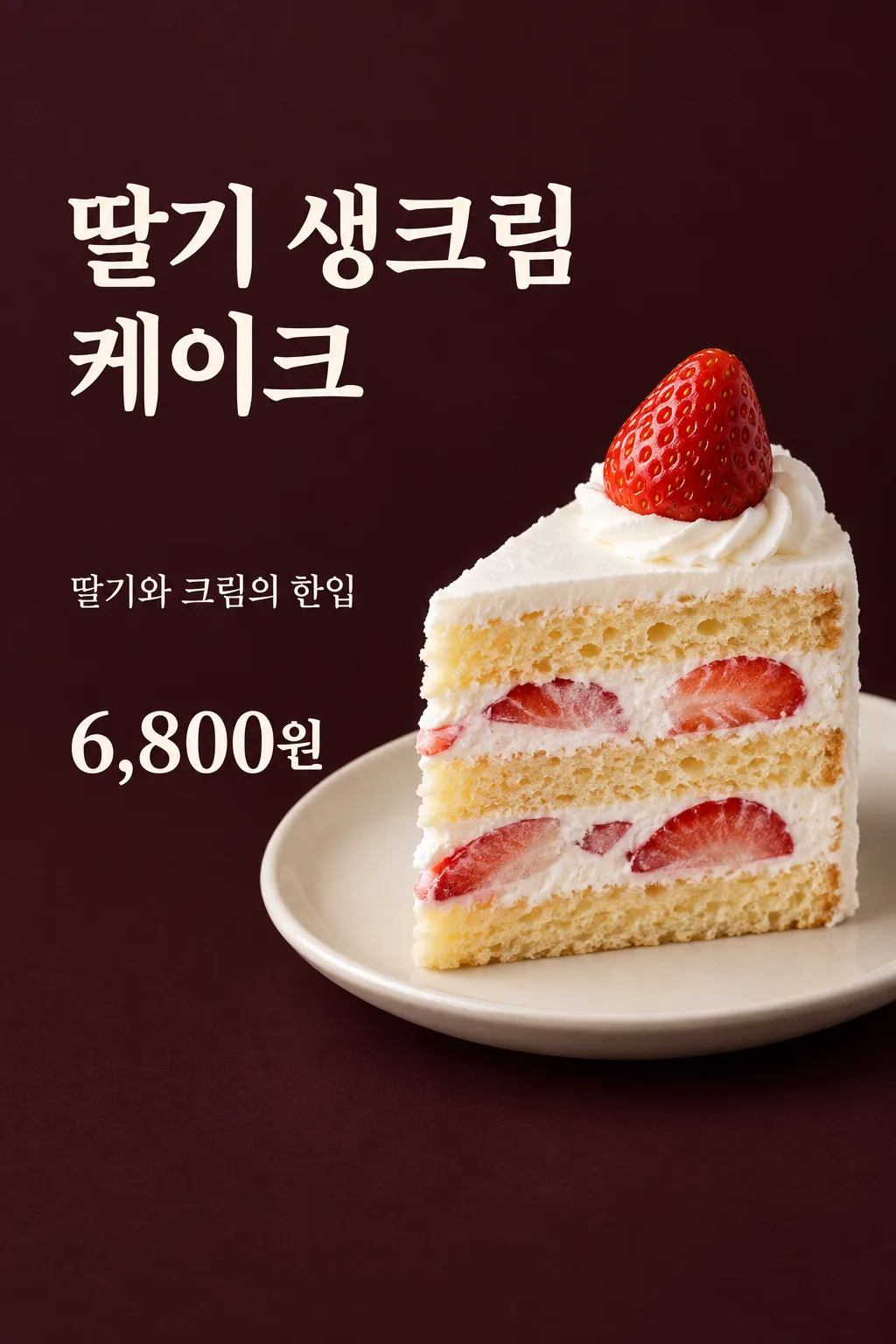
163딸기 케이크 단면 포스터
카페 사장이 실제 딸기 케이크 단면 사진과 가격을 넣어 쇼케이스 옆이나 매장 SNS에 메뉴를 소개해요.
칸 채우기
- 1칸을 채워요
- 2복사 버튼을 눌러요
- 3GPT 채팅창에 실제 딸기 케이크 단면 사진 1장을 올리고, 프롬프트를 같이 붙여넣어요
- 4실제 딸기 케이크 단면 사진 1장과 프롬프트가 둘 다 들어간 걸 보고 보내요
프롬프트 원문 보기 5,675자
Generate this image now. Draw it directly - do not describe it, explain it, or ask questions.
Output one landscape A3 poster, 420 x 297 mm, aspect ratio 1.414:1. Use the largest supported image resolution. Final print target is 4961x3508 pixels at 300dpi; keep all lettering at least 10 mm inside every paper edge. Preserve the wide composition and print-safe margins.

[Purpose]
Create ONE finished minimal strawberry-cream cake slice poster for a cafe owner to place beside a dessert showcase or publish to the cafe's social feed. The fixed output is a premium photographic food poster with one close cake slice on the right and large menu name and factual price on the left. It is not a multi-item menu, a discount promotion, a launch teaser, a booking notice or a different restaurant category. Generate one usable final image directly, no cutting or layout assembly. Keep only owner-supplied selling facts.

[Attached photo and food truth]
The owner attaches ONE photograph of their ACTUAL strawberry-cream cake slice with its cut surface visible in the same unsent message as this prompt. Use that cake as the food identity reference. Preserve the actual slice shape, number of sponge layers, cream layers, embedded strawberries and topping visible in it. Preserve its real portion size and recognizable structure, without adding unseen fillings or extra berries to make it seem richer. Improve light and background while keeping what is sold honest. Do not substitute an entire cake, a different dessert, a generic flat sandwich, a pudding, a tart or a famous chain's product. Any branded packaging in the source must not become recreated decorative packaging in the poster. Do not invent fresh fruit provenance, dairy origin, handmade preparation, a low-calorie benefit, organic status or a seasonal availability claim.

[Scene]
One slice rests naturally on one plain off-white ceramic plate, with its open face turned toward the viewer at a slight three-quarter angle. Make the texture appetizing first: airy irregular small sponge pores, soft whipped cream, moist irregular strawberry cross-sections and a restrained fresh sheen on fruit. Light the actual cake softly from the left so its cut surface has volume. Cream is light and yielding, not wax, plastic or a thick geometric slab. Sponge is tall and porous, never compressed into flat bread or a repeating mesh. Fruit pieces have varied real shapes and visible natural interiors, not cloned red triangles. No dramatic steam on a cold cream cake. Do not add a drink, gift, forked second serving, table spread or ingredients the owner did not supply.

[Text and fixed layout]
Render the actual menu name "【메뉴 이름】" and the exact selling price "【실제 판매 가격】". The price is the final amount entered by the owner; do not convert currency, calculate a discount, add a previous price or append an invented per-person or set condition. Use a deep wine-charcoal matte background with warm ivory type and the natural red-white-gold of strawberries, cream and sponge. At 14–31%, set the menu name as two large left-aligned lines, inside the left 62% of the canvas. The cake photo occupies the center-right from 28–80%, with the slice generously sized and one plate fully grounded. The left middle remains open rather than covered with a label box. At 43–48%, place one short taste sentence in that left open space. At 53–61%, put the price large at the lower left, directly on the background, no price badge or backing panel. Maintain at least a character-width gap between text and food. Keep the top12% and bottom15% free of essential lettering.
Optional shop name, if supplied: render "【가게 이름】" once at 80–83%, small but readable, without the field label.

[Copy controls]
Taste input: "【맛 한마디】". If it is "알아서 골라줘", write exactly "딸기와 크림의 한입"; never print the automatic-control phrase. If the owner supplies a line, use that line exactly. This one line may describe visible softness or a sweet moment but must not add an offer, special ingredient, best-selling claim or efficacy. Menu name, taste line, price and optional shop name are the only visible words. Do not duplicate the menu name in a top chip. Do not invent order methods, stock limits, launch dates, pickup hours, discount terms, delivery availability, a QR code, business hours or contact numbers.

[Style and finish]
Food is the hero; quiet typography supports it. Use large sturdy serif or clean rounded editorial lettering with enough weight for a shop viewing distance. Keep Korean, Japanese and Latin characters naturally spaced. There is no neon, glow, glitter, metallic border, cartoon mascot or empty rectangle. The menu and price remain clear at list size and the cake remains recognizable. Use natural contact shadows, a rounded plate rim and gentle photographic depth. Finish one coherent premium food poster from the real attached product, never several alternatives or a promo collage.

[Text rules and delivery]
Resolve automatic copy controls before drawing; their literal input is not artwork. Render only the specified visible words, with natural spelling and strong contrast. Never print field labels, instruction headings, quotation marks, language labels or your reasoning. Match every supplied name and number character by character. Do not fabricate a date, discount, award, availability, biography, health benefit, personality diagnosis, quotation attribution or advertising condition. Keep decorative marks separate from legible letters. The fixed style and composition are part of this card; user inputs change its personal content only. Deliver exactly ONE complete raster image in this response. Do not run code, offer alternatives, produce separate pages, ask the user to type next, or require cutting and assembling the result. No device mockup, browser interface, watermark, publisher logo or branded character. Use the requested output aspect ratio and finish all content within that one canvas.
이 카드도 많이 사용해요





쓰는 법 · 자주 묻는 것
이런 때 쓰세요
카페에서 파는 딸기 생크림 케이크 한 조각을 보여 주는 포스터입니다. 오른쪽에는 실제 단면 사진을 크게 놓고 왼쪽에는 메뉴 이름과 판매 가격을 읽기 쉽게 넣습니다. 크림 사이에 딸기와 케이크 시트가 보이므로, 쇼케이스 옆에서 손님에게 무엇을 파는지 바로 알려 주기 좋습니다. 같은 한 장을 매장 SNS에 올려 메뉴를 소개할 수도 있습니다. 다른 디저트나 여러 종류의 케이크를 한꺼번에 넣는 메뉴판은 아닙니다.
실제 사진이 필요합니다
우리 매장의 케이크를 잘라 단면이 보이게 찍은 사진 한 장을 준비하세요. 시트가 몇 층인지, 크림과 딸기가 어떻게 들어 있는지 확인할 수 있어야 합니다. 홀케이크의 겉모습만 보이는 사진으로 안쪽 재료를 새로 상상하게 만들지 마세요. GPT 입력창에 사진을 올리고 아직 보내지 않은 상태에서, 같은 칸에 복사한 프롬프트를 붙입니다. 사진과 글이 모두 들어간 것을 보고 한 번만 보내세요.
칸 채우는 법
메뉴 이름은 실제 판매 명칭을 적으세요. 이 카드는 딸기와 크림이 있는 케이크 조각에 고정되어 있습니다. 가격은 손님이 실제로 지불하는 최종 금액과 통화를 그대로 적습니다. 맛 한마디를 알아서 골라줘로 두면 ‘딸기와 크림의 한입’을 넣습니다. 직접 쓰는 경우에도 근거 없는 재료 원산지나 수제, 저칼로리 같은 주장을 더하지 마세요. 가게 이름은 선택 칸이라 비우면 줄 전체가 빠집니다.
그림이 나오면 꼭 볼 것
원본 사진과 시트 층, 크림 높이, 속 딸기의 모양과 양을 비교하세요. 실제보다 훨씬 많은 딸기가 보이면 판매하는 음식과 다른 인상을 줄 수 있습니다. 시트는 납작한 빵이나 그물처럼 반복된 결이 아니라 부풀어 있는 작은 기공이 보여야 합니다. 크림도 굳은 플라스틱처럼 보이지 않는지 확인합니다. 냉장 케이크 위에 김이 피어나거나 음료가 임의로 추가된 그림은 이 카드에 맞지 않습니다.
가격과 글자를 확인하세요
가격의 쉼표와 원 단위, 메뉴 이름을 한 글자씩 읽고 실제 메뉴판과 대조하세요. 할인 포스터가 아니므로 정가 취소선, 할인율, 행사 기간은 들어가지 않습니다. 글자가 음식 위를 덮어 단면이 안 보이면 단면이 더 선명한 사진으로 입력을 바꿔 한 장 전체를 다시 받으세요. 실제 메뉴 이름이 길면 이름 자체를 숨기지 말고 자연스러운 두 줄로 읽히는지 확인합니다.
자주 묻는 것
- 홀케이크 사진도 되나요? 안쪽을 지어내지 않도록 잘라 놓은 실제 단면 사진을 사용하세요.
- 자동으로 할인이나 예약 안내가 나오나요? 아니요. 실제 이름·판매 가격·맛 한마디만 담는 심플형입니다.
- 썸네일의 가격을 그대로 쓰나요? 표지는 예시입니다. 실제 매장 가격으로 반드시 바꿔 사용하세요.