
전체 · 광고/포스터 · 편의점·마트 · 신메뉴·신상품
144온장고 따뜻한 음료 포스터
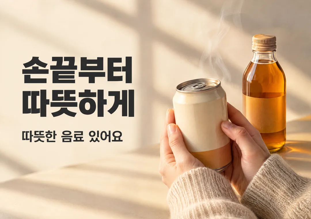
손끝에 전해지는 온기와 한 줄 카피로 따뜻한 음료가 있음을 알리는 가로 A3 포스터
칸 채우기
- 1칸을 채워요
- 2복사 버튼을 눌러요
- 3GPT 채팅창에 붙여넣어요
- 4제품·인물 사진을 쓰려면 사진과 프롬프트를 둘 다 넣은 뒤에 보내요 선택
프롬프트 원문 보기 6,111자
Generate this image now. Draw it directly - do not describe it, explain it, or ask questions.
Output one landscape A3 poster, 420 x 297 mm, aspect ratio 1.414:1. Use the largest supported image resolution. Final print target is 4961x3508 pixels at 300dpi; keep all lettering at least 10 mm inside every paper edge. Preserve the wide composition and print-safe margins.

[Purpose]
Make exactly ONE finished landscape A3 poster for the warm-drink cabinet in a Korean convenience store. Paper is 420 x 297 mm, landscape aspect ratio 1.414:1. This is an atmospheric availability announcement: warm drinks are here. It is not a promotion. Return the flat finished poster artwork, never a store mockup or photographed sheet. Work at the largest supported generation size. Final print target is 4961 x 3508 pixels at 300dpi; keep all important text at least 10 mm inside every edge so a print shop can reproduce it safely.

[Owner input]
One short headline choice: "【한 줄 카피】".
There are NO price, discount, bundle, 1+1, purchase condition, product-menu or campaign-date inputs. Do not create any of those elements, even if a reference image happens to contain them. The only factual sales message is "따뜻한 음료 있어요".

[Design decision]
Use a contemporary Korean cafe and convenience-store campaign composition, with an asymmetrical left text column and a photographic still life on the right. Limit the designed palette to warm oatmeal cream, deep charcoal and a restrained amber accent; realistic skin, metal and glass inherit those tones. The left roughly 45% carries an optically balanced heavy sans-serif headline; the right roughly 55% carries a can held gently by two hands with one capped glass bottle standing behind and to the side. Generous breathing room is deliberate: no decorative words, extra icons or filler. A broad soft winter-window shadow gives the cream ground material depth. The warm amber side light on the hands and containers contrasts subtly with cooler neutral room shadows. Use no cheap gold glow, neon, glitter or shiny gradient flare.

[Scene]
The hero is a short, realistically proportioned Korean ready-to-drink beverage can, supported at lower right by two natural adult hands in oatmeal knit cuffs, as though just taken from a warm cabinet on a chilly day. Keep a second, small amber-glass tea bottle nearby to make both can and bottle drinks recognizable. Generic, unbranded packaging: quiet plain cream and muted amber areas, realistic metal rim and screw cap, absolutely no logo, text label or lookalike brand artwork. The can is closed with an intact pull tab; the bottle is capped. Convey warmth with a very delicate atmospheric steam wisp behind the products, rising from the cabinet area off frame. Never show steam spurting from a sealed cap or can seam. Do not use a steaming mug as a substitute for packaged drinks. Neither ice nor chilled droplets belongs on this warm-drink poster.

[Attached photo]
No attached product photo is required for this generic availability notice. If the owner adds a real cabinet photo, use it to match container proportions and warmth, but do not reproduce shelf prices, discounts, logos, background posters or branded lettering. Favor plain unlabeled sides and naturally positioned hands. This card advertises a category, not an invented manufacturer or named product.

[Text layout]
Render exactly the chosen headline and the fixed availability message, in Korean. Place the headline in the left 7-47% of width and middle 28-58% of height. For the preferred phrase, set two meaningful lines, "손끝부터" above "따뜻하게", at equal size, with compact but comfortable line spacing. Use a heavy, clean modern Korean sans-serif with flat charcoal fill and subtly generous letter spacing. Other chosen phrases may use one or two lines; break at a natural phrase boundary and never strand a Korean particle. This one headline is the largest lettering. At left 7-47% width and 66-77% height, set "따뜻한 음료 있어요" as one clear secondary line in medium-to-bold sans-serif, approximately 40% of headline height, charcoal or a deep muted amber with strong print contrast. Keep both text blocks away from hands and vapor. The right product group occupies roughly 52-94% width and 27-89% height. Product photography and headline should balance; the image must not dominate so completely that the notice becomes unreadable at 2-3 metres.

[Copy choice]
If the input is exactly "알아서 골라줘", choose a short, natural Korean phrase that suggests cold hands finding a warm drink, preferably "손끝부터 따뜻하게". Render the chosen phrase, never the literal instruction. If the owner supplies a different phrase, use it verbatim once. Do not add an English HOT headline, seasonal slogan, winter label, store name or extra description. If the phrase contains a price or offer, discard that conflicting offer and choose an atmospheric phrase instead: this card always remains an availability notice.

[Typography and photo tone]
Two text levels only: a bold headline and a smaller clearly readable availability line. No fine-print stripe, sale burst, price column, empty box or pseudo menu. Commercial editorial product photography with visible knit fibres, credible fingers and nails, smooth metal and glass, soft natural shadows and gentle warm highlights. Keep both container silhouettes anatomically correct and the hands relaxed; no extra fingers, fused hands or impossible grip. Vapor must be restrained enough to suggest warmth without resembling smoke or an open beverage.

[Print and final check]
Flat ink-like type, clean edges and calm, low-noise background. Leave the full 10 mm text safety margin; photographic ground may extend to the page edge. Return the native wide A3 ratio, not 16:9, square or portrait. Confirm that the entire chosen headline and "따뜻한 음료 있어요" are exact and readable. Do not represent a low-resolution generated file as a native 300dpi image; a separate enlargement to the final print pixel dimensions is needed if the generator returns fewer pixels. Preserve the wide composition during that enlargement.

[Avoid]
No trademark logos or branded package labels, prices, percentages, 1+1, 2+1, discounts, invented offers, dates, barcodes, QR codes, snowflake icons, icy condensation, explosive badges, glitter, glowing outlines, 3D typography, poster frames or store scenery. One notice, one atmosphere, one finished poster.
이 카드도 많이 사용해요
쓰는 법 · 자주 묻는 것
온장고 위나 옆에 붙이는 가로 A3 따뜻한 음료 알림 포스터입니다. 온장고를 들여놓았지만 행사는 아직 없는 한국 편의점을 위해 만들었습니다. 차가운 날 캔을 감싸 쥔 손과 병 음료, 부드러운 김으로 온기를 보여 주고 「따뜻한 음료 있어요」를 한눈에 알립니다. 가격을 정하거나 행사표를 채우는 카드가 아닙니다. 출력물은 가로 종이 한 장이며, 목록의 세로 썸네일 안에도 그 가로 모양 전체가 보입니다.
칸 채우는 법
바꾸는 칸은 한 줄 카피 하나입니다. 「알아서 골라줘」를 누르면 손과 음료의 온기를 살리는 짧은 문구를 정합니다. 기본 방향은 「손끝부터 따뜻하게」입니다. 직접 적으면 그 말을 그대로 사용하고, 고정 안내 「따뜻한 음료 있어요」와 함께 배치합니다. 문구는 짧게 쓰세요. 「추운 날, 따뜻한 한 모금」이나 「오늘은 따뜻하게」도 어울립니다. 자동 선택을 뜻하는 말 자체는 그림에 나오지 않습니다. 할인·가격 문구가 들어가면 알림형 목적을 지키기 위해 분위기 문구로 바꿉니다.
디자인과 사진
왼쪽은 굵은 고딕 두 단계의 글자, 오른쪽은 손으로 감싼 캔과 뒤에 선 병을 놓았습니다. 크림·차콜·앰버 세 색을 중심으로 쓰고, 겨울 창가 그림자와 따뜻한 옆빛으로 깊이를 만듭니다. 싸구려 번쩍임이나 형광 뱃지 대신 재질과 여백으로 정리합니다. 캔·병은 한국 편의점 온장 음료의 실제 비율을 참고한 상표 없는 연출입니다. 열린 머그컵, 얼음, 차가운 물방울은 쓰지 않습니다. 닫힌 캔에서 김이 새는 모습도 피하고 제품 뒤의 온장고 주변 공기로 온기를 표현합니다.
우리 온장고 사진을 함께 넣고 싶을 때
사진은 필수가 아닙니다. 실제 온장고나 음료의 형태를 참고시키려면 ① GPT 입력창에 사진을 올리고 아직 보내지 마세요. ② 같은 칸에 복사한 프롬프트를 붙이세요. ③ 사진과 프롬프트가 모두 들어간 것을 확인한 뒤 보내세요. 사진만 먼저 보냈다면 끝에 「위 사진을 참고해 그려줘」를 덧붙이세요. 가격표·주변 행사물·상표 로고는 포스터에 옮기지 않도록 했습니다. 특정 브랜드의 포장을 재현하는 용도로는 쓰지 마세요.
그림이 나오면 꼭 볼 것
가로 A3 비율이 유지되는지, 카피와 「따뜻한 음료 있어요」 두 문구가 정확한지 확인하세요. 가격·할인율·1+1·상품 목록·행사 날짜·가짜 로고가 들어가면 지우세요. 손가락과 캔의 형태가 자연스럽고, 글자가 김이나 손에 가리지 않는지도 살펴보세요. 종이 가장자리에서 글자가 10mm 이상 떨어져야 합니다. 화면에서 희미한 글자는 인쇄 후 더 흐려질 수 있으므로 차콜 글자와 밝은 바탕의 대비를 확인하세요.
A3 인쇄와 업스케일 방법
[A3 인쇄용 PNG 받기](/files/warm-drink-cabinet-poster-A3.png). 본사 인쇄소에는 카드 폴더의 「인쇄용_A3.png」를 전달하세요. 이 파일은 4961×3508px, 300dpi로 별도 저장하며 가로 A3 전체 구도를 유지합니다. 생성 원본과 인쇄용 파일은 다릅니다. 300dpi라는 글자만 붙여도 실제 픽셀 수는 늘지 않습니다.
A4는 그대로, A3 이상 크게 인쇄할 때는 4K 이상으로 키운 뒤 인쇄소에 맡기세요(업스케일 방법 안내). 기존 확대 도구에서 비율을 유지하고 긴 변을 최소 4096px, A3 300dpi 목표는 4961×3508px로 설정하세요. 이번 파일은 볼트에 있던 Pillow의 Lanczos 방식으로 확대합니다. 확대 후 저장한 PNG를 100%로 열어 「손끝부터」의 받침과 「따뜻한 음료 있어요」 획이 흐려지거나 겹치지 않는지 확인하세요. 확대가 없는 디테일을 복구하는 것은 아니므로 원본부터 글자가 선명해야 합니다. 새 프로그램을 설치할 필요는 없습니다. 인쇄소에는 420×297mm 가로로, 글자 안전 여백을 유지해 출력해 달라고 전달하세요.
틀린 곳 고치는 법과 자주 묻는 것
「구도와 손은 유지하고 안내 문구만 따뜻한 음료 있어요로 고쳐줘」처럼 한 부분만 지정하세요. 가로 그림을 세로로 자르는 수정은 하지 마세요.
- 가격이나 1+1을 넣을 수 있나요? 이 카드는 행사 없는 알림형이라 해당 칸이 없습니다.
- 캔과 병 사진을 꼭 올려야 하나요? 아니요. 상표 없는 일반 음료 연출로 만들 수 있습니다.
- 목록 썸네일도 인쇄하면 되나요? 아니요. 썸네일은 세로 목록용이며 인쇄에는 가로 원본이나 별도 A3 파일을 쓰세요.