
전체 · 광고/포스터 · 로고·브랜드
155크롬 로고
거울처럼 반사되는 메탈 상징과 이름으로, 날렵한 Y2K 3D 로고를 만들어요.
받는 것
- 거울 금속 질감의 상징 하나
- 같은 금속으로 만든 입체 이름
- Y2K 반사와 하이라이트가 있는 로고 한 장
ChatGPT 무료 OK
칸 채우기
- 1칸을 채워요
- 2복사 버튼을 눌러요
- 3GPT 채팅창에 붙여넣어요
- 4그대로 보내면 썸네일 예시처럼 나와요
- 5카드에 맞는 실제 사진을 같이 넣으면 그 사진이 반영돼요 — 배경 카드는 배경 사진, 인물 · 음식 카드는 그 사진 선택
프롬프트 원문 보기 4,364자
Generate this image now. Return exactly ONE finished image itself; draw it directly without explanations or questions.
Output size 1080x1080 pixels, 1:1 square card. Keep the same top-to-bottom order but compress the zones to fit the square: the illustration becomes smaller and every text line stays fully readable.
One resolved 3D CHROME symbol-and-wordmark identity, not a logo grid, product shot or poster. A compact symbol floats above the wide, readable name. The complete group fills 72-80% of canvas width, with enough clean space to distinguish every letter.
Use original brand artwork. Preserve the input name in its original script, spelling, case, spaces and punctuation; never translate or romanize it. Korean and Latin names are both supported. Keep characters readable, including Hangul final consonants. Do not imitate recognizable existing logos, characters or signature marks.
The background fills the canvas edge to edge. Keep essential lettering and all key elements below the top 12% and above the bottom 15%; adapt the spacing to the chosen ratio. No watermark, trademark symbol, field labels, extra sales copy or invented contact details.

[INPUTS FOR THIS IMAGE]
BRAND_NAME selected: "【가게 이름】"
Set BRAND_NAME to this input. Render the exact name once as a complete readable wordmark.
BUSINESS selected: "【업종】"
Use the business only to tune the mark character; do not print this input.
SYMBOL selected: "【상징】"
Build one compact original chrome symbol from this subject, using broad connected surfaces. If asked to choose, infer a bold simple shape from BUSINESS.
METAL_TINT selected: "【금속 빛】"
The finish remains reflective chrome with bright metal highlights and dark reflected bands; this is tint and reflected light, not flat ink.
Interpret only the selected choice:
- 은색 + 파랑 + 진분홍: neutral silver chrome with electric-blue and hot-pink reflected accents
- 차가운 은색: cool silver chrome with subtle steel-blue reflections
- 샴페인 메탈: pale champagne-tinted mirror metal
- 검은 크롬: dark gunmetal chrome with readable bright rim highlights
If this selection line is missing or empty, use 은색 + 파랑 + 진분홍 only.
BEVEL selected: "【입체 모서리】"
Use the chosen bevel consistently on symbol and letters, with actual depth and intact open counters.
Interpret only the selected choice:
- 둥근 볼륨: smooth rounded bevels and thick sculpted volume
- 날렵한 면: precise faceted bevels, slightly angular but not spiky
- 얇은 금속판: thin extruded metal with controlled edge reflections
If this selection line is missing or empty, use 둥근 볼륨 only.
TYPEFACE selected: "【이름 글꼴】"
Keep the name readable; never turn it into an illegible tribal shape or fuse neighboring letters.
Interpret only the selected choice:
- 넓은 미래형 고딕: wide futuristic sans serif with distinct character skeletons
- 둥근 굵은 글씨: rounded bold display lettering
- 각진 압축 글씨: angular condensed display lettering, open counters
If this selection line is missing or empty, use 넓은 미래형 고딕 only.
BACKGROUND selected: "【바탕】"
Use one uncluttered studio backdrop. No stars, grid floor or extra floating objects.
Interpret only the selected choice:
- 짙은 남색: deep midnight-navy backdrop
- 검정: matte near-black backdrop
- 차가운 연회색: cool pale-gray backdrop with very soft tonal falloff
- 짙은 자두색: dark plum backdrop
If this selection line is missing or empty, use 짙은 남색 only.

[RESOLVED DESIGN]
A polished Y2K chrome identity with one broad sculptural SYMBOL and the exact name beneath in TYPEFACE. Strong alternating light and dark reflection bands curve continuously over physically plausible surfaces using BEVEL. A large softbox key light and subtle edge lights give glossy depth. Apply only METAL_TINT on the selected BACKGROUND, with physically reflective metal rather than flat neon paint. The name is larger than the mark width and retains clear gaps, readable centers and convincing thickness. Straight-on, minimal perspective; a restrained shadow anchors the unified group. No liquid drips, excessive star flares, laser beams or texture that eats lettering.
Before returning, compare every rendered name character with BRAND_NAME and repair any misspelling. Keep the same resolved design while correcting letters. Print BRAND_NAME exactly once.

[Final output format]
Output size 1080x1080 pixels, 1:1 square card. Keep the same top-to-bottom order but compress the zones to fit the square: the illustration becomes smaller and every text line stays fully readable.
This selected output format takes priority over any fixed canvas size or aspect ratio elsewhere in this template. Adapt the composition, text zones and margins to the selected canvas without stretching or cropping essential content. Device safe areas apply only when a device is selected. Never print these format instructions on the image.
결과 어땠어요?
이 카드도 많이 사용해요





쓰는 법 · 자주 묻는 것
반사되는 금속이 주인공이에요
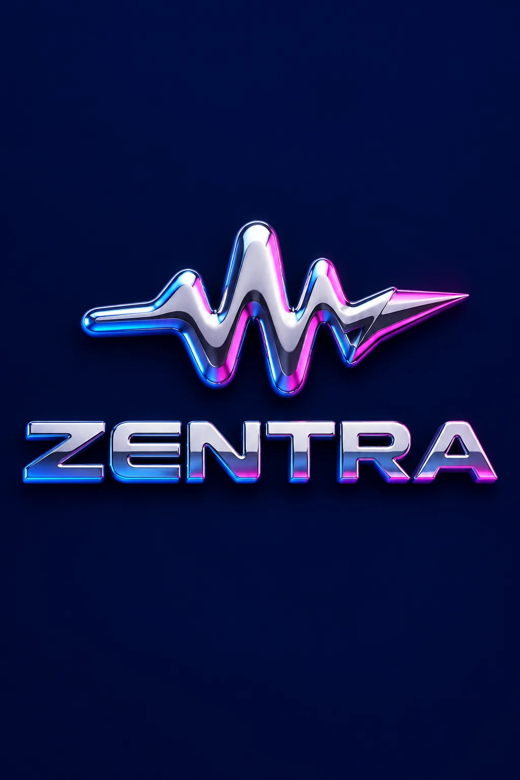
전자음악·게임 장비·영상 브랜드처럼 날렵하고 미래적인 인상을 줄 때 씁니다. 상징과 이름을 같은 반사 금속으로 만들고, 빛과 어두운 띠가 볼륨을 보여 줘요. 표지는 가상의 전자음악 플러그인 브랜드 ZENTRA, 번개 끝의 소리 파형, 파랑·진분홍 반사가 있는 은색 크롬과 짙은 남색 바탕입니다.
이름과 굵은 상징을 적어요
가게 이름은 한글·영문 모두 실제 표기대로 넣습니다. 업종은 디자인 참고용이며 그림에 추가 문구로 찍히지 않아요. 상징은 ‘소리 파형 한 줄’처럼 큰 면으로 만들 수 있는 모양이 좋습니다. 작은 부품을 여러 개 적으면 반사 때문에 복잡해집니다. 보기나 ‘알아서 골라줘’로 업종에 맞는 상징을 고를 수 있어요.
금속색·모서리·글꼴을 바꿔요
금속 빛은 색 반사가 있는 은색, 차가운 은색, 샴페인 메탈, 검은 크롬 중 고릅니다. 둥근 볼륨은 유연하게, 날렵한 면은 단단하게, 얇은 금속판은 가볍게 보여요. 이름 글꼴과 바탕도 단추로 바꿀 수 있습니다. 선택 칸을 비우면 표지의 색 반사 은색, 둥근 볼륨, 넓은 미래형 고딕, 남색 바탕을 사용해요.
반짝임 속에서도 이름을 읽어야 해요
사진 없이 1:1로 GPT나 Gemini에 보냅니다. 표지는 2:3 예시예요. 한글 받침과 영문 철자를 확인하고, 밝은 반사가 글자의 구멍이나 획을 지우지 않는지 보세요. 너무 눈부시면 ‘이름 위 하이라이트를 약하게 하고 글자 사이를 넓혀 줘’라고 고칩니다. 실제 금속 간판 설계도나 평면 인쇄 도안이 아니라 3D 재질 표현 이미지입니다.
상업용 전 키프리스(KIPRIS) 상표 검색 · 크게 쓸 땐 벡터로 다시 그리기