
All · Ads & posters · Logos & branding
138Brand identity board
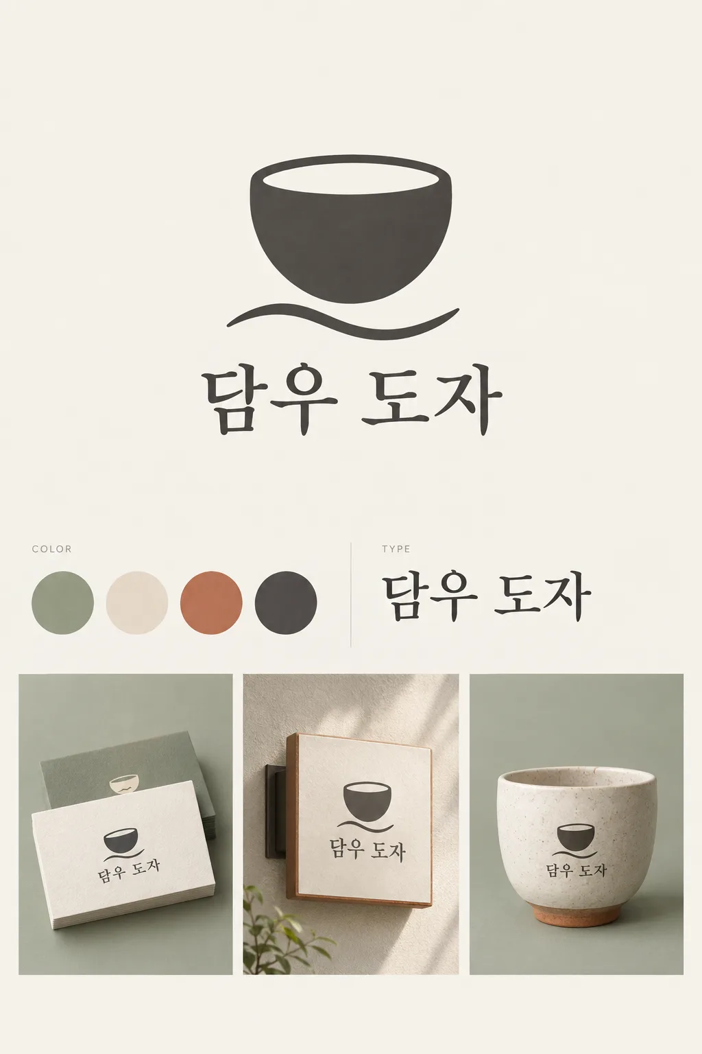
Bring a large logo, color swatches, a type specimen and small mockups together on one clean identity board.
What you get
- One large symbol and brand name
- Three to five color swatches and a type specimen
- One board with two or three small mockups
ChatGPT Free OK
Fill in the fields
- 1Fill in the fields
- 2Copy the prompt
- 3Paste it into a GPT chat
- 4Send it as is and you get an image like the thumbnail example
- 5Attach a real photo that fits the card and it is used in the result: a background photo for background cards, a person or food photo for those cards Optional
Full prompt 5,033 characters
Generate this image now. Return exactly ONE finished image itself; draw it directly without explanations or questions.
Output size 1080x1350 pixels, 4:5 portrait, Instagram standard.
ONE coherent visual brand identity GRID BOARD. This is one presentation image for one brand, not alternative logo proposals. Use a precise asymmetric editorial grid with aligned columns, fine gutters and ample quiet spacing. The large hero logo takes the upper half of the usable central area; palette and type occupy the middle strip; two or three modest mockups occupy the lower area. Keep the hero dominant even in a portrait cover.
Use original brand artwork. Preserve the input name in its original script, spelling, case, spaces and punctuation; never translate or romanize it. Korean and Latin names are both supported. Keep characters readable, including Hangul final consonants. Do not imitate recognizable existing logos, characters or signature marks.
The background fills the canvas edge to edge. Keep essential lettering and all key elements below the top 12% and above the bottom 15%; adapt the spacing to the chosen ratio. No watermark, trademark symbol, field labels, extra sales copy or invented contact details.

[INPUTS FOR THIS IMAGE]
BRAND_NAME selected: "【Brand name】"
Set BRAND_NAME to this exact input. Every application uses the same spelling and same resolved mark.
BUSINESS selected: "【Business】"
Use this business to choose appropriate scale and identity details; do not print the business input as extra copy.
SYMBOL selected: "【Symbol】"
Simplify this input into one original, memorable, broad-shape mark. If asked to choose, infer one suitable symbol from BUSINESS. Reuse the identical mark in every mockup.
PALETTE selected: "【Palette】"
Keep this palette consistent in the logo, swatches and mockups. No new saturated colors.
Interpret only the selected choice:
- Sage + cream + terracotta + charcoal: sage green, warm cream, muted terracotta and charcoal
- Sky + butter + navy + white: sky blue, butter yellow, deep navy and white
- Lilac + plum + apricot + ivory: lilac, dark plum, apricot and ivory
- Pale gray + coral + teal + white: pale gray, coral, teal and white
If this selection line is missing or empty, use Sage + cream + terracotta + charcoal only.
SWATCH_COUNT selected: "【Swatch count】"
Draw exactly this many equal-size swatches in one tidy row. For three, use the three strongest palette colors; for five, add one light tint of an existing color. Do not invent color codes.
Interpret only the selected choice:
- 4 swatches: exactly four swatches
- 3 swatches: exactly three swatches
- 5 swatches: exactly five swatches
If this selection line is missing or empty, use 4 swatches only.
TYPEFACE selected: "【Name typeface】"
Use one consistent wordmark typeface. The type specimen repeats the brand name, not random lorem ipsum or font-file claims.
Interpret only the selected choice:
- Soft serif: warm, balanced serif with open counters
- Clean sans serif: restrained contemporary sans serif with careful kerning
- Rounded sans serif: friendly rounded sans serif, fully readable characters
If this selection line is missing or empty, use Soft serif only.
MOCKUP_SET selected: "【Mockup set】"
Draw only the selected applications as small isolated views in aligned grid cells. No phone frames, people, clutter or second board.
Interpret only the selected choice:
- Business card + sign + cup: three mockups: a thick business card, a simple wall sign and a ceramic cup
- Business card + paper bag: two mockups: a business card and a paper shopping bag
- Sign + packaging box + sticker: three mockups: a wall sign, a small packaging box and one round sticker
If this selection line is missing or empty, use Business card + sign + cup only.

[RESOLVED DESIGN]
A refined identity tailored to BUSINESS: the selected large SYMBOL and exact BRAND_NAME wordmark using TYPEFACE, a swatch row using PALETTE and SWATCH_COUNT, and a visibly distinct but consistent type specimen. Subtle grid cells using the selected palette hold the selected MOCKUP_SET as tactile, professionally lit small applications. Mockup shadows remain inside their cells. The hero logo is crisp, flat and large; mockups demonstrate real materials at a smaller scale. Use at most tiny neutral section labels such as COLOR and TYPE, never a giant page title. The sheet must read as one designed identity, not an e-commerce collage.
Before returning, compare every rendered name character with BRAND_NAME and repair any misspelling. Keep the same resolved design while correcting letters. Print BRAND_NAME once in the hero and once in each chosen mockup; the type specimen may repeat BRAND_NAME once. All instances must be identical.

[Final output format]
Output size 1080x1350 pixels, 4:5 portrait, Instagram standard.
This selected output format takes priority over any fixed canvas size or aspect ratio elsewhere in this template. Adapt the composition, text zones and margins to the selected canvas without stretching or cropping essential content. Device safe areas apply only when a device is selected. Never print these format instructions on the image.
How did it turn out?
You may also like





How to use it · FAQ
Share one coherent identity
Use this board when preparing a new shop or briefing the people making your packaging and sign. It combines a dominant logo, three to five swatches, a type specimen and two or three small applications. The cover represents the fictional event tableware rental service 담우 도자, with a simple cup-and-ripple mark and sage, cream, terracotta and charcoal. The business card, wall sign and cup all carry the same identity.
Fill in three concrete inputs
Enter the brand name exactly as it should appear; Korean and English names both work. Describe the business briefly, then give one simple symbol rather than a collection of unrelated objects. Use an idea button or Choose for me if you cannot decide on a symbol. The business description guides the design without becoming an extra slogan on the board.
Keep the applications consistent
Choose a palette, three, four or five swatches, a wordmark typeface and one application set. Five swatches add a light tint of an existing color. The type specimen repeats the name in the same typeface. You can select three applications with a card, sign and cup, two with a card and bag, or three with a sign, box and sticker. Blank selections use the cover defaults: four swatches, a soft serif and the card, sign and cup set.
Move from a visual brief to production
Select 4:5 and send the filled prompt to GPT or Gemini; no photo is needed. The catalog cover is a 2:3 example. Check every repeated name and make sure the swatches match the mockups. Ask for the same hero mark on every application if the model changes it. This is a presentation image, not a delivery of font files, measured print colors or editable business-card artwork. Before commercial use, search relevant trademarks; redraw larger artwork as vectors when needed.