
すべて · 広告・ポスター · ロゴ・ブランド
138ブランドボードロゴ
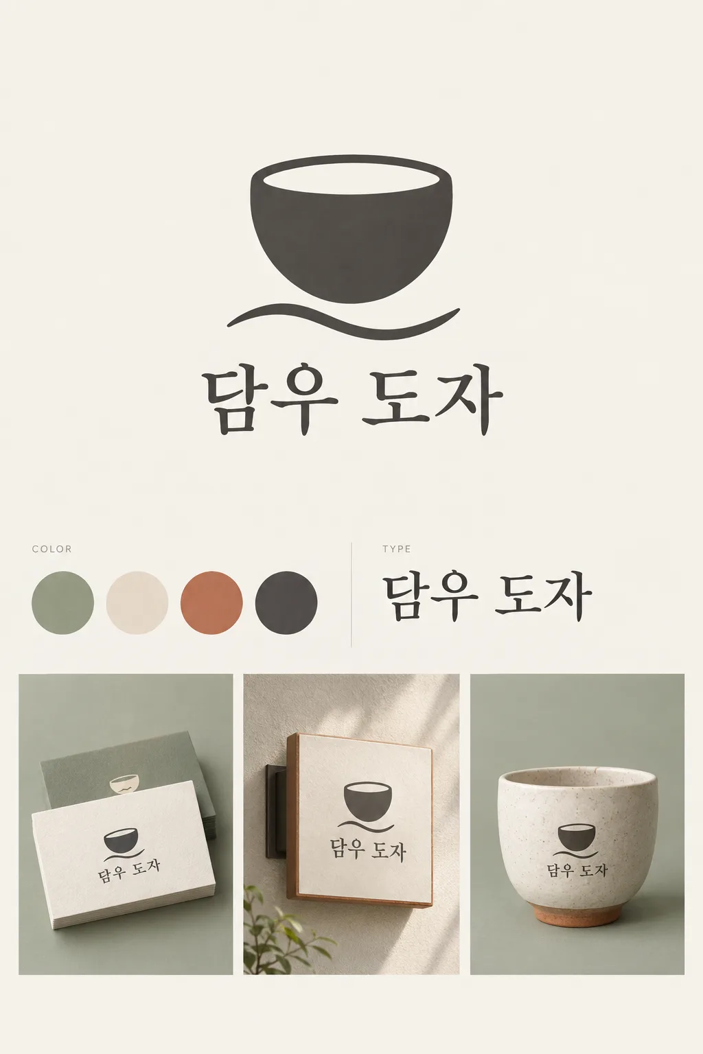
大きなロゴ、色見本、書体見本、小さな使用例を一枚のブランドボードにまとめます。
受け取れるもの
- 大きなシンボルとお店の名前
- 3〜5個の色見本と書体見本
- 小さな使用例2〜3個を含むボード一枚
ChatGPT 無料 OK
項目を入力
- 1項目を入力します
- 2コピーを押します
- 3GPTのチャットに貼り付けます
- 4そのまま送ると、サムネイルの例のような画像になります
- 5カードに合う実際の写真を一緒に入れると反映されます。背景カードなら背景の写真、人物・料理カードならその写真 任意
プロンプト全文を見る 4,774文字
Generate this image now. Return exactly ONE finished image itself; draw it directly without explanations or questions.
出力サイズは1080×1350ピクセル、4:5の縦型Instagram投稿にしてください。
ONE coherent visual brand identity GRID BOARD. This is one presentation image for one brand, not alternative logo proposals. Use a precise asymmetric editorial grid with aligned columns, fine gutters and ample quiet spacing. The large hero logo takes the upper half of the usable central area; palette and type occupy the middle strip; two or three modest mockups occupy the lower area. Keep the hero dominant even in a portrait cover.
Use original brand artwork. Preserve the input name in its original script, spelling, case, spaces and punctuation; never translate or romanize it. Korean and Latin names are both supported. Keep characters readable, including Hangul final consonants. Do not imitate recognizable existing logos, characters or signature marks.
The background fills the canvas edge to edge. Keep essential lettering and all key elements below the top 12% and above the bottom 15%; adapt the spacing to the chosen ratio. No watermark, trademark symbol, field labels, extra sales copy or invented contact details.

[INPUTS FOR THIS IMAGE]
BRAND_NAME selected: "【お店・ブランド名】"
Set BRAND_NAME to this exact input. Every application uses the same spelling and same resolved mark.
BUSINESS selected: "【業種】"
Use this business to choose appropriate scale and identity details; do not print the business input as extra copy.
SYMBOL selected: "【シンボル】"
Simplify this input into one original, memorable, broad-shape mark. If asked to choose, infer one suitable symbol from BUSINESS. Reuse the identical mark in every mockup.
PALETTE selected: "【配色】"
Keep this palette consistent in the logo, swatches and mockups. No new saturated colors.
Interpret only the selected choice:
- セージ+クリーム+テラコッタ+墨色: sage green, warm cream, muted terracotta and charcoal
- 空色+バター+紺+白: sky blue, butter yellow, deep navy and white
- ライラック+プラム+杏+生成り: lilac, dark plum, apricot and ivory
- 薄灰+コーラル+青緑+白: pale gray, coral, teal and white
If this selection line is missing or empty, use セージ+クリーム+テラコッタ+墨色 only.
SWATCH_COUNT selected: "【色見本の数】"
Draw exactly this many equal-size swatches in one tidy row. For three, use the three strongest palette colors; for five, add one light tint of an existing color. Do not invent color codes.
Interpret only the selected choice:
- 4個: exactly four swatches
- 3個: exactly three swatches
- 5個: exactly five swatches
If this selection line is missing or empty, use 4個 only.
TYPEFACE selected: "【名前の書体】"
Use one consistent wordmark typeface. The type specimen repeats the brand name, not random lorem ipsum or font-file claims.
Interpret only the selected choice:
- 柔らかな明朝: warm, balanced serif with open counters
- 端正なゴシック: restrained contemporary sans serif with careful kerning
- 丸いゴシック: friendly rounded sans serif, fully readable characters
If this selection line is missing or empty, use 柔らかな明朝 only.
MOCKUP_SET selected: "【使用例セット】"
Draw only the selected applications as small isolated views in aligned grid cells. No phone frames, people, clutter or second board.
Interpret only the selected choice:
- 名刺+看板+カップ: three mockups: a thick business card, a simple wall sign and a ceramic cup
- 名刺+紙袋: two mockups: a business card and a paper shopping bag
- 看板+箱+ステッカー: three mockups: a wall sign, a small packaging box and one round sticker
If this selection line is missing or empty, use 名刺+看板+カップ only.

[RESOLVED DESIGN]
A refined identity tailored to BUSINESS: the selected large SYMBOL and exact BRAND_NAME wordmark using TYPEFACE, a swatch row using PALETTE and SWATCH_COUNT, and a visibly distinct but consistent type specimen. Subtle grid cells using the selected palette hold the selected MOCKUP_SET as tactile, professionally lit small applications. Mockup shadows remain inside their cells. The hero logo is crisp, flat and large; mockups demonstrate real materials at a smaller scale. Use at most tiny neutral section labels such as COLOR and TYPE, never a giant page title. The sheet must read as one designed identity, not an e-commerce collage.
Before returning, compare every rendered name character with BRAND_NAME and repair any misspelling. Keep the same resolved design while correcting letters. Print BRAND_NAME once in the hero and once in each chosen mockup; the type specimen may repeat BRAND_NAME once. All instances must be identical.

[Final output format]
出力サイズは1080×1350ピクセル、4:5の縦型Instagram投稿にしてください。
This selected output format takes priority over any fixed canvas size or aspect ratio elsewhere in this template. Adapt the composition, text zones and margins to the selected canvas without stretching or cropping essential content. Device safe areas apply only when a device is selected. Never print these format instructions on the image.
結果はどうでしたか?
こちらのカードも人気です





使い方・よくある質問
ブランドの雰囲気を一枚で共有
新しいお店の準備や、包装・看板を作る人への説明に使います。大きなロゴ、3〜5個の色見本、書体見本、2〜3個の使用例を整った格子にまとめます。表紙は架空のイベント用食器レンタル「담우 도자」。丸いカップと波線のマークを、セージ、クリーム、テラコッタ、墨色で名刺・看板・カップに展開した例です。
名前・業種・シンボルを入力
名前は実際に使う表記のまま入れます。韓国語名や英語名にも対応します。業種は「日常使いの陶器工房」のように短く、シンボルは大きな形一つを指定してください。決められなければ候補ボタンや「おまかせ」を使えます。業種の説明はデザインの参考にし、勝手な宣伝文として表示しません。
色と使用例をそろえる
配色、色見本の数、書体、使用例セットを選びます。色見本を5個にすると既存の色の淡い色調を一つ加えます。書体見本には同じ名前を同じ書体で載せます。名刺・看板・カップの3点、名刺・紙袋の2点、看板・箱・ステッカーの3点から選択できます。選択欄を空にすると、表紙の4色・色見本4個・柔らかな明朝・名刺と看板とカップを使います。
制作前に統一感を確認
写真なしで4:5を選び、完成したプロンプトをGPTやGeminiへ送ります。表紙は一覧用の2:3例です。繰り返した名前の綴り、色見本の数、各使用例のロゴを確認してください。別のマークが混ざったら「全てに上のカップのロゴをそのまま使って」と依頼します。雰囲気を伝える画像であり、フォントファイル、正確な印刷色値、編集可能な名刺データは含みません。商用利用前に関連商標を検索し、大きく使う場合は必要に応じてベクター化してください。