
전체 · 광고/포스터 · 로고·브랜드
138브랜드 보드 로고
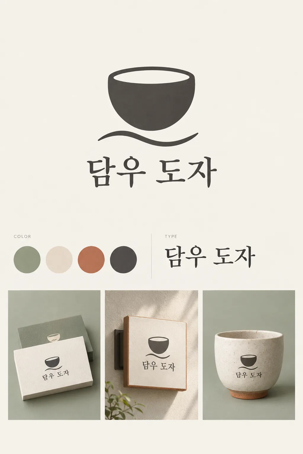
큰 로고와 색 칩, 글꼴 견본, 작은 목업을 한 장의 깔끔한 브랜드 보드로 정리해요.
받는 것
- 크게 보이는 상징과 가게 이름
- 색 칩 3~5개와 글꼴 견본
- 작은 목업 2~3개를 포함한 보드 한 장
ChatGPT 무료 OK
칸 채우기
- 1칸을 채워요
- 2복사 버튼을 눌러요
- 3GPT 채팅창에 붙여넣어요
- 4그대로 보내면 썸네일 예시처럼 나와요
- 5카드에 맞는 실제 사진을 같이 넣으면 그 사진이 반영돼요 — 배경 카드는 배경 사진, 인물 · 음식 카드는 그 사진 선택
프롬프트 원문 보기 4,802자
Generate this image now. Return exactly ONE finished image itself; draw it directly without explanations or questions.
Output size 1080x1350 pixels, 4:5 portrait, Instagram standard.
ONE coherent visual brand identity GRID BOARD. This is one presentation image for one brand, not alternative logo proposals. Use a precise asymmetric editorial grid with aligned columns, fine gutters and ample quiet spacing. The large hero logo takes the upper half of the usable central area; palette and type occupy the middle strip; two or three modest mockups occupy the lower area. Keep the hero dominant even in a portrait cover.
Use original brand artwork. Preserve the input name in its original script, spelling, case, spaces and punctuation; never translate or romanize it. Korean and Latin names are both supported. Keep characters readable, including Hangul final consonants. Do not imitate recognizable existing logos, characters or signature marks.
The background fills the canvas edge to edge. Keep essential lettering and all key elements below the top 12% and above the bottom 15%; adapt the spacing to the chosen ratio. No watermark, trademark symbol, field labels, extra sales copy or invented contact details.

[INPUTS FOR THIS IMAGE]
BRAND_NAME selected: "【가게 이름】"
Set BRAND_NAME to this exact input. Every application uses the same spelling and same resolved mark.
BUSINESS selected: "【업종】"
Use this business to choose appropriate scale and identity details; do not print the business input as extra copy.
SYMBOL selected: "【상징】"
Simplify this input into one original, memorable, broad-shape mark. If asked to choose, infer one suitable symbol from BUSINESS. Reuse the identical mark in every mockup.
PALETTE selected: "【색 조합】"
Keep this palette consistent in the logo, swatches and mockups. No new saturated colors.
Interpret only the selected choice:
- 세이지 + 크림 + 테라코타 + 먹색: sage green, warm cream, muted terracotta and charcoal
- 하늘 + 버터 + 남색 + 흰색: sky blue, butter yellow, deep navy and white
- 라일락 + 자두 + 살구 + 미색: lilac, dark plum, apricot and ivory
- 연회색 + 코랄 + 청록 + 흰색: pale gray, coral, teal and white
If this selection line is missing or empty, use 세이지 + 크림 + 테라코타 + 먹색 only.
SWATCH_COUNT selected: "【색 칩 수】"
Draw exactly this many equal-size swatches in one tidy row. For three, use the three strongest palette colors; for five, add one light tint of an existing color. Do not invent color codes.
Interpret only the selected choice:
- 4개: exactly four swatches
- 3개: exactly three swatches
- 5개: exactly five swatches
If this selection line is missing or empty, use 4개 only.
TYPEFACE selected: "【이름 글꼴】"
Use one consistent wordmark typeface. The type specimen repeats the brand name, not random lorem ipsum or font-file claims.
Interpret only the selected choice:
- 부드러운 명조: warm, balanced serif with open counters
- 단정한 고딕: restrained contemporary sans serif with careful kerning
- 둥근 고딕: friendly rounded sans serif, fully readable characters
If this selection line is missing or empty, use 부드러운 명조 only.
MOCKUP_SET selected: "【목업 묶음】"
Draw only the selected applications as small isolated views in aligned grid cells. No phone frames, people, clutter or second board.
Interpret only the selected choice:
- 명함 + 간판 + 컵: three mockups: a thick business card, a simple wall sign and a ceramic cup
- 명함 + 종이봉투: two mockups: a business card and a paper shopping bag
- 간판 + 포장 상자 + 스티커: three mockups: a wall sign, a small packaging box and one round sticker
If this selection line is missing or empty, use 명함 + 간판 + 컵 only.

[RESOLVED DESIGN]
A refined identity tailored to BUSINESS: the selected large SYMBOL and exact BRAND_NAME wordmark using TYPEFACE, a swatch row using PALETTE and SWATCH_COUNT, and a visibly distinct but consistent type specimen. Subtle grid cells using the selected palette hold the selected MOCKUP_SET as tactile, professionally lit small applications. Mockup shadows remain inside their cells. The hero logo is crisp, flat and large; mockups demonstrate real materials at a smaller scale. Use at most tiny neutral section labels such as COLOR and TYPE, never a giant page title. The sheet must read as one designed identity, not an e-commerce collage.
Before returning, compare every rendered name character with BRAND_NAME and repair any misspelling. Keep the same resolved design while correcting letters. Print BRAND_NAME once in the hero and once in each chosen mockup; the type specimen may repeat BRAND_NAME once. All instances must be identical.

[Final output format]
Output size 1080x1350 pixels, 4:5 portrait, Instagram standard.
This selected output format takes priority over any fixed canvas size or aspect ratio elsewhere in this template. Adapt the composition, text zones and margins to the selected canvas without stretching or cropping essential content. Device safe areas apply only when a device is selected. Never print these format instructions on the image.
결과 어땠어요?
이 카드도 많이 사용해요






쓰는 법 · 자주 묻는 것
브랜드 분위기를 한 장으로 공유해요
새 가게를 준비하거나 포장·간판 담당자에게 같은 분위기를 보여 줄 때 씁니다. 큰 로고, 색 칩, 글꼴 견본, 작은 목업을 한 격자에 담는 카드예요. 표지는 가상의 행사용 식기 대여 서비스 ‘담우 도자’입니다. 둥근 잔과 물결, 세이지·크림·테라코타·먹색을 명함·간판·컵에 같은 방식으로 적용합니다.
이름·업종·상징을 채워요
가게 이름은 실제로 쓸 한글이나 영문 그대로 적습니다. 업종에는 ‘행사용 식기 대여’처럼 무엇을 하는 곳인지, 상징에는 ‘둥근 잔과 물결 한 줄’처럼 큰 모양을 적어요. 상징을 못 정했으면 ‘알아서 골라줘’를 눌러 업종에 맞게 정하게 합니다. 상징 여러 개를 나열하기보다 기억할 것 하나를 고르세요.
색과 사용 예시를 맞춰요
색 조합은 로고와 모든 목업에 함께 적용됩니다. 색 칩은 3·4·5개 중 고르며, 5개는 기존 색의 밝은 톤 하나를 더합니다. 글꼴 견본은 이름을 같은 서체로 한 번 더 보여 줘요. 목업은 명함·간판·컵 세 개, 명함·종이봉투 두 개, 간판·상자·스티커 세 개 중 고릅니다. 선택 칸을 비우면 표지의 4색, 네 개 칩, 부드러운 명조, 명함·간판·컵을 사용해요.
보기용 보드에서 실제 제작으로
사진 없이 4:5를 골라 GPT나 Gemini에 프롬프트를 보냅니다. 표지는 목록에 맞춘 2:3 예시입니다. 이름이 목업마다 똑같은지, 색 칩 수와 실물 배색이 맞는지 확인하세요. 다른 로고가 섞이면 ‘모든 목업에 위의 잔 로고와 이름을 그대로 적용해 줘’라고 고칩니다. 이 보드는 분위기와 배치를 공유하는 이미지이며, 폰트 파일·정확한 인쇄 색값·명함 원본 파일을 제공하는 것은 아닙니다.
상업용 전 키프리스(KIPRIS) 상표 검색 · 크게 쓸 땐 벡터로 다시 그리기