
All · Ads & posters · Logos & branding
118Hand-drawn crayon logo
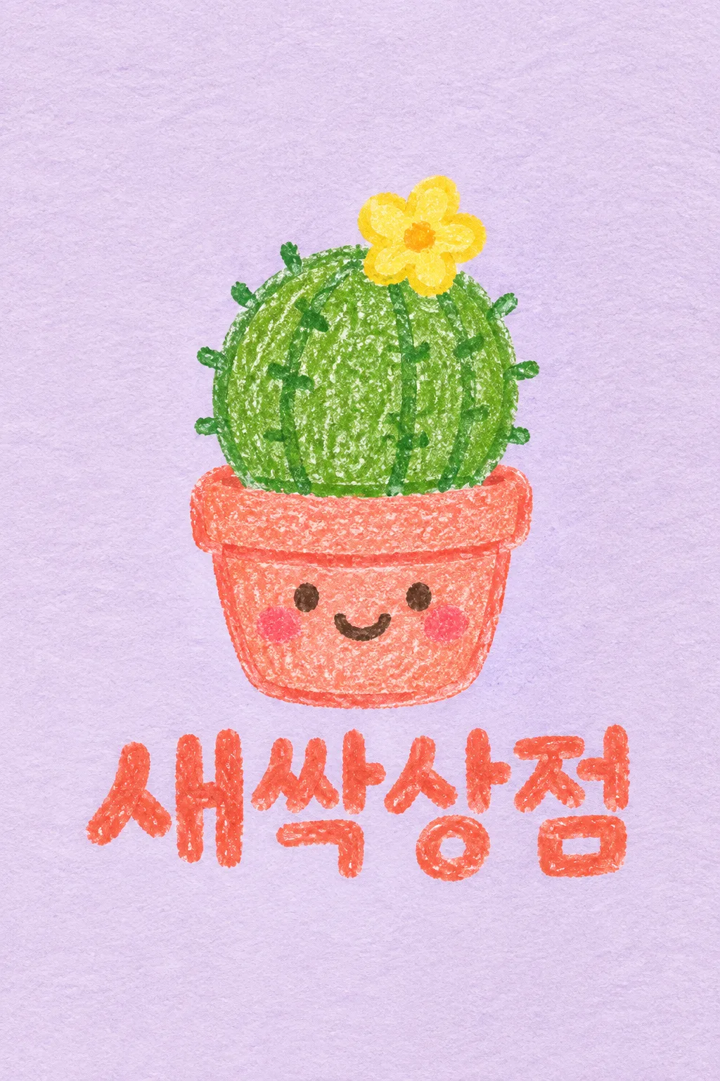
A warm illustrated logo with visible crayon grain and a handwritten name.
What you get
- One warm crayon-drawn character
- Your exact name in readable handwriting
- One completed logo on textured drawing paper
ChatGPT Free OK
Fill in the fields
- 1Fill in the fields
- 2Copy the prompt
- 3Paste it into a GPT chat
- 4Send it as is and you get an image like the thumbnail example
- 5Attach a real photo that fits the card and it is used in the result: a background photo for background cards, a person or food photo for those cards Optional
Full prompt 5,500 characters
Generate this image now. Return exactly ONE finished logo image itself; draw it directly, without explanations or questions.
Output size 1080x1080 pixels, 1:1 square post. Keep all text fully readable.
Create one original professional brand identity, one finished composition and one material. No options sheet, multiple applications, props, hands, devices or collage. Never imitate an existing brand's recognizable logo, mascot or typography. Do not add slogans, field labels, unrelated words, watermarks or trademark symbols. The chosen substrate fills the canvas edge to edge.
Keep all essential lettering below the top 12% and above the bottom 15% of the canvas. Center the complete logo group with quiet margins, about 70-78% of canvas width. Adapt the same identity to the chosen ratio without changing the style.

[INPUTS FOR THIS IMAGE]
Brand name selected: "【Brand name】"
Set BRAND_NAME to this input. Preserve its exact spelling, case, spaces and punctuation. Print it exactly once. Never translate or romanize it. If explicitly asked to choose, invent one short original name. If no name was supplied, ask for the name rather than inventing an existing business. Do not print the field label.
Drawn character selected: "【Drawn character】"
Use one subject described by this input, preserving the requested defining feature. If asked to choose or no subject was supplied, use a rounded cactus with one small yellow flower in a smiling pot. Keep the silhouette immediately recognizable at small size.
Material selected: "【Material】"
Apply only this finish to the whole logo. Preserve the fixed style of this card. Foil keeps its physical metal color; palette changes mainly affect the substrate. One continuous surface fills the canvas.
Interpret the selected choice as follows (use only the selected one):
- Crayon on lilac paper: wax crayon on pale lilac textured drawing paper, grain and wax buildup visible.
- Crayon on white paper: wax crayon on warm white drawing paper.
- Colored pencil on ivory paper: colored-pencil hatching and visible paper tooth, still a hand-drawn illustration.
- Oil pastel on cream paper: soft oil-pastel grain on cream paper, no glossy painting effect.
- Crayon on recycled paper: wax crayon on lightly flecked natural recycled paper.
- Crayon on rough art paper: wax crayon on rough off-white watercolor paper, dry grain stays clear.
If the selection line is absent or empty, use Crayon on lilac paper only.
Colors selected: "【Colors】"
Use this restrained palette and necessary substrate tones only. Keep the name clearly readable against its background. Real metal retains its physical color.
Interpret the selected choice as follows (use only the selected one):
- Green + coral + lilac: leaf-green cactus, coral pot and name, small yellow flower, pale lilac background.
- Blue + yellow + white: blue character accents, yellow name, warm white background.
- Brown + pink + cream: warm brown character, pink name, cream background.
- Lime + plum + ivory: lime character, plum name, ivory background.
If the selection line is absent or empty, use Green + coral + lilac only.
Drawing strokes selected: "【Drawing strokes】"
Preserve the handmade look in all finishes; no glossy 3D, hard vector edges or photorealistic character.
Interpret the selected choice as follows (use only the selected one):
- Grainy crayon: visible crayon grain, bold warm wax edges, natural pressure variations.
- Soft colored pencil: soft layered pencil strokes, small visible hatching, strong contour.
- Thick pastel: thick soft pastel strokes with handmade edges and clear silhouette.
If the selection line is absent or empty, use Grainy crayon only.
Name weight selected: "【Name weight】"
Handmade lettering remains readable; the texture never removes essential character strokes.
Interpret the selected choice as follows (use only the selected one):
- Large and bold: large bold rounded handwritten letters with grain and open counters.
- Neat medium weight: clear medium-weight handwriting with gentle irregularity.
- Confident doodle: confident broad hand-drawn lettering, lively but precisely spelled.
If the selection line is absent or empty, use Large and bold only.

[RESOLVED DESIGN]
ONE hand-drawn crayon illustration ABOVE a large handmade BRAND_NAME. Default a rounded green cactus with one yellow flower in a coral smiling pot; put the single face on the pot, no duplicate faces. Coral handwritten name beneath, pale lilac textured drawing paper fills the background. The illustration has visible wax grain, slightly uneven hand pressure and warm imperfect edges, professionally composed rather than careless scribbles. Character about 53-60% of width; name about 72-78%. No white sticker outline, no drop-shadow sticker effect, no glossy 3D. Paper tooth and visible grain are essential. Keep all letters intact, widely readable and lively.
Before returning, compare every visible name character with BRAND_NAME, one by one, including Hangul initial consonants, vowels and final consonants. Repair missing or altered letters while retaining the design. Print the brand name exactly once. The finish may be realistic, but the identity must remain clear at thumbnail size.

[Final output format]
Output size 1080x1080 pixels, 1:1 square post. Keep all text fully readable.
This selected output format takes priority over any fixed canvas size or aspect ratio elsewhere in this template. Adapt the composition, text zones and margins to the selected canvas without stretching or cropping essential content. Device safe areas apply only when a device is selected. Never print these format instructions on the image.
How did it turn out?
You may also like






How to use it · FAQ
Hand-Drawn Store's Small Face
Used for profiles or packaging illustrations of houseplant accessories, neighborhood workshops, and charming everyday accessories. Both the character and the name are hand-drawn with visible crayon grains. The cover is an example of a fictional plant accessories shop, "새싹상점," featuring a cactus with a single yellow flower and a smiling coral pot drawn on lilac paper. Instead of distinct sticker borders, paper textures and hand pressure remain.
Subject and One Small Feature
For Brand name, enter the exact name that needs to be read. For Drawn character, write the subject and one memorable feature, such as "a cactus with a single yellow flower." You can start by tapping options like sprouts, puppies, cats, squirrels, or "choose for me." Limiting the face placement to either the pot or the plant helps reduce redundancy where both smile. Adding too many surrounding landscapes and props makes it look like an illustration scene rather than a logo.
Change Paper and Stroke Feel
There are six materials: lilac and white paper, ivory colored pencil, cream oil pastel, recycled paper, and rough art paper. Material adjusts the paper and base tool, while Drawing strokes controls the grains and stroke feel on top. Name weight is chosen so the name remains legible even on small packaging. Leaving selections blank defaults to Crayon on lilac paper, Green + coral + lilac, Grainy crayon, and Large and bold name.
Keep the Texture, Make the Name Clear
Choose 1:1 without a photo and send the prompt. Read every name character, including final consonants, then shrink the image to check whether the cactus and pot remain distinct. If the letters are too rough, request, "Keep the crayon texture, but fill only the empty strokes of the name." If they are too digital and smooth, request, "Bring back the wax grains and pressed-down lines." For commercial printing, decide with the print shop whether to separate the paper background and logo, and match the stroke weight for small labels. The cover is 2:3, and the default result is 1:1.
Before commercial use, search KIPRIS and the relevant trademark database; for large signs or prints, have the logo redrawn as a clean vector.