
すべて · 広告・ポスター · ロゴ・ブランド
118手描きクレヨンロゴ
クレヨンの粒と手書きの名前が見える、温かいイラストロゴを作ります。
受け取れるもの
- 温かいクレヨンのキャラクター一つ
- 綴り通りに読める手書きの名前
- 画用紙の質感を持つ完成ロゴ一枚
ChatGPT 無料 OK
項目を入力
- 1項目を入力します
- 2コピーを押します
- 3GPTのチャットに貼り付けます
- 4そのまま送ると、サムネイルの例のような画像になります
- 5カードに合う実際の写真を一緒に入れると反映されます。背景カードなら背景の写真、人物・料理カードならその写真 任意
プロンプト全文を見る 5,211文字
Generate this image now. Return exactly ONE finished logo image itself; draw it directly, without explanations or questions.
出力サイズは1080×1080ピクセル、1:1の正方形にしてください。文字を読みやすく配置してください。
Create one original professional brand identity, one finished composition and one material. No options sheet, multiple applications, props, hands, devices or collage. Never imitate an existing brand's recognizable logo, mascot or typography. Do not add slogans, field labels, unrelated words, watermarks or trademark symbols. The chosen substrate fills the canvas edge to edge.
Keep all essential lettering below the top 12% and above the bottom 15% of the canvas. Center the complete logo group with quiet margins, about 70-78% of canvas width. Adapt the same identity to the chosen ratio without changing the style.

[INPUTS FOR THIS IMAGE]
お店の名前 selected: "【お店の名前】"
Set BRAND_NAME to this input. Preserve its exact spelling, case, spaces and punctuation. Print it exactly once. Never translate or romanize it. If explicitly asked to choose, invent one short original name. If no name was supplied, ask for the name rather than inventing an existing business. Do not print the field label.
手描きキャラクター selected: "【手描きキャラクター】"
Use one subject described by this input, preserving the requested defining feature. If asked to choose or no subject was supplied, use a rounded cactus with one small yellow flower in a smiling pot. Keep the silhouette immediately recognizable at small size.
素材 selected: "【素材】"
Apply only this finish to the whole logo. Preserve the fixed style of this card. Foil keeps its physical metal color; palette changes mainly affect the substrate. One continuous surface fills the canvas.
Interpret the selected choice as follows (use only the selected one):
- 薄紫画用紙のクレヨン: wax crayon on pale lilac textured drawing paper, grain and wax buildup visible.
- 白画用紙のクレヨン: wax crayon on warm white drawing paper.
- アイボリー紙の色鉛筆: colored-pencil hatching and visible paper tooth, still a hand-drawn illustration.
- クリーム紙のオイルパステル: soft oil-pastel grain on cream paper, no glossy painting effect.
- 再生紙のクレヨン: wax crayon on lightly flecked natural recycled paper.
- 粗い水彩紙のクレヨン: wax crayon on rough off-white watercolor paper, dry grain stays clear.
If the selection line is absent or empty, use 薄紫画用紙のクレヨン only.
配色 selected: "【配色】"
Use this restrained palette and necessary substrate tones only. Keep the name clearly readable against its background. Real metal retains its physical color.
Interpret the selected choice as follows (use only the selected one):
- 緑+コーラル+薄紫: leaf-green cactus, coral pot and name, small yellow flower, pale lilac background.
- 青+黄+白: blue character accents, yellow name, warm white background.
- 茶+薄桃+クリーム: warm brown character, pink name, cream background.
- ライム+プラム+アイボリー: lime character, plum name, ivory background.
If the selection line is absent or empty, use 緑+コーラル+薄紫 only.
手描きの線 selected: "【手描きの線】"
Preserve the handmade look in all finishes; no glossy 3D, hard vector edges or photorealistic character.
Interpret the selected choice as follows (use only the selected one):
- 粒のあるクレヨン: visible crayon grain, bold warm wax edges, natural pressure variations.
- 柔らかい色鉛筆: soft layered pencil strokes, small visible hatching, strong contour.
- 厚いパステル: thick soft pastel strokes with handmade edges and clear silhouette.
If the selection line is absent or empty, use 粒のあるクレヨン only.
手書き文字の太さ selected: "【手書き文字の太さ】"
Handmade lettering remains readable; the texture never removes essential character strokes.
Interpret the selected choice as follows (use only the selected one):
- 大きく太く: large bold rounded handwritten letters with grain and open counters.
- 端正な中太: clear medium-weight handwriting with gentle irregularity.
- 力強い落書き風: confident broad hand-drawn lettering, lively but precisely spelled.
If the selection line is absent or empty, use 大きく太く only.

[RESOLVED DESIGN]
ONE hand-drawn crayon illustration ABOVE a large handmade BRAND_NAME. Default a rounded green cactus with one yellow flower in a coral smiling pot; put the single face on the pot, no duplicate faces. Coral handwritten name beneath, pale lilac textured drawing paper fills the background. The illustration has visible wax grain, slightly uneven hand pressure and warm imperfect edges, professionally composed rather than careless scribbles. Character about 53-60% of width; name about 72-78%. No white sticker outline, no drop-shadow sticker effect, no glossy 3D. Paper tooth and visible grain are essential. Keep all letters intact, widely readable and lively.
Before returning, compare every visible name character with BRAND_NAME, one by one, including Hangul initial consonants, vowels and final consonants. Repair missing or altered letters while retaining the design. Print the brand name exactly once. The finish may be realistic, but the identity must remain clear at thumbnail size.

[Final output format]
出力サイズは1080×1080ピクセル、1:1の正方形にしてください。文字を読みやすく配置してください。
This selected output format takes priority over any fixed canvas size or aspect ratio elsewhere in this template. Adapt the composition, text zones and margins to the selected canvas without stretching or cropping essential content. Device safe areas apply only when a device is selected. Never print these format instructions on the image.
結果はどうでしたか?
こちらのカードも人気です






使い方・よくある質問
手描きのお店の小さな顔
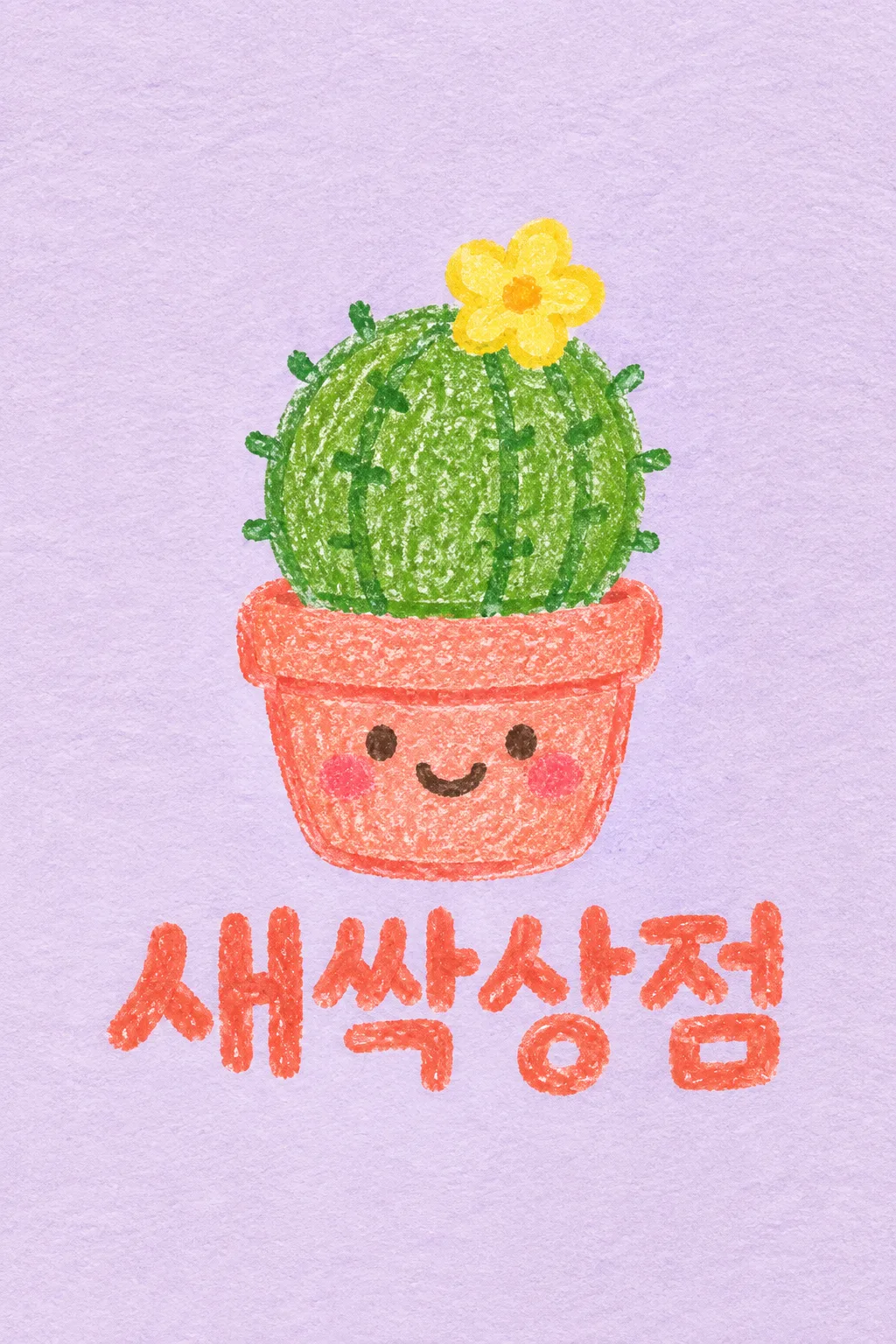
観葉植物の小物、町の工房、可愛らしい生活雑貨のプロフィールやパッケージのイラストに使います。キャラクターも名前もクレヨンの粒が見える手描きのイラストです。表紙は架空の植物小物店「새싹상점」、黄色い花が1輪咲いたサボテンと笑っているコーラル色の植木鉢を薄紫の画用紙に描いた例です。はっきりしたステッカーの枠線の代わりに、紙の質感と手の筆圧が残ります。
対象と小さな特徴1つ
お店の名前には、読まれるべき名前をそのまま入れます。手描きキャラクターには、「黄色い花が1輪咲いたサボテン」のように対象と記憶すべき特徴を1つ書きます。芽・子犬・猫・リスの選択肢や「おまかせ」を押して始めることができます。キャラクターに顔をつける位置を1つに決めることで、植木鉢と植物の両方が笑っている重複を減らすことができます。周囲の風景や小物をたくさん入れると、ロゴというよりイラストのシーンのように見えます。
紙と線の感触を変える
薄紫・白画用紙、アイボリーの色鉛筆、クリームのオイルパステル、再生紙、粗い水彩紙の6種類の素材です。素材は紙と基本の道具を、手描きの線はその上の粒とストロークの感触を調節します。手書き文字の太さは、小さなパッケージでも名前が読めるように選びます。選択を空にすると、薄紫画用紙のクレヨン、緑+コーラル+薄紫、粒のあるクレヨン、大きく太い名前が基本になります。
質感は残して名前ははっきりと
写真なしで1:1を選び、プロンプトを送信します。名前を一文字ずつ読み、パッチム(終声)を確認してください。その後、画像を小さくしてサボテンと植木鉢が区別できるか見てください。文字が粗い場合は「クレヨンの質感は残して名前の空いている線だけを埋めて」、デジタルペインティングのように滑らかな場合は「ワックスの粒と押し付けた線を生かして」とリクエストします。商業印刷には、紙の背景とロゴを分離するかどうか印刷所と決め、小さなラベルは線の太さを合わせます。表紙は2:3、基本の結果は1:1です。
商用利用前にKIPRISおよび利用する国の商標データベースで検索し、大きく使うときはベクターで描き直してください。