
すべて · 広告・ポスター · ロゴ・ブランド
180白黒ステッカーロゴ
太い白黒の絵と名前、網点、ひとつながりの白いカット枠で強いステッカーを作ります。
受け取れるもの
- 太い輪郭と網点の白黒イラスト
- 大きく読みやすい名前
- つながった白いカット枠のステッカー一枚
ChatGPT 無料 OK
項目を入力
- 1項目を入力します
- 2コピーを押します
- 3GPTのチャットに貼り付けます
- 4そのまま送ると、サムネイルの例のような画像になります
- 5カードに合う実際の写真を一緒に入れると反映されます。背景カードなら背景の写真、人物・料理カードならその写真 任意
プロンプト全文を見る 4,704文字
Generate this image now. Return exactly ONE finished image itself; draw it directly without explanations or questions.
出力サイズは1080×1080ピクセル、1:1の正方形にしてください。文字を読みやすく配置してください。
Exactly one original BLACK-AND-WHITE DIE-CUT STICKER logo, centered at 72-80% of width. One bold graphic above one oversized exact name. A single continuous white cutline encloses both as one physical matte-vinyl sticker on a plain black surface. No sticker sheet, badge circle, extra copy or application mockup.
Use original brand artwork. Preserve the input name in its original script, spelling, case, spaces and punctuation; never translate or romanize it. Korean and Latin names are both supported. Keep characters readable, including Hangul final consonants. Do not imitate recognizable existing logos, characters or signature marks.
The background fills the canvas edge to edge. Keep essential lettering and all key elements below the top 12% and above the bottom 15%; adapt the spacing to the chosen ratio. No watermark, trademark symbol, field labels, extra sales copy or invented contact details.

[INPUTS FOR THIS IMAGE]
BRAND_NAME selected: "【お店・ブランド名】"
Set BRAND_NAME to the exact input. Print once in large intact characters, preserving the original script.
BUSINESS selected: "【業種】"
Use this business to inform the graphic attitude; never print it as a subtitle.
GRAPHIC selected: "【ステッカーの絵】"
Draw one original simplified graphic with broad silhouettes, strong readable negative-space cuts and no tiny detached parts. If asked to choose, infer one simple subject from BUSINESS.
CONTRAST selected: "【白黒の比率】"
Artwork uses black and white inks only. Gray-looking shading must come from black dots on white, never a gray gradient or third ink.
Interpret only the selected choice:
- 黒い面+白い抜き: dominant black silhouette with bold white negative-space cuts
- 白い顔+黒い線: mostly white face with heavy black contour and solid dark accents
- 半々のコントラスト: roughly balanced black masses and white openings, intentional asymmetric lighting shapes
If this selection line is missing or empty, use 黒い面+白い抜き only.
HALFTONE selected: "【網点】"
Use halftone dots only in selected broad graphic shadows. Keep letters and outer cutline solid and clear.
Interpret only the selected choice:
- 粗い点を少し: sparse coarse halftone shading in one or two broad areas
- 中粒点を多めに: medium halftone screens in larger shadow areas, never across eyes or letters
- 点なし: solid black-and-white shapes only
If this selection line is missing or empty, use 粗い点を少し only.
CUTLINE selected: "【白い枠】"
Maintain exactly one connected white border wrapping both graphic and name. Bridge small gaps cleanly, without blocking letter counters or symbol openings.
Interpret only the selected choice:
- 太い枠: a generous thick white die-cut border, roughly 22-28 pixels at 1024-wide output
- 中幅の枠: a clear medium white border, roughly 14-18 pixels at 1024-wide output
- とても太い枠: an extra-thick white border, roughly 32-38 pixels at 1024-wide output
If this selection line is missing or empty, use 太い枠 only.
TYPEFACE selected: "【名前の書体】"
Use bold readable letters below the graphic, with white faces and black separation. No script lettering, slogans or compressed unreadable kerning.
Interpret only the selected choice:
- 太い細幅ゴシック: bold condensed sans serif with large open counters
- 角張ったスポーツ文字: angular athletic display lettering with intact character shapes
- 太い丸文字: bold rounded display lettering with open counters
If this selection line is missing or empty, use 太い細幅ゴシック only.

[RESOLVED DESIGN]
A strong original sticker tailored to BUSINESS: the selected GRAPHIC in large broad shapes using CONTRAST, crisp black-and-white boundaries and the selected HALFTONE in broad shadow areas only. Exact BRAND_NAME beneath in oversized white lettering using TYPEFACE, with black separation and intact counters. Graphic and name form one cohesive white-bordered silhouette using CUTLINE, with no detached pieces or separate text sticker. The matte white vinyl edge has tiny believable depth and a restrained shadow on a plain black surface. Use strict black and white artwork, no color accents, gradients, excessive scratch distress or imitation of existing sports-team mascots.
Before returning, compare every rendered name character with BRAND_NAME and repair any misspelling. Keep the same resolved design while correcting letters. Print BRAND_NAME exactly once.

[Final output format]
出力サイズは1080×1080ピクセル、1:1の正方形にしてください。文字を読みやすく配置してください。
This selected output format takes priority over any fixed canvas size or aspect ratio elsewhere in this template. Adapt the composition, text zones and margins to the selected canvas without stretching or cropping essential content. Device safe areas apply only when a device is selected. Never print these format instructions on the image.
結果はどうでしたか?
こちらのカードも人気です





使い方・よくある質問
二色だけで強い印象に
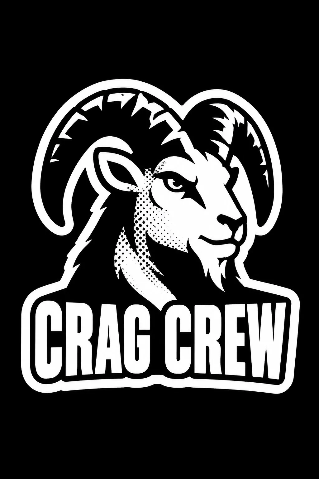
ボルダリングクラブ、スケートチーム、タトゥースタジオなどに使います。大きな絵と名前、控えめな網点を白い枠一つでまとめます。表紙は架空のクラブ「CRAG CREW」。太い角の山羊、黒い面と白い抜き、少量の粗い点、太い白枠を使った例です。
覚えやすい絵を一つ
名前は韓国語も英語もそのまま入力します。業種は雰囲気の参考で、追加の副題にはしません。絵は「太い角の山羊の頭」のように、輪郭で分かるものを指定してください。候補や「おまかせ」も使えます。細かな分離部品や複数のキャラクターは、一枚のステッカーでは複雑になります。
白黒比率・点・枠を選ぶ
黒い面中心、白い顔中心、半々の比率から選びます。網点は粗い点少量、中粒点多め、なしに変更できます。点は絵の陰影だけに入れ、名前と枠は明瞭なままにします。白枠の太さと書体も選択可能です。空欄なら表紙の黒い面、粗い点少量、太い枠、太い細幅ゴシックになります。
一枚につながる形か確認
写真なしで1:1を選び、GPTやGeminiへ送ります。表紙は2:3の例です。枠が絵と名前を一緒に包み、角や文字が離れていないか確認してください。分離したら「絵と名前を一つの白いカット枠につないで」と依頼します。縮小して点が黒い塊になるなら網点を減らします。実際のカットパス、塗り足し、透明背景の原稿は印刷所の規格で別途準備します。商用利用前の商標検索と、必要に応じたベクター化も行ってください。