
すべて · 広告・ポスター · ロゴ・ブランド
175サインロゴ
名前の綴りを保つ自然な手書きで、短く優雅なサイン風ブランドロゴを作ります。
受け取れるもの
- 正確な名前の手書きサイン
- 選んだ線幅と控えめな飾り線
- 紙地の名前が主役のロゴ一枚
ChatGPT 無料 OK
項目を入力
- 1項目を入力します
- 2コピーを押します
- 3GPTのチャットに貼り付けます
- 4そのまま送ると、サムネイルの例のような画像になります
- 5カードに合う実際の写真を一緒に入れると反映されます。背景カードなら背景の写真、人物・料理カードならその写真 任意
プロンプト全文を見る 4,967文字
Generate this image now. Return exactly ONE finished image itself; draw it directly without explanations or questions.
出力サイズは1080×1080ピクセル、1:1の正方形にしてください。文字を読みやすく配置してください。
One original HANDWRITTEN SIGNATURE BRAND LOGO, the exact name as the only text, centered at 70-82% of canvas width. A naturally connected Latin signature, or coherent legible hand-lettered syllables for Hangul. No monogram, portrait, pen, certificate, business card mockup or second tagline.
Use original brand artwork. Preserve the input name in its original script, spelling, case, spaces and punctuation; never translate or romanize it. Korean and Latin names are both supported. Keep characters readable, including Hangul final consonants. Do not imitate recognizable existing logos, characters or signature marks.
The background fills the canvas edge to edge. Keep essential lettering and all key elements below the top 12% and above the bottom 15%; adapt the spacing to the chosen ratio. No watermark, trademark symbol, field labels, extra sales copy or invented contact details.

[INPUTS FOR THIS IMAGE]
BRAND_NAME selected: "【名前】"
Set BRAND_NAME to this exact input. Latin names are recommended for flowing signature lettering. For Hangul, use a short legible handwritten name, preserve every syllable and final consonant, and never romanize it. This is original brand lettering, not an imitation of a real person signature.
BUSINESS selected: "【業種】"
Use the business only to tune the temperament of the handwriting. Do not print the input.
HANDWRITING selected: "【手書きの雰囲気】"
Keep the spelling fully readable and avoid loops that add phantom letters. For non-Latin scripts interpret the mood, not Latin letter shapes.
Interpret only the selected choice:
- 流れるが明瞭: fluid moderately slanted lettering with clear open lowercase forms
- 端正でゆったり: calm relatively upright handwriting, generous spacing
- 軽やかな筆ペン: light brush-pen rhythm with restrained thick-thin variation, no paint splatter
If this selection line is missing or empty, use 流れるが明瞭 only.
WEIGHT selected: "【線の太さ】"
Keep enough weight for phone-size reading. Fine strokes should never vanish, and thick strokes must not close small counters.
Interpret only the selected choice:
- 読みやすい中幅: medium signature strokes with modest pressure variation
- 繊細な線: delicate but continuous ink lines, not hairline-thin
- 力のある線: confident thicker ink strokes with open counters
If this selection line is missing or empty, use 読みやすい中幅 only.
FLOURISH selected: "【末尾の飾り線】"
Use at most one restrained finishing gesture, connected to the name when possible. It never crosses letter bodies or replaces a letter.
Interpret only the selected choice:
- 短い下線: one short gently curved finishing underline beneath the final half of the name
- 長く流れる下線: one long gently flowing underline below the name with clear separation
- 飾りなし: plain clean ending with no underline or extra ornament
If this selection line is missing or empty, use 短い下線 only.
INK selected: "【インク色】"
Use one matte opaque ink color only, no gold foil, metal reflections or gradients.
Interpret only the selected choice:
- 深い藍: deep indigo ink
- 深いエスプレッソ: deep espresso-brown ink
- 墨黒: soft ink-black ink
- 深いバーガンディ: deep burgundy ink
If this selection line is missing or empty, use 深い藍 only.
PAPER selected: "【紙地】"
Keep one quiet subtly textured paper surface and sufficient name/background contrast. No ruled notebook, stationery collage or torn corners.
Interpret only the selected choice:
- 淡い杏: very pale apricot cotton paper
- ミルク白: warm milk-white cotton paper
- 淡い石灰色: light stone-gray uncoated paper
- 淡いラベンダー: pale lavender uncoated paper
If this selection line is missing or empty, use 淡い杏 only.

[RESOLVED DESIGN]
A luxury but readable handwritten brand identity tailored to BUSINESS: the exact name in INK on PAPER, using HANDWRITING and WEIGHT. Natural hand pressure, controlled ascenders and descenders, clearly differentiated letters and an authentic pause at every input space. Latin lowercase may connect gracefully; Hangul syllable shapes remain fully intact. Apply only FLOURISH below or at the end without crossing letter bodies, and omit extra gestures when No flourish is selected. Quiet balanced composition, continuous strokes strong enough to read at thumbnail size. Subtle paper fibres are secondary; the lettering is the finished work. No random loops, invented dots, repeating name, personal authentication details or imitation of a famous signature.
Before returning, compare every rendered name character with BRAND_NAME and repair any misspelling. Keep the same resolved design while correcting letters. Print BRAND_NAME exactly once.

[Final output format]
出力サイズは1080×1080ピクセル、1:1の正方形にしてください。文字を読みやすく配置してください。
This selected output format takes priority over any fixed canvas size or aspect ratio elsewhere in this template. Adapt the composition, text zones and margins to the selected canvas without stretching or cropping essential content. Device safe areas apply only when a device is selected. Never print these format instructions on the image.
結果はどうでしたか?
こちらのカードも人気です






使い方・よくある質問
名前そのものを優雅なロゴに
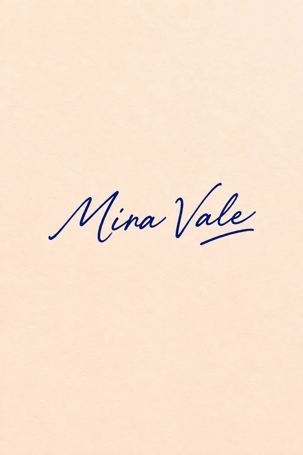
ウェディングプランナー、写真家、作家など、名前をブランドにする人に向いています。別のシンボルを付けず、自然な手書きと末尾の線で個性を作ります。表紙は架空のプランナー「Mira Vale」。深い藍のインク、淡い杏の紙、短い下線の例です。実在する人の署名を複製するカードではありません。
英字の名前がおすすめ
大文字・小文字、空白、点を含め、希望する表記をそのまま入力します。流れるサインの雰囲気には英字が向いています。韓国語も使えますが、2〜4音節程度に短くし、終声まで一文字ずつ確認してください。勝手にローマ字には変換しません。業種は書き味の参考で、追加文にはしません。
線幅と末尾を調整
流れる明瞭な文字、端正な文字、筆ペンから選びます。線幅は繊細・中幅・力強い線です。末尾は短い下線、長い下線、飾りなしから選択できます。インクと紙も別々に変更可能です。空欄なら表紙の流れる文字、中幅、短い下線、藍、杏色になります。
装飾より先に名前を読む
写真なしで1:1を選び、GPTやGeminiへ送ります。表紙は2:3の例です。iの点、似た文字、空白、韓国語の終声を確認します。読みにくければ「飾りの輪を減らして文字を区別できるように」、誤字なら「名前だけ正確に直して」と依頼してください。小さなプロフィールでは中幅の線が残りやすくなります。印刷・看板用の背景なし原稿やベクターは別途用意します。商用利用前に商標を検索し、用途に合わせて制作データを整えてください。