
すべて · 広告・ポスター · 季節・記念日 · セール・イベント · 小売店 · カフェ・スイーツ
133キャンディギフトポスター
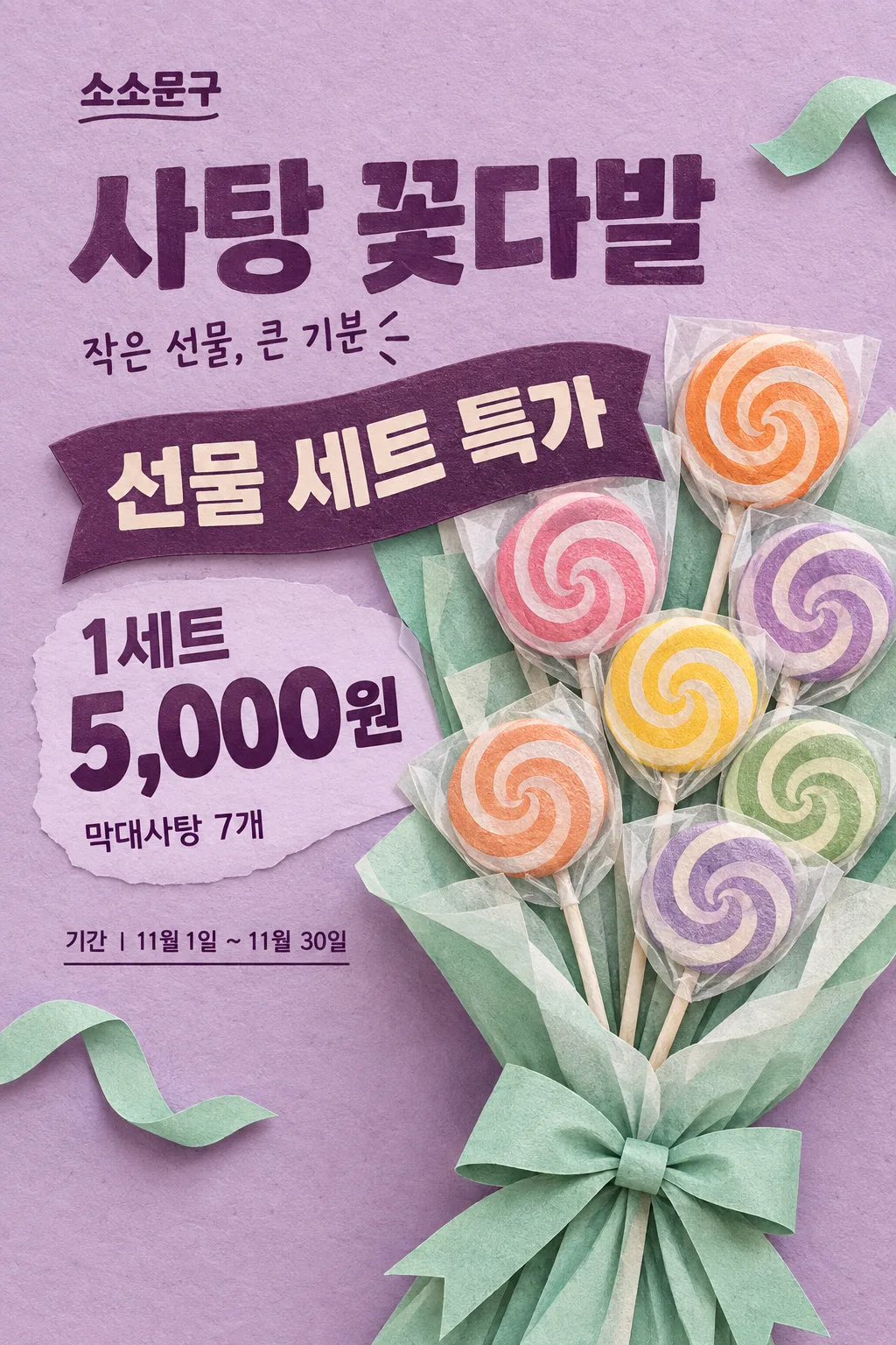
ライラックとミントのペーパークラフト風で、キャンディの花束と特典・セット価格を大きく見せます。
受け取れるもの
- 表紙と同じ一種類の季節向け店舗ポスター一枚
- 正確な店名と特典内容および支払価格
- 写真を添えた場合は実物の包装と形を保つ結果
項目を入力
- 1項目を入力します
- 2プロンプトをコピーします
- 3GPTのチャットに貼り付けます
- 4そのまま送ると、サムネイルの例のような画像になります
- 5実際の販売商品の写真一枚(任意)をプロンプトと一緒に入れると、その写真が反映されます 任意
プロンプト全文を見る 7,816文字
Generate this image now. Return ONE finished retail gift-season poster with a large exact offer and payable price.
AUTHORITATIVE SUBJECT DETAILS for this image: "【商品の詳細】". AUTHORITATIVE VISUAL CHOICE for this image: "【背景のリボン色】". These are internal definitions, not captions. For an invented no-photo subject, these supplied values override the default count, coating or decorative accent in the scene below. If either value is absent, use the corresponding example default. If a product photo is attached, the photo overrides both these definitions and the default scene.
ONE FIXED DESIGN: tactile layered paper-craft illustration with lilac paper background, mint folded wrapping, peach-orange candy accents and deep-plum letterpress-like text. Use visible paper fibers, cut edges, shallow embossed relief and short natural cast shadows. An enormous seven-lollipop gift bouquet rises from the lower edge, fanning toward the upper-right; keep the bouquet asymmetrical, occupying about 60% of the canvas. Lollipop heads are rounded edible disks with varied simple swirls, each on a single straight thin paper stick, each protected by lightly translucent wrapping. Layered tissue surrounds the handles with one tied mint bow. Render a real plausible gift arrangement in a hand-crafted illustration style, not photorealism and not a flat icon. No hearts or cream gift-box still life. Foreground tissue and stems reach the bottom trim.
PHOTO RULE (this overrides any other line in this prompt, before or after it, that calls the photo required or mandatory or says to ask for it): if a photo is attached, use it exactly as the instructions below describe. If no photo is attached, never ask for one and never stop — invent a fitting fictional subject (person, pet, food, product or place, whatever this card is about) in the spirit of the card's example image, and finish the image.

[ACTUAL PRODUCT ACCURACY — overrides all illustration and scene instructions]
When a product photo is attached, treat the complete merchandise as an exact photographic cutout, not a packaging design task. Preserve its package lettering, logos, label colors, shape, materials, size proportions, flavor, quantity, wrappers and visible contents. Never erase or replace package text, recolor a wrapper, clone pieces, add merchandise or turn a box into another sales form. A closed box stays closed. Crop the background only; keep the whole actual product and all labels visible. Only uniformly enlarge, place, and make restrained lighting/exposure adjustments. If the photo differs from the invented example, the photo wins. Apply this card's fixed illustration or photography style to the BACKGROUND and typography, not to the attached merchandise. Do not infer hidden contents.
出力サイズは2480×3508ピクセル、A4縦、300dpiの印刷用ポスターにしてください。

[ONE RESULT AND COMPOSITION]
DIAGONAL PAPER COMPOSITION: store at x7–60%/y16–20%; compact stacked PRODUCT headline at x7–60%/y23–35%. Bouquet fan fills x28–100%/y35–98%. OFFER is printed on a solid plum curved paper label at x7–74%/y39–49%, integrated into the wrapping edge, with every word readable. PRICE sits at x7–75%/y55–65%, plum on a pale-lilac open patch beside the bouquet; keep the entire amount and unit together and large. DETAIL follows the price, while optional COPY is near the headline. CONDITION/PERIOD occupy short clear lines left of the lower wrapping at y72–82%. The bouquet and its shadows occupy the lower trim; no full-width lower information strip. Essential type stays within x6–94%/y15–84%. Adapt to the selected ratio without making the bouquet a small inset.
One flat finished poster, never a wall mockup, multi-panel comparison, instruction sheet or collection of alternatives. Keep food and tactile surfaces prominent, with a close-up that fills the canvas rather than a little inset. The title and product may connect visually; every price digit and condition must remain fully readable. No blank text boxes or empty badges.

[OWNER INPUT — missing optional lines are absent]
STORE: "【店名】". Required. Print the exact store name once as a compact wordmark.
OFFER: "【特典内容】". Required. Print once, large; retain every numeral, plus sign, percent symbol and supplied word. Use short balanced rows for longer offers. Never select, calculate or rewrite an offer.
PRICE: "【価格】". Required. Print once, very large, with the supplied sales unit inseparable from the amount. This is the final actual payable total, including mandatory costs. Never calculate a discount, invent an old price, split a set-only price into a per-piece price, or imply an unentered benefit.
PRODUCT: "【商品名】". Optional; use exactly as the main headline. When absent, the headline is exactly "キャンディギフト". User-entered actual product names are allowed.
DETAIL: "【商品の詳細】". Optional actual weight, quantity and contents. Show the supplied information once near the price, using it to define only an invented no-photo product; never alter an attached product to fit a conflicting description. Without a photo or supplied detail, use only the fictional example described above. Do not print an invented pack weight or count.
COPY: "【短いコピー】". Optional one short supporting line. For the exact control value "おまかせで選んで", write a short everyday Japanese gift invitation only; never print the control value or add a transaction claim.
VISUAL_CHOICE: "【背景のリボン色】". Internal instruction, never a caption. RIBBON_COLOR changes a newly illustrated decorative ribbon surrounding the product only. Mint is the default; apricot, yellow or lilac changes that visible accent while the lilac/plum poster and bouquet layout remain fixed. With a photo, never recolor the photographed bow, wrapping or merchandise; apply the color only to a separate small paper-ribbon accent in the background, clearly not part of the sold set.
CONDITION: "【特典の条件】". Optional actual offer restrictions. Print every supplied condition clearly adjacent to OFFER or PRICE; never hide it in tiny fine print or invent eligibility, stock limits or free wrapping.
PERIOD: "【実施期間】". Optional supplied start/end dates. Print only these dates; the November gift season alone never implies that an offer ends on November 11.

[OPTIONAL INPUT AND TRUTH]
Treat "選択なし" as absent. Empty optional fields and removed input lines create no labels, filler text or empty panels; close the space naturally with the product or background. Required STORE, OFFER and PRICE all remain prominent even when optional fields are absent. Do not print field labels or internal keys. No automatic November 11 heading, holiday trademark, date, claims, QR code, website, phone number, rating or watermark. No invented real brand identity, recognizable packaging design or brand name in a fictional product. Actual packaging and user-entered names remain unchanged when supplied.

[FINISH]
Visible wording uses Japanese; reproduce supplied names and values verbatim in their entered script. Keep all supplied transaction conditions and units readable at full size and the main offer and price recognizable in a small thumbnail. Coating and physical food structures must remain edible and plausible, with natural variations and honest portions. Finish ONE image directly without questions. Print-oriented full-bleed composition; safe text inset about 6%, with the main copy kept between 15% and 84% of the height for the example cover. Actual pixel dimensions follow the selected ratio; A4 is the recommended print format, with 300dpi metadata where supported.

[Final output format]
出力サイズは2480×3508ピクセル、A4縦、300dpiの印刷用ポスターにしてください。
This selected output format takes priority over any fixed canvas size or aspect ratio elsewhere in this template. Adapt the composition, text zones and margins to the selected canvas without stretching or cropping essential content. Device safe areas apply only when a device is selected. Never print these format instructions on the image.
結果はどうでしたか?
こちらのカードも人気です






使い方・よくある質問
紙の質感があるキャンディギフト
ライラック色の紙に、大きなキャンディの花束が斜めに伸びるポスターです。切り紙の縁、紙の繊維、浅い影が見えるペーパークラフト風で、特典は曲線の紙ラベル、価格は花束の左側に大きく載ります。文具店の友達向けギフト売場、コンビニのレジ、カフェの小さな贈り物コーナーに使えます。構図と絵柄は一種類で、写真がなければ表紙と同じ七本の花束を描きます。
店で決めた値を三欄に
店名、特典内容、価格は必須です。価格には「1セット800円」のように販売単位と実際の支払額を入力します。値引き後の価格は自分で確定し、セット専売の商品を一個の価格で見せないでください。購入数、対象商品、決済方法などは特典の条件に、実際の日時だけを実施期間に書きます。特典や価格をモデルが決めることはありません。
商品名には実際の花束やギフトセットの名前を入れます。省くと「キャンディギフト」が見出しになります。商品の詳細には本数や包装込みなど確認した構成を書いてください。必須の包装代も支払総額に含めます。短いコピーは自由に書けます。「おまかせで選んで」は呼びかけだけを作り、特典は追加しません。任意欄は必要なものだけを使います。
リボン色と実物写真
背景のリボン色をミント、アプリコット、黄色、ライラックに変更できます。写真のリボンや包装は変えず、別の背景装飾にだけ反映します。紙の絵柄と花束の構図は同じです。
実物を使う場合は、販売する構成全体が写った写真を一枚添え、コピーしたプロンプトと同じGPTメッセージで送ります。自分の写真か使用許可のある写真を使ってください。商品は写真の切り抜きとして配置し、包装文字、ロゴ、形、本数、リボンを保ちます。箱型セットを花束に変えたり、キャンディを追加したりしません。
完成後はセット内容、販売単位、価格、条件を照合してください。A4で試し刷りし、遠くから価格を読めるか確認します。表紙は2:3の例で、店と商品と価格は架空です。誤った文字や数字は同じチャットでその部分だけ修正するよう伝えます。写真なしでも架空の花束で完成するため、最初の試作に写真は必須ではありません。