
すべて · 広告・ポスター · ロゴ・ブランド
161グルーヴィーレトロロゴ
太い丸文字に波とうららかな配色を加え、70年代風のレタリングロゴを作ります。
受け取れるもの
- 名前が主役の太い丸文字
- 暖かな3〜4色の波と装飾
- 70年代グルーヴィーロゴ一枚
ChatGPT 無料 OK
項目を入力
- 1項目を入力します
- 2コピーを押します
- 3GPTのチャットに貼り付けます
- 4そのまま送ると、サムネイルの例のような画像になります
- 5カードに合う実際の写真を一緒に入れると反映されます。背景カードなら背景の写真、人物・料理カードならその写真 任意
プロンプト全文を見る 4,311文字
Generate this image now. Return exactly ONE finished image itself; draw it directly without explanations or questions.
出力サイズは1080×1080ピクセル、1:1の正方形にしてください。文字を読みやすく配置してください。
One flat 1970s GROOVY LETTERING LOGO, with the exact brand name as the dominant artwork. Name occupies 72-82% of canvas width in a compact cohesive group. Waves and a few ornaments support the name, not a separate mascot or scene. No mockup, metal, extrusion or identity grid.
Use original brand artwork. Preserve the input name in its original script, spelling, case, spaces and punctuation; never translate or romanize it. Korean and Latin names are both supported. Keep characters readable, including Hangul final consonants. Do not imitate recognizable existing logos, characters or signature marks.
The background fills the canvas edge to edge. Keep essential lettering and all key elements below the top 12% and above the bottom 15%; adapt the spacing to the chosen ratio. No watermark, trademark symbol, field labels, extra sales copy or invented contact details.

[INPUTS FOR THIS IMAGE]
BRAND_NAME selected: "【お店・ブランド名】"
Set BRAND_NAME to this exact input. Preserve character order and readable individual skeletons; no invented slogans.
BUSINESS selected: "【業種】"
Use the business to give the name appropriate energy, without printing the input.
PALETTE selected: "【配色】"
Use only the selected three or four warm print colors. Background is one of these colors; keep strong text/background contrast.
Interpret only the selected choice:
- 橙+黄金色+オリーブ+クリーム: burnt orange, golden yellow, dark olive and warm cream
- コーラル+煉瓦色+桃+クリーム: coral, dark brick, peach and warm cream
- マスタード+チョコ+クリーム: mustard yellow, deep chocolate brown and cream
- ラズベリー+杏+プラム+生成り: warm raspberry, apricot, dark plum and ivory
If this selection line is missing or empty, use 橙+黄金色+オリーブ+クリーム only.
WAVE selected: "【文字の波】"
Warp the baseline and outer rhythm only. Keep counters open and Hangul syllable blocks intact; never merge adjacent characters.
Interpret only the selected choice:
- 緩やかなS字: a gentle S-shaped baseline with broad rounded letter bodies
- 上向きのアーチ: one broad upward arch with optically balanced letters
- 中央が膨らむ形: slightly taller center letters and smaller side letters, readable rhythm
If this selection line is missing or empty, use 緩やかなS字 only.
OUTLINE selected: "【文字の縁】"
The graphic remains flat ink. Nest the chosen outline snugly around the letters without obscuring the holes.
Interpret only the selected choice:
- 二重の色縁: two broad nested outline bands in palette colors
- 太い一重の縁: one generous high-contrast outline
- 下側の波形影: one flat offset wavy shadow below the lettering, not a 3D extrusion
If this selection line is missing or empty, use 二重の色縁 only.
ACCENT selected: "【小さな装飾】"
Place at most three small flat accents in the gaps around the name; they may not compete with the wordmark.
Interpret only the selected choice:
- デイジー二輪: two simple rounded daisies with large centers
- 星のきらめき二つ: two broad four-point retro sparkles
- 短い波二本: two short decorative wavy stripes
- なし: no extra accent
If this selection line is missing or empty, use デイジー二輪 only.

[RESOLVED DESIGN]
Joyful, professionally drawn 1970s psychedelic-retro wordmark: thick inflated-looking but entirely FLAT rounded letterforms, large open counters, the selected WAVE and tight intentional optical spacing. Use PALETTE for letter faces, the selected OUTLINE and the background; the selected ACCENT punctuates empty side spaces, or omit accents when None is selected. The name is the star and stays one readable line when it fits; wrap a long name into two balanced lines without duplicating any text. Very light screen-print grain may soften broad fills, never scratch out characters. Avoid 1950s diner signs, distressed badges, neon or illegible swirls.
Before returning, compare every rendered name character with BRAND_NAME and repair any misspelling. Keep the same resolved design while correcting letters. Print BRAND_NAME exactly once.

[Final output format]
出力サイズは1080×1080ピクセル、1:1の正方形にしてください。文字を読みやすく配置してください。
This selected output format takes priority over any fixed canvas size or aspect ratio elsewhere in this template. Adapt the composition, text zones and margins to the selected canvas without stretching or cropping essential content. Device safe areas apply only when a device is selected. Never print these format instructions on the image.
結果はどうでしたか?
こちらのカードも人気です





使い方・よくある質問
名前に弾む波をつける
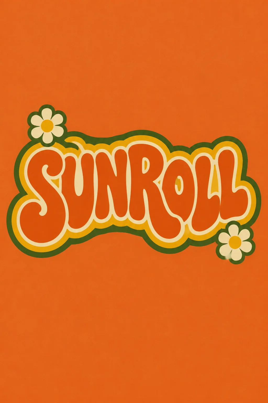
ローラースケート場、古着店、ダンス教室など、楽しいレトロ感を出したいときに使います。太い丸文字、波のリズム、暖かな色の縁が主役です。表紙は架空のスケート場「SUNROLL」。緩やかなS字、橙・黄金色・オリーブ・クリーム、デイジー二輪を使っています。
名前と業種から始める
韓国語名も英語名も実際の表記のまま入れます。韓国語は短い名前ほど波をつけても読みやすくなります。業種は雰囲気の参考で、別の説明文字としては表示しません。名前を翻訳したり、勝手なスローガンを追加したりしない指示です。
波と縁の違いを選択
S字、上向きアーチ、中央が膨らむ形から選びます。文字の縁は二重、一重、下側の平面影です。装飾はデイジー、星、短い波、なしから選択できます。配色は背景を含む3〜4色だけです。空欄なら表紙の橙系4色、S字、二重の縁、デイジーになります。
曲がっても綴りは正確に
写真なしで1:1を選び、GPTやGeminiに送ります。表紙は2:3の例です。文字がつながっていないか、文字の穴や韓国語の終声が潰れていないか確認してください。読みにくければ「波を半分にして、文字の穴を広げて」と依頼します。印刷前に使用するサイズへ縮小して読み、細かな質感で線が消えないよう調整します。商用利用前に商標を検索し、必要な用途ではベクター化してください。