
전체 · 광고/포스터 · 로고·브랜드
161그루비 레트로 로고
두꺼운 둥근 이름에 물결과 따뜻한 색을 더해, 70년대 느낌의 레터링 로고를 만들어요.
받는 것
- 굵고 둥근 이름 중심의 레터링
- 따뜻한 3~4색 물결과 장식
- 70년대 그루비 로고 한 장
ChatGPT 무료 OK
칸 채우기
- 1칸을 채워요
- 2복사 버튼을 눌러요
- 3GPT 채팅창에 붙여넣어요
- 4그대로 보내면 썸네일 예시처럼 나와요
- 5카드에 맞는 실제 사진을 같이 넣으면 그 사진이 반영돼요 — 배경 카드는 배경 사진, 인물 · 음식 카드는 그 사진 선택
프롬프트 원문 보기 4,345자
Generate this image now. Return exactly ONE finished image itself; draw it directly without explanations or questions.
Output size 1080x1080 pixels, 1:1 square card. Keep the same top-to-bottom order but compress the zones to fit the square: the illustration becomes smaller and every text line stays fully readable.
One flat 1970s GROOVY LETTERING LOGO, with the exact brand name as the dominant artwork. Name occupies 72-82% of canvas width in a compact cohesive group. Waves and a few ornaments support the name, not a separate mascot or scene. No mockup, metal, extrusion or identity grid.
Use original brand artwork. Preserve the input name in its original script, spelling, case, spaces and punctuation; never translate or romanize it. Korean and Latin names are both supported. Keep characters readable, including Hangul final consonants. Do not imitate recognizable existing logos, characters or signature marks.
The background fills the canvas edge to edge. Keep essential lettering and all key elements below the top 12% and above the bottom 15%; adapt the spacing to the chosen ratio. No watermark, trademark symbol, field labels, extra sales copy or invented contact details.

[INPUTS FOR THIS IMAGE]
BRAND_NAME selected: "【가게 이름】"
Set BRAND_NAME to this exact input. Preserve character order and readable individual skeletons; no invented slogans.
BUSINESS selected: "【업종】"
Use the business to give the name appropriate energy, without printing the input.
PALETTE selected: "【색 조합】"
Use only the selected three or four warm print colors. Background is one of these colors; keep strong text/background contrast.
Interpret only the selected choice:
- 주황 + 황금 + 올리브 + 크림: burnt orange, golden yellow, dark olive and warm cream
- 코랄 + 벽돌 + 복숭아 + 크림: coral, dark brick, peach and warm cream
- 겨자 + 초콜릿 + 크림: mustard yellow, deep chocolate brown and cream
- 라즈베리 + 살구 + 자두 + 미색: warm raspberry, apricot, dark plum and ivory
If this selection line is missing or empty, use 주황 + 황금 + 올리브 + 크림 only.
WAVE selected: "【글자 물결】"
Warp the baseline and outer rhythm only. Keep counters open and Hangul syllable blocks intact; never merge adjacent characters.
Interpret only the selected choice:
- 완만한 S자: a gentle S-shaped baseline with broad rounded letter bodies
- 위로 둥근 아치: one broad upward arch with optically balanced letters
- 가운데 볼록: slightly taller center letters and smaller side letters, readable rhythm
If this selection line is missing or empty, use 완만한 S자 only.
OUTLINE selected: "【글자 테두리】"
The graphic remains flat ink. Nest the chosen outline snugly around the letters without obscuring the holes.
Interpret only the selected choice:
- 두 겹 색 테두리: two broad nested outline bands in palette colors
- 한 겹 굵은 테두리: one generous high-contrast outline
- 아래 물결 그림자: one flat offset wavy shadow below the lettering, not a 3D extrusion
If this selection line is missing or empty, use 두 겹 색 테두리 only.
ACCENT selected: "【작은 장식】"
Place at most three small flat accents in the gaps around the name; they may not compete with the wordmark.
Interpret only the selected choice:
- 데이지 두 송이: two simple rounded daisies with large centers
- 별 반짝임 두 개: two broad four-point retro sparkles
- 짧은 물결 두 줄: two short decorative wavy stripes
- 없음: no extra accent
If this selection line is missing or empty, use 데이지 두 송이 only.

[RESOLVED DESIGN]
Joyful, professionally drawn 1970s psychedelic-retro wordmark: thick inflated-looking but entirely FLAT rounded letterforms, large open counters, the selected WAVE and tight intentional optical spacing. Use PALETTE for letter faces, the selected OUTLINE and the background; the selected ACCENT punctuates empty side spaces, or omit accents when None is selected. The name is the star and stays one readable line when it fits; wrap a long name into two balanced lines without duplicating any text. Very light screen-print grain may soften broad fills, never scratch out characters. Avoid 1950s diner signs, distressed badges, neon or illegible swirls.
Before returning, compare every rendered name character with BRAND_NAME and repair any misspelling. Keep the same resolved design while correcting letters. Print BRAND_NAME exactly once.

[Final output format]
Output size 1080x1080 pixels, 1:1 square card. Keep the same top-to-bottom order but compress the zones to fit the square: the illustration becomes smaller and every text line stays fully readable.
This selected output format takes priority over any fixed canvas size or aspect ratio elsewhere in this template. Adapt the composition, text zones and margins to the selected canvas without stretching or cropping essential content. Device safe areas apply only when a device is selected. Never print these format instructions on the image.
결과 어땠어요?
이 카드도 많이 사용해요





쓰는 법 · 자주 묻는 것
이름이 통통한 물결이 돼요
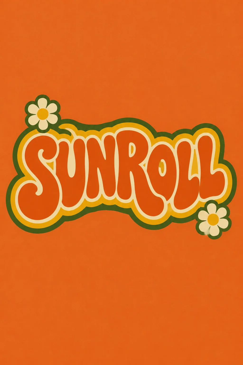
롤러스케이트장·빈티지 숍·댄스 교실처럼 즐겁고 복고적인 인상을 줄 때 씁니다. 두꺼운 둥근 이름, 물결 리듬, 따뜻한 색 테두리가 로고의 주인공이에요. 표지는 가상의 롤러스케이트장 SUNROLL, 완만한 S자 글자, 주황·황금·올리브·크림과 데이지 두 송이입니다.
이름과 업종만 먼저 써요
한글·영문 이름을 표기 그대로 넣습니다. 한글은 짧을수록 물결을 넣어도 읽기 쉬워요. 업종은 활기와 장식의 정도를 정하는 참고 정보이며 별도 설명으로 찍히지 않습니다. 이름을 억지로 영문으로 바꾸거나 슬로건을 더하지 않도록 지시합니다.
물결과 테두리로 차이를 만들어요
글자 물결은 S자·아치·가운데 볼록 중 고릅니다. 테두리는 두 겹, 한 겹, 아래쪽의 평면 물결 그림자가 있어요. 작은 장식은 데이지·별·물결·없음 중 고릅니다. 색은 고른 3~4색만 쓰며 바탕도 그 안에서 정해요. 선택 칸을 비우면 표지의 주황 계열 4색, S자, 두 겹 테두리, 데이지를 사용합니다.
휘어져도 철자는 그대로
사진 없이 1:1로 GPT나 Gemini에 보냅니다. 표지는 2:3 예시입니다. 글자가 붙거나 O·R 같은 구멍이 막히지 않았는지, 한글 받침이 눌리지 않았는지 읽어 보세요. 이름이 어렵게 보이면 ‘물결을 절반으로 줄이고 글자 속 빈틈을 넓혀 줘’라고 요청합니다. 인쇄 전에 실제 스티커나 간판 크기로 줄여 읽고, 거친 질감이 작은 글자에 남지 않게 정리하세요.
상업용 전 키프리스(KIPRIS) 상표 검색 · 크게 쓸 땐 벡터로 다시 그리기