
전체 · 광고/포스터 · 로고·브랜드
175서명 로고
이름의 철자를 살린 자연스러운 손글씨로, 짧고 우아한 서명형 브랜드 로고를 만들어요.
받는 것
- 이름 그대로의 손글씨 서명
- 고른 굵기와 절제된 끝 획
- 종이 바탕의 이름 중심 로고 한 장
ChatGPT 무료 OK
칸 채우기
- 1칸을 채워요
- 2복사 버튼을 눌러요
- 3GPT 채팅창에 붙여넣어요
- 4그대로 보내면 썸네일 예시처럼 나와요
- 5카드에 맞는 실제 사진을 같이 넣으면 그 사진이 반영돼요 — 배경 카드는 배경 사진, 인물 · 음식 카드는 그 사진 선택
프롬프트 원문 보기 4,994자
Generate this image now. Return exactly ONE finished image itself; draw it directly without explanations or questions.
Output size 1080x1080 pixels, 1:1 square card. Keep the same top-to-bottom order but compress the zones to fit the square: the illustration becomes smaller and every text line stays fully readable.
One original HANDWRITTEN SIGNATURE BRAND LOGO, the exact name as the only text, centered at 70-82% of canvas width. A naturally connected Latin signature, or coherent legible hand-lettered syllables for Hangul. No monogram, portrait, pen, certificate, business card mockup or second tagline.
Use original brand artwork. Preserve the input name in its original script, spelling, case, spaces and punctuation; never translate or romanize it. Korean and Latin names are both supported. Keep characters readable, including Hangul final consonants. Do not imitate recognizable existing logos, characters or signature marks.
The background fills the canvas edge to edge. Keep essential lettering and all key elements below the top 12% and above the bottom 15%; adapt the spacing to the chosen ratio. No watermark, trademark symbol, field labels, extra sales copy or invented contact details.

[INPUTS FOR THIS IMAGE]
BRAND_NAME selected: "【이름】"
Set BRAND_NAME to this exact input. Latin names are recommended for flowing signature lettering. For Hangul, use a short legible handwritten name, preserve every syllable and final consonant, and never romanize it. This is original brand lettering, not an imitation of a real person signature.
BUSINESS selected: "【업종】"
Use the business only to tune the temperament of the handwriting. Do not print the input.
HANDWRITING selected: "【손글씨 느낌】"
Keep the spelling fully readable and avoid loops that add phantom letters. For non-Latin scripts interpret the mood, not Latin letter shapes.
Interpret only the selected choice:
- 유려하지만 또렷하게: fluid moderately slanted lettering with clear open lowercase forms
- 단정하고 여유롭게: calm relatively upright handwriting, generous spacing
- 경쾌한 붓펜: light brush-pen rhythm with restrained thick-thin variation, no paint splatter
If this selection line is missing or empty, use 유려하지만 또렷하게 only.
WEIGHT selected: "【획 굵기】"
Keep enough weight for phone-size reading. Fine strokes should never vanish, and thick strokes must not close small counters.
Interpret only the selected choice:
- 읽기 좋은 중간 획: medium signature strokes with modest pressure variation
- 섬세한 획: delicate but continuous ink lines, not hairline-thin
- 힘 있는 획: confident thicker ink strokes with open counters
If this selection line is missing or empty, use 읽기 좋은 중간 획 only.
FLOURISH selected: "【끝 획 장식】"
Use at most one restrained finishing gesture, connected to the name when possible. It never crosses letter bodies or replaces a letter.
Interpret only the selected choice:
- 짧은 밑줄: one short gently curved finishing underline beneath the final half of the name
- 긴 흐르는 밑줄: one long gently flowing underline below the name with clear separation
- 장식 없이: plain clean ending with no underline or extra ornament
If this selection line is missing or empty, use 짧은 밑줄 only.
INK selected: "【잉크 색】"
Use one matte opaque ink color only, no gold foil, metal reflections or gradients.
Interpret only the selected choice:
- 짙은 인디고: deep indigo ink
- 짙은 에스프레소: deep espresso-brown ink
- 먹색: soft ink-black ink
- 짙은 버건디: deep burgundy ink
If this selection line is missing or empty, use 짙은 인디고 only.
PAPER selected: "【종이 바탕】"
Keep one quiet subtly textured paper surface and sufficient name/background contrast. No ruled notebook, stationery collage or torn corners.
Interpret only the selected choice:
- 옅은 살구: very pale apricot cotton paper
- 우유색: warm milk-white cotton paper
- 연한 돌 회색: light stone-gray uncoated paper
- 옅은 라벤더: pale lavender uncoated paper
If this selection line is missing or empty, use 옅은 살구 only.

[RESOLVED DESIGN]
A luxury but readable handwritten brand identity tailored to BUSINESS: the exact name in INK on PAPER, using HANDWRITING and WEIGHT. Natural hand pressure, controlled ascenders and descenders, clearly differentiated letters and an authentic pause at every input space. Latin lowercase may connect gracefully; Hangul syllable shapes remain fully intact. Apply only FLOURISH below or at the end without crossing letter bodies, and omit extra gestures when No flourish is selected. Quiet balanced composition, continuous strokes strong enough to read at thumbnail size. Subtle paper fibres are secondary; the lettering is the finished work. No random loops, invented dots, repeating name, personal authentication details or imitation of a famous signature.
Before returning, compare every rendered name character with BRAND_NAME and repair any misspelling. Keep the same resolved design while correcting letters. Print BRAND_NAME exactly once.

[Final output format]
Output size 1080x1080 pixels, 1:1 square card. Keep the same top-to-bottom order but compress the zones to fit the square: the illustration becomes smaller and every text line stays fully readable.
This selected output format takes priority over any fixed canvas size or aspect ratio elsewhere in this template. Adapt the composition, text zones and margins to the selected canvas without stretching or cropping essential content. Device safe areas apply only when a device is selected. Never print these format instructions on the image.
결과 어땠어요?
이 카드도 많이 사용해요






쓰는 법 · 자주 묻는 것
이름 자체가 우아한 로고가 돼요
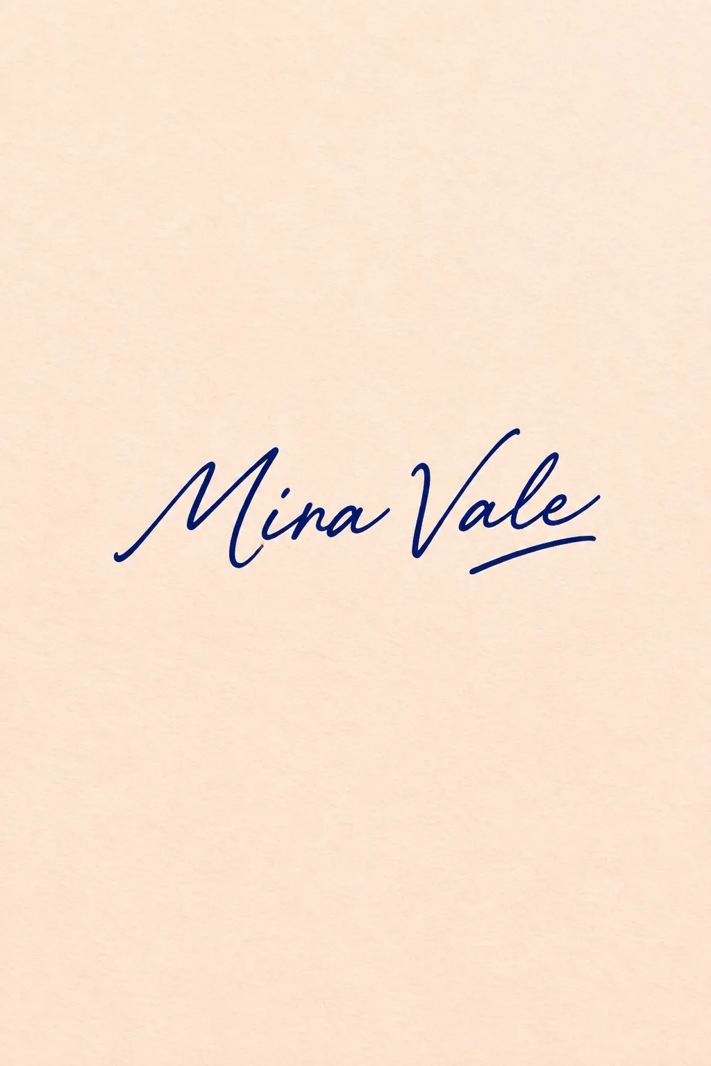
웨딩 플래너·사진가·작가처럼 이름을 브랜드로 쓰는 사람에게 맞습니다. 상징을 따로 붙이지 않고 자연스러운 손글씨와 끝 획 하나로 인상을 만들어요. 표지는 가상의 웨딩 플래너 Mira Vale, 짙은 인디고 잉크와 옅은 살구 종이, 짧은 밑줄의 예입니다. 실제 개인의 서명을 복제하는 카드가 아닙니다.
영문 이름을 권장해요
이름은 대소문자·공백·점을 포함해 원하는 표기 그대로 적습니다. 이어 쓰는 서명 느낌은 영문이 편합니다. 한글도 가능하지만 2~4글자처럼 짧게 쓰고 받침을 한 글자씩 확인하세요. 이름을 영문으로 자동 변환하지 않습니다. 업종은 필체 분위기에만 쓰고 별도 문구로 찍지 않아요.
획과 끝 장식을 조절해요
유려한 글씨, 단정한 글씨, 붓펜 느낌 중 고릅니다. 획은 섬세·중간·힘 있는 굵기를, 끝 장식은 짧은 밑줄·긴 밑줄·없음을 정해요. 잉크와 종이색도 각각 고를 수 있습니다. 비우면 표지처럼 유려하지만 또렷한 글씨, 중간 획, 짧은 밑줄, 인디고, 살구 바탕을 사용합니다.
멋보다 이름을 먼저 읽어요
사진 없이 1:1로 GPT나 Gemini에 보냅니다. 표지는 2:3 예시예요. 영문 i의 점, r·n의 구분, 이름 사이 공백과 한글 받침을 확인합니다. 읽기 어려우면 ‘꾸민 고리를 줄이고 모든 글자를 구분해 줘’, 한글이 틀리면 ‘이름만 입력한 철자로 정확히 고쳐 줘’라고 요청하세요. 작은 프로필에서는 섬세한 획보다 중간 획이 잘 남습니다. 인쇄·간판용은 배경 없는 도안과 벡터 작업을 따로 준비합니다.
상업용 전 키프리스(KIPRIS) 상표 검색 · 크게 쓸 땐 벡터로 다시 그리기