
すべて · 広告・ポスター · ロゴ・ブランド
077ワンラインアートロゴ
一筆でつながる大きなシンボルと名前を、箔やエンボスで上品に仕上げます。
受け取れるもの
- 一本の線でつながる大きなシンボル
- シンボルの下に正確な名前
- 箔やエンボスなど選んだ素材のロゴ一枚
ChatGPT 無料 OK
項目を入力
- 1項目を入力します
- 2コピーを押します
- 3GPTのチャットに貼り付けます
- 4そのまま送ると、サムネイルの例のような画像になります
- 5カードに合う実際の写真を一緒に入れると反映されます。背景カードなら背景の写真、人物・料理カードならその写真 任意
プロンプト全文を見る 5,564文字
Generate this image now. Return exactly ONE finished logo image itself; draw it directly, without explanations or questions.
出力サイズは1080×1080ピクセル、1:1の正方形にしてください。文字を読みやすく配置してください。
Create one original professional brand identity, one finished composition and one material. No options sheet, multiple applications, props, hands, devices or collage. Never imitate an existing brand's recognizable logo, mascot or typography. Do not add slogans, field labels, unrelated words, watermarks or trademark symbols. The chosen substrate fills the canvas edge to edge.
Keep all essential lettering below the top 12% and above the bottom 15% of the canvas. Center the complete logo group with quiet margins, about 70-78% of canvas width. Adapt the same identity to the chosen ratio without changing the style.

[INPUTS FOR THIS IMAGE]
お店の名前 selected: "【お店の名前】"
Set BRAND_NAME to this input. Preserve its exact spelling, case, spaces and punctuation. Print it exactly once. Never translate or romanize it. If explicitly asked to choose, invent one short original name. If no name was supplied, ask for the name rather than inventing an existing business. Do not print the field label.
一筆のシンボル selected: "【一筆のシンボル】"
Use one subject described by this input, preserving the requested defining feature. If asked to choose or no subject was supplied, use an open seashell whose upper and lower contours flow into one pearl loop along a SINGLE UNBROKEN path. Keep the silhouette immediately recognizable at small size.
素材 selected: "【素材】"
Apply only this finish to the whole logo. Preserve the fixed style of this card. Foil keeps its physical metal color; palette changes mainly affect the substrate. One continuous surface fills the canvas.
Interpret the selected choice as follows (use only the selected one):
- プラム紙の金箔: warm gold foil, shallow debossed edges and delicate metal highlights on deep plum cotton paper.
- パール紙のエンボス: raised pearl-white embossed line and name, directional light making every contour readable.
- 薄灰紙の銀箔: silver foil with crisp edges on pale gray cotton paper.
- 薄桃紙の活版印刷: dark plum letterpress line slightly pressed into blush pink paper.
- シャンパン色の金属サイン: raised champagne-gold metal line on muted warm gray plaster.
- フラット: clean solid continuous line and wordmark, no material shadows.
If the selection line is absent or empty, use プラム紙の金箔 only.
配色 selected: "【配色】"
Use this restrained palette and necessary substrate tones only. Keep the name clearly readable against its background. Real metal retains its physical color.
Interpret the selected choice as follows (use only the selected one):
- 金+濃いプラム: gold on deep plum.
- パール+白: pearl-white relief on white, readable shadow contrast.
- 銀+薄灰: silver on pale gray.
- プラム+薄桃: plum on pale blush.
If the selection line is absent or empty, use 金+濃いプラム only.
名前の書体 selected: "【名前の書体】"
The name is separate from the continuous symbol line and must remain easily readable.
Interpret the selected choice as follows (use only the selected one):
- 細く端正なゴシック: refined light sans serif, enough weight to remain readable.
- 優雅な明朝: elegant serif with moderate contrast, open counters.
- 簡潔な丸文字: simple gently rounded lettering with intact character shapes.
If the selection line is absent or empty, use 細く端正なゴシック only.
線の太さ selected: "【線の太さ】"
One unbroken line traces the subject, with no sketch hatching, filled silhouette or separate decorative marks.
Interpret the selected choice as follows (use only the selected one):
- 明瞭な中細線: medium line, roughly 10-14 pixels at 1024-wide output, large enough for thumbnail visibility.
- 繊細な線: fine but readable line, roughly 7-9 pixels at 1024-wide output.
- 力強い線: strong line, roughly 15-19 pixels at 1024-wide output.
If the selection line is absent or empty, use 明瞭な中細線 only.

[RESOLVED DESIGN]
A LARGE graceful ONE-CONTINUOUS-LINE symbol above a restrained exact wordmark. A SINGLE unbroken non-branching path forms the subject. Default an open shell: flow from the upper rim around the hinge into the lower bowl contour, then form one pearl loop connected to that same path. No separate floating pearl, parallel interior hatching, double outlines, filled areas or extra decorative strokes. Keep the gold path evenly medium-thin, elegant but clearly visible. Exactly two path ends, no split branches. The symbol itself occupies 60-66% of canvas width and about 34-40% of canvas height in a portrait image, with medium clear line weight. It must feel substantial, never a tiny thin sketch floating in empty space. BRAND_NAME below occupies about 35-45% of width, enough letter size to read on a phone. Default genuine warm gold foil and gentle debossing on deep plum cotton paper, with believable metal highlights and raking light. The name uses the same finish. Keep the whole identity around the central vertical zone. Premium jewelry-house restraint; the large flowing symbol and tangible finish are essential.
Before returning, compare every visible name character with BRAND_NAME, one by one, including Hangul initial consonants, vowels and final consonants. Repair missing or altered letters while retaining the design. Print the brand name exactly once. The finish may be realistic, but the identity must remain clear at thumbnail size.

[Final output format]
出力サイズは1080×1080ピクセル、1:1の正方形にしてください。文字を読みやすく配置してください。
This selected output format takes priority over any fixed canvas size or aspect ratio elsewhere in this template. Adapt the composition, text zones and margins to the selected canvas without stretching or cropping essential content. Device safe areas apply only when a device is selected. Never print these format instructions on the image.
結果はどうでしたか?
こちらのカードも人気です






使い方・よくある質問
一本の線を主人公に
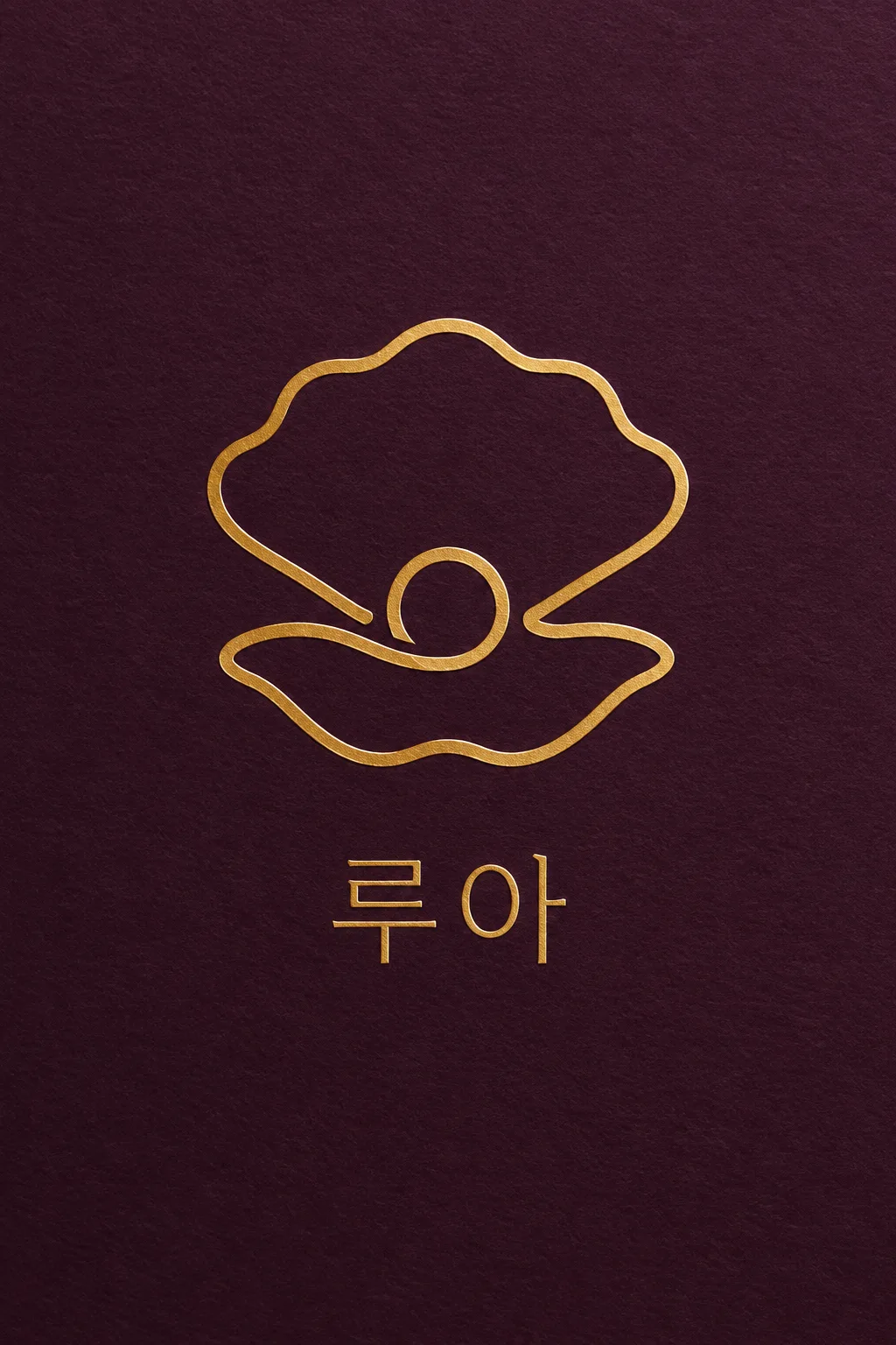
ジュエリー、スキンケア、スタジオなど、繊細なシンボルを大きく見せたいブランドに使います。ペンを離さずに描いたようにつながった線の下に、お店の名前を配置します。表紙は、架空のジュエリーブランド「루아」と、一粒の真珠を抱いた開いた貝を、プラム紙の金箔で作った例です。小さくて平坦な線画の代わりに、シンボルが画面幅の半分以上を占め、金属の反射や押された跡が見えるように設計しました。
一本の線でつながる対象を書く
お店の名前と一筆のシンボルを記入します。「貝」とだけ書くよりも、「貝の上・下の輪郭と真珠のリングが一筆書きのようにつながった姿」のように、つなぐ部分を書くのがおすすめです。横顔・やかん・枝・手の例、または「おまかせ」も使えます。名前はシンボルの線に混ぜず、下部に一度だけ入れます。複数の動物や背景の風景を入れると、一筆書き特有の簡潔さが弱まります。
細さより大きく、素材は本物のように
素材は、プラム紙の金箔、パール紙のエンボス、薄灰紙の銀箔、薄桃紙の活版印刷、シャンパン色の金属サイン、フラットの6種類です。金箔は金属色を維持し、まわりの配色は主に背景に反映されます。白いエンボスは光と影で線を読み取らせます。線の太さを変えてもシンボルのサイズは維持します。選択欄を空欄にすると、金+濃いプラム、細く端正なゴシック、明瞭な中細線が基本になります。
途切れた線と誤字を見る
写真なしで1:1を選び、プロンプトを送信します。名前を1文字ずつ読み、シンボルの線を目で追いながら、途切れたところや絡まったループがないか確認します。線が小さく見えたら「シンボルをもっと大きく、線は中細線で」、線が途切れていたら「貝と真珠のリングの輪郭を1本のつながった線に直して」とリクエストします。金箔の写真は素材の例ですので、実際の箔加工は印刷所に最小線の太さを確認し、フラットな図面を準備します。表紙は2:3、基本の結果は1:1です。
商用利用前にKIPRISおよび利用する国の商標データベースで検索し、大きく使うときはベクターで描き直してください。