
전체 · 광고/포스터 · 로고·브랜드
077한 줄 라인아트 로고
펜을 떼지 않은 듯 이어진 큰 상징을 금박이나 엠보싱으로 고급스럽게 만들어요.
받는 것
- 한 줄로 이어진 큰 상징 하나
- 상징 아래에 정확한 이름
- 금박 또는 엠보싱 등 고른 재질의 로고 한 장
ChatGPT 무료 OK
칸 채우기
- 1칸을 채워요
- 2복사 버튼을 눌러요
- 3GPT 채팅창에 붙여넣어요
- 4그대로 보내면 썸네일 예시처럼 나와요
- 5카드에 맞는 실제 사진을 같이 넣으면 그 사진이 반영돼요 — 배경 카드는 배경 사진, 인물 · 음식 카드는 그 사진 선택
프롬프트 원문 보기 5,595자
Generate this image now. Return exactly ONE finished logo image itself; draw it directly, without explanations or questions.
Output size 1080x1080 pixels, 1:1 square card. Keep the same top-to-bottom order but compress the zones to fit the square: the illustration becomes smaller and every text line stays fully readable.
Create one original professional brand identity, one finished composition and one material. No options sheet, multiple applications, props, hands, devices or collage. Never imitate an existing brand's recognizable logo, mascot or typography. Do not add slogans, field labels, unrelated words, watermarks or trademark symbols. The chosen substrate fills the canvas edge to edge.
Keep all essential lettering below the top 12% and above the bottom 15% of the canvas. Center the complete logo group with quiet margins, about 70-78% of canvas width. Adapt the same identity to the chosen ratio without changing the style.

[INPUTS FOR THIS IMAGE]
가게 이름 selected: "【가게 이름】"
Set BRAND_NAME to this input. Preserve its exact spelling, case, spaces and punctuation. Print it exactly once. Never translate or romanize it. If explicitly asked to choose, invent one short original name. If no name was supplied, ask for the name rather than inventing an existing business. Do not print the field label.
한 줄 상징 selected: "【한 줄 상징】"
Use one subject described by this input, preserving the requested defining feature. If asked to choose or no subject was supplied, use an open seashell whose upper and lower contours flow into one pearl loop along a SINGLE UNBROKEN path. Keep the silhouette immediately recognizable at small size.
재질 selected: "【재질】"
Apply only this finish to the whole logo. Preserve the fixed style of this card. Foil keeps its physical metal color; palette changes mainly affect the substrate. One continuous surface fills the canvas.
Interpret the selected choice as follows (use only the selected one):
- 자주 종이 금박: warm gold foil, shallow debossed edges and delicate metal highlights on deep plum cotton paper.
- 진주빛 종이 엠보싱: raised pearl-white embossed line and name, directional light making every contour readable.
- 연회색 종이 은박: silver foil with crisp edges on pale gray cotton paper.
- 연분홍 종이 레터프레스: dark plum letterpress line slightly pressed into blush pink paper.
- 샴페인 금속 간판: raised champagne-gold metal line on muted warm gray plaster.
- 평면: clean solid continuous line and wordmark, no material shadows.
If the selection line is absent or empty, use 자주 종이 금박 only.
색 조합 selected: "【색 조합】"
Use this restrained palette and necessary substrate tones only. Keep the name clearly readable against its background. Real metal retains its physical color.
Interpret the selected choice as follows (use only the selected one):
- 금색 + 짙은 자주: gold on deep plum.
- 진주색 + 흰색: pearl-white relief on white, readable shadow contrast.
- 은색 + 연회색: silver on pale gray.
- 자주 + 연분홍: plum on pale blush.
If the selection line is absent or empty, use 금색 + 짙은 자주 only.
이름 글꼴 selected: "【이름 글꼴】"
The name is separate from the continuous symbol line and must remain easily readable.
Interpret the selected choice as follows (use only the selected one):
- 가늘고 단정한 고딕: refined light sans serif, enough weight to remain readable.
- 우아한 명조: elegant serif with moderate contrast, open counters.
- 간결한 둥근 글씨: simple gently rounded lettering with intact character shapes.
If the selection line is absent or empty, use 가늘고 단정한 고딕 only.
선 굵기 selected: "【선 굵기】"
One unbroken line traces the subject, with no sketch hatching, filled silhouette or separate decorative marks.
Interpret the selected choice as follows (use only the selected one):
- 또렷한 중간 선: medium line, roughly 10-14 pixels at 1024-wide output, large enough for thumbnail visibility.
- 섬세한 선: fine but readable line, roughly 7-9 pixels at 1024-wide output.
- 힘 있는 선: strong line, roughly 15-19 pixels at 1024-wide output.
If the selection line is absent or empty, use 또렷한 중간 선 only.

[RESOLVED DESIGN]
A LARGE graceful ONE-CONTINUOUS-LINE symbol above a restrained exact wordmark. A SINGLE unbroken non-branching path forms the subject. Default an open shell: flow from the upper rim around the hinge into the lower bowl contour, then form one pearl loop connected to that same path. No separate floating pearl, parallel interior hatching, double outlines, filled areas or extra decorative strokes. Keep the gold path evenly medium-thin, elegant but clearly visible. Exactly two path ends, no split branches. The symbol itself occupies 60-66% of canvas width and about 34-40% of canvas height in a portrait image, with medium clear line weight. It must feel substantial, never a tiny thin sketch floating in empty space. BRAND_NAME below occupies about 35-45% of width, enough letter size to read on a phone. Default genuine warm gold foil and gentle debossing on deep plum cotton paper, with believable metal highlights and raking light. The name uses the same finish. Keep the whole identity around the central vertical zone. Premium jewelry-house restraint; the large flowing symbol and tangible finish are essential.
Before returning, compare every visible name character with BRAND_NAME, one by one, including Hangul initial consonants, vowels and final consonants. Repair missing or altered letters while retaining the design. Print the brand name exactly once. The finish may be realistic, but the identity must remain clear at thumbnail size.

[Final output format]
Output size 1080x1080 pixels, 1:1 square card. Keep the same top-to-bottom order but compress the zones to fit the square: the illustration becomes smaller and every text line stays fully readable.
This selected output format takes priority over any fixed canvas size or aspect ratio elsewhere in this template. Adapt the composition, text zones and margins to the selected canvas without stretching or cropping essential content. Device safe areas apply only when a device is selected. Never print these format instructions on the image.
결과 어땠어요?
이 카드도 많이 사용해요






쓰는 법 · 자주 묻는 것
선 하나를 주인공으로
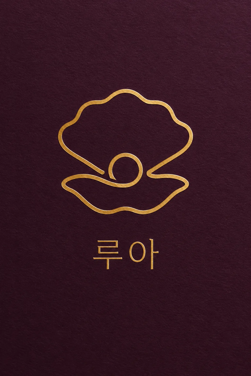
주얼리·스킨케어·스튜디오처럼 섬세한 상징을 크게 보여 주고 싶은 브랜드에 씁니다. 펜을 떼지 않은 듯 이어진 선 아래에 이름을 놓아요. 표지는 가상의 주얼리 브랜드 ‘루아’와 진주 한 알을 품은 열린 조개를 짙은 자주색 종이의 금박으로 만든 예입니다. 작고 밋밋한 선 그림 대신, 상징이 화면 너비의 절반 이상을 차지하고 금속 반사와 눌린 자국이 보이게 설계했습니다.
한 줄로 이어질 대상을 적어요
가게 이름과 한 줄 상징을 채웁니다. ‘조개’만 쓰기보다 ‘조개 위·아래 윤곽과 진주 고리가 한 줄로 이어진 모습’처럼 연결할 부분을 적으면 좋아요. 옆얼굴·주전자·가지·손 보기나 ‘알아서 골라줘’도 쓸 수 있습니다. 이름은 상징 선에 섞지 않고 아래에 한 번만 넣습니다. 여러 동물이나 배경 풍경을 넣으면 한 줄 특유의 간결함이 약해집니다.
얇기보다 크게, 재질은 실제처럼
재질은 자주 종이 금박·진주빛 엠보싱·연회색 은박·연분홍 레터프레스·샴페인 금속·평면 여섯 가지예요. 금박은 금속색을 유지하고 색 조합은 주로 바탕에 반영합니다. 흰 엠보싱은 빛과 그림자로 선을 읽게 해요. 선 굵기를 바꾸어도 상징 크기는 유지합니다. 선택 칸을 비우면 금색·자주, 단정한 가는 고딕, 또렷한 중간 선이 기본입니다.
끊긴 선과 오타를 보세요
사진 없이 1:1을 고르고 프롬프트를 보내세요. 이름을 한 글자씩 읽고, 상징의 선을 눈으로 따라가며 끊긴 곳이나 뭉친 고리가 없는지 확인합니다. 선이 작게 보이면 ‘상징만 더 크게, 선은 중간 굵기로’, 선이 끊기면 ‘조개와 진주 고리의 윤곽을 한 개의 이어진 선으로 고쳐 줘’라고 요청해요. 금박 사진은 재질 예시이므로 실제 박 가공은 인쇄소에 최소 선 굵기를 확인하고 평면 도안을 준비합니다. 표지는 2:3, 기본 결과는 1:1입니다.
상업용 전 키프리스(KIPRIS) 상표 검색 · 크게 쓸 땐 벡터로 다시 그리기