
すべて · 広告・ポスター · ロゴ・ブランド
174リソラベルロゴ
2〜3色のインクの重なり、網点、小さな版ずれで手作り商品のラベルロゴを作ります。
受け取れるもの
- ブランド名と商品名のあるラベル一枚
- 大きな簡潔な絵と2〜3色の重なり
- 網点と小さな版ずれの紙の質感
ChatGPT 無料 OK
項目を入力
- 1項目を入力します
- 2コピーを押します
- 3GPTのチャットに貼り付けます
- 4そのまま送ると、サムネイルの例のような画像になります
- 5カードに合う実際の写真を一緒に入れると反映されます。背景カードなら背景の写真、人物・料理カードならその写真 任意
プロンプト全文を見る 4,842文字
Generate this image now. Return exactly ONE finished image itself; draw it directly without explanations or questions.
出力サイズは1080×1080ピクセル、1:1の正方形にしてください。文字を読みやすく配置してください。
One RISO-PRINTED MAKER LABEL identity on uncoated paper. A single coherent label fills 68-78% of canvas width, with a dominant brand name near its top, one large simple illustration in the middle and a short product name below. No label sheets, jar mockups, bottles, gift sets or presentation board. The printed label is itself the artwork.
Use original brand artwork. Preserve the input name in its original script, spelling, case, spaces and punctuation; never translate or romanize it. Korean and Latin names are both supported. Keep characters readable, including Hangul final consonants. Do not imitate recognizable existing logos, characters or signature marks.
The background fills the canvas edge to edge. Keep essential lettering and all key elements below the top 12% and above the bottom 15%; adapt the spacing to the chosen ratio. No watermark, trademark symbol, field labels, extra sales copy or invented contact details.

[INPUTS FOR THIS IMAGE]
BRAND_NAME selected: "【お店・ブランド名】"
Set BRAND_NAME to this exact input. Render once as the label headline.
PRODUCT_NAME selected: "【商品名】"
Set PRODUCT_NAME to this exact input and print it once below the illustration, smaller than BRAND_NAME. Do not invent ingredients, claims, weights, certifications or prices.
ILLUSTRATION selected: "【ラベルの絵】"
Draw one broad original illustration from this input. Use large overlapping ink shapes, readable at label size. If asked to choose, infer one simple motif from PRODUCT_NAME.
INKS selected: "【インクの色】"
Use exactly the specified two or three inks plus the selected paper. Overprinted areas may show the natural mixed color, never extra independent inks.
Interpret only the selected choice:
- 鮮やかな桃+群青: two inks: fluorescent hot pink and rich ultramarine
- 青緑+朱: two inks: deep teal and vermilion
- 黄+青+赤: three inks: warm yellow, blue and red
- 苔色+プラム: two inks: moss green and dark plum
If this selection line is missing or empty, use 鮮やかな桃+群青 only.
HALFTONE selected: "【網点の大きさ】"
Apply halftone dots to broad shaded illustration areas, not through letter edges. Dots are regular print screens with a light imperfect texture, not random digital noise.
Interpret only the selected choice:
- 明瞭な中粒点: readable medium round halftone dots, about 4-6 pixels at 1024-wide output
- 細かい点: fine round halftone dots, about 2-3 pixels at 1024-wide output
- 粗い点: coarse round dots, about 7-9 pixels at 1024-wide output, contained in broad shaded shapes
If this selection line is missing or empty, use 明瞭な中粒点 only.
REGISTRATION selected: "【版ずれ】"
Offset only secondary illustration color plates and border accents. Keep both exact text lines registered and readable.
Interpret only the selected choice:
- 小さな版ずれ: a subtle 2-3 pixel offset between illustration ink plates at 1024-wide output
- ほぼ整列: a nearly aligned print with no more than a one-pixel illustration drift
- 目に見える版ずれ: a visible but controlled 4-5 pixel offset in illustration plates, never duplicated text
If this selection line is missing or empty, use 小さな版ずれ only.
PAPER selected: "【紙地】"
Show subtle absorbent uncoated-paper fibre. No cardboard box, shiny plastic or simulated folded packaging.
Interpret only the selected choice:
- 暖かな生成り: warm ivory uncoated paper
- 明るい白: bright white uncoated paper
- 淡いバター色: pale butter-colored uncoated paper
- 淡い灰桃: pale gray-pink uncoated paper
If this selection line is missing or empty, use 暖かな生成り only.

[RESOLVED DESIGN]
A bold contemporary small-batch maker label. Exact BRAND_NAME in a large friendly condensed display face, the selected ILLUSTRATION using INKS, and exact PRODUCT_NAME in clean readable smaller lettering. One rectangular keyline using the darkest selected ink with generous inner padding ties the composition together on PAPER. Ink is matte, slightly absorbent and imperfect at edges; overlapping translucent inks create natural mixed-color areas without adding independent inks. Apply HALFTONE in broad illustration shading and REGISTRATION only to illustration plates and border accents. Both text lines remain sharp and fully registered. No fake handmade badge, batch number, ingredient list, healing claim, barcode or certification stamp.
Before returning, compare every rendered name character with BRAND_NAME and repair any misspelling. Keep the same resolved design while correcting letters. Print BRAND_NAME exactly once.

[Final output format]
出力サイズは1080×1080ピクセル、1:1の正方形にしてください。文字を読みやすく配置してください。
This selected output format takes priority over any fixed canvas size or aspect ratio elsewhere in this template. Adapt the composition, text zones and margins to the selected canvas without stretching or cropping essential content. Device safe areas apply only when a device is selected. Never print these format instructions on the image.
結果はどうでしたか?
こちらのカードも人気です





使い方・よくある質問
小さな手作り商品につけるラベル
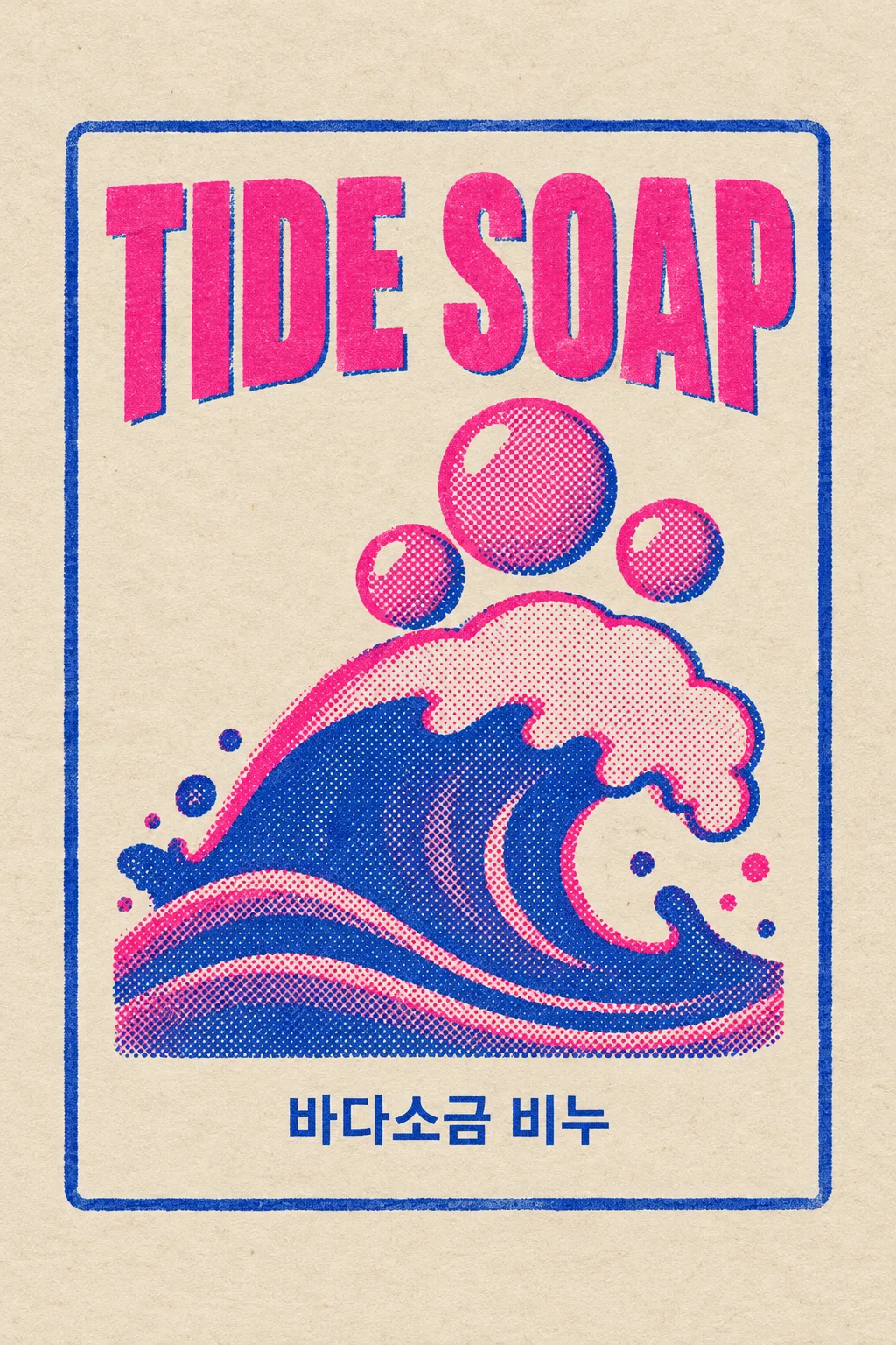
手作り石けん、ジャム、キャンドル、ノートなどに使います。ブランド名、商品名、大きな絵を2〜3色のリソ印刷風にまとめます。表紙は架空の石けんブランド「TIDE SOAP」。海塩石けんの商品名、波と泡、鮮やかな桃色と群青のインク、生成りの紙が例です。紫に見える部分は二つのインクの重なりです。
名前二つと絵を入力
実際のブランド名と短い商品名を入れます。韓国語も英語も使えます。絵は「波一本と泡三つ」のような大きな形を指定します。候補や「おまかせ」で下案を作れますが、実商品には本当の商品名を入力してください。成分、量、効能、認証、価格を勝手に作らない指示です。
インクの重なりと版ずれ
配色ボタンにある2〜3色のインクだけを使います。網点は絵の大きな陰影部分、版ずれは絵の色版と縁だけに適用します。名前は整列したまま読める状態です。紙色も選べます。空欄なら表紙の二色、中粒点、小さな版ずれ、生成りの紙になります。
文字が二重なら整列させる
写真なしで1:1を選び、GPTやGeminiへ送ります。表紙は2:3の例です。二つの名前、点の大きさ、色数を確認してください。読みにくければ「文字は整列し、絵の色版だけ2ピクセルずらして」と依頼します。リソ分版データではなくラベルのデザイン画像です。正確な商品表示は別途用意し、印刷所とサイズ・色版を調整します。商用利用前の商標検索と、必要に応じたベクター化も行ってください。