
전체 · 광고/포스터 · 로고·브랜드
174리소 라벨 로고
2~3색 잉크 겹침과 망점, 작은 인쇄 어긋남으로 수제 상품의 라벨 로고를 만들어요.
받는 것
- 이름과 상품명이 들어간 라벨 한 장
- 큰 단순 그림과 2~3색 겹침
- 망점과 작은 인쇄 어긋남의 종이 질감
ChatGPT 무료 OK
칸 채우기
- 1칸을 채워요
- 2복사 버튼을 눌러요
- 3GPT 채팅창에 붙여넣어요
- 4그대로 보내면 썸네일 예시처럼 나와요
- 5카드에 맞는 실제 사진을 같이 넣으면 그 사진이 반영돼요 — 배경 카드는 배경 사진, 인물 · 음식 카드는 그 사진 선택
프롬프트 원문 보기 4,867자
Generate this image now. Return exactly ONE finished image itself; draw it directly without explanations or questions.
Output size 1080x1080 pixels, 1:1 square card. Keep the same top-to-bottom order but compress the zones to fit the square: the illustration becomes smaller and every text line stays fully readable.
One RISO-PRINTED MAKER LABEL identity on uncoated paper. A single coherent label fills 68-78% of canvas width, with a dominant brand name near its top, one large simple illustration in the middle and a short product name below. No label sheets, jar mockups, bottles, gift sets or presentation board. The printed label is itself the artwork.
Use original brand artwork. Preserve the input name in its original script, spelling, case, spaces and punctuation; never translate or romanize it. Korean and Latin names are both supported. Keep characters readable, including Hangul final consonants. Do not imitate recognizable existing logos, characters or signature marks.
The background fills the canvas edge to edge. Keep essential lettering and all key elements below the top 12% and above the bottom 15%; adapt the spacing to the chosen ratio. No watermark, trademark symbol, field labels, extra sales copy or invented contact details.

[INPUTS FOR THIS IMAGE]
BRAND_NAME selected: "【가게 이름】"
Set BRAND_NAME to this exact input. Render once as the label headline.
PRODUCT_NAME selected: "【상품 이름】"
Set PRODUCT_NAME to this exact input and print it once below the illustration, smaller than BRAND_NAME. Do not invent ingredients, claims, weights, certifications or prices.
ILLUSTRATION selected: "【라벨 그림】"
Draw one broad original illustration from this input. Use large overlapping ink shapes, readable at label size. If asked to choose, infer one simple motif from PRODUCT_NAME.
INKS selected: "【잉크 색】"
Use exactly the specified two or three inks plus the selected paper. Overprinted areas may show the natural mixed color, never extra independent inks.
Interpret only the selected choice:
- 진분홍 + 군청: two inks: fluorescent hot pink and rich ultramarine
- 청록 + 주홍: two inks: deep teal and vermilion
- 노랑 + 파랑 + 빨강: three inks: warm yellow, blue and red
- 이끼 + 자두: two inks: moss green and dark plum
If this selection line is missing or empty, use 진분홍 + 군청 only.
HALFTONE selected: "【망점 크기】"
Apply halftone dots to broad shaded illustration areas, not through letter edges. Dots are regular print screens with a light imperfect texture, not random digital noise.
Interpret only the selected choice:
- 또렷한 중간 점: readable medium round halftone dots, about 4-6 pixels at 1024-wide output
- 고운 점: fine round halftone dots, about 2-3 pixels at 1024-wide output
- 굵은 점: coarse round dots, about 7-9 pixels at 1024-wide output, contained in broad shaded shapes
If this selection line is missing or empty, use 또렷한 중간 점 only.
REGISTRATION selected: "【인쇄 어긋남】"
Offset only secondary illustration color plates and border accents. Keep both exact text lines registered and readable.
Interpret only the selected choice:
- 살짝 어긋나게: a subtle 2-3 pixel offset between illustration ink plates at 1024-wide output
- 거의 가지런하게: a nearly aligned print with no more than a one-pixel illustration drift
- 눈에 띄는 어긋남: a visible but controlled 4-5 pixel offset in illustration plates, never duplicated text
If this selection line is missing or empty, use 살짝 어긋나게 only.
PAPER selected: "【종이 바탕】"
Show subtle absorbent uncoated-paper fibre. No cardboard box, shiny plastic or simulated folded packaging.
Interpret only the selected choice:
- 따뜻한 미색: warm ivory uncoated paper
- 밝은 흰색: bright white uncoated paper
- 옅은 버터색: pale butter-colored uncoated paper
- 연한 회분홍: pale gray-pink uncoated paper
If this selection line is missing or empty, use 따뜻한 미색 only.

[RESOLVED DESIGN]
A bold contemporary small-batch maker label. Exact BRAND_NAME in a large friendly condensed display face, the selected ILLUSTRATION using INKS, and exact PRODUCT_NAME in clean readable smaller lettering. One rectangular keyline using the darkest selected ink with generous inner padding ties the composition together on PAPER. Ink is matte, slightly absorbent and imperfect at edges; overlapping translucent inks create natural mixed-color areas without adding independent inks. Apply HALFTONE in broad illustration shading and REGISTRATION only to illustration plates and border accents. Both text lines remain sharp and fully registered. No fake handmade badge, batch number, ingredient list, healing claim, barcode or certification stamp.
Before returning, compare every rendered name character with BRAND_NAME and repair any misspelling. Keep the same resolved design while correcting letters. Print BRAND_NAME exactly once.

[Final output format]
Output size 1080x1080 pixels, 1:1 square card. Keep the same top-to-bottom order but compress the zones to fit the square: the illustration becomes smaller and every text line stays fully readable.
This selected output format takes priority over any fixed canvas size or aspect ratio elsewhere in this template. Adapt the composition, text zones and margins to the selected canvas without stretching or cropping essential content. Device safe areas apply only when a device is selected. Never print these format instructions on the image.
결과 어땠어요?
이 카드도 많이 사용해요





쓰는 법 · 자주 묻는 것
작은 수제 상품에 붙일 라벨
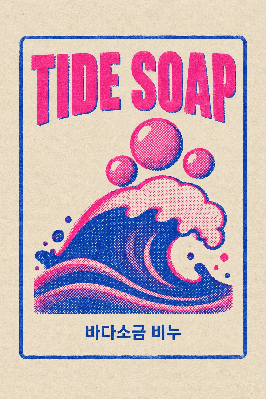
수제 비누·잼·양초·노트처럼 손으로 만드는 상품에 씁니다. 가게 이름과 상품 이름, 큰 그림 하나를 2~3색 리소 인쇄 느낌으로 정리해요. 표지는 가상의 비누 브랜드 TIDE SOAP, ‘바다소금 비누’, 파도와 거품, 진분홍·군청 잉크와 미색 종이입니다. 겹친 부분의 보라색은 두 잉크가 만난 표현이에요.
이름 두 개와 그림을 채워요
가게 이름은 브랜드 표기, 상품 이름은 실제 제품에 쓸 짧은 이름을 적습니다. 한글·영문 모두 가능해요. 라벨 그림은 ‘파도와 거품 세 개’처럼 큰 모양을 지정합니다. 상품 이름과 그림은 보기나 ‘알아서 골라줘’로 시작할 수 있지만 실제 상품명은 직접 넣으세요. 성분·용량·효능을 알아서 지어내지 않도록 지시합니다.
잉크의 겹침과 어긋남을 골라요
색 단추에 적힌 잉크 두 개 또는 세 개만 사용합니다. 망점은 큰 그림의 음영에, 인쇄 어긋남은 그림의 색판과 테두리에만 적용해요. 이름은 정렬된 채 또렷하게 남습니다. 종이색도 바꿀 수 있어요. 선택을 비우면 표지의 두 색 잉크, 중간 점, 작은 어긋남, 미색 종이로 완성합니다.
글자가 흐려지면 어긋남을 줄여요
사진 없이 1:1로 GPT나 Gemini에 보냅니다. 표지는 2:3 예시예요. 이름 두 줄의 철자, 망점의 크기, 색의 수를 확인합니다. 흐리면 ‘글자는 정렬하고 그림의 색판만 2픽셀 어긋나게’라고 고칩니다. 결과는 라벨 디자인 이미지이며 리소 분판 파일이 아닙니다. 실제 상품의 표시사항은 별도로 정확히 준비하고 인쇄소와 크기·색판을 맞춥니다.
상업용 전 키프리스(KIPRIS) 상표 검색 · 크게 쓸 땐 벡터로 다시 그리기