
すべて · 広告・ポスター · ロゴ・ブランド
052シルエットロゴ
動物や物のシルエットと正確なお店の名前を、本物の看板や紙のような素材に仕上げます。
受け取れるもの
- 動物または物のシルエットひとつ
- シンボルの下に入力どおりのお店の名前
- 選んだ素材で仕上げたロゴ画像一枚
ChatGPT 無料 OK
項目を入力
- 1項目を入力します
- 2コピーを押します
- 3GPTのチャットに貼り付けます
- 4そのまま送ると、サムネイルの例のような画像になります
- 5カードに合う実際の写真を一緒に入れると反映されます。背景カードなら背景の写真、人物・料理カードならその写真 任意
プロンプト全文を見る 5,237文字
Generate this image now. Return exactly ONE finished logo image itself; draw it directly, without explanations or questions.
出力サイズは1080×1080ピクセル、1:1の正方形にしてください。文字を読みやすく配置してください。
The result is one resolved identity in one material, never an options sheet or multiple applications. Keep the entire logo in the central area, about 65-75% of canvas width. Leave generous quiet margins, with all essential lettering below the top 12% and above the bottom 15% of the canvas. Adapt this same identity to the chosen ratio.
Make an original professional brand identity, never imitate an existing brand's recognizable logo, mascot or typography. No slogan, unrelated writing, field labels, watermarks or trademark symbols. No props, hands, devices or collage. The substrate fills the image edge to edge.

[INPUTS FOR THIS IMAGE]
Brand name selected: "【お店・ブランド名】"
Set BRAND_NAME to this input. Copy its original script, exact spelling, case, spaces and punctuation once; never romanize or translate it. If explicitly asked to choose, invent one short original name. Do not print the field label.
Symbol selected: "【シンボル】"
Draw only this SYMBOL. If asked to choose, select one fitting simple animal or object. Without an input, use a seated rabbit with one ear gently bent. Reduce fur, feathers and surface textures to a confident solid silhouette with at most three crisp negative-space cuts.
Material selected: "【素材】"
MATERIAL controls the actual finish and substrate. Metallic foil uses its physical metal color; keep the chosen palette in the substrate or ink rather than painting over metal. A flat finish uses the chosen palette directly.
Interpret the selected choice as follows (use only the selected one):
- ベージュ壁に黒い金属サイン: raised satin-black metal, crisp bevels and soft cast shadows on a warm beige plaster wall.
- 緑の紙に金箔: real gold foil hot stamping slightly debossed into deep forest-green textured paper.
- 黒い紙に銀箔: silver foil pressed into thick matte black cotton paper, tiny edge highlights and a fine paper grain.
- クリーム紙に活版印刷: the chosen logo ink color pressed slightly into thick cream cotton paper, visible paper fibres and precise ink edges.
- 半透明アクリルサイン: frosted acrylic on a cool light concrete wall, colored translucent logo and letters, restrained real depth and diffuse highlights; one continuous surface, no decorative frame.
- フラット: crisp opaque vector-like flat artwork on a clean solid background, no material lighting, no mockup, no gradients.
If the selection line is absent or empty, use ベージュ壁に黒い金属サイン only.
Colors selected: "【配色】"
Use only this restrained palette plus necessary substrate tones. The selected material keeps its real physical color.
Interpret the selected choice as follows (use only the selected one):
- 黒+ベージュ: satin black on warm beige.
- 金+深緑: warm gold on forest green.
- 銀+黒: silver on matte black.
- 濃茶+クリーム: dark brown on cream.
- 紺+白: deep navy on warm white.
If the selection line is absent or empty, use 黒+ベージュ only.
Name typeface selected: "【名前の書体】"
The typeface may change, but never redesign, fuse or ornament multiple letters at once; spelling and readability come first.
Interpret the selected choice as follows (use only the selected one):
- 端正な明朝・セリフ: refined high-contrast serif for Latin, elegant Myeongjo for Hangul, Mincho for Japanese, readable generous spacing.
- すっきりしたゴシック: clean contemporary sans serif, balanced weight and optical kerning.
- 太い丸文字: bold friendly rounded display lettering with open counters and intact characters.
- 太い角文字: bold squared display lettering, clear letter structure, strong sign readability.
If the selection line is absent or empty, use 端正な明朝・セリフ only.
Symbol direction selected: "【シンボルの向き】"
Change only the viewing direction of the same subject; do not add a second symbol.
Interpret the selected choice as follows (use only the selected one):
- 右: clean right-facing profile.
- 左: clean left-facing profile.
- 正面: balanced front-facing silhouette.
If the selection line is absent or empty, use 右 only.

[RESOLVED DESIGN]
A single characterful, simplified solid silhouette ABOVE one refined wordmark, a premium symbol-and-name combination. Keep the silhouette compact and distinctive, without tiny fur strokes. The name is about 1.2-1.6 times the symbol width, generous optical spacing, readable thick-thin strokes. The selected typeface replaces the default refined serif. Both symbol and name use the same selected material. Straight-on close-up, soft directional light showing believable physical edges, texture and depth when the material is not flat. The symbol and name form one balanced group, centered vertically and horizontally. The name must not become a monogram or enter the silhouette.
Before returning, compare every visible name character with BRAND_NAME, one by one, including Hangul final consonants and Japanese characters; repair spelling without changing the design. Print the name exactly once.

[Final output format]
出力サイズは1080×1080ピクセル、1:1の正方形にしてください。文字を読みやすく配置してください。
This selected output format takes priority over any fixed canvas size or aspect ratio elsewhere in this template. Adapt the composition, text zones and margins to the selected canvas without stretching or cropping essential content. Device safe areas apply only when a device is selected. Never print these format instructions on the image.
結果はどうでしたか?
こちらのカードも人気です






使い方・よくある質問
一つの形でお店を覚えてもらう
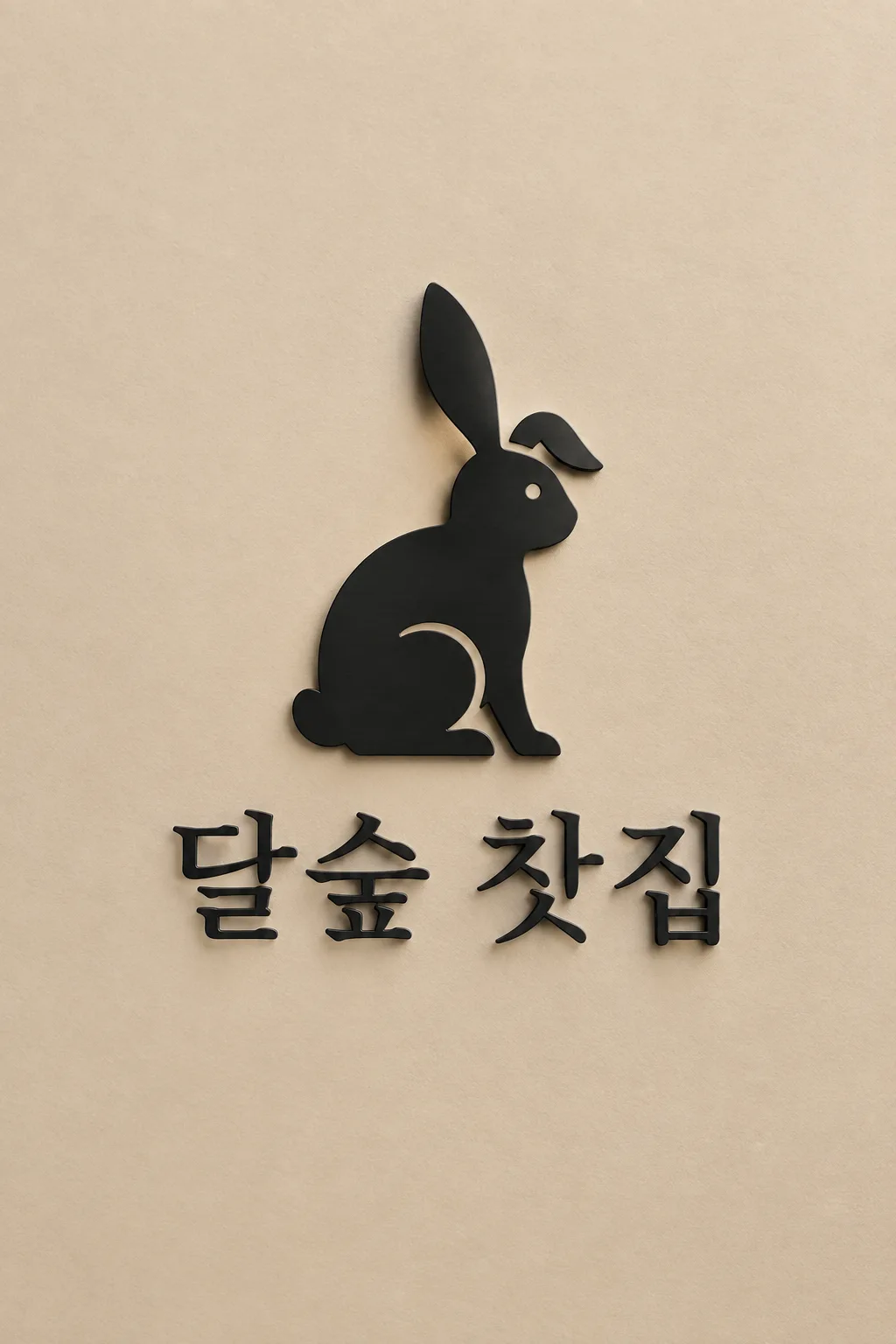
茶房・美容室・花屋など、名前と覚えやすい動物や物を一緒に見せたいときに使います。シンボルが上、名前が下のロゴ一枚です。入力例は架空の韓国語の茶房名と片耳を少し曲げて座るウサギ。名前の例は表紙と同じ表記です。自分のお店の名前へ変更してください。共通の表紙には架空の韓国語の店名を使い、ベージュ壁の黒い金属サインに仕上げています。
名前とシンボルを入力
名前は実際に使う文字と空白をそのまま入れてください。日本語を勝手に英字へ変換しません。シンボルは「犬」より「尾を上げて歩く犬」のように姿勢まで短く書くと伝わります。キツネ・小鳥・洋梨・急須の例から選んでも大丈夫。「おまかせ」なら一つだけ考えます。複数の動物や小物を詰めると、小さくしたときに分かりにくくなります。
素材と向きで印象を調整
素材は金属サイン・金箔・銀箔・活版印刷・アクリル・フラットの六つ。箔の金属色は保ち、配色は主に背景へ反映します。明朝は落ち着いた印象、ゴシックは明快、太い丸文字は親しみやすくなります。向きは同じ対象を右・左・正面から見た形に変えます。任意欄を空にすると、黒とベージュの看板、端正な書体、右向きの形で完成します。
小さくして確かめる
サイトで1:1を選び、コピーしたプロンプトをGPTやGeminiに送ります。写真は不要です。名前を一文字ずつ読み、耳や尾が小さくても見えるか確認してください。毛の線が多いなら「細かい線を消して内側の切れ込みを三つ以内に」、誤字なら名前だけ直すよう頼みます。看板の写真風画像は素材の見本なので、印刷用には同じ形をフラットで作り直します。
商用利用前にKIPRISおよび利用する国の商標データベースで検索し、大きく使うときはベクターで描き直してください。