
전체 · 광고/포스터 · 로고·브랜드
052실루엣 로고
동물이나 사물을 단순한 실루엣으로 만들고, 정확한 가게 이름과 함께 실제 간판이나 종이에 담아요.
받는 것
- 단순한 동물 또는 사물 실루엣 하나
- 실루엣 아래에 철자 그대로 들어간 가게 이름
- 고른 재질로 완성한 로고 이미지 한 장
ChatGPT 무료 OK
칸 채우기
- 1칸을 채워요
- 2복사 버튼을 눌러요
- 3GPT 채팅창에 붙여넣어요
- 4그대로 보내면 썸네일 예시처럼 나와요
- 5카드에 맞는 실제 사진을 같이 넣으면 그 사진이 반영돼요 — 배경 카드는 배경 사진, 인물 · 음식 카드는 그 사진 선택
프롬프트 원문 보기 5,255자
Generate this image now. Return exactly ONE finished logo image itself; draw it directly, without explanations or questions.
Output size 1080x1080 pixels, 1:1 square card. Keep the same top-to-bottom order but compress the zones to fit the square: the illustration becomes smaller and every text line stays fully readable.
The result is one resolved identity in one material, never an options sheet or multiple applications. Keep the entire logo in the central area, about 65-75% of canvas width. Leave generous quiet margins, with all essential lettering below the top 12% and above the bottom 15% of the canvas. Adapt this same identity to the chosen ratio.
Make an original professional brand identity, never imitate an existing brand's recognizable logo, mascot or typography. No slogan, unrelated writing, field labels, watermarks or trademark symbols. No props, hands, devices or collage. The substrate fills the image edge to edge.

[INPUTS FOR THIS IMAGE]
Brand name selected: "【가게 이름】"
Set BRAND_NAME to this input. Copy its original script, exact spelling, case, spaces and punctuation once; never romanize or translate it. If explicitly asked to choose, invent one short original name. Do not print the field label.
Symbol selected: "【상징】"
Draw only this SYMBOL. If asked to choose, select one fitting simple animal or object. Without an input, use a seated rabbit with one ear gently bent. Reduce fur, feathers and surface textures to a confident solid silhouette with at most three crisp negative-space cuts.
Material selected: "【재질】"
MATERIAL controls the actual finish and substrate. Metallic foil uses its physical metal color; keep the chosen palette in the substrate or ink rather than painting over metal. A flat finish uses the chosen palette directly.
Interpret the selected choice as follows (use only the selected one):
- 베이지 벽 검정 금속 간판: raised satin-black metal, crisp bevels and soft cast shadows on a warm beige plaster wall.
- 초록 종이 금박: real gold foil hot stamping slightly debossed into deep forest-green textured paper.
- 검정 종이 은박: silver foil pressed into thick matte black cotton paper, tiny edge highlights and a fine paper grain.
- 크림 종이 레터프레스: the chosen logo ink color pressed slightly into thick cream cotton paper, visible paper fibres and precise ink edges.
- 반투명 아크릴 간판: frosted acrylic on a cool light concrete wall, colored translucent logo and letters, restrained real depth and diffuse highlights; one continuous surface, no decorative frame.
- 평면: crisp opaque vector-like flat artwork on a clean solid background, no material lighting, no mockup, no gradients.
If the selection line is absent or empty, use 베이지 벽 검정 금속 간판 only.
Colors selected: "【색 조합】"
Use only this restrained palette plus necessary substrate tones. The selected material keeps its real physical color.
Interpret the selected choice as follows (use only the selected one):
- 검정 + 베이지: satin black on warm beige.
- 금색 + 짙은 초록: warm gold on forest green.
- 은색 + 검정: silver on matte black.
- 짙은 갈색 + 크림: dark brown on cream.
- 남색 + 흰색: deep navy on warm white.
If the selection line is absent or empty, use 검정 + 베이지 only.
Name typeface selected: "【이름 글꼴】"
The typeface may change, but never redesign, fuse or ornament multiple letters at once; spelling and readability come first.
Interpret the selected choice as follows (use only the selected one):
- 단정한 명조: refined high-contrast serif for Latin, elegant Myeongjo for Hangul, Mincho for Japanese, readable generous spacing.
- 깔끔한 고딕: clean contemporary sans serif, balanced weight and optical kerning.
- 굵은 둥근 글씨: bold friendly rounded display lettering with open counters and intact characters.
- 굵은 각진 글씨: bold squared display lettering, clear letter structure, strong sign readability.
If the selection line is absent or empty, use 단정한 명조 only.
Symbol direction selected: "【상징 방향】"
Change only the viewing direction of the same subject; do not add a second symbol.
Interpret the selected choice as follows (use only the selected one):
- 오른쪽: clean right-facing profile.
- 왼쪽: clean left-facing profile.
- 정면: balanced front-facing silhouette.
If the selection line is absent or empty, use 오른쪽 only.

[RESOLVED DESIGN]
A single characterful, simplified solid silhouette ABOVE one refined wordmark, a premium symbol-and-name combination. Keep the silhouette compact and distinctive, without tiny fur strokes. The name is about 1.2-1.6 times the symbol width, generous optical spacing, readable thick-thin strokes. The selected typeface replaces the default refined serif. Both symbol and name use the same selected material. Straight-on close-up, soft directional light showing believable physical edges, texture and depth when the material is not flat. The symbol and name form one balanced group, centered vertically and horizontally. The name must not become a monogram or enter the silhouette.
Before returning, compare every visible name character with BRAND_NAME, one by one, including Hangul final consonants and Japanese characters; repair spelling without changing the design. Print the name exactly once.

[Final output format]
Output size 1080x1080 pixels, 1:1 square card. Keep the same top-to-bottom order but compress the zones to fit the square: the illustration becomes smaller and every text line stays fully readable.
This selected output format takes priority over any fixed canvas size or aspect ratio elsewhere in this template. Adapt the composition, text zones and margins to the selected canvas without stretching or cropping essential content. Device safe areas apply only when a device is selected. Never print these format instructions on the image.
결과 어땠어요?
이 카드도 많이 사용해요






쓰는 법 · 자주 묻는 것
상징 하나로 가게를 기억하게 해요
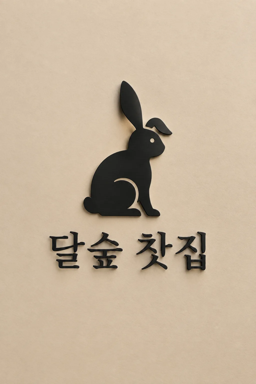
찻집·미용실·꽃집처럼 가게 이름과 기억할 그림을 함께 보여 주고 싶을 때 씁니다. 토끼나 주전자 같은 상징이 위에, 이름이 아래에 들어가는 로고 한 장이에요. 표지는 가상의 ‘달숲 찻집’과 귀를 살짝 접은 토끼를 베이지 벽의 검정 금속 간판으로 만든 예시입니다.
이름과 상징 두 칸을 채워요
가게 이름은 간판에 쓸 표기 그대로 적습니다. 한글·영문·일본어와 띄어쓰기를 바꾸지 않도록 지시해요. 이름을 대신 정해 달라면 ‘알아서 골라줘’라고 적을 수 있지만, 실제 이름이 있으면 직접 넣어 주세요. 상징은 ‘강아지’보다 ‘꼬리를 들고 걷는 강아지’처럼 대상과 자세를 짧게 적으면 좋습니다. 보기에서 여우·새·배·주전자 등을 눌러 시작해도 돼요. 여러 동물이나 소품을 한꺼번에 넣으면 작은 로고에서 뭉개지기 쉽습니다.
단추로 실제 인상을 바꿔요
재질은 검정 금속 간판, 초록 종이 금박, 검정 종이 은박, 크림 종이 레터프레스, 반투명 아크릴, 평면 중 고릅니다. 금박·은박은 실제 금속색을 유지하고 색 조합은 주로 바탕에 반영해요. 명조는 차분하게, 고딕은 또렷하게, 굵은 둥근 글씨는 친근하게 보입니다. 상징 방향은 같은 동물의 왼쪽·오른쪽·정면을 바꿔요. 선택 칸을 비우면 검정·베이지, 명조, 오른쪽을 보는 단순한 토끼와 기본 간판 재질로 마무리합니다.
작게 보고 철자를 확인해요
사이트에서 1:1을 고르고 프롬프트를 복사해 GPT나 Gemini에 보내면 됩니다. 사진은 필요 없어요. 이름을 한 글자씩 읽고 토끼 귀·발·꼬리가 한 덩어리로 보이는지 확인하세요. 털이 너무 많으면 ‘털 선을 지우고 세 군데 안쪽 틈만 남겨 줘’, 이름이 틀리면 ‘이름만 달숲 찻집으로 정확히 고쳐 줘’처럼 요청합니다. 간판 목업은 재질 확인용이므로 인쇄할 도안이 필요하면 같은 모양을 평면으로 다시 요청해요. 표지는 2:3이지만 기본 결과 비율은 1:1입니다.
상업용 전 키프리스(KIPRIS) 상표 검색 · 크게 쓸 땐 벡터로 다시 그리기