
すべて · 広告・ポスター · ロゴ・ブランド
075ヴィンテージバッジロゴ
版画風の絵とリボンの名前を、古びた二色刷りの工房ロゴにまとめます。
受け取れるもの
- 版画風の絵を入れた円形バッジ
- まっすぐなリボンに正確な店名
- 選んだ素材と任意のEST.年を入れたロゴ一枚
ChatGPT 無料 OK
項目を入力
- 1項目を入力します
- 2コピーを押します
- 3GPTのチャットに貼り付けます
- 4そのまま送ると、サムネイルの例のような画像になります
- 5カードに合う実際の写真を一緒に入れると反映されます。背景カードなら背景の写真、人物・料理カードならその写真 任意
プロンプト全文を見る 5,337文字
Generate this image now. Return exactly ONE finished logo image itself; draw it directly, without explanations or questions.
出力サイズは1080×1080ピクセル、1:1の正方形にしてください。文字を読みやすく配置してください。
Create one original professional brand identity, one finished composition and one material. No options sheet, multiple applications, props, hands, devices or collage. Never imitate an existing brand's recognizable logo, mascot or typography. Do not add slogans, field labels, unrelated words, watermarks or trademark symbols. The chosen substrate fills the canvas edge to edge.
Keep all essential lettering below the top 12% and above the bottom 15% of the canvas. Center the complete logo group with quiet margins, about 70-78% of canvas width. Adapt the same identity to the chosen ratio without changing the style.

[INPUTS FOR THIS IMAGE]
The only allowed auxiliary text is EST. followed by the supplied opening year. This is explicitly required when a year is supplied: include the letters E S T and the period, not just the digits.
お店の名前 selected: "【お店の名前】"
Set BRAND_NAME to this input. Preserve its exact spelling, case, spaces and punctuation. Print it exactly once. Never translate or romanize it. If explicitly asked to choose, invent one short original name. If no name was supplied, ask for the name rather than inventing an existing business. Do not print the field label.
バッジの絵 selected: "【バッジの絵】"
Use one subject described by this input, preserving the requested defining feature. If asked to choose or no subject was supplied, use an awl piercing a leather patch beside one small thread loop. Keep the silhouette immediately recognizable at small size.
開業年 selected: "【開業年】"
Use only the supplied four-digit YEAR as EST. YEAR beneath the ribbon. 2026 is an editable cover demonstration, not proof of a real opening date. If absent or empty, omit the entire EST. line; do not invent a year.
素材 selected: "【素材】"
Apply only this finish to the whole logo. Preserve the fixed style of this card. Foil keeps its physical metal color; palette changes mainly affect the substrate. One continuous surface fills the canvas.
Interpret the selected choice as follows (use only the selected one):
- クラフト紙の二色刷り: slightly uneven two-ink screenprint on warm kraft paper; visible fibers, no excessive dirt.
- オリーブ紙の真鍮箔: warm brass foil pressed into muted olive paper.
- 紺紙の銅箔: copper foil on matte navy cotton paper.
- 古いクリーム色のブリキ看板: a lightly aged cream enamel tin sign with readable ink and subtle chipped edges.
- アイボリー紙の活版印刷: slightly debossed two-ink letterpress on ivory paper.
- フラット: crisp two-color flat badge artwork without material shadows.
If the selection line is absent or empty, use クラフト紙の二色刷り only.
配色 selected: "【配色】"
Use this restrained palette and necessary substrate tones only. Keep the name clearly readable against its background. Real metal retains its physical color.
Interpret the selected choice as follows (use only the selected one):
- オリーブ+黄土色: olive green and ochre on kraft brown.
- 紺+銅色: navy and copper.
- 黒+砂色: black and warm sand.
- えんじ+アイボリー: burgundy and ivory.
If the selection line is absent or empty, use オリーブ+黄土色 only.
名前の書体 selected: "【名前の書体】"
Keep the fixed vintage badge style; fit the complete name on a straight ribbon without dropping characters.
Interpret the selected choice as follows (use only the selected one):
- 太いセリフ: bold heritage serif with open counters, exact characters.
- 太いスラブセリフ: sturdy slab serif with clear square-ended strokes.
- ヴィンテージゴシック: bold vintage sans serif, no extra flourishes.
If the selection line is absent or empty, use 太いセリフ only.
インクのかすれ selected: "【インクのかすれ】"
Wear belongs to the ink texture, never to missing letters or unreadable fine details.
Interpret the selected choice as follows (use only the selected one):
- 控えめ: fine sparse wear mainly on border and illustration; name remains almost solid.
- ほどほど: moderate authentic ink wear, keeping every name letter intact.
- きれい: clean print edges with substrate texture only.
If the selection line is absent or empty, use 控えめ only.

[RESOLVED DESIGN]
ONE circular retro badge with a woodcut/engraving illustration in its upper half. Confident engraved hatching, strong contour and authentic two-ink print craft. A STRAIGHT folded-end ribbon crosses the lower-middle; BRAND_NAME is large and readable on the ribbon. The smaller EST. YEAR appears below only if supplied. Default olive and ochre ink on warm kraft paper, controlled ink wear, strong artisan leather-workshop character. Keep it clearly different from a clean flat emblem: carved hatching, ribbon folds and tactile print are essential. No curved name text. The whole badge occupies about 74% of canvas width.
Before returning, compare every visible name character with BRAND_NAME, one by one, including Hangul initial consonants, vowels and final consonants. Repair missing or altered letters while retaining the design. Print the brand name exactly once. The finish may be realistic, but the identity must remain clear at thumbnail size.

[Final output format]
出力サイズは1080×1080ピクセル、1:1の正方形にしてください。文字を読みやすく配置してください。
This selected output format takes priority over any fixed canvas size or aspect ratio elsewhere in this template. Adapt the composition, text zones and margins to the selected canvas without stretching or cropping essential content. Device safe areas apply only when a device is selected. Never print these format instructions on the image.
結果はどうでしたか?
こちらのカードも人気です






使い方・よくある質問
使い込まれた工房のバッジのように
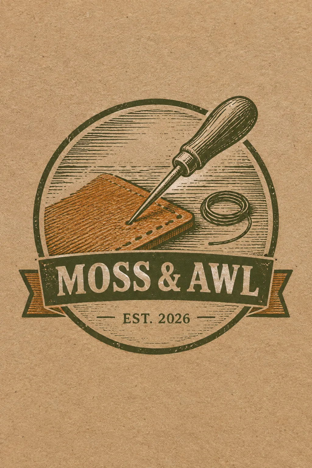
革工房、修理店、ハンドメイド工具ブランドのステッカーやパッケージのラベルに使います。円の中の版画の絵とリボンの名前がひとまとまりに見えるヴィンテージバッジです。表紙は架空の革工房「MOSS & AWL」、革の切れ端を貫く錐と、その横の小さな糸の輪、オリーブと黄土色のインクをクラフト紙に押した例です。円形エンブレムカードよりも、版画の斜線とかすれた印刷感がはっきりしています。
名前と絵はシンプルに
お店の名前には実際のスペルと分かち書きを入れます。バッジの絵には、工房を説明する道具一つと小さな補助要素程度を書きます。ハサミ・レンチ・山・葉の表示、または「おまかせ」から始めることができます。道具をたくさん入れると版画の線が絡み合い、小さなステッカーでは区別しにくくなります。名前が長い場合は、文字を削らずにリボンを広げるようリクエストしてください。
開業年と印刷感を選ぶ
開業年の2026は編集可能な表紙のサンプルです。実際の開業年に変更するか、欄を空欄にしてEST.の行全体を削除してください。素材は、クラフト紙の二色刷り、真鍮箔、銅箔、ブリキ看板、活版印刷、フラットの6種類です。金属箔は金属の色を維持します。名前の書体とインクのかすれ具合は変更できますが、名前の画数を削ってかすれたようにすることはありません。選択欄を空欄にすると、クラフト紙の二色刷り、オリーブ+黄土色、太いセリフ、控えめなインクのかすれがデフォルトになります。
小さいステッカーサイズで確認
写真なしでサイトから1:1を選択してプロンプトを送信すればOKです。名前、&記号、開業年をそれぞれ照らし合わせ、縮小して見た時にキリとリボンが残っているか確認してください。インクが粗すぎる場合は「名前のかすれを消して枠線にだけ少し残して」、文字が小さい場合は「リボンの高さを増やして名前を大きく」と修正します。質感のある表紙自体をスタンプの図案として使うよりは、フラットを選んで印刷所と線の太さを合わせてください。表紙は2:3、デフォルトの結果は1:1です。
商用利用前にKIPRISおよび利用する国の商標データベースで検索し、大きく使うときはベクターで描き直してください。