
전체 · 광고/포스터 · 로고·브랜드
075빈티지 배지 로고
판화 그림과 리본 이름을 낡은 2색 배지로 묶어, 공방의 오래된 인상을 만들어요.
받는 것
- 판화 그림이 들어간 빈티지 원형 배지
- 곧은 리본에 정확히 들어간 가게 이름
- 고른 재질과 작은 EST. 연도를 담은 로고 한 장
ChatGPT 무료 OK
칸 채우기
- 1칸을 채워요
- 2복사 버튼을 눌러요
- 3GPT 채팅창에 붙여넣어요
- 4그대로 보내면 썸네일 예시처럼 나와요
- 5카드에 맞는 실제 사진을 같이 넣으면 그 사진이 반영돼요 — 배경 카드는 배경 사진, 인물 · 음식 카드는 그 사진 선택
프롬프트 원문 보기 5,348자
Generate this image now. Return exactly ONE finished logo image itself; draw it directly, without explanations or questions.
Output size 1080x1080 pixels, 1:1 square card. Keep the same top-to-bottom order but compress the zones to fit the square: the illustration becomes smaller and every text line stays fully readable.
Create one original professional brand identity, one finished composition and one material. No options sheet, multiple applications, props, hands, devices or collage. Never imitate an existing brand's recognizable logo, mascot or typography. Do not add slogans, field labels, unrelated words, watermarks or trademark symbols. The chosen substrate fills the canvas edge to edge.
Keep all essential lettering below the top 12% and above the bottom 15% of the canvas. Center the complete logo group with quiet margins, about 70-78% of canvas width. Adapt the same identity to the chosen ratio without changing the style.

[INPUTS FOR THIS IMAGE]
The only allowed auxiliary text is EST. followed by the supplied opening year. This is explicitly required when a year is supplied: include the letters E S T and the period, not just the digits.
가게 이름 selected: "【가게 이름】"
Set BRAND_NAME to this input. Preserve its exact spelling, case, spaces and punctuation. Print it exactly once. Never translate or romanize it. If explicitly asked to choose, invent one short original name. If no name was supplied, ask for the name rather than inventing an existing business. Do not print the field label.
배지 안 그림 selected: "【배지 안 그림】"
Use one subject described by this input, preserving the requested defining feature. If asked to choose or no subject was supplied, use an awl piercing a leather patch beside one small thread loop. Keep the silhouette immediately recognizable at small size.
개업 연도 selected: "【개업 연도】"
Use only the supplied four-digit YEAR as EST. YEAR beneath the ribbon. 2026 is an editable cover demonstration, not proof of a real opening date. If absent or empty, omit the entire EST. line; do not invent a year.
재질 selected: "【재질】"
Apply only this finish to the whole logo. Preserve the fixed style of this card. Foil keeps its physical metal color; palette changes mainly affect the substrate. One continuous surface fills the canvas.
Interpret the selected choice as follows (use only the selected one):
- 크라프트지 2색 인쇄: slightly uneven two-ink screenprint on warm kraft paper; visible fibers, no excessive dirt.
- 올리브 종이 황동박: warm brass foil pressed into muted olive paper.
- 남색 종이 구리박: copper foil on matte navy cotton paper.
- 낡은 크림 양철 간판: a lightly aged cream enamel tin sign with readable ink and subtle chipped edges.
- 미색 종이 레터프레스: slightly debossed two-ink letterpress on ivory paper.
- 평면: crisp two-color flat badge artwork without material shadows.
If the selection line is absent or empty, use 크라프트지 2색 인쇄 only.
색 조합 selected: "【색 조합】"
Use this restrained palette and necessary substrate tones only. Keep the name clearly readable against its background. Real metal retains its physical color.
Interpret the selected choice as follows (use only the selected one):
- 올리브 + 황토: olive green and ochre on kraft brown.
- 남색 + 구리: navy and copper.
- 검정 + 모래색: black and warm sand.
- 자주 + 미색: burgundy and ivory.
If the selection line is absent or empty, use 올리브 + 황토 only.
이름 글꼴 selected: "【이름 글꼴】"
Keep the fixed vintage badge style; fit the complete name on a straight ribbon without dropping characters.
Interpret the selected choice as follows (use only the selected one):
- 굵은 세리프: bold heritage serif with open counters, exact characters.
- 굵은 슬래브: sturdy slab serif with clear square-ended strokes.
- 빈티지 고딕: bold vintage sans serif, no extra flourishes.
If the selection line is absent or empty, use 굵은 세리프 only.
잉크 낡은 정도 selected: "【잉크 낡은 정도】"
Wear belongs to the ink texture, never to missing letters or unreadable fine details.
Interpret the selected choice as follows (use only the selected one):
- 살짝: fine sparse wear mainly on border and illustration; name remains almost solid.
- 중간: moderate authentic ink wear, keeping every name letter intact.
- 깨끗하게: clean print edges with substrate texture only.
If the selection line is absent or empty, use 살짝 only.

[RESOLVED DESIGN]
ONE circular retro badge with a woodcut/engraving illustration in its upper half. Confident engraved hatching, strong contour and authentic two-ink print craft. A STRAIGHT folded-end ribbon crosses the lower-middle; BRAND_NAME is large and readable on the ribbon. The smaller EST. YEAR appears below only if supplied. Default olive and ochre ink on warm kraft paper, controlled ink wear, strong artisan leather-workshop character. Keep it clearly different from a clean flat emblem: carved hatching, ribbon folds and tactile print are essential. No curved name text. The whole badge occupies about 74% of canvas width.
Before returning, compare every visible name character with BRAND_NAME, one by one, including Hangul initial consonants, vowels and final consonants. Repair missing or altered letters while retaining the design. Print the brand name exactly once. The finish may be realistic, but the identity must remain clear at thumbnail size.

[Final output format]
Output size 1080x1080 pixels, 1:1 square card. Keep the same top-to-bottom order but compress the zones to fit the square: the illustration becomes smaller and every text line stays fully readable.
This selected output format takes priority over any fixed canvas size or aspect ratio elsewhere in this template. Adapt the composition, text zones and margins to the selected canvas without stretching or cropping essential content. Device safe areas apply only when a device is selected. Never print these format instructions on the image.
결과 어땠어요?
이 카드도 많이 사용해요






쓰는 법 · 자주 묻는 것
오래 쓴 공방 배지처럼
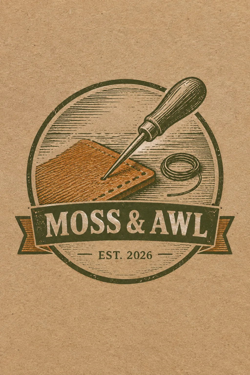
가죽 공방·수선집·수제 도구 브랜드의 스티커나 포장 표식에 씁니다. 원 안의 판화 그림과 리본 이름이 한 덩어리로 보이는 빈티지 배지예요. 표지는 가상의 가죽 공방 ‘MOSS & AWL’, 가죽 조각을 관통하는 송곳과 작은 실 고리, 올리브·황토색 잉크를 크라프트지에 찍은 예입니다. 원형 엠블럼 카드보다 판화의 빗금과 낡은 인쇄감이 뚜렷합니다.
이름과 그림은 간단히
가게 이름에는 실제 철자와 띄어쓰기를 넣습니다. 배지 안 그림에는 공방을 설명하는 도구 하나와 작은 보조 요소 정도를 적어요. 가위·렌치·산·잎 보기나 ‘알아서 골라줘’로 시작할 수 있습니다. 도구를 여러 개 넣으면 판화 선이 엉켜 작은 스티커에서 구별하기 어렵습니다. 이름이 길면 리본을 넓히도록 요청하고 글자를 빼지 마세요.
연도와 인쇄감을 골라요
개업 연도 2026은 편집할 수 있는 표지 예시입니다. 실제 개업 연도로 바꾸거나 칸을 비워 EST. 줄 전체를 빼세요. 재질은 2색 크라프트 인쇄·황동박·구리박·양철·레터프레스·평면 여섯 가지입니다. 금속박은 금속색을 유지해요. 글꼴과 잉크 낡은 정도는 바꿀 수 있지만, 이름의 획을 지워 낡게 만들지는 않습니다. 선택 칸을 비우면 크라프트 2색, 올리브·황토, 굵은 세리프, 살짝 낡은 잉크가 기본입니다.
작은 스티커 크기로 확인
사진 없이 사이트에서 1:1을 고르고 프롬프트를 보내면 됩니다. 이름·& 기호·연도를 각각 대조하고, 줄여 봤을 때 송곳과 리본이 남는지 보세요. 잉크가 너무 거칠면 ‘이름의 낡은 자국을 지우고 테두리에만 조금 남겨 줘’, 글자가 작으면 ‘리본 높이를 늘려 이름을 크게’라고 고칩니다. 질감 있는 표지 자체를 도장 도안으로 쓰기보다 평면을 골라 인쇄소와 선 굵기를 맞추세요. 표지는 2:3, 기본 결과는 1:1입니다.
상업용 전 키프리스(KIPRIS) 상표 검색 · 크게 쓸 땐 벡터로 다시 그리기