
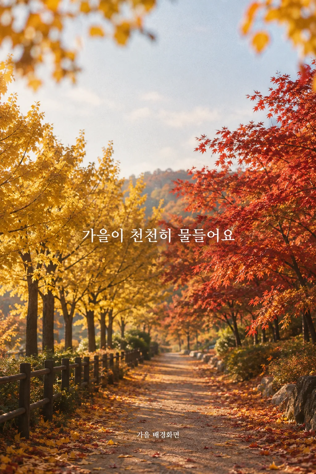
전체 · 배경화면 · 폰 배경화면 · 계절·풍경
066가을 배경화면
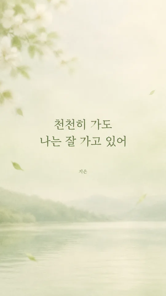
기종과 가을 장면, 표현 방식을 고르면 시계 자리를 비운 휴대폰 배경화면을 만들어요.
칸 채우기
- 1칸을 채워요
- 2복사 버튼을 눌러요
- 3GPT 채팅창에 붙여넣어요
- 4제품·인물 사진을 쓰려면 사진과 프롬프트를 둘 다 넣은 뒤에 보내요 선택
프롬프트 원문 보기 9,152자
Generate this image now. Draw it directly - do not describe it, explain it, or ask questions.
Target screen: "【기종】". If the value is a ratio such as 9:16, make a vertical wallpaper at exactly that ratio; use 1080x1920 pixels if a 9:16 pixel size is needed. Otherwise identify the named device's actual display aspect ratio and native resolution, camera cutout, usual lock-screen clock zone, and likely home-screen dock or gesture area before drawing. For a foldable, respect the named main or cover display. Render a flat image that fits that screen, and adjust the safe areas below to it. If exact device data cannot be verified, preserve the requested portrait intent and generous interface-safe space without claiming an invented resolution. Never show the research, device name, or dimensions in the image.

[Purpose]
Create exactly one complete, original autumn phone wallpaper that its owner can save, use on a lock screen or home screen, and later share in a social story. Let the season be recognizable through one specific scene rather than through a title or a decorative border. The wallpaper should still feel finished when the optional sentence is omitted. Deliver the edge-to-edge artwork itself, with no phone mockup, screen capture, interface, story caption, or explanation. The owner's story text can be added separately in the story editor. Make the image personal in mood: a small moment of noticing autumn, not a commercial seasonal poster or a generic collage of fall symbols.

[Scene]
The requested scene is "【장면】". Treat it as subject guidance, not lettering. If it is exactly "알아서 골라줘", choose ONE of these four scenes yourself and never print those words. For "단풍 길", show a walkable path receding gently through trees with irregular red, amber, and brown leaves; keep any vivid canopy and the path's most detailed turn in the middle of the screen. For "은행잎", make a small group of naturally varied fan-shaped yellow ginkgo leaves the clear subject, with a quiet pavement, muted wall, or soft sky behind them; avoid rows of identical leaves. For "억새 들판", show wind-bent silver grass in an open field with a low, soft horizon and believable late-afternoon air; keep bright plumes away from the clock band. For "창가 커피와 낙엽", show a modest cup by a window and a few fallen leaves beyond or beside it, with credible perspective, a restrained tabletop, and no readable café branding. Do not combine multiple option scenes or introduce pumpkins, Halloween ornaments, snow, or unrelated seasonal props.

The requested treatment is "【느낌】". Choose exactly that ONE treatment and keep it consistent throughout the entire image. "사진" means a believable single camera exposure: natural leaf variation, realistic scale and focus, credible reflections and weather, and restrained color grading. "일러스트" means a deliberate contemporary drawn scene with clean shapes, controlled line work, layered depth, and hand-selected autumn colors; do not mimic a photograph or use childish clip art. "수채화" means translucent pigment, subtle paper texture, soft irregular color edges, and enough shape definition to recognize the scene at phone size; do not dissolve the scene into random stains. The chosen medium changes how the scene is rendered, never what text appears. Whatever the medium, keep ochre, russet, muted green, and cream in natural balance instead of saturating every area orange.

Compose specifically for a working phone screen. Reserve roughly the top 0-25% for the real lock-screen clock, status indicators, and camera cutout: continue the scene there using low-detail sky, wall, defocused distance, or subdued negative space. Put no focal leaf, cup, bright sun, sharp branch, horizon line, strong edge, or lettering in that band. Keep roughly the bottom 80-100% quiet for the dock, lock-screen controls, and gesture area. Place the principal leaves, field texture, path turn, or cup within the middle 30-70%, leaving enough quieter space for actual app icons and widgets. On a foldable or unusual display, adapt these percentages to the real interface. Make the safe areas emerge naturally from the chosen scene and treatment; never paste on blank bars, hard gradients, or obvious blurred rectangles. Leave crop tolerance near all edges.

[Attached photo]
No user photo is needed. Invent an original autumn scene from the selected words. Do not copy a known wallpaper, painting, photograph, branded café, recognizable landmark, or living artist's signature composition. If a personal photo is attached later, it may guide the owner's own place, but the final layout must still protect the clock and controls and follow the selected treatment.

[Text layout]
Use the full canvas height as the coordinate system. The seasonal scene is the main content, and the optional sentence sits within a naturally quiet pocket around 42-68% of height, away from the subject, window frame, path edge, or grass plumes. Keep every letter outside the top clock zone and bottom dock zone, with generous side margins. When text is present, set it in one short horizontal line if it fits; for a longer user entry, break only at a natural Korean phrase boundary into at most two balanced lines. Make Korean glyph height about 4-5% of the full canvas height, clearly readable at a glance on a real phone, never tiny caption type. Use a clean, well-formed Korean typeface suited to the medium and enough tonal contrast to read against the actual image. A gentle local adjustment of the underlying scene is acceptable, but no opaque label, sticker, text box, outline, or heavy drop shadow.
- 42-68%: Render this exact supplied Korean sentence once, without quotation marks: "【한 줄 문구】". Preserve its syllables, spaces, and punctuation. If the supplied value is exactly "알아서 골라줘", do not render those words; invent one original, short Korean line of about 6-14 syllables that evokes the chosen autumn moment, then render only that line.

[Style]
Aim for an inviting seasonal image that someone would willingly keep behind everyday apps for weeks. Use a limited palette and calm composition rather than a loud harvest advertisement. Keep the scene visually specific: ginkgo leaves have fan-shaped blades, silver grass has airy seed heads, a path has believable depth, and a cup is grounded on a surface. For illustration, simplify without losing those identifying shapes. For watercolor, allow organic pigment variation while keeping the subject legible. For photography, preserve real-world imperfections and avoid a synthetic composite look. Let the image remain attractive when viewed alone in a story and useful when covered by a clock or icons.

[Visual hierarchy]
First, immediate recognition of the selected autumn scene. Second, the light and season-specific color. Third, only when requested, a single readable Korean sentence. The most vivid and detailed area should sit below the clock band and above the dock band. Balance light and dark regions so the phone's actual clock, app labels, and widgets can still be read. If the optional sentence line is absent, keep the same strong composition and leave its pocket as part of the artwork; do not invent a title, quote, date, season label, or replacement word. Do not draw phone interface elements into the artwork to test the layout.

[Lighting and texture]
Give the scene one coherent light source and plausible autumn atmosphere: gentle overcast light on a path, soft side light on ginkgo leaves, low warm light through silver grass, or diffuse window light around the cup. Preserve detail in both highlights and shadows. Texture must fit the selected treatment: fine natural grain only for photography, restrained drawn marks for illustration, and translucent paper-and-pigment texture for watercolor. Keep the clock area calm through composition, not through a visible wash-out overlay. Avoid glowing outlines, excessive haze, sharp HDR contrast, fake lens flares, repeating leaf stamps, repeated grass clumps, and muddy color that hides the scene.

[Text rules]
If the optional sentence line is absent, render absolutely no text anywhere. If present, render only that exact supplied line once, or the single original Korean line chosen for "알아서 골라줘". Check every Korean consonant and vowel stroke, spelling, and spacing. Do not print the chosen device, scene name, treatment name, file dimensions, quotation marks, or any instruction words. Never add a signature, watermark, date, social handle, English subtitle, or story caption. If a longer phrase cannot remain readable and clear of interface zones, place it on two lines inside the central safe area rather than shrinking the glyphs below the specified size.

[Avoid]
No phone frame, mockup, screenshot, clock, time, date, battery symbol, notification, camera hole drawing, app icon, widget, dock, gesture bar, social story sticker, border, brand, logo, watermark, recognizable person, character, or readable shop sign. No second scene, collage, decorative leaf border, perfect repeating patterns, giant foreground prop, neon orange, glitter, glowing text, illegible lettering, or additional words. Produce one finished wallpaper image only.
이 카드도 많이 사용해요
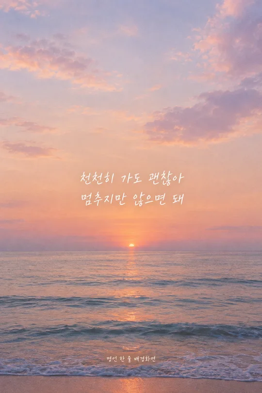
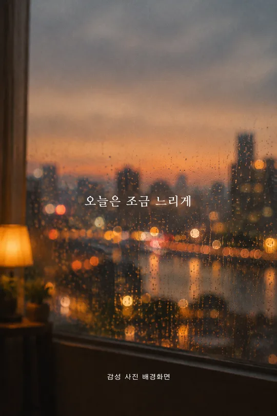
쓰는 법 · 자주 묻는 것
이런 때 쓰세요
아침에 휴대폰을 켰을 때 계절이 바뀐 느낌을 받고 싶다면 가을 장면 하나를 배경화면으로 만들어 보세요. 단풍 길, 은행잎, 억새 들판, 창가의 커피와 낙엽 중 하나를 고르고 사진·일러스트·수채화 중 마음에 드는 표현을 붙이면 됩니다. 같은 장소라도 사진은 실제로 다녀온 듯하고, 일러스트는 모양과 색이 또렷하며, 수채화는 종이에 스민 색처럼 부드럽게 보입니다. 잠금화면과 홈 화면에 적용한 뒤 스토리에 올려 계절을 바꾼 화면을 나누기에도 좋아요. 스토리에 쓰고 싶은 설명은 스토리 편집기에서 별도로 넣을 수 있습니다.
칸 채우는 법
- 기종: 사용 중인 휴대폰 모델을 적으세요. 폴더블은 메인 화면인지 커버 화면인지까지 고르세요. 모델을 모르면 보기의 9:16을 택하면 됩니다. 이 값으로 화면 형태와 시계·카메라·독 위치를 맞추므로 별도의 크기 칸은 없습니다.
- 장면: 네 장면 중 하나만 고르세요. 단풍 길은 숲의 깊이, 은행잎은 선명한 잎 모양, 억새 들판은 바람과 넓은 하늘, 창가 커피와 낙엽은 실내에서 바라본 계절이 중심입니다. 「알아서 골라줘」를 누르면 이 중 하나를 골라 줍니다. 네 장면을 한꺼번에 섞으라는 뜻은 아니에요.
- 느낌: 사진은 실제 카메라로 찍은 듯한 화면, 일러스트는 선과 면으로 그린 화면, 수채화는 물감과 종이의 부드러운 질감입니다. 장면을 유지한 채 느낌만 바꾸어 다시 만들어 보면 어느 쪽이 앱 뒤에 더 편안한지도 비교할 수 있습니다.
- 한 줄 문구: 넣고 싶은 말이 있으면 짧게 적으세요. 「알아서 골라줘」를 누르면 장면에 맞는 짧은 한국어 문구를 직접 지어 넣습니다. 비워 두면 문구 없이 그림만 만듭니다. 문구가 있을 때에는 폰에서 한눈에 읽히도록 화면 높이의 약 4~5%인 글자 크기로 중앙의 조용한 자리에 배치합니다.
칸을 채운 다음 프롬프트를 복사해 GPT에 붙여넣으세요. 사진을 따로 올릴 필요는 없습니다. 계절에 맞춰 다시 만들 때는 장면을 바꾸거나, 같은 장면에서 느낌을 바꿔 새 배경을 만들 수 있습니다. 만들어진 파일은 먼저 휴대폰에 저장한 뒤 잠금화면과 홈 화면에서 각각 확인하세요.
시계 자리를 비우는 이유
잠금화면 위쪽에는 실제 휴대폰의 시계와 상태 표시가 놓입니다. 단풍잎 한 장이 멋지게 그려졌더라도 시계 바로 뒤에 오면 잎과 숫자가 모두 잘 안 보일 수 있어요. 이 카드에는 위쪽 약 25%를 하늘, 벽, 먼 배경처럼 차분한 장면으로 이어 그리도록 적었습니다. 아래쪽 약 20%도 독과 화면 조작 표시를 위해 조용하게 둡니다. 가운데에는 가을임을 알아볼 수 있는 잎, 길, 억새나 컵을 놓되, 앱 아이콘이 올라와도 답답하지 않게 합니다. 기종에 따라 실제 시계나 위젯 자리가 다르면 그 배치에 맞추어 여백을 조절하도록 했습니다. 흰 띠나 흐림 효과로 억지로 비우는 방식은 쓰지 않습니다.
그림이 나오면 꼭 볼 것
배경화면을 잠금화면에 적용해 시계가 잘 읽히는지 먼저 보세요. 홈 화면에서는 앱 이름과 독이 배경에 묻히지 않는지 살펴보세요. 은행잎을 골랐다면 부채 모양이 자연스러운지, 억새라면 같은 줄기가 반복되지 않는지, 창가라면 컵이 실제 탁자에 놓인 것처럼 보이는지 확인하면 좋습니다. 선택한 느낌도 한 장 안에서 끝까지 같아야 합니다. 문구를 넣었다면 원문과 한 글자씩 대조하고 폰을 손에 든 거리에서 바로 읽히는지 확인하세요. 문구 칸을 비웠다면 뜻 모를 영어 글씨나 서명이 없어야 합니다. 스토리에 올릴 때는 저장한 그림을 고른 뒤 그때의 기분을 스토리 편집기에서 덧붙이세요.
틀린 곳 고치는 법
처음 그림을 만든 대화에서 겹치는 위치를 짚어 다시 요청하세요. 예를 들어 「윗부분 단풍잎이 시계에 겹쳐요. 잎은 가운데로 내리고 위 25%는 조용한 하늘로 이어 주세요」라고 말하면 됩니다. 수채화가 너무 흐려 장면을 알아보기 어렵다면 「종이 질감은 유지하고 은행잎 모양만 더 또렷하게 그려 주세요」처럼 고칠 대상을 좁혀 보세요. 글씨가 작다면 「문구의 한글 글자 높이를 전체 화면의 4~5%로 키우고 중앙 여백에 놓아 주세요」라고 요청할 수 있습니다. 글자가 틀렸다면 정확한 한 줄을 다시 붙여 다른 부분은 그대로 두고 그 글자만 고쳐 달라고 하세요.
자주 묻는 것
- 기종을 모르면 어떻게 하나요? 기종 칸에서 9:16을 고르면 일반적인 세로 배경화면으로 만들 수 있습니다.
- 사진을 꼭 올려야 하나요? 아니요. 장면과 느낌만으로 새로운 가을 그림을 만드는 카드입니다.
- 문구를 쓰지 않아도 되나요? 네. 마지막 칸을 비우면 글자 없는 가을 배경화면이 됩니다.
- 시계나 앱 아이콘도 그려지나요? 아니요. 휴대폰이 표시하는 요소이므로 그림에는 그 자리를 위한 조용한 배경만 남깁니다.
- 스토리에는 어떻게 올리나요? 완성된 배경화면을 저장해 스토리 사진으로 고르고, 공유할 말은 스토리 편집기에서 따로 넣으세요.