
전체 · 배경화면 · 폰 배경화면 · 감성 문구
064명언 한 줄 배경화면
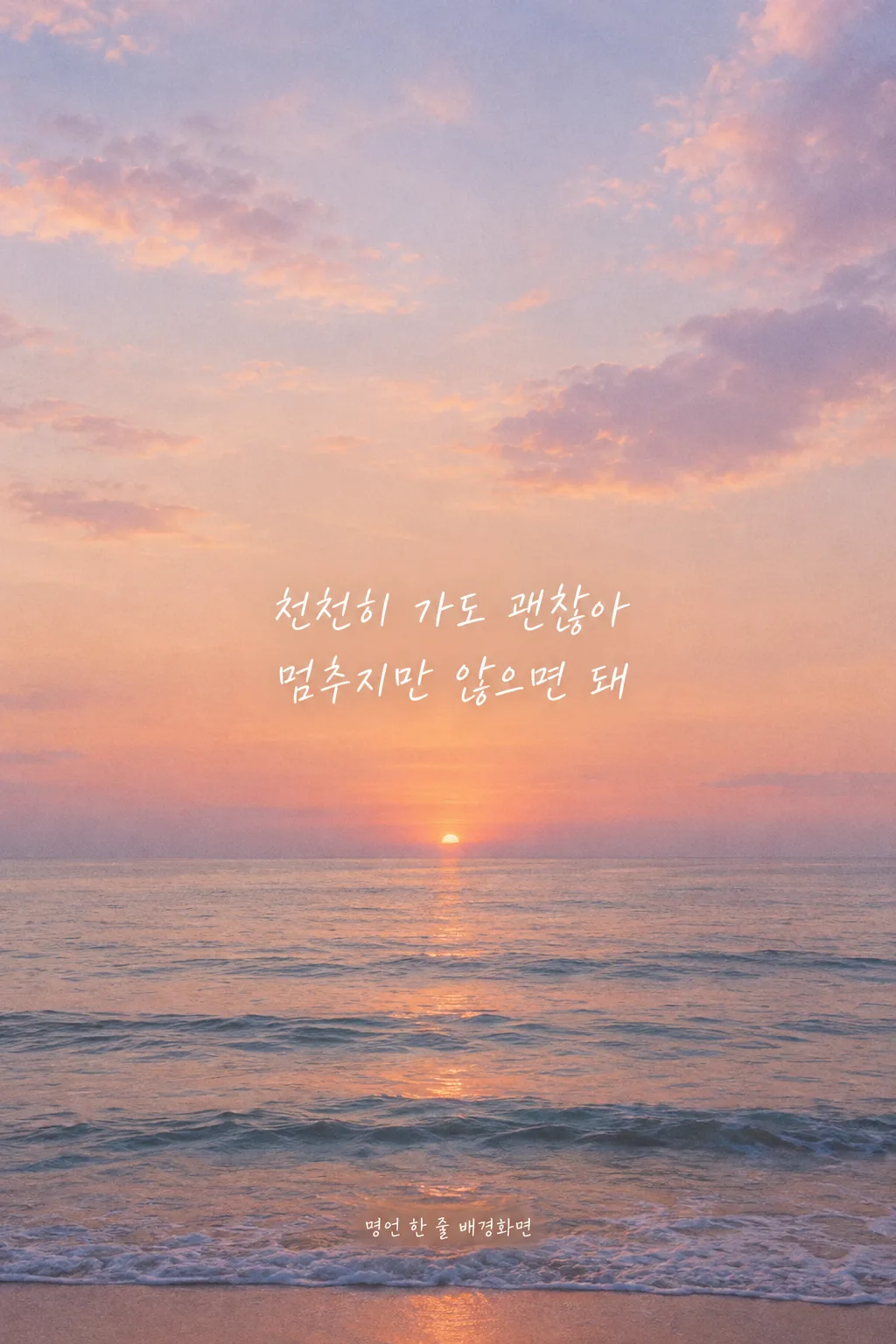
오늘 필요한 응원 한 줄과 분위기, 글씨를 골라 매일 보는 잠금화면에 담아요.
칸 채우기
- 1칸을 채워요
- 2복사 버튼을 눌러요
- 3GPT 채팅창에 붙여넣어요
- 4제품·인물 사진을 쓰려면 사진과 프롬프트를 둘 다 넣은 뒤에 보내요 선택
프롬프트 원문 보기 8,366자
Generate this image now. Draw it directly - do not describe it, explain it, or ask questions.
Target phone screen: "【기종】". If the value is 9:16, make a 1080x1920 portrait wallpaper. Otherwise, before drawing, look up the named device's native display resolution and aspect ratio, camera cutout, lock-screen clock placement, notification area, and bottom controls. For a foldable use the named main or cover display; if neither is specified use the main display. Draw at the device's native aspect ratio and resolution. Adapt the safe zones below to that screen rather than cropping a generic poster. Do not report the lookup.

[Purpose]
Create one complete Korean lock-screen wallpaper that someone will want to see every day for encouragement and courage. The single short sentence is the unmistakable visual center of the work; the background supports it with atmosphere and generous negative space. Make a flat, edge-to-edge image ready to save, with no handset, bezel, lock-screen interface, social-story frame, or mockup. It should also look composed when the saved image is shared in a story. The image must feel personal and calm, not like a motivational advertisement or a page of text.

[Scene]
Interpret the chosen atmosphere "【분위기】" as a single coherent visual setting. For "새벽 하늘", use a believable predawn blue-to-pale-light sky with soft cloud variation and a low, unobtrusive horizon; for "바다", use a quiet sea with a plausible horizon, fine water detail and restrained early light; for "종이 질감", use a tactile matte sheet with delicate fibers, slight unevenness and very soft tonal variation, without a printed page border; for "필름 사진", make an original, observed-looking photographic moment with restrained grain, gentle color shifts and realistic perspective, leaving an open low-detail area for the words. Choose just one direction. Do not combine all four, add unrelated objects, or turn the background into a stock quote template. Keep upper and lower safe areas as natural continuations of the same scene, not blank bars. Use subdued color and real depth or material detail so the wallpaper still feels finished beyond the sentence.

[Attached photo]
No user photo is required. Make the background and Korean typography from the selected inputs. If a personal photo is attached in the same request, use it only as a reference for the person's own scene while preserving its recognizable geography and leaving a legible, interface-safe place for the sentence. Do not invent a portrait, celebrity, brand, famous landmark, film still, book cover, or recognizable existing artwork.

[Text layout]
Use the entire canvas height as the coordinate system. Reserve the top 0-48% for the camera cutout, status icons, lock-screen clock, widgets, and the first notification area. Keep all lettering out of that band and keep bright focal objects or hard edges away from the clock. Reserve the bottom 84-100% for lock-screen controls and the gesture bar. Put the sentence in a quiet horizontal zone around 58-76% of canvas height: centered left to right and visibly below the screen midpoint, yet comfortably above bottom controls. These are starting guides; adjust them after checking the actual device so the words do not overlap the clock or expected notifications. Leave at least 8% of the canvas width clear on either side and generous breathing room above and below. One line is preferred when it reads naturally at phone size; use two balanced lines at Korean phrase boundaries when a narrower screen requires it. Never shrink the words into tiny type or let them touch the edge, horizon, texture seam, or a bright patch.
Make the Korean letters large enough to read in one glance on an actual phone lock screen: each Hangul syllable should be about 4-5% of the full canvas height (about 77-96 pixels on a 1080x1920 wallpaper), with clear strokes and comfortable line spacing. If the line is too long, break it into two balanced lines at a natural Korean phrase boundary while keeping this letter height; never reduce it to tiny type just to force one line.
Requested Korean sentence: "【문구】"
If the requested sentence line is absent because the optional field was left blank, or its value is exactly "알아서 골라줘", do not print that instruction. Write one new, original Korean sentence of encouragement or courage yourself, about 10-22 Hangul syllables with plain everyday wording. Make it sound like a quiet thought a person could bear reading every day, not a promise of guaranteed success. Do not borrow a familiar quotation, lyric, poem line, slogan, or speech. If a different sentence was supplied, render that sentence exactly as entered, including every Korean syllable, space, and punctuation mark; do not silently improve, shorten, or paraphrase it.

[Style]
Let "【글씨】" determine the lettering, not printed copy. "손글씨" means a neat, human Korean hand with consistent complete Hangul strokes and restrained character variation, never childish scrawl. "명조" means a refined Korean serif with clear contrast and balanced spacing; "고딕" means a clean Korean sans serif with open counters and gentle weight. Use only one family for the sentence. Choose a text tone with firm readability against the selected atmosphere: warm ivory on a dark dawn or sea, charcoal on light paper, or a suitably contrasting neutral in a film image. Avoid a thick outline, glowing letters, strong drop shadow, sticker, opaque label, or rectangular text panel. A barely perceptible local tonal adjustment within the scene is acceptable when needed for contrast.

[Visual hierarchy]
The sentence must be the first thing noticed, followed by the chosen background atmosphere. Place scenic details away from the lettering; a horizon, cloud, wave, paper crease, bright highlight, or film object must not run through any glyph. Keep the whole image balanced when the phone is held vertically and allow slight edge cropping. The clock region must remain calm enough for white or dark interface lettering to be read, while the sentence occupies its own lower-middle space. Do not draw phone interface elements or story captions into the image. The image should work with real lock-screen overlays rather than depicting a pretend screenshot.

[Lighting and texture]
Use physically plausible soft light for sky, sea, or film photography, and restrained even light for matte paper. Preserve gentle color transitions and meaningful detail without busy patterns. Texture may be visible on close inspection but should not interfere with a single consonant or vowel stroke. Avoid blown highlights, crushed shadows, artificial fog, lens flare, excessive stars, fake film light leaks, heavy grain, oily gradients, repeated waves, and synthetic looking cloud patterns. Keep contrast around the sentence clear and stable at small phone viewing size.

[Text rules]
Render exactly one sentence, once, as complete Korean Hangul with no spelling error. Preserve the supplied text verbatim when present; for a generated sentence, proofread every syllable and space before finishing. Never print the field values "【분위기】", "【글씨】", or "【기종】" as labels. Do not add an author, attribution, date, second quote, English translation, logo, watermark, signature, or decoration that resembles stray letters. Never invent or credit a quotation to a real person. If a real person's words or name are explicitly requested, treat them as a sourced quotation only when exact wording and attribution are confirmed from a reliable source; otherwise avoid a claim about that person and use an original, unattributed encouragement line. Check that no glyph is split, duplicated, cropped, or hidden by scenery. If Korean text cannot be rendered accurately, leave no substitute gibberish: make a clean space for a corrected retry.

[Avoid]
No phone frame, hand holding a phone, lock icon, clock, time, date, battery, signal bars, notification cards, camera or flashlight buttons, app icons, home-screen dock, story interface, border, label, speech bubble, decorative quotation marks, title, hashtag, or extra lettering. No celebrity likeness, copied book art, trademark, attributed line with uncertain origin, famous lyric, misspelled Hangul, pseudo-Korean marks, duplicate sentence, high-contrast object behind text, neon glow, poster slogan treatment, or crowded decoration. Output one finished wallpaper image only.
이 카드도 많이 사용해요
쓰는 법 · 자주 묻는 것
이런 때 쓰세요
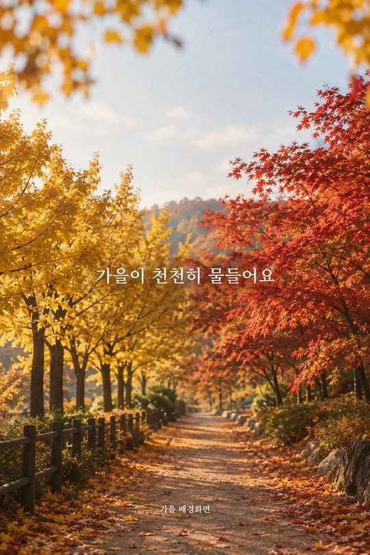
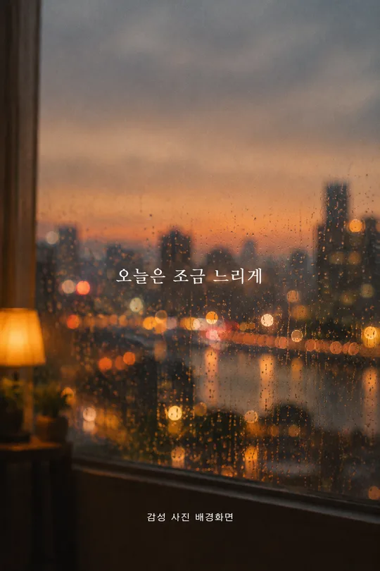
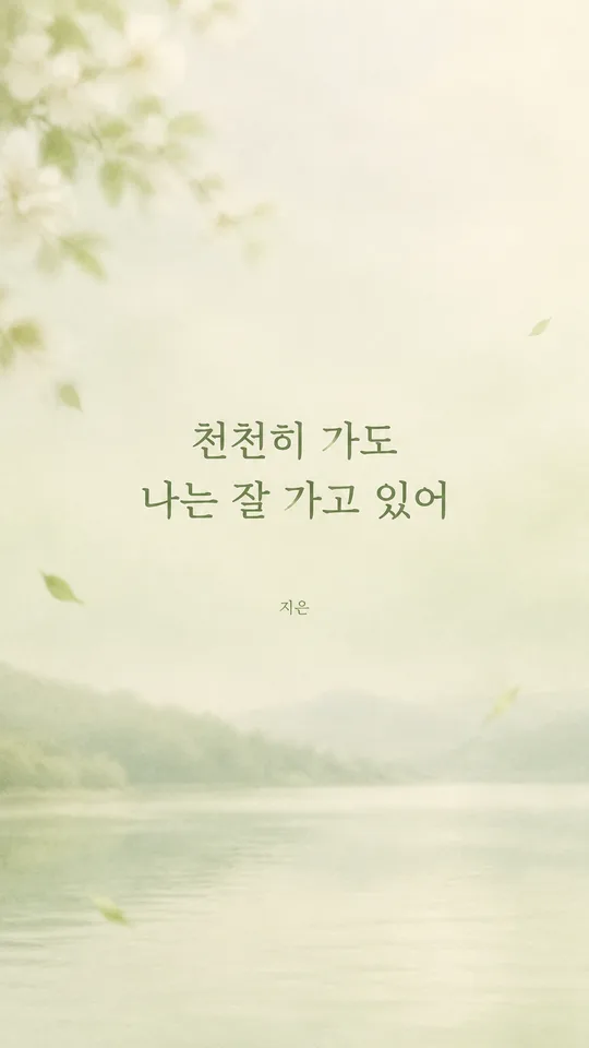
휴대폰을 켤 때마다 긴 조언보다 짧은 한마디를 보고 싶을 때 쓰는 잠금화면 배경화면이에요. 일이 잘 풀리지 않는 날에는 용기를 주는 말을, 새로운 일을 시작하는 날에는 오늘의 마음을 붙잡아 주는 말을 한 줄 골라 보세요. 완성된 그림은 그대로 잠금화면에 지정할 수 있고, 색과 글씨가 마음에 들면 스토리에 올려 하루의 기분을 나눌 수도 있습니다. 이 카드는 풍경 사진을 감상하는 배경화면이나 계절 이름을 넣는 월간 문구 화면과 달리, 매일 읽을 한 문장을 화면 가운데 아래쪽에 또렷하게 놓습니다.
칸 채우는 법
- 기종: 휴대폰 이름을 적어 주세요. 폴더블이면 메인 화면인지 커버 화면인지 꼭 구분해 주세요. 기종을 모르면 「9:16」을 쓰면 일반적인 세로 배경화면으로 만들어요. 화면 크기를 따로 적는 칸은 없습니다.
- 문구: 오늘 듣고 싶은 말을 짧게 적어 주세요. 빈칸으로 두거나 「알아서 골라줘」를 누르면 GPT가 응원이나 용기를 담은 한 문장을 새로 씁니다. 보기의 문장도 그대로 쓸 수 있어요. 직접 적은 문구는 띄어쓰기와 문장부호까지 그대로 그리도록 지시했습니다.
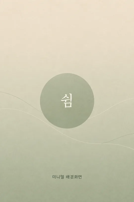
- 분위기: 새벽 하늘, 바다, 종이 질감, 필름 사진 중 하나를 골라 주세요. 새벽 하늘과 바다는 고요한 자연 장면, 종이 질감은 글에 집중하기 좋은 표면, 필름 사진은 실제 순간을 담은 듯한 배경으로 해석합니다.
- 글씨: 손글씨는 다정하고 개인적인 느낌, 명조는 차분하고 단정한 느낌, 고딕은 간결하고 또렷한 느낌이에요. 같은 문구라도 글씨에 따라 인상이 달라지므로 자주 읽고 싶은 쪽을 골라 보세요.
실존 인물의 명언을 직접 적고 싶다면 원문과 이름을 신뢰할 수 있는 출처에서 먼저 확인해 주세요. 출처가 불확실한 말을 유명인의 말로 표시하지 않는 편이 안전합니다. 문구가 생각나지 않을 때는 자동 문구를 쓰면 출처가 필요한 인용 대신 새로 쓴 한 줄이 들어갑니다. 사진을 따로 올릴 필요는 없습니다. 네 칸을 채우거나 문구만 비운 뒤 프롬프트를 복사해 GPT에 붙여넣으세요.
잠금화면에 맞게 만든 이유
잠금화면에는 위쪽 시계와 상태 아이콘이 놓이고, 알림은 그 아래로 내려올 수 있어요. 그림 자체가 예뻐도 그 자리에 문구를 넣으면 실제 휴대폰에서는 읽기 어려워집니다. 그래서 이 카드는 문구를 화면 높이 약 58~76%의 가운데 아래쪽에 배치하고, 한글 한 글자의 높이를 화면 높이의 약 4~5%로 잡아 한눈에 읽히게 합니다. 문장이 길면 작은 글씨로 줄이지 않고 자연스럽게 두 줄로 나눕니다. 아래쪽 버튼과 제스처 자리도 비우도록 지시합니다. 숫자는 출발점이에요. GPT가 선택한 기종의 화면 비율과 카메라 구멍, 시계 위치를 확인해 알맞게 조정해야 합니다. 알림을 많이 띄우는 휴대폰이라면 완성 뒤 실제 잠금화면 미리보기에서 겹침을 다시 확인해 주세요.
그림이 나오면 꼭 볼 것
가장 먼저 문구를 한 글자씩 읽어 주세요. 한글 음절, 띄어쓰기, 마침표가 입력한 말과 같아야 합니다. 「알아서 골라줘」를 골랐다면 그 말 자체가 그림에 없어야 하고, 새로 쓴 응원 문장 하나만 보여야 해요. 글이 시계나 알림과 겹치지 않는지, 화면 하단의 손전등·카메라 버튼 자리와도 떨어져 있는지 살펴보세요. 문구가 잘 읽히더라도 하늘의 밝은 구름이나 바다의 수평선이 글자를 가로지르면 실제 화면에서는 불편할 수 있습니다.
틀린 곳 고치는 법
한 글자라도 틀리면 같은 대화에서 「문구를 '오늘도 한 걸음이면 충분해'로 정확히 다시 써 줘. 띄어쓰기까지 그대로 두고 다른 요소는 유지해 줘」처럼 요청하세요. 알림과 겹친다면 「문구를 조금 더 아래로 옮기되 화면 하단 버튼보다 위에 둬」라고 말하면 됩니다. 글씨가 배경에 묻히면 배경의 해당 부분만 조용하게 하고 글자 대비를 높여 달라고 하세요. 다시 받은 그림도 휴대폰 잠금화면에 적용하기 전에 문구와 위치를 확인하는 것이 좋습니다.
자주 묻는 것
- 문구를 비워도 되나요? 네. 비우거나 「알아서 골라줘」를 고르면 GPT가 짧은 응원·용기 문장을 새로 씁니다.
- 기종을 모르는데 만들 수 있나요? 네. 기종 칸에 「9:16」을 입력하면 일반 세로 비율로 만들 수 있어요.
- 명언의 저자를 그림에 넣어 주나요? 기본 결과는 한 문장만 보여 줍니다. 실존 인물의 이름과 말을 연결하려면 신뢰할 수 있는 출처로 문구와 저자를 먼저 확인해 주세요.
- 사진을 올려야 하나요? 아니요. 네 칸의 선택만으로 배경과 문구를 만들 수 있습니다.
- 스토리에는 어떻게 올리나요? 완성된 배경화면 이미지를 휴대폰에 저장한 뒤 스토리 편집기에서 사진으로 불러오세요. 스토리 문구나 스티커는 그때 따로 얹으면 됩니다.