
전체 · 광고/포스터 · 신메뉴·신상품 · 음식점·식당
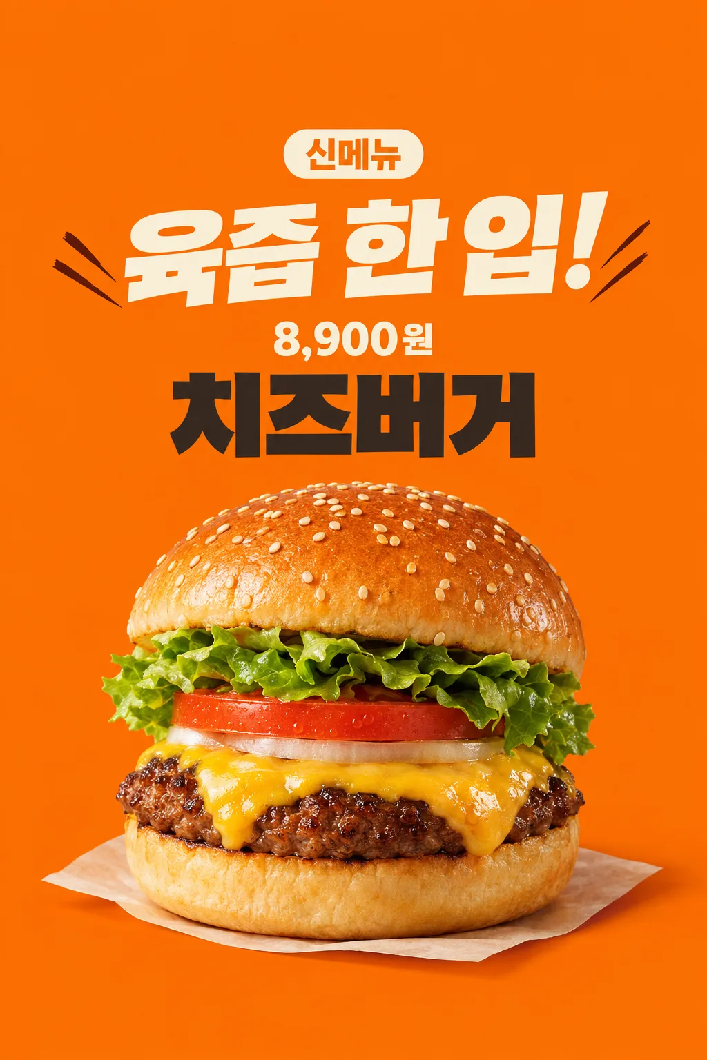
175수제버거 신메뉴 포스터
버거 가게 사장이 실제 음식 사진과 판매 가격으로 출입문·SNS 신메뉴 포스터를 만들어요.
칸 채우기
- 1칸을 채워요
- 2복사 버튼을 눌러요
- 3GPT 채팅창에 내 버거 사진 1장을 올리고, 프롬프트를 같이 붙여넣어요
- 4내 버거 사진 1장과 프롬프트가 둘 다 들어간 걸 보고 보내요
프롬프트 원문 보기 6,414자
Generate this image now. Draw it directly - do not describe it, explain it, or ask questions.
Output one landscape A3 poster, 420 x 297 mm, aspect ratio 1.414:1. Use the largest supported image resolution. Final print target is 4961x3508 pixels at 300dpi; keep all lettering at least 10 mm inside every paper edge. Preserve the wide composition and print-safe margins.

[Purpose]
Create one finished appetizing new-burger poster for a burger shop's entrance and social account. Use the actual attached food photograph and the shop's supplied menu name and final selling price. One industry, one hero burger, one fixed energetic orange poster. The image must make the real food look inviting before adding information. It is not a discount offer, a menu grid or a launch-date teaser.

[Scene]
The menu name is "【메뉴 이름】". The exact selling-price string is "【판매 가격】". The short headline is "【큰 한마디】". If the headline is "알아서 골라줘", choose one original short food-sensation phrase of at most ten Korean/Japanese characters or four English words, based only on visible food features. Do not print the automatic control. Do not invent an ingredient, discount, free side, portion, delivery method, available date, limited quantity, bestseller rank, origin, nutritional advantage or cooking claim. The fact that this is a new-menu announcement is the card's fixed purpose; do not infer any extra launch condition.

[Attached photo]
The single actual burger photograph is REQUIRED. Preserve the visible burger's ingredient count, bun form, patty texture, cheese and vegetable layers. Do not replace the user's burger with a generic taller product, multiply patties or add bacon that is absent. Recompose the same burger as one appetizing hero in the poster, while excluding branded wrapping, logos and other dishes. Preserve the rounded puffy top bun and thick soft bottom bun when present; bread must not become a flat biscuit. Sesame seeds vary naturally in position and size rather than repeating in a geometric pattern. The seared patty edge has irregular browned bits, and melted cheese follows the uneven food surface. Tomato and lettuce remain plausible continuous pieces, not floating identical sheets. Keep the actual ingredient order in the photo.

[Text layout]
All visible copy is in Korean, except a supplied currency or name which keeps its exact spelling. The orange ground fills the canvas. At13-17% print the small clear fixed label "신메뉴". At18-29% print the supplied or newly chosen sensation headline in very large cream lettering over at most two lines. At45-89%, show one close three-quarter burger hero, with its base resting on a subtle cream paper surface and a real contact shadow. Do not add a drink, fries, second burger or exploded ingredients. At35-44% set "【메뉴 이름】" in large charcoal block lettering. At30-34% set "【판매 가격】" directly on the orange ground, with no price rectangle behind it; keep the supplied currency and all digits. The price is smaller than the headline but clear in a thumbnail. Leave the upper12% and lower15% free of important text.
If supplied, put "【가게 이름】" once as a modest shop signature beside the menu name above the food, inside the central text-safe region. If this instruction is removed, do not invent a shop or draw a blank label.

[Style]
One energetic Korean burger-shop poster: flat warm orange, bold cream typography, dark menu name and one realistic food photograph. Restrained diagonal ink strokes beside the headline add momentum without glowing or covering letters. The photographed food remains realistic, not illustrated or made of plastic. Avoid decorative awards, glossy3D letters, thick gold outlines, flames, exploding sauce, photorealistic sparks and neon. Use the whole image as finished flat art; no restaurant wall or phone mockup surrounds it.

[Visual hierarchy]
Food appetizingness and the big headline lead, followed by the price and menu name above the food. Keep clean readable hierarchy and at least7% side margins. Never hide a digit in cheese, sesame, decorative strokes or shadow. The menu and price stay above the food. Reduce the hero's height before sacrificing the text-safe region. Long menu names can break into two readable lines while the price remains one intact string. Do not repeat 'new' in the headline when the fixed new-menu label already says it.

[Lighting and texture]
Warm close studio light reveals moist seared meat, soft bun volume, naturally draped melted cheese and crisp visible leaves. Highlights are small and uneven, not a mirror-like greasy coating. A subtle warm contact shadow anchors one complete burger; no extreme steam cloud hides the food. Background orange contrasts with darker meat and pale bread. Food geometry and actual contents take priority over dramatic effects. Finish one image usable as supplied without cropping or compositing.


[Binding safe composition]
Arrange ALL text in the upper half of the finished poster. On1024x1536: y0-185 is empty orange; new-menu label y190-260; big sensation headline y275-460; intact price string y465-525; menu name y535-670; one complete puffy burger and contact paper x145-885,y690-1385. From y1300 down there is only orange, no text. Never put the price or menu name beneath the food. Place price directly on orange, no price plate. Preserve bun volume and realistic food proportions by uniformly scaling the whole burger. These ranges are binding and adapt proportionally.

[Text rules]
All quoted visible copy belongs to the artwork, while input labels and instruction headings do not. Resolve any automatic wording control into a short original sentence before drawing; never print that control literally. Preserve provided spelling and numbers, and use the target language consistently. Keep readable letters separate from highlights, folds, shadows and decorative marks. Do not invent a price, discount, date, availability, award, endorsement, biography or purchasing condition. The fixed composition and medium stay the same for every user; personal inputs change its content only.

[Avoid and final delivery]
Deliver exactly ONE finished raster image in this response. Draw it directly with image generation. Do not execute code, give drawing instructions instead of an image, offer multiple versions, create separate pages, ask for a next message, or require cropping and assembly. No phone mockup, browser frame, watermark, publisher logo, branded packaging, existing character or celebrity likeness. Finish all artwork within the selected aspect ratio, preserving the composition and large readable lettering. Leave the upper 12% and lower 15% free of essential lettering and maintain generous side margins.
이 카드도 많이 사용해요




쓰는 법 · 자주 묻는 것
이런 때 쓰세요
버거 가게에서 새로 판매하는 메뉴를 출입문이나 매장 SNS에 알릴 때 쓰는 포스터예요. 오렌지색 바탕, 큰 맛 표현, 실제 버거 한 개의 가까운 사진, 메뉴 이름과 가격으로 구성됩니다. 피자나 치킨까지 함께 넣는 공용 음식 포스터가 아니라 버거 가게용 한 장이에요. 할인율이나 출시일을 임의로 붙이지 않고, 신메뉴가 어떤 모습인지 먼저 보여 줍니다. 메뉴판 전체를 바꾸기보다 이번에 소개할 한 가지 버거를 강조하고 싶을 때 맞아요.
칸 채우는 법
메뉴 이름은 지금 판매할 메뉴판의 표기 그대로 적어 주세요. 판매 가격에는 손님이 실제로 결제할 금액과 통화를 함께 넣으세요. 예시의 8,900원은 입력법을 보여 주는 값이며 권장 판매가가 아닙니다. 가게 이름은 선택 사항이므로 넣고 싶지 않으면 비워 두세요. 가짜 가게명 보기는 제공하지 않아요. 큰 한마디는 직접 적거나 ‘알아서 골라줘’를 누르면 됩니다. 자동 문구는 첨부 음식에 보이는 결을 바탕으로 짧게 고르도록 했어요. 확인되지 않은 원산지, 수제 공정, 최고 순위, 건강 효과를 새로 만들지 않아요.
음식 사진은 필수예요
실제로 파는 버거 사진 한 장을 준비해 주세요. 번의 모양과 패티, 치즈, 채소 층이 보이는 사선 구도가 좋아요. 다른 메뉴나 컵, 포장 로고가 크게 나온 사진은 제품 자체가 잘 보이는 사진으로 바꾸는 편이 좋습니다. 무료 GPT에 사진을 첨부하고 아직 보내지 마세요. 같은 메시지에 복사한 프롬프트를 붙여넣은 뒤 사진과 글이 함께 들어간 것을 확인하고 한 번 보내세요. 사진만 먼저 보냈다면 끝에 ‘위 사진으로 그려줘’를 덧붙일 수 있어요. 사진을 넣지 않고 업종 이름만으로 실제 판매품을 맞히게 하는 카드가 아닙니다.
썸네일의 음식은 어떻게 확인했나요
한국 매장의 실제 치즈버거 사진을 웹에서 찾아 앞면과 재료 층을 직접 열어 봤어요. 부풀어 있는 윗번과 두께 있는 아랫번, 잘게 구워진 패티 가장자리, 처지는 치즈와 실제 채소 모양을 기준으로 표지와 비교합니다. 참고 사진의 브랜드, 가격, 포장 디자인이나 행사는 카드에 가져오지 않았어요. 썸네일은 입력 예시를 위한 가상 버거이며, 손님에게 올릴 결과는 첨부하는 본인 음식 사진을 유지하도록 했습니다.
그림이 나오면 꼭 볼 것
내 가게의 실제 버거와 나란히 보고 번이 납작해지지 않았는지, 패티 수가 늘지 않았는지, 없는 베이컨이나 사이드가 붙지 않았는지 확인하세요. 참깨가 격자처럼 반복되거나 채소가 공중에 떠 있으면 자연스러운 음식 사진이 아니에요. 글자보다 음식이 먼저 맛있어 보이되, 메뉴와 가격의 숫자는 정확하게 보여야 합니다. 가격 뒤에 검정 네모를 두지 않고 오렌지 바탕에 직접 쓰도록 했어요. 화면 아래쪽 안전 여백에는 중요한 가격이 들어가지 않아야 합니다.
실제로 게시하거나 붙일 때
게시 전에 실제 메뉴 이름과 결제 금액을 다시 대조해 주세요. 할인, 무료 제공, 배달, 기간, 수량을 알릴 필요가 있으면 확인한 내용을 가진 다른 행사 카드를 쓰는 편이 맞아요. 이 포스터를 큰 종이로 출력하려면 인쇄소에 원하는 종이 크기와 결과 이미지의 해상도를 함께 전달하세요. 이미지 생성 결과만으로 어떤 인쇄 크기에서도 선명하다고 보장하지 않습니다. SNS에는 한 장을 그대로 올릴 수 있고 조각을 잘라 다시 조립할 필요가 없어요.
자주 묻는 것
- 사진 없이도 실제 메뉴를 만들 수 있나요? 이 카드는 음식 사진이 필수예요. 메뉴 이름만으로 만드는 모습은 실제 판매품과 달라질 수 있습니다.
- 가격이나 혜택을 알아서 정하나요? 아니요. 가격은 가게가 정한 값만 그대로 쓰고, 할인과 증정 조건은 넣지 않아요.
- 무료 GPT에서 직접 시험했나요? 표지는 이미지 API로 생성해 음식 구조와 글자를 확인했어요. 무료 GPT 화면에서의 직접 생성은 시험하지 않았고, 계정의 이미지 기능과 남은 사용량에 따라 달라질 수 있어요.
가격과 메뉴 이름을 버거 위에 모아 중요한 글자가 목록 아래 제목에 가리지 않게 했어요. 아래쪽에는 음식 사진만 남습니다.