
전체 · SNS/카드뉴스 · 밈·공감
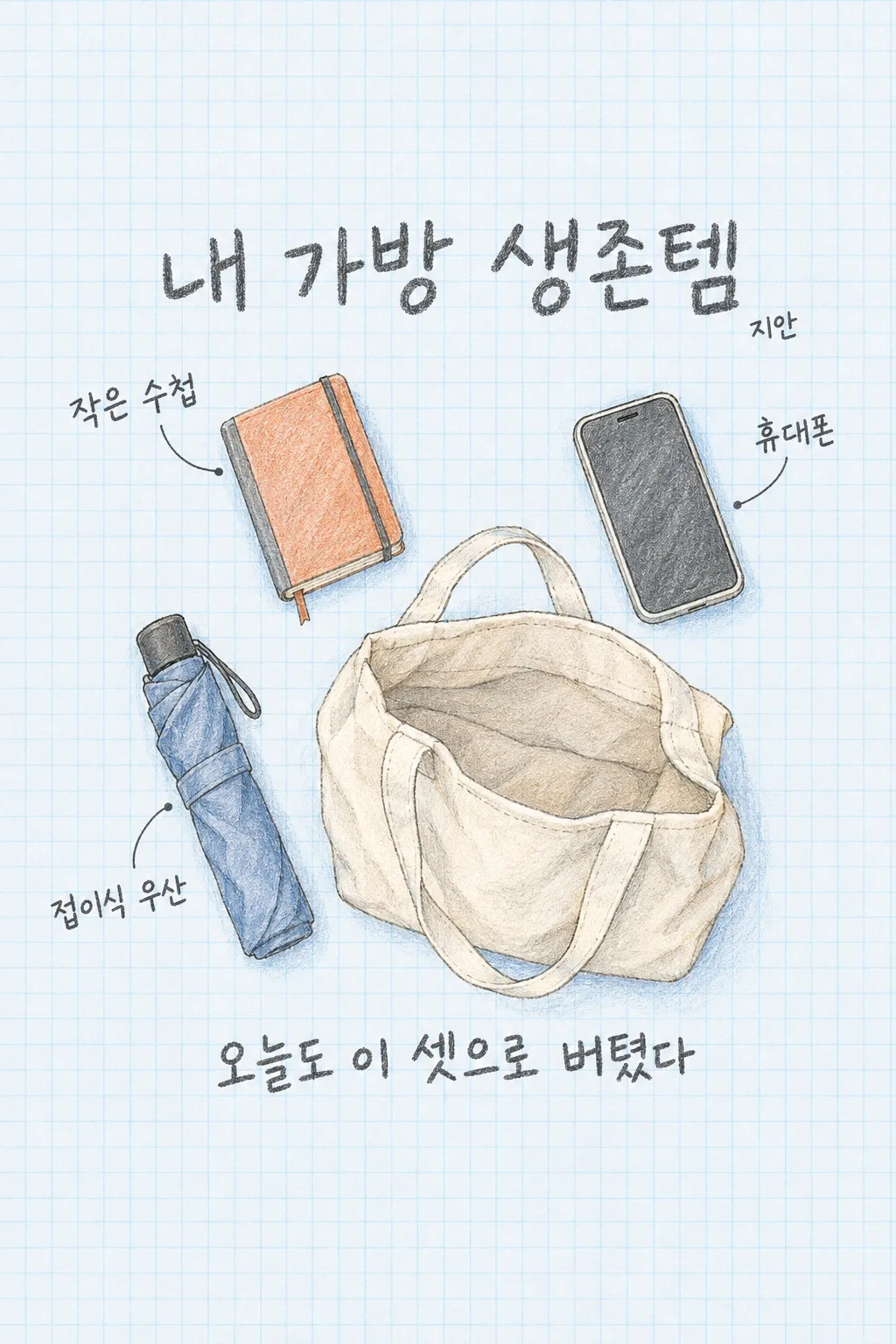
168내 가방 생존템
오늘 챙긴 세 물건을 한 장의 연필 콜라주로 만들어 스토리나 스레드에 나의 일상을 올려요.
칸 채우기
- 1칸을 채워요
- 2복사 버튼을 눌러요
- 3GPT 채팅창에 붙여넣어요
- 4제품·인물 사진을 쓰려면 사진과 프롬프트를 둘 다 넣은 뒤에 보내요 선택
프롬프트 원문 보기 5,696자
Generate this image now. Draw it directly - do not describe it, explain it, or ask questions.
Output one landscape A3 poster, 420 x 297 mm, aspect ratio 1.414:1. Use the largest supported image resolution. Final print target is 4961x3508 pixels at 300dpi; keep all lettering at least 10 mm inside every paper edge. Preserve the wide composition and print-safe margins.

[Purpose]
Create one ready-to-share illustrated daily-carry card titled "내 가방 생존템". The user names three actual objects carried today. Turn these objects into one overhead pen-and-colored-pencil arrangement around an open cream canvas tote. This is a personal social post about everyday taste and small comforts, not a product recommendation, shopping list, weight measurement or survival instruction. It is one continuous illustrated sheet, never three separate object cards.

[Scene]
Draw the three supplied objects: "【첫 번째 물건】", "【두 번째 물건】" and "【세 번째 물건】". Use ordinary recognizable silhouettes with no brand logo or invented specifications. A small notebook has a bound cover, an umbrella has a believable folded shaft, and a phone is a simple unbranded rectangle; follow other supplied objects equally literally. These examples do not add extra objects to the user's selection. If two names mean the same object, show it once and do not fabricate a replacement. There is one fixed off-white canvas tote, with an open mouth, seam lines, two connected handles and natural fabric folds. The tote's shape is fixed; the personal object contents can vary.

[Attached photo]
No photograph is required. Interpret the words as everyday objects using original linework. Do not infer a person's occupation, income, health, secrets or habits from the items. No human face or hands appear. Render only the supplied three distinct items and one tote; add no keys, receipt, identity document, bank card, medication, food or extra phone by default.

[Text layout]
All visible wording is Korean. Fill the canvas with very pale blue graph paper and loose graphite outlines with small rust and slate-blue pencil accents. Keep top12% and bottom15% free of important words. At15-24% place the exact title "내 가방 생존템" in large dark graphite hand lettering. The tote occupies the lower-center, about x35-76% and y43-70%, viewed from directly above with its opening visible. Arrange one object upper-left at y29-43%, one upper-right at y31-49%, and one lower-left at y53-70%. Give each distinct object ONE handwritten label using its provided name, linked by one thin curved pointer ending beside the object. Keep pointer lines clear of letter interiors. A long object may follow the left edge diagonally. End every object and object label above74% height. Preserve breathing room rather than arranging a rigid grid. Strictly leave top0-12% and bottom85-100% as graph paper only. The title starts BELOW15% and the entire caption ends BEFORE81%; do not push either text block to the image edges.
If supplied, put "【이름】" once as a small personal signature at26-28%, aligned with the title. Omit this signature when the instruction is absent.
The personal caption input is "【한마디】". If it equals "알아서 골라줘", write one original short Korean line about the three objects keeping the day manageable. Do not invent events, prices, a diagnosis or a real measured bag weight. Otherwise render the user's caption faithfully. Put this single caption at75-80% in large dark pencil handwriting, no more than two short lines. The title, item labels, optional signature and caption are the only text.

[Style and visual hierarchy]
One fixed charming overhead stationery illustration: visible pencil grain, wobbly fine pen contours, translucent colored-pencil filling, natural fabric shading. It feels like a personal notebook page made for sharing. Do not turn it into photorealistic product flat-lay, a retail advertisement, a sticker-pack grid, comic panels or multiple pages. The tote is the main shape, while the objects surround it at different angles. Item labels must remain large enough to read at list size. The whole page should feel connected by the placement of objects and the thin pointing lines, without a box behind each label.

[Lighting and texture]
Use gentle diffuse imagined daylight, light blue paper texture and small soft pencil shadows below each object. Never use glossy neon, bold drop shadows, repeated pattern objects, decorative unreadable script or a barcode. Objects have coherent real shapes: notebook pages join their cover, phone corners agree, tote handles connect to the rim, and folded umbrella ribs stay inside the fabric. Do not claim a diagram measures physical dimensions. Preserve the finished page without requiring users to rearrange anything.

[Text rules]
All quoted visible copy belongs to the artwork, while input labels and instruction headings do not. Resolve any automatic wording control into a short original sentence before drawing; never print that control literally. Preserve provided spelling and numbers, and use the target language consistently. Keep readable letters separate from highlights, folds, shadows and decorative marks. Do not invent a price, discount, date, availability, award, endorsement, biography or purchasing condition. The fixed composition and medium stay the same for every user; personal inputs change its content only.

[Avoid and final delivery]
Deliver exactly ONE finished raster image in this response. Draw it directly with image generation. Do not execute code, give drawing instructions instead of an image, offer multiple versions, create separate pages, ask for a next message, or require cropping and assembly. No phone mockup, browser frame, watermark, publisher logo, branded packaging, existing character or celebrity likeness. Finish all artwork within the selected aspect ratio, preserving the composition and large readable lettering. Leave the upper 12% and lower 15% free of essential lettering and maintain generous side margins.
이 카드도 많이 사용해요
쓰는 법 · 자주 묻는 것
이런 때 쓰세요
가방 속 물건을 보면 오늘 하루를 어떻게 보내는지 조금 드러납니다. 출근길에 챙긴 수첩, 길을 걷다 꺼내는 우산, 연락할 때 쓰는 휴대폰처럼 실제로 들고 다닌 세 물건을 한 장의 그림으로 기록해 보세요. 물건 사진을 여러 장 찍거나 정리해서 편집할 필요 없이 이름만 적으면 됩니다. 열린 천 가방과 주변의 세 물건, 가는 지시선, 짧은 손글씨가 한 페이지로 나옵니다. 스토리나 스레드에서 친구와 “너는 뭘 들고 다녀?” 하고 가볍게 취향을 나누기 좋습니다.
세 물건은 칸마다 하나씩
첫 번째·두 번째·세 번째 물건에 오늘 챙긴 것을 하나씩 적으세요. 한 칸에 쉼표로 여러 개를 몰아넣으면 물건 수가 늘어나 그림과 라벨이 작아질 수 있습니다. “수첩”보다 “작은 수첩”, “우산”보다 “접이식 우산”처럼 형태가 보이는 짧은 이름이 좋습니다. 특정 상품명이나 브랜드를 쓸 필요는 없습니다. 이름 칸은 선택이며 비우면 작은 서명만 빠집니다. 가방은 크림색 천 가방으로 고정되어 있어 가방 종류나 그림체를 고르는 칸은 없습니다.
한마디를 못 정했을 때
한마디 칸의 맨 앞 보기인 알아서 골라줘를 누르면, GPT가 적은 세 물건에 어울리는 짧은 생활 문장을 만듭니다. 직접 “오늘도 이 셋으로 버텼다”처럼 써도 됩니다. 실제 가방 무게나 지출 금액을 재는 카드가 아니므로 그램·원 같은 수치를 임의로 만들지 않습니다. 어떤 일을 겪었는지 쓰지 않았다면 그 사건도 만들어 넣지 않도록 지시했습니다. 그림 속 글자는 제목, 물건 이름, 선택 이름, 한마디뿐입니다.
사진은 필요하지 않아요
칸을 채워 프롬프트를 복사하고 GPT에 한 번 붙여넣어 보내세요. 결과는 위에서 내려다본 한 장의 연필 일러스트입니다. 지갑의 카드번호, 신분증의 내용, 집 열쇠의 자세한 모양처럼 공개할 필요가 없는 것은 물건 이름에 넣지 않는 편이 좋습니다. 결과는 제품의 실제 규격이나 구조를 증명하는 도면이 아니라 일상의 작은 물건을 그린 공유용 이미지입니다.
결과를 확인하는 순서
먼저 입력한 세 물건이 보이는지, 적지 않은 물건이 붙지 않았는지 확인하세요. 이어 라벨이 각각 자기 물건을 가리키는지 보세요. 천 가방의 손잡이는 입구와 연결되어야 하고, 접힌 우산이 있다면 손잡이와 천 부분이 자연스러워야 합니다. 제목과 한마디는 폰에서 읽히는 크기여야 합니다. 여러 물건을 같은 도형처럼 복제하거나 각각의 작은 네모 칸으로 나누면 이 카드의 콜라주 구성과 다릅니다.
고치고 다시 만들 때
물건을 잘못 이해했다면 첫째 칸에 긴 설명을 덧붙이기보다 “검정색 접이식 우산”처럼 모양을 알아볼 짧은 이름으로 바꾸세요. 문장이 너무 길다면 한마디를 짧게 줄인 뒤 전체 프롬프트를 새 메시지로 보내 완성 한 장을 다시 받으세요. 물건마다 따로 그림을 만들거나 잘라서 붙이는 단계는 없습니다. 내용은 바꾸어 다시 쓸 수 있지만 천 가방·연필 콜라주라는 결과 모양은 그대로입니다.
자주 묻는 것
- 가방의 실제 무게를 알려 주나요? 아니요. 세 물건을 그림으로 기록하며 무게를 추측하지 않습니다.
- 사진을 첨부해야 하나요? 아니요. 물건 이름만으로 만드는 연필 일러스트 카드입니다.
- 물건을 여섯 개로 늘려도 되나요? 이 카드는 세 물건에 맞춘 구도입니다. 각 칸에 하나씩 쓰는 것을 권합니다.
- 무료 GPT에서 직접 시험했나요? 제작에서는 API로 표지를 확인했습니다. 무료 GPT 화면의 직접 생성 시험은 하지 않았습니다.