
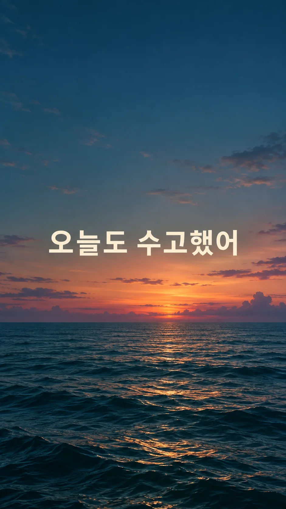
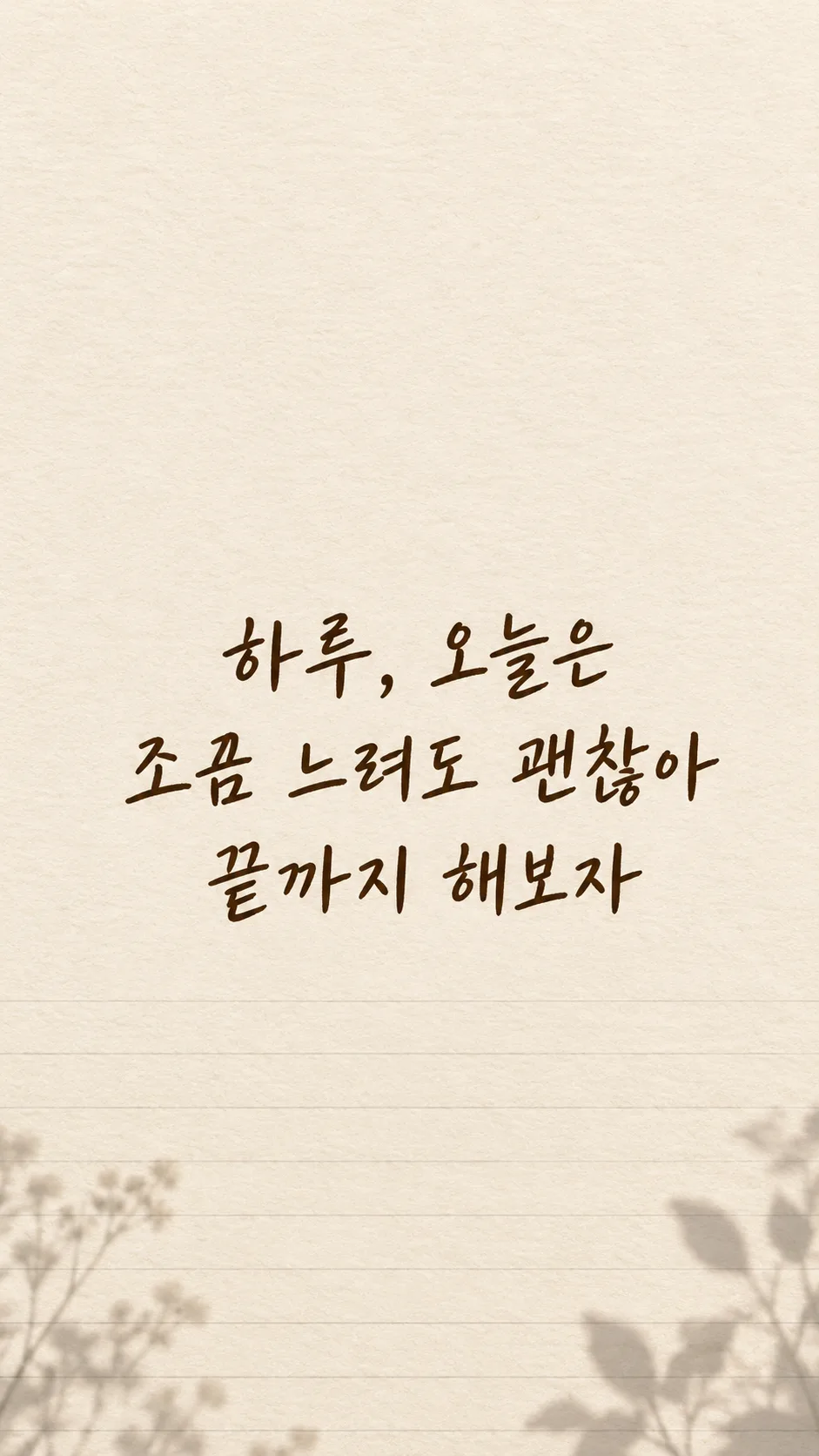
칸 채우기
- 1칸을 채워요
- 2복사 버튼을 눌러요
- 3GPT 채팅창에 붙여넣어요
- 4그대로 보내면 썸네일 예시처럼 나와요
- 5카드에 맞는 실제 사진을 같이 넣으면 그 사진이 반영돼요 — 배경 카드는 배경 사진, 인물 · 음식 카드는 그 사진 선택
프롬프트 원문 보기 3,584자
Generate this image now. Draw it directly, without explanation or questions. Create exactly one finished personal-sentence phone lock-screen wallpaper at aspect ratio Output size 1080x1920 pixels, 9:16 portrait story. Keep all text inside the central 80% of the height: compress every zone percentage below into the 10-90% range.; default 9:16. The scene fills the entire flat canvas edge to edge. No phone, frame, app interface, mockup or collage.
Render the user's own sentence exactly once: "【내 문장】". Preserve every character, space and punctuation mark. Do not translate, paraphrase, shorten, append a quote or invent an author. This is a personal sentence, never a famous-person quotation. If the required sentence is blank, request that sentence only; do not invent a replacement.
Lettering: "【글씨】". Choose the selected family only: handwritten = friendly human handwriting with complete distinct strokes; brush lettering = graceful brush-pressure variation without obscuring characters; clean sans serif = open counters and balanced medium weight; flowing script = softly connected natural lettering, with all syllables and words still clearly distinguishable. These are lettering treatments of the same single wallpaper, not different result formats. If blank, use friendly handwriting.
Background: "【배경】". Use just the selected scene: clouds = airy blue and warm dawn clouds concentrated toward the lower edges; sea = quiet teal water in the lower third and subdued dusk sky; flowers = restrained soft original flower details near lower corners with open quiet center; notebook paper = full-canvas ivory paper fibers and subtle ruled lines near bottom, no separate sheet on a desk; stars = deep indigo night sky with sparse tiny stars away from the lettering and clock area. If blank, use clouds. Keep a calm unified soft matte atmosphere. Do not print the background or lettering labels.
Reserve the upper 25% entirely for a real lock-screen clock: continuous low-detail background, no text, no bright focal objects. Position the sentence centered across the middle-to-lower area, approximately 45–70% height. Keep bottom 16% free of text for controls and at least 9% side margins. Use strong clear contrast and generous spacing, without glowing text, outlines, opaque text boxes or heavy shadows. Avoid horizons, petals, stars or paper lines crossing glyphs.
The sentence is the dominant visual element. Keep individual characters large and legible on a phone. For a long sentence, arrange two to four balanced lines at natural phrase boundaries; line breaks may change but words and punctuation may not. Do not shrink into tiny type, clip letters or omit the end of the sentence. Adjust within the safe region to the chosen aspect ratio.
Before finishing, inspect the sentence character by character at enlarged size, including complex consonants, spaces, punctuation and any supplied numbers or weekdays. Correct damaged, duplicated, missing or substituted glyphs by regenerating before returning the image. Do not print verification notes. Render the supplied text in Korean; do not add another language.
No extra title, subtitle, date, attribution, decorative quotation marks, signature, watermark, logo, trademark, real person, recognizable character or copied artwork. Use original backgrounds. No photo is needed. Return one complete wallpaper image only.

[Final output format]
Output size 1080x1920 pixels, 9:16 portrait story. Keep all text inside the central 80% of the height: compress every zone percentage below into the 10-90% range.
This selected output format takes priority over any fixed canvas size or aspect ratio elsewhere in this template. Adapt the composition, text zones and margins to the selected canvas without stretching or cropping essential content. Device safe areas apply only when a device is selected. Never print these format instructions on the image.
결과 어땠어요?
이 카드도 많이 사용해요
쓰는 법 · 자주 묻는 것
내 문장을 매일 보고 싶을 때
오늘 지키고 싶은 다짐이나 나에게 건네는 말을 잠금화면에 크게 담는 카드예요. 유명인의 말을 찾아 주는 명언 카드와 달리, 내가 적은 문장을 그대로 그립니다. 문장의 뜻을 바꾸거나 저자 이름을 붙이지 않아요. 구름과 바다처럼 잔잔한 장면을 바탕으로 쓰고 위쪽은 실제 휴대폰의 시계가 들어갈 자리로 남깁니다. 종이 위에 작은 카드를 올려놓은 사진이 아니라 저장해서 바로 쓸 수 있는 화면 전체 그림 한 장을 만듭니다.
칸 채우기
- 내 문장은 유일한 꼭 칸이에요. 「천천히, 그래도 꾸준히」처럼 직접 쓴 말을 넣으세요. 「하루, 오늘은 조금 느려도 괜찮아 끝까지 해보자」처럼 이름과 긴 문장을 넣어도 됩니다. 이름은 이 문장에 적었을 때만 나타나요. 비우면 임의의 다짐 대신 문장을 먼저 요청합니다.
- 글씨는 손글씨·붓글씨·깔끔한 고딕·필기체 중 골라요. 손글씨는 다정한 느낌, 붓글씨는 굵기 변화, 고딕은 또렷한 획, 필기체는 흐르는 듯한 느낌으로 같은 문장을 표현해요. 비우면 손글씨를 씁니다.
- 배경은 구름·바다·꽃·노트 종이·별 중 하나예요. 글자가 묻히지 않도록 꽃과 별은 가장자리 위주로 배치하고, 종이는 화면 전체에 질감을 냅니다. 비우면 구름을 씁니다.
공통 크기 선택의 기본값은 9:16입니다. 사진은 필요 없어요. 칸을 채운 프롬프트를 한 번 복사해 그림 AI에 붙여 넣으면 완성 이미지 한 장을 받습니다. 외부 서비스의 요금과 약관은 해당 서비스에서 확인하세요.
저장 전에 대조하기
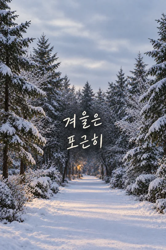
글자를 확대해서 입력 문장과 한 글자씩 맞춰 보세요. 특히 「꾸준히」의 된소리와 「괜찮아」의 받침, 쉼표와 띄어쓰기를 확인하면 좋아요. 긴 문장은 두 줄에서 네 줄로 나뉠 수 있지만 단어나 끝부분이 빠지면 안 됩니다. 표지는 구름과 손글씨, 첫 예시는 바다와 고딕, 둘째 예시는 종이와 붓글씨로 서로 다른 선택을 보여 줍니다.
위쪽 25%에는 문장을 넣지 않도록 지시했어요. 휴대폰마다 시계와 알림 위치가 다르므로 저장한 이미지를 잠금화면 미리보기에서 확인하세요. 알림이 문장을 가리면 같은 대화에서 「문장을 조금 아래로 옮기고 하단 버튼 위에 남겨 줘」라고 요청해 다시 받으세요. 오타가 있으면 정확한 문장을 따옴표 안에 다시 적고 그 글자만 고쳐 달라고 요청합니다.
자주 묻는 것
긴 문장도 되나요? 자연스러운 구절로 나누어 크게 배치하도록 지시합니다. 줄바꿈은 바뀔 수 있고 원문은 유지해요. 화면에 너무 많은 글을 넣으면 읽기 어려우니 한 번에 읽고 싶은 문장 하나를 권해요.
이름을 따로 넣나요? 별도 이름 칸은 없어요. 내 문장 안에 「하루」를 적으면 그 부분까지 그대로 들어갑니다.
문구를 알아서 골라 주나요? 이 카드는 내 문장을 보존하는 카드라서 꼭 칸을 비우면 문장을 요청해요. 출처 없는 인용이나 노랫말을 대신 넣지 않습니다.