
전체 · SNS/카드뉴스 · 정보·꿀팁 · 밈·공감
185번호 리스트 카드
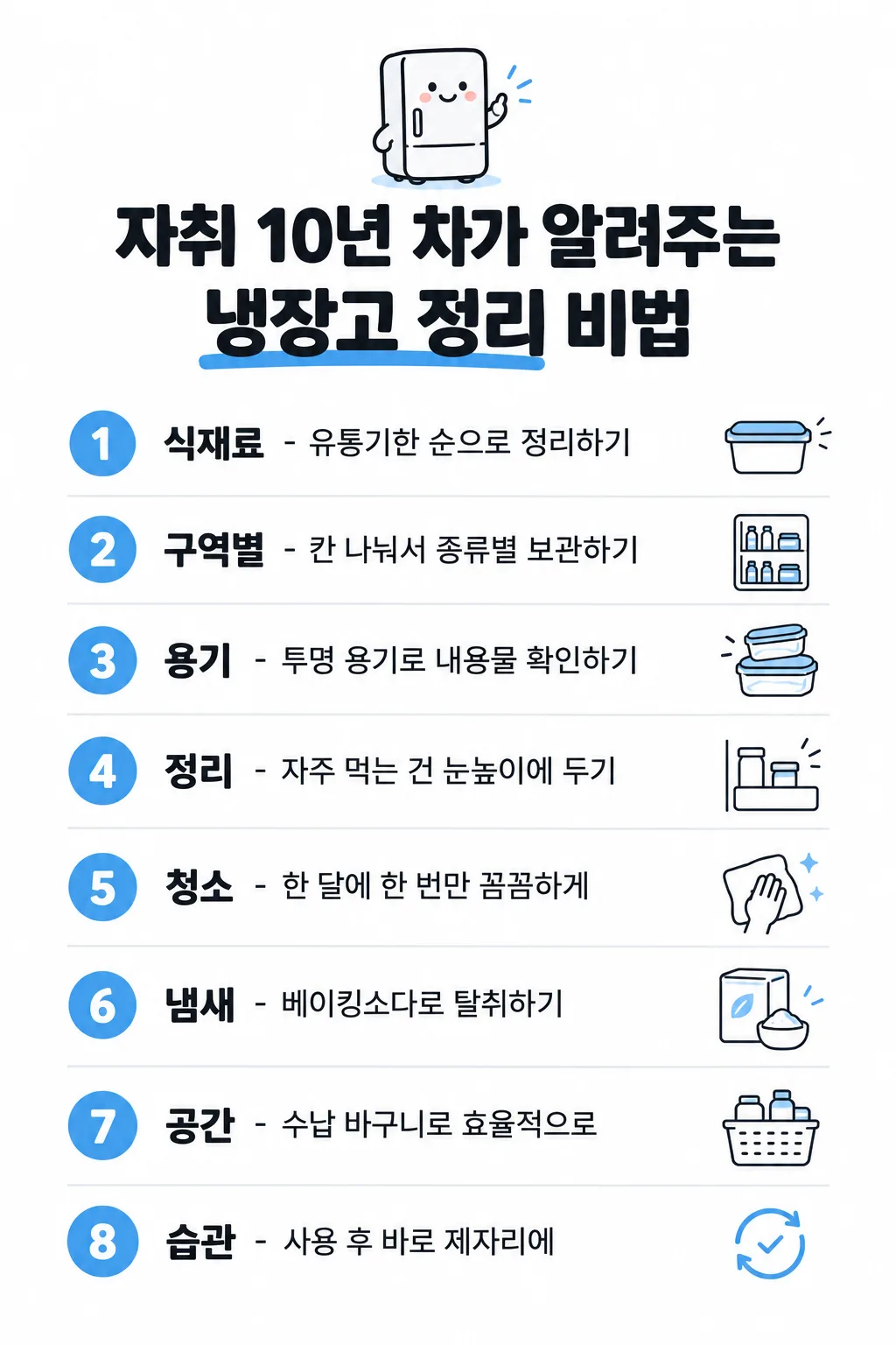
제목 하나만 고르면 내용·마스코트·아이콘까지 자동으로 채워 번호 리스트 한 장을 만들어요.
받는 것
- 제목에 맞춘 번호 리스트 이미지 한 장
칸 채우기
- 1칸을 채워요
- 2복사 버튼을 눌러요
- 3GPT 채팅창에 붙여넣어요
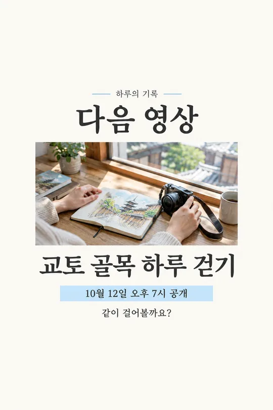
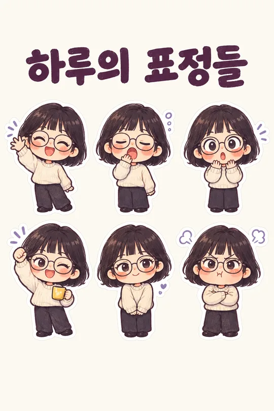
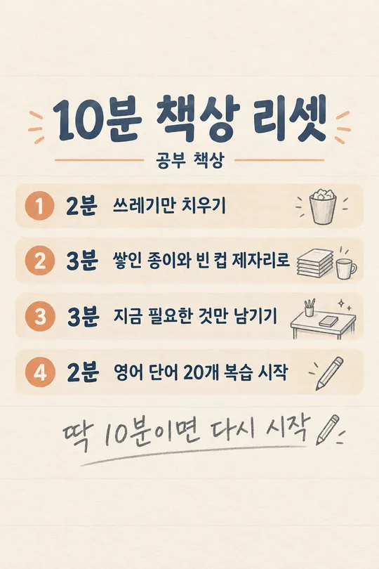
- 4그대로 보내면 썸네일 예시처럼 나와요
- 5카드에 맞는 실제 사진을 같이 넣으면 그 사진이 반영돼요 — 배경 카드는 배경 사진, 인물 · 음식 카드는 그 사진 선택
프롬프트 원문 보기 5,426자
Generate this image now. Draw it directly - do not describe it, explain it, or ask questions.
Output size 1080x1920 pixels, 9:16 portrait story. Keep all text inside the central 80% of the height: compress every zone percentage below into the 10-90% range.

[Input]
Exact Korean title: "【제목】"
Requested number of rows: 【줄 수】
Chosen accent color: "【색】"
User-written rows, separated by line breaks: "【내 내용 직접 쓰기】"

[Automatic decisions]
Create exactly ONE finished numbered-list image for Threads or Instagram. The title alone is enough: silently choose every row's wording, the row format, one small cute mascot, one thin-line icon per row, and a suitable accent color. Never ask the user for row content, a mascot, icons or a design. If the row-count input is absent, use 8; supported choices are 5, 6, 8 and 10. If the color input is absent, choose red, orange, green, blue or brown to suit the title. Use one consistent accent throughout. Keep the entire list on this single canvas.

[Content priority]
If the user-written rows input is absent or whitespace only, generate exactly the requested number of distinct, relevant rows from the title. For practical tips, use ordinary, accurate, actionable knowledge. Do not invent credentials, secret insider evidence, statistics, quotes, guarantees, or medical claims. Treat an expert-themed title as the user's headline, not proof that an expert endorsed the content. For empathy or advice, use gentle everyday observations rather than declaring a universal truth. A diet-themed title may use ordinary habits without claiming weight loss, treatment, prevention, a guaranteed effect or a prescribed intake.
If user-written rows are present, each nonblank input line is one complete row, in the same order. Copy every character of each line verbatim, including spaces, spelling and punctuation; do not correct, summarize, translate, replace or add to it. Blank lines only separate rows. The number of supplied rows takes precedence over the requested count: never drop supplied rows or invent missing rows to reach a button value. Keep all supplied rows on one image. The short-writing rules below apply only to automatically written rows.

[Choose one row format from the title]
For a tips, methods or practical know-how title: one line per row, with a bold Korean keyword of 2-6 characters, then " - ", then a short practical method of at most 15 characters. Choose compact wording that is useful without an unsupported claim.
For an empathy, reflection or life-advice title: two lines per row, with a bold main statement above and a smaller line beginning "- " below. Keep the main statement compact and the small remark within 15 characters. Prefer a 2-6-character key phrase when it reads naturally. This is a visual line break, not a printed slash. Choose the best format silently and use it consistently; never make separate cards for the two formats.
For supplied rows, preserve their exact text regardless of format. Emphasize an existing key phrase and wrap at natural word boundaries only; do not add a method, dash, subtitle or commentary to a supplied line. A visual line wrap must not change its text.

[Design]
Clean pure white background, dark near-black Korean sans-serif, generous readable spacing, flat polished editorial illustration. Place exactly one small original cute mascot at the top, naturally connected to the title: for example a smiling fridge for fridge organization or a quiet friendly character for life advice. Keep the mascot small enough that the list is the main subject. Below it, render the exact supplied title in very bold type across two balanced lines. Wrap the existing title naturally without rewriting it. Mark one existing key phrase with a thick accent-colored marker underline below the letters, keeping the strokes unobscured.
Below the title, create evenly spaced numbered rows. At the left of each row, use a solid accent-colored circle with its white Arabic number, from 1 through the actual row count, each exactly once. Keep the row text left-aligned next to the circles. At the far right, place one small delicate thin-line icon specific to that row's content; do not repeat a generic icon for all rows. Separate neighboring rows with fine light-gray horizontal rules. Tip rows use one text line; empathy rows use the two-level main statement and small remark. Keep all numbers, text and icons fully visible, with clean consistent alignment and enough bottom breathing room. Adapt spacing and type size to the selected aspect ratio and row count before drawing. The last row must be as readable as the first. Do not crop, split into pages, create a carousel, use a phone mockup, add a colored background, or add badges, branding, sources, a footer slogan or watermark.

[Text fidelity and output]
Every Korean character exactly as written, nothing added.
The user's title and supplied rows are immutable. Automatically generated rows are allowed only when no user rows were provided: decide their exact wording before drawing and render it faithfully. Render only the exact title, the row wording and the numbered circles; no form labels, placeholder braces or extra captions. Return one complete image directly.

[Final output format]
Output size 1080x1920 pixels, 9:16 portrait story. Keep all text inside the central 80% of the height: compress every zone percentage below into the 10-90% range.
This selected output format takes priority over any fixed canvas size or aspect ratio elsewhere in this template. Adapt the composition, text zones and margins to the selected canvas without stretching or cropping essential content. Device safe areas apply only when a device is selected. Never print these format instructions on the image.
결과 어땠어요?
이 카드도 많이 사용해요
쓰는 법 · 자주 묻는 것
제목 하나로 한 장을 만들어요
홈카페 요령, 자취 생활 팁, 가게의 작은 배려, 관계에서 깨달은 말을 스레드·인스타에 정리하고 싶을 때 쓰세요. 제목 보기 하나를 누르면 그 제목에 맞는 8가지가 자동으로 채워집니다. 줄마다 내용을 적거나 마스코트·아이콘을 고를 필요가 없습니다. 결과는 흰 바탕에 큰 제목, 색 원 안의 번호, 짧은 내용과 가는 선 아이콘이 들어간 완성 이미지 한 장입니다.
네 칸만 쓰세요
- 제목: 꼭 채우는 칸입니다. 보기 20개에서 누르거나 원하는 제목을 직접 쓰세요. 홈카페·정리·요리·여행·가게 운영 같은 비법형과 관계·후회·위로 같은 공감형을 섞어 두었습니다. 직접 쓴 제목도 글자를 고치지 않고 사용합니다. 제목이 길면 기존 문장을 두 줄로 나눠 배치합니다.
- 줄 수: 5·6·8·10 중 고르세요. 처음에는 8이 선택되어 있습니다. 주제를 빠르게 훑게 하려면 5나 6, 조금 더 자세히 모으려면 8이나 10을 쓰세요.
- 색: 빨강·주황·초록·파랑·갈색 단추입니다. 선택하지 않으면 제목에 어울리는 색을 AI가 고릅니다. 색은 번호 원과 마커 밑줄 등에 쓰고 바탕은 흰색으로 유지합니다.
- 내 내용 직접 쓰기: 선택 칸 하나입니다. 한 항목을 적고 엔터를 눌러 다음 항목을 쓰세요. 비워 두면 모든 줄을 자동으로 만듭니다. 내용이 있으면 입력한 줄을 순서대로 그대로 사용하고, 빠뜨리거나 새 줄을 채워 넣지 않습니다. 직접 쓴 항목 개수가 줄 수 단추와 다르면 직접 쓴 개수를 우선합니다. 원하는 개수에 맞추려면 그만큼의 줄을 적으세요.
제목에 따라 줄 모양도 자동으로 바뀌어요
비법·꿀팁 제목은 굵은 키워드 - 짧은 방법을 한 줄에 놓습니다. 공감·조언 제목은 굵은 큰 문장 아래에 작은 - 한마디를 놓습니다. 이 모양을 따로 고르는 칸은 없습니다. 마스코트는 제목을, 각 아이콘은 해당 줄을 보고 정합니다. 내가 직접 적은 내용에는 설명을 덧붙이지 않고, 기존 글자만 굵게 하거나 자연스럽게 줄을 나눕니다.
한 번에 받는 법
제목을 고르고 필요하면 줄 수·색만 바꾼 뒤 프롬프트를 복사해 GPT에 붙여넣으세요. 사진을 넣을 필요는 없습니다. 추천 비율은 휴대폰에서 세로로 읽기 좋은 9:16입니다. 10줄이라도 마지막 항목까지 한 장 안에 담도록 간격과 글자 크기를 맞춥니다. 직접 쓸 때는 한 줄을 짧게 적을수록 작은 화면에서도 읽기 좋습니다.
올리기 전에 읽어 보세요
AI가 채운 정보는 사실인지 확인하고 올리기. 비법처럼 들리는 제목이어도 특정 전문가가 보증한 내용은 아닙니다. 생활 팁이 실제 상황에 맞는지 살펴보고, 다이어트·건강 주제는 치료나 효과를 단정하는 말이 없는지 확인하세요. 제목과 직접 적은 줄은 띄어쓰기·문장부호까지 입력한 값과 대조하고, 번호가 순서대로 있는지, 마지막 줄과 아이콘이 잘리지 않았는지 확인한 뒤 저장하거나 게시하세요. 공감 문장은 모든 사람에게 적용되는 사실이라기보다 나눌 만한 생각으로 읽으세요.