
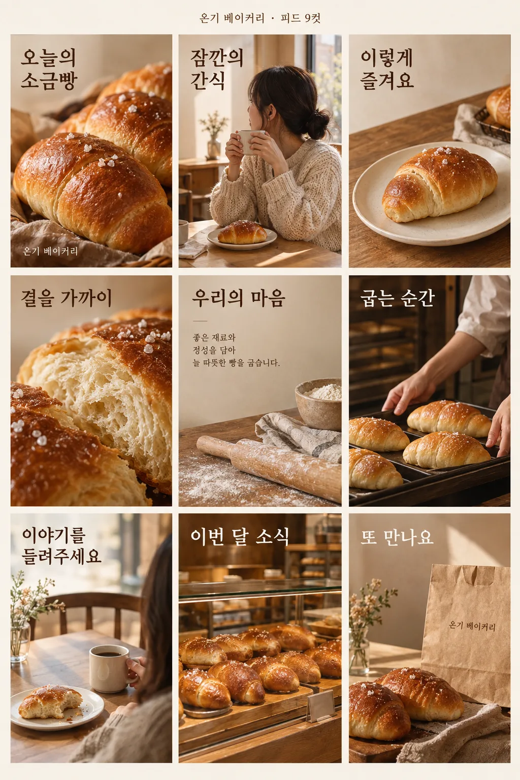
전체 · SNS/카드뉴스 · 가게 이야기 · 신메뉴 소개
070가게 인스타 피드 9컷 — 음식점 · 카페 · 미용실 · 소매점
사장님이 한 달치 인스타 게시물 기획판과 브랜드 소개 이미지로 쓰는 3×3 한 장 — 가게와 대표 상품에 맞춰 구성해요.
칸 채우기
- 1칸을 채워요
- 2복사 버튼을 눌러요
- 3GPT 채팅창에 붙여넣어요
- 4제품·인물 사진을 쓰려면 사진과 프롬프트를 둘 다 넣은 뒤에 보내요 선택
프롬프트 원문 보기 9,139자
Generate this image now. Draw it directly - do not describe it, explain it, or ask questions.

[Real food photo and shape check — whenever food, drink, or an ingredient is pictured]
Before drawing any food, drink, or ingredient, search the web for real photographs of the exact named dish, beverage, or ingredient as actually prepared and served. Inspect those photographs and follow their visible anatomy, color, cooked texture, portion, and serving vessel. An attached owner photo is the primary truth for that specific product; use web photos to check natural structure without changing its ingredients, quantity, label, or packaging.
Match real structure and proportions: noodles are loose natural strands, never a lattice, net, or dome pattern; bread and sandwiches have real thickness, crumb, and fillings; fried food has irregular natural batter; skewers have a realistic count and spacing; and a real portion fits a real bowl or plate. Preserve the actual shape and proportions of a photographed drink container. No repeated identical food copies, geometric or impossible shapes, melted or plastic surfaces, extra limbs on seafood, or unnatural ingredient arrangements. The food must look like an honest photo of something a customer would recognize when served. When this card allows only small illustrations or icons, apply the same real shape at that scale without adding a food photograph. Explicitly requested repeated cutouts of one attached packaged drink are allowed, but do not invent cloned servings.
Create exactly ONE finished Korean 2:3 portrait image containing a deliberate 3-by-3 Instagram feed grid. Nine tiles are visually separated by fine gutters but all exist inside this one exported canvas. Do not output nine images, a carousel, code, an HTML page, a template for later filling, a crop instruction, or a request to say "next".

[Purpose]
Make a small-business social-feed planning board that the owner of "【가게 이름】" can save as a brand introduction image or use as one month's nine-post plan. The business type is "【업종】" and the actual named hero menu or product is "【대표 메뉴/상품】". Desired brand feeling is "【분위기】". Use only these user-provided business facts. The board should suggest a believable series of nine posts with a beginning, middle, and close, while also reading as one attractive, coherent page at list size. It must stay useful across a cafe, restaurant, bakery, florist, salon, or other entered industry. Do not silently turn every business into a healthy-meal delivery brand just because the example image depicts one.

Optional event supplied by owner: "【행사】"

[Fact and copy rules]
The input does not include a real testimonial, star rating, price, address, opening hour, discount amount, delivery promise, ingredient source, or customer count. Never invent any of those. Tile 7 is a review-related post that invites a real customer's comment or explains where the owner's genuine customer words can later be featured; it must not masquerade as a quotation from a customer. If the optional event line is missing, tile 8 becomes an ordinary "이번 달 소식" or seasonal product reminder, without an empty promotion box. If an event is supplied, reflect exactly the information provided and do not add date, discount, reservation condition, giveaway, or scarcity. A vague input such as "주말 시식" stays vague. For food, do not make medical, diet, or nutritional-effect claims. For beauty, do not promise outcomes. Use natural Korean copy of no more than about 150 characters per tile, mostly far shorter, rather than filler paragraphs. Do not show "알아서 골라줘" if it somehow appears as a user-provided copy instruction; write fitting copy instead.

[Scene]
One complete 3-column by 3-row portrait page, nine equally sized tall tiles with consistent narrow gutters, generous outer margins, and one brand system. This is a preview of actual social-feed posts: each tile has its own finished photo or graphic and one simple message, all readable in the combined board. Use a coherent palette derived from "【분위기】" and the product: for warm bakery, toasted cream and cinnamon; for a fresh florist, airy greens and floral accents; for a premium salon, refined charcoal and warm neutral; for a lively casual restaurant, stronger appetite-led contrasts. These are examples, not presets that override the user's input. Do not copy the example's pale green nutrition-box brand, exact food photos, copy, or layout details. If web references are available, examine real photos of the entered type of product, shop work, and materials for accurate texture and scale. Use reference images to learn appearance only, never to lift a particular photograph, label, trademark, or design.

[Nine tiles: read left to right, top to bottom]
1. "대표 한 컷": a visually commanding real-photography-style hero shot of "【대표 메뉴/상품】" and the visible shop name "【가게 이름】". This tile must remain recognizable at thumbnail scale.
2. "이럴 때": a short customer problem or moment that this actual business can address, expressed without claiming to know an individual's private thoughts. For a bakery it may be a simple snack break; for a florist, choosing a gift. A context photograph supports it.
3. "우리의 제안": show how the actual named product or service fits that moment, with a concise grounded line; no invented measurable benefit.
4. "가까이 보기": a tactile detail photograph of the real type of menu item, product, or service. Keep physical materials believable: bread crust, fresh flowers, hair strands, ceramic, or fabric as appropriate.
5. "가게의 기준": three short factual-looking but non-specific care principles that can be safely inferred from ordinary attentive service, or phrase them as intentions rather than proven claims. Do not invent sourcing, certification, rankings, guarantees, or years of history.
6. "만드는 과정": show a truthful generic work step associated with the entered industry, such as shaping dough, arranging stems, plating food, or preparing styling tools. Avoid depicting an impossible process for the named product.
7. "후기 이야기": a photographic customer-use setting and an invitation such as "다녀가신 이야기를 들려주세요". No fabricated quote, five-star mark, named customer, or claimed satisfaction number.
8. If "【행사】" is supplied, "이번 달 행사" with only those facts and a fitting image. If no event line is present, "이번 달 소식" with a calm reminder of the representative offering, no fake promotion.
9. "다음에 또": a warm closing image of the actual product or shop mood and a concise invitation using "【가게 이름】". Do not invent a call-to-action link, phone number, address, or service hours.

[Text layout]
Top margin 0-6%: small board heading "【가게 이름】 · 인스타 피드 9컷" with a clear visual brand mark made only from typography or generic geometry. The grid fills approximately 8-96% of the page. Each tall tile has one short high-contrast Korean headline and at most one or two short supporting lines. Repeat the shop name sparingly, not nine times. Place readable text on quieter parts of photographs or subtle solid text areas. The lower edge may have a tiny "한 달 피드 기획" label; no extra tenth tile. Preserve the 3×3 geometry exactly.

[Style]
High-quality Korean local-business social photography and concise editorial design. Choose color, props, typography, and mood to fit the entered industry, product, and atmosphere. Keep visual rhythm by alternating product hero, people-at-work or customer context, detail, and simple typography tiles. A beauty service can show tools and real hair texture without inventing a before-and-after result. Food, flowers, clothing, and people must look like real photographs, with believable shadows and scale. Make a coherent brand introduction that can be understood without captions outside the image.

[Visual hierarchy]
At list thumbnail size, viewers should immediately see one 3×3 feed, the business category from the leading photographs, the shop name, and the hero product. At phone viewing size, all nine short messages should read in order. Give tile 1 and tile 9 clear beginning and close, keep gutters even, and never allow a heading to straddle two tiles. A grid page remains one image even though it depicts nine planned posts.

[Lighting and texture]
Use consistent photographic light and real product surfaces across all nine tiles. Make each photograph look individually shot but color-graded into the same business identity. No doll-like people, vector food, illegible microcopy, neon glare, floating ingredients, or decorative props larger than the actual named product.

[Text rules]
Spell "【가게 이름】" and "【대표 메뉴/상품】" exactly. Render all Korean naturally and legibly. Do not put the input words "【분위기】" or "【업종】" on the image as form labels unless they make sense as natural copy. Do not print a quotation attributed to a customer. Use supplied event facts exactly, if any. Keep all nine panels on this one page, with no output explanation or follow-up instruction.

[Avoid]
No invented price, rating, review, discount, time, location, certificate, health benefit, trademark, cartoon food texture, ninth tile omitted, cropped grid, separate images, or copying the example's branding.
이 카드도 많이 사용해요
쓰는 법 · 자주 묻는 것
이런 때 쓰세요
가게 사장님이 다음 한 달의 인스타그램 게시물 흐름을 잡거나, 가게가 무엇을 하는지 한눈에 보여 줄 브랜드 소개 이미지를 만들 때 쓰세요. 완성물은 사진과 짧은 문구가 들어간 3×3 격자 한 장입니다. 대표 상품에서 시작해 손님이 떠올릴 상황, 제품·서비스의 가까운 모습, 과정, 후기 이야기, 행사나 이번 달 소식, 마무리까지 순서가 이어집니다. 실제로 아홉 개 파일을 만들거나 게시물을 예약하는 기능은 아닙니다.
칸 채우는 법
- 가게 이름은 간판이나 계정에서 쓰는 표기를 그대로 넣으세요.
- 업종은 직접 적거나 보기에서 고르세요. 빵집, 카페, 음식점, 꽃집, 미용실, 소품 가게처럼 사진의 소재가 달라지는 정보입니다.
- 대표 메뉴/상품은 아홉 컷의 주인공이 될 한 가지를 적으세요. 메뉴 이름이 구체적일수록 사진과 문구가 한 방향으로 모입니다.
- 분위기는 가게에 맞게 고르세요. 본보기의 색을 따라 하기보다 실제 상품과 원하는 무드에 어울리는 색을 쓰게 합니다.
- 행사는 있을 때만 쓰세요. 날짜·가격·혜택은 제공한 내용만 사용합니다. 빈칸이면 행사 대신 이번 달 소식 칸으로 바뀝니다.
실제 사진을 함께 쓰고 싶을 때
제품이나 매장 사진을 더 닮게 만들고 싶다면 GPT 채팅창에 실제 사진을 먼저 올리되 아직 보내지 마세요. 같은 입력 칸에 복사한 프롬프트를 붙여넣고, 사진과 프롬프트가 둘 다 들어간 것을 확인한 뒤 한 번만 보내세요. 사진이 없다면 GPT가 업종과 대표 상품에 맞는 실사 질감의 새 장면을 만듭니다. 다른 가게의 로고, 고객 얼굴, 상품 라벨은 허락 없이 그대로 가져오지 않도록 살펴보세요.
그림이 나오면 꼭 볼 것
음식 모양이 실제와 같은지 — 면이 그물처럼, 빵이 납작하게, 튀김이 똑같이 반복되면 다시 만들어 달라고 하세요
아홉 칸이 빠짐없이 3×3으로 보이는지, 첫 칸에서 가게 종류와 대표 상품을 알아볼 수 있는지 확인하세요. 글자가 격자 경계에서 잘리지 않았는지, 업종에 맞지 않는 제작 과정이 섞이지 않았는지도 보세요. 후기 칸은 실제 손님이 남긴 말처럼 꾸며지면 안 됩니다. 행사를 썼다면 행사 정보가 입력한 범위를 넘지 않는지, 비웠다면 허구의 할인 문구가 나오지 않는지 확인하세요. 이름과 상품명은 확대해 한 글자씩 점검한 뒤 사용하세요.
자주 묻는 것
- 아홉 장을 따로 받나요? 아니요. 게시물 흐름을 보여 주는 아홉 칸이 이미지 한 장에 함께 나옵니다.
- 후기가 없는데 후기 칸은 어떻게 되나요? 실제 후기인 척하는 문구를 만들지 않고 고객의 이야기를 받는 장면과 안내로 채웁니다.
- 행사가 없으면 비어 보이나요? 아니요. 여덟째 칸은 평소 상품을 다시 알리는 「이번 달 소식」으로 바뀝니다.
- 업종이 보기 목록에 없으면요? 업종 칸에 직접 적으세요. 대표 상품과 맞는 사진 소재를 고르게 되어 있습니다.