
All · Ads & posters · Cafés & desserts · Restaurants
241Retro Food Illustration Poster
Create old restaurant advertisements with yellowed paper, red ribbons, and print-like food illustrations. Fits cafe walls and feeds.
What you get
- Retro Food Illustration Poster
Fill in the fields
- 1Fill in the fields
- 2Copy the prompt
- 3Paste it into a GPT chat
- 4Send it as is and you get an image like the thumbnail example
- 5Attach a real photo that fits the card and it is used in the result: a background photo for background cards, a person or food photo for those cards Optional
Full prompt 3,911 characters
Generate this image now. Return exactly ONE complete image directly. Do not ask questions, browse for photos, return a plan or give a prompt instead of the image.

Output exactly one finished 2:3 portrait image, 1024x1536 pixels. Leave the top 12% and bottom 15% free of essential text.

[Input: values are the only facts and wording]
MENU: "【Menu Name】"
SHOP: "【Shop Name】"
COPY: "【Short Phrase】"
FOOD_DETAIL: "【Ingredients & Shape】"
SMALL_ART: "【Peripheral Ingredient Illustration】"
ACCENT: "【Point Ink Color】"
SERVING: "【Food Serving Place】"
DETAIL: "【Paper Grain Intensity】"

[Fixed card design]
Design an original old neighborhood restaurant print advertisement, densely detailed vintage food illustration rather than a photo. Use warm yellowed cream paper, brick-red ink, cocoa contours and ACCENT as one food-related ink accent. If absent, choose that accent from FOOD_DETAIL. One main serving occupies about 55–60% of the poster. Draw the food volume, cut surface and texture with engraving-like hatching, slightly uneven flat ink fills and delicate stipple; no glossy plastic rendering.
A broad red ribbon in the upper area carries MENU in bold cream letters. A compact oval above carries SHOP. A short lower ribbon carries COPY once. Beside the main serving draw three or four small ingredient illustrations from SMALL_ART only; if absent derive only ingredients explicitly named in FOOD_DETAIL, never unrelated products. Place the food on SERVING if supplied; otherwise a simple cream plate. A fine ornamental border, tiny stars and botanical marks link the side illustrations and the ribbons. Keep food outlines and letter counters clear. Paper fibers and ink density follow DETAIL: subtle or evident, but neither choice erases letters. No false fold, ripped corner or heavy grime.
Only MENU, SHOP and COPY are printed. No invented slogans, translated subtitles, price, age claim, quality certification or brand imitation. The main food must remain much larger than decorations. The bottom feels completed by a ribbon and print ornament rather than an empty price panel.

[Button meanings, internal instructions only]
DETAIL: "Subtle" means subtle paper grain; "Distinct" means visible paper grain.

[Missing inputs and finish]
An optional input line removed from this prompt is absent. Do not print its key, invent a substitute caption, ask for it or reserve an empty panel. Choose a fitting simple visual only where the fixed design explicitly permits an automatic default. Selected values alter content only; retain this card's single style and one composition. Every supplied visible string stays verbatim in its original script and currency, without translation. Ordinary automatic lettering, if explicitly allowed above, is English; internal English keys and button names are never captions.
Use the stated aspect ratio, adapting one coherent layout rather than stretching food or letters. Text-bearing posters keep important lettering within the central 16–83% of image height and 5–95% of width; extend food-related ornament, background, shadows or texture to the trim so these insets do not create empty bands. Keep all price digits and ingredient labels unobstructed. Text-free photographs fill the canvas naturally with their scene. No frame, phone, wall mockup, watermark or extra results.
No uploaded photo is needed: create a fictional food scene from these inputs. If a reference photo is attached, use it only for the stated food's visible shape and materials within this same drawing or photographic medium, without adding absent products or claiming exact portion preservation. Finish one image even when no photo is attached.

[Final output format]
Output exactly one finished 2:3 portrait image, 1024x1536 pixels. Leave the top 12% and bottom 15% free of essential text.
This selected output format takes priority over any fixed canvas size or aspect ratio elsewhere in this template. Adapt the composition, text zones and margins to the selected canvas without stretching or cropping essential content. Device safe areas apply only when a device is selected. Never print these format instructions on the image.
How did it turn out?
You may also like


How to use it · FAQ
Large Food Illustration on Warm Paper
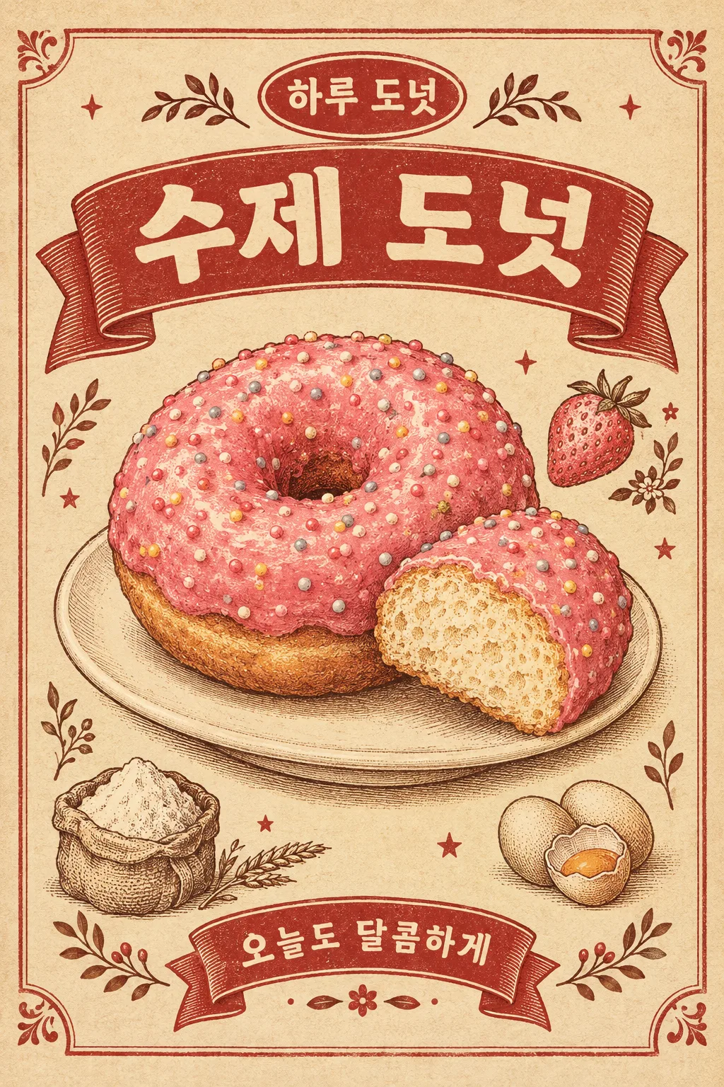
This is a retro poster drawing a large donut on yellowed paper, featuring a red title ribbon at the top and small illustrations of strawberries, eggs, and flour around it. By emphasizing the thickness and surface of the food with fine print lines, it gives the feel of a printed advertisement from an old neighborhood diner. Great for decorative artwork on cafe walls or donut new menu feeds. It is a single image centered on illustration, distinct from price tags.
Fill in the Name and Food Shape
These are four essential boxes: menu name, shop name, short phrase, and ingredients & shape. Writing colors and shapes like 'round donut with pink strawberry coating, small sugar decorations' determines the central food illustration. The large ribbon holds the menu name, the small oval holds the shop name, and the bottom ribbon holds the short phrase. Instead of long descriptions with too much text, a single line like 'Sweet Today As Well' fits best.
Adjust Peripheral Illustrations and Ink
For peripheral ingredient illustrations, write just three or four ingredients included in the menu, such as 'strawberry, flour, egg'. Leaving it blank selects and draws from what is written in ingredients and shape. Point ink colors can use pink, yellow, green, or orange suggestions matching the food. For where the food is served, write a small plate or wooden cutting board. Selecting a clear paper grain makes the print texture more visible, but not so worn that the text gets erased.
Contrast Retro Text and Ingredients
Send the filled text to GPT once to request a single finished poster. From the result, read the menu name above the ribbon and the phrase below, and check if the side illustrations are ingredients related to the central food. If the border looks larger than the donut, fix it by saying 'Make the food larger and reduce only the peripheral decorations.' Maintaining the hatching and paper grain rather than turning the illustration into a photo brings out the mood of this card. It doesn't require shapes identical to an actual store's brand logo; the shop name is sufficient to complete it.