
すべて · 広告・ポスター · カフェ・スイーツ · 飲食店
241レトロフードイラストポスター
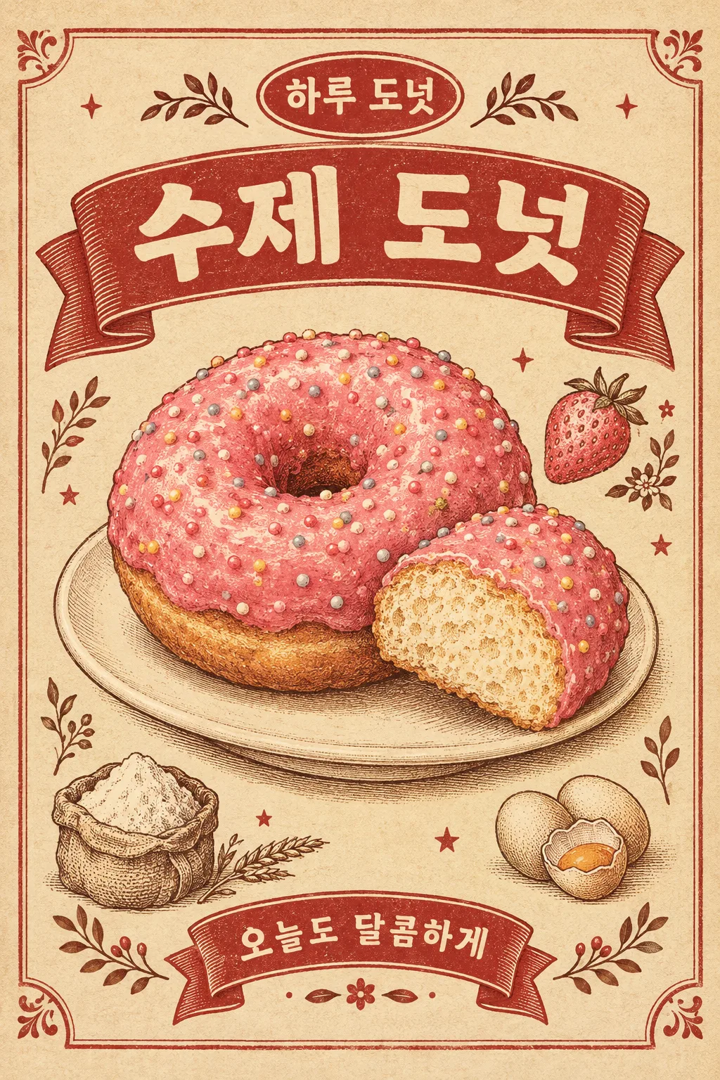
黄ばんだ紙と赤いリボン、版画のような料理のイラストで昔の食堂の広告を作ります。カフェの壁やフィードによく合います。
受け取れるもの
- レトロフードイラストポスター
項目を入力
- 1項目を入力します
- 2コピーを押します
- 3GPTのチャットに貼り付けます
- 4そのまま送ると、サムネイルの例のような画像になります
- 5カードに合う実際の写真を一緒に入れると反映されます。背景カードなら背景の写真、人物・料理カードならその写真 任意
プロンプト全文を見る 3,822文字
Generate this image now. Return exactly ONE complete image directly. Do not ask questions, browse for photos, return a plan or give a prompt instead of the image.

完成した2:3の縦型画像を1枚、1024×1536ピクセルで出力してください。重要な文字は上12%と下15%に置かないでください。

[Input: values are the only facts and wording]
MENU: "【メニュー名】"
SHOP: "【店名】"
COPY: "【短いフレーズ】"
FOOD_DETAIL: "【材料と形】"
SMALL_ART: "【周辺の材料のイラスト】"
ACCENT: "【ポイントインク色】"
SERVING: "【料理を盛り付ける場所】"
DETAIL: "【紙の目の強さ】"

[Fixed card design]
Design an original old neighborhood restaurant print advertisement, densely detailed vintage food illustration rather than a photo. Use warm yellowed cream paper, brick-red ink, cocoa contours and ACCENT as one food-related ink accent. If absent, choose that accent from FOOD_DETAIL. One main serving occupies about 55–60% of the poster. Draw the food volume, cut surface and texture with engraving-like hatching, slightly uneven flat ink fills and delicate stipple; no glossy plastic rendering.
A broad red ribbon in the upper area carries MENU in bold cream letters. A compact oval above carries SHOP. A short lower ribbon carries COPY once. Beside the main serving draw three or four small ingredient illustrations from SMALL_ART only; if absent derive only ingredients explicitly named in FOOD_DETAIL, never unrelated products. Place the food on SERVING if supplied; otherwise a simple cream plate. A fine ornamental border, tiny stars and botanical marks link the side illustrations and the ribbons. Keep food outlines and letter counters clear. Paper fibers and ink density follow DETAIL: subtle or evident, but neither choice erases letters. No false fold, ripped corner or heavy grime.
Only MENU, SHOP and COPY are printed. No invented slogans, translated subtitles, price, age claim, quality certification or brand imitation. The main food must remain much larger than decorations. The bottom feels completed by a ribbon and print ornament rather than an empty price panel.

[Button meanings, internal instructions only]
DETAIL: "さりげなく" means subtle paper grain; "はっきりと" means visible paper grain.

[Missing inputs and finish]
An optional input line removed from this prompt is absent. Do not print its key, invent a substitute caption, ask for it or reserve an empty panel. Choose a fitting simple visual only where the fixed design explicitly permits an automatic default. Selected values alter content only; retain this card's single style and one composition. Every supplied visible string stays verbatim in its original script and currency, without translation. Ordinary automatic lettering, if explicitly allowed above, is Japanese; internal English keys and button names are never captions.
Use the stated aspect ratio, adapting one coherent layout rather than stretching food or letters. Text-bearing posters keep important lettering within the central 16–83% of image height and 5–95% of width; extend food-related ornament, background, shadows or texture to the trim so these insets do not create empty bands. Keep all price digits and ingredient labels unobstructed. Text-free photographs fill the canvas naturally with their scene. No frame, phone, wall mockup, watermark or extra results.
No uploaded photo is needed: create a fictional food scene from these inputs. If a reference photo is attached, use it only for the stated food's visible shape and materials within this same drawing or photographic medium, without adding absent products or claiming exact portion preservation. Finish one image even when no photo is attached.

[Final output format]
完成した2:3の縦型画像を1枚、1024×1536ピクセルで出力してください。重要な文字は上12%と下15%に置かないでください。
This selected output format takes priority over any fixed canvas size or aspect ratio elsewhere in this template. Adapt the composition, text zones and margins to the selected canvas without stretching or cropping essential content. Device safe areas apply only when a device is selected. Never print these format instructions on the image.
結果はどうでしたか?
こちらのカードも人気です


使い方・よくある質問
暖かい紙の上に大きな料理のイラストを
黄ばんだ紙の上にドーナツを大きく描き、上には赤いタイトルのリボン、周辺には小さなイチゴ・卵・小麦粉のイラストを入れるレトロポスターです。料理の厚みと表面を細かい版画の線で表現し、昔の下町の食堂の印刷広告のような雰囲気を醸し出します。カフェの壁の装飾画やドーナツの新メニューのフィードに使うのにぴったりです。価格表とは異なる、イラスト中心の1枚です。
名前と料理の形を埋める
メニュー名・店名・短いフレーズ・材料と形の4つが必須の欄です。「ピンクのイチゴコーティングの丸いドーナツ、カラフルな小さな砂糖の飾り」のように色と形を書くと中央の料理のイラストが決まります。大きなリボンにはメニュー名、小さな楕円には店名、下のリボンには短いフレーズが入ります。文字が多くなる長い説明よりも「今日も甘く」程度の1行がよく似合います。
周辺のイラストとインクを調整する
周辺の材料のイラストには「イチゴ、小麦粉、卵」のようにメニューに入る材料を3〜4個だけ書きます。空欄にすると材料と形に書かれたものから選んで描きます。ポイントのインク色は料理に合うピンク・黄色・緑・オレンジの候補が使えます。料理を盛り付ける場所には小さなお皿や木のまな板を書きます。紙の目の強さをはっきりと選ぶと印刷の質感がより見えますが、文字が消えるほど古びた感じにはしません。
レトロな文字と材料を対照させる
欄を埋めてコピーした文章をGPTに一度送ると、完成したポスターが1枚要求されます。結果からリボンの上のメニュー名と下のフレーズを読み、隣の絵が中央の料理と関係のある材料か確認してください。ドーナツより外側の枠が大きく見える場合は「料理をさらに大きくして周辺の装飾だけ減らして」と修正します。イラストを写真のように変えるより、ハッチングと紙の目を維持する方がこのカードの雰囲気を生かします。実際の店舗のブランドロゴと同じ形を求めなくても、店名だけで十分に仕上がります。