
전체 · 인포그래픽/안내 · 비교표
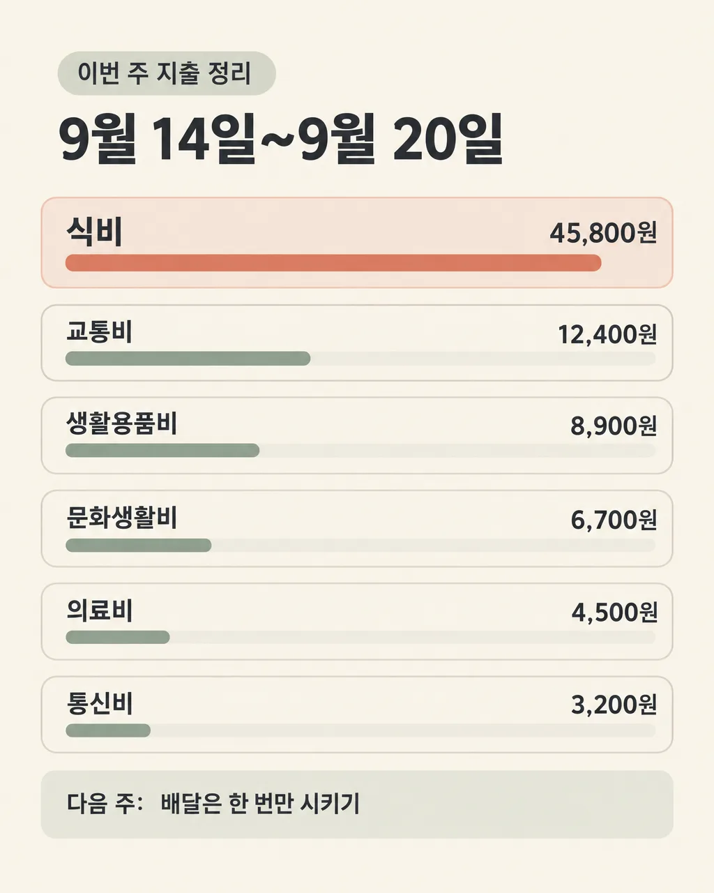
027이번 주 지출 정리 — 큰 지출이 바로 보이는 개인 소비 비교표
기간과 지출 항목을 적은 그대로 보여 주고, 큰 금액은 긴 막대와 넓은 칸으로 한눈에 비교하는 개인용 주간 지출 카드
칸 채우기
- 1칸을 채워요
- 2복사 버튼을 눌러요
- 3GPT 채팅창에 붙여넣어요
- 4제품·인물 사진을 쓰려면 사진과 프롬프트를 둘 다 넣은 뒤에 보내요 선택
프롬프트 원문 보기 7,010자
Generate this image now. Draw it directly - do not describe it, explain it, or ask questions.
Output size 2480x3508 pixels, A4 portrait, 300dpi, print-ready poster.

[Purpose]
Create one complete Korean personal weekly-expense infographic that is ready to save on a phone and review at the end of the week. It is a visual comparison card for one individual, not a bank statement, receipt, financial-advice advertisement, or accounting worksheet. Show the supplied period and every supplied expense entry exactly as written. Make the largest expenses immediately recognizable through proportional horizontal bar lengths and matching row emphasis. Never calculate, add, subtract, estimate, normalize, rank by an invented value, correct a suspected typo, change a currency unit, insert a total, or infer any missing amount. A total may appear only if the user explicitly included a total as one of the supplied lines, and then it must be reproduced only as that line.

[Scene]
Design a clean portrait infographic on a fully painted, warm off-white canvas. At the top, place a compact eyebrow label reading "이번 주 지출 정리", followed by the supplied period in a strong headline. Below it, build one tidy comparison area containing only the supplied expense lines, from one line up to a maximum of eight. Give every line its own rounded horizontal row. Each row has the expense label on the left, the exact amount on the right, and a colored horizontal bar behind or beneath the text. Use the written numeric amounts only to determine relative bar lengths and subtle row emphasis; preserve the original order of the supplied lines instead of sorting them. The greatest written amount gets the longest bar and a slightly stronger panel, while smaller written amounts get proportionally shorter bars. If amounts cannot be interpreted safely or use incomparable units, use equal bars rather than guessing. Reserve a separate quiet strip at the bottom for the optional weekly goal. Do not add a person, room, wallet photograph, coins, receipts, charts with axes, decorative currency, or financial app interface.

[Attached photo]
No attached photo is required. Ignore any unrelated uploaded image. Construct the result entirely from flat vector shapes and the supplied Korean text.

[Text layout]
Render these exact Korean strings and supplied values without the surrounding quotation marks. The percentages below describe the top-to-bottom structure. Keep all content inside generous safe margins of about 7% on every side.
- 6-11%: Render the fixed small label "이번 주 지출 정리". This is the only fixed title text.
- 14-22%: Render "【기간】" as the main headline. Keep every character, number, separator, spacing, and date expression exactly as entered. Do not convert the period into other dates or weekdays.
- 27-79%: Render every non-empty line from "【항목과 금액 (한 줄에 하나, 최대 8줄)】" as one separate expense row, with no more than eight rows. Preserve the supplied top-to-bottom order. Keep each complete line verbatim: do not split an item name from its amount, rewrite the unit, insert commas, fix spacing, or change digits. Place the item text toward the left and its amount toward the right only when that separation is unambiguous from the supplied line; otherwise keep the whole line together. Scale row height and text size consistently to fit the actual number of lines. Never duplicate a line or create a blank placeholder row.
- 84-93%: Render "【이번 주 목표 한 줄】" inside a distinct but quiet goal strip. Put the fixed prefix "다음 주:" before the supplied goal only when the optional goal exists. If the optional field is empty, omit the entire strip, including the prefix, and let the comparison area breathe; never invent a goal.

[Style]
Use a calm editorial infographic style with crisp flat vector geometry, Korean Gothic sans-serif lettering, and a restrained household-budget palette: warm ivory background, charcoal text, muted sage bars, and one terracotta accent for the largest written expense. Rows should feel like clearly separated ledger strips, with soft rounded corners, fine borders, and ample internal padding. Use bar length and row fill area—not oversized numbers, warning colors, or dramatic effects—to reveal magnitude at a glance. Keep item labels and amounts equally legible. Paint the entire canvas edge to edge with an opaque color. The visual should feel useful, private, and neutral rather than promotional or judgmental.

[Visual hierarchy]
The first read is the supplied period. The second read is the comparison area, where the longest bar and slightly larger row area make the largest written expense visible immediately. The third read is each exact item-and-amount line. The optional goal is last. When there are few entries, enlarge the rows while maintaining even gaps; when there are many, reduce all row heights consistently without squeezing Korean characters. Bar proportions must reflect only clearly readable supplied amounts. Do not reorder the entries even if a later line is larger. Do not show percentages, category shares, totals, averages, savings, differences, badges, rankings, or recommendations unless those exact words and values were supplied in an expense line.

[Lighting and texture]
Use even flat color and a clean matte finish. Keep Korean strokes sharp and unobstructed. Separate rows through fill contrast, fine borders, and spacing rather than shadows. Avoid gradients, gloss, paper grain over text, reflections, backlighting, depth effects, and photographic textures. Every bar must remain visibly distinct from both its row and the lettering.

[Text rules]
Preserve all user-entered Korean syllables, spaces, punctuation, digits, commas, decimal marks, currency symbols, and units exactly. The expense input is authoritative even when an amount looks unusual. Do not correct it. Do not perform arithmetic. Do not add a grand total. Do not calculate a remainder, percentage, average, daily amount, change, or budget. Do not silently standardize "원", "만원", won signs, dates, or category names. Render only the fixed title "이번 주 지출 정리", the supplied period, all supplied expense lines, and—when present—the fixed prefix "다음 주:" plus the supplied goal. Do not print field names, braces, instructions, row numbers, axis labels, legends, or example text. Check every Korean consonant, vowel, final consonant, and every amount digit against the supplied input before finishing.

[Avoid]
No invented or corrected amounts, no arithmetic, no automatic total, no currency conversion, no percentages, no averages, no savings claims, no financial advice, and no moral judgment about spending. No bank, card-company, delivery-app, shop, or other brand names or logos. No real business names, contact details, phone numbers, QR codes, celebrity faces, characters, song lyrics, watermarks, signatures, receipts, credit cards, mobile-app mockups, pie charts, axes, fake statistics, decorative coins, empty placeholders, cropped rows, tiny unreadable text, neon, glow, strong shadows, transparent canvas, unpainted margins, or black letterbox bars.
이 카드도 많이 사용해요
쓰는 법 · 자주 묻는 것
이런 때 쓰세요
일주일 동안 어디에 돈을 많이 썼는지 휴대폰에서 빠르게 돌아보고 싶을 때 쓰세요. 가계부 앱 화면처럼 복잡한 표 대신, 직접 적은 항목과 금액을 한 장의 비교표로 보여 줍니다. 큰 금액은 긴 막대와 조금 더 넓게 느껴지는 칸으로 드러나서 식비, 교통, 장보기, 취미 같은 지출의 차이를 한눈에 볼 수 있어요. 개인용 카드이므로 SNS 공개보다 혼자 저장해 두거나 다음 주 계획을 세울 때 활용하기 좋습니다.
이 카드는 계산기가 아닙니다. 적은 금액을 합치거나 고치지 않고 그대로 옮기도록 만들었어요. 합계를 표시하고 싶다면 「합계 165,100원」처럼 사장님이 직접 확인한 값을 항목 줄에 적어 주세요. 그림을 만든 AI가 계산한 합계는 믿지 말고, 원본 기록과 다시 대조해야 합니다.
칸 채우는 법
- 기간: 정리할 범위를 그대로 적으세요. 「9월 14일~9월 20일」처럼 날짜를 쓰거나 「9월 셋째 주」처럼 적어도 됩니다. 카드는 날짜와 요일을 새로 계산하지 않아요.
- 항목과 금액: 한 줄에 항목 하나와 금액 하나를 적고, 줄을 바꿔 다음 항목을 쓰세요. 최대 8줄까지 넣을 수 있어요. 「식비 45,800원」처럼 실제 기록에 있는 표기 그대로 입력하세요. 쉼표, 원, 만원 같은 단위도 자동으로 고치지 않습니다.
- 이번 주 목표 한 줄: 다음 주에 기억할 행동이 있을 때만 적으세요. 비워 두면 목표 칸 전체가 빠집니다. 금액을 약속하기보다 「장보기 전에 냉장고 확인하기」처럼 바로 할 수 있는 행동 한 가지가 읽기 편해요.
항목 이름에 가게 이름, 배달앱 이름, 카드사 이름을 넣지 않아도 지출 흐름은 충분히 볼 수 있어요. 「외식」, 「교통」, 「생활용품」처럼 나만 알아볼 수 있는 일반 항목을 쓰면 그림을 저장하거나 공유할 때 개인정보 노출도 줄일 수 있습니다.
그림이 나오면 꼭 볼 것
먼저 기간을 원문과 한 글자씩 맞춰 보세요. 그다음 첫 줄부터 마지막 줄까지 항목 이름, 숫자, 쉼표, 단위를 차례로 대조하세요. 특히 3과 8, 1과 7처럼 이미지에서 헷갈리기 쉬운 숫자를 자세히 봐야 합니다. 입력하지 않은 합계, 비율, 평균이 생겼다면 그 그림은 쓰지 마세요. 가장 큰 금액의 막대가 가장 길게 보이는지도 확인하되, 막대 모양보다 적힌 금액이 정확한지가 먼저입니다.
틀린 곳 고치는 법
그림을 만든 대화에서 위치와 정확한 원문을 함께 말하세요. 예를 들어 「셋째 줄 금액을 '62,400원'으로 고치고 다른 항목과 금액은 그대로 유지해 주세요」처럼 요청하면 됩니다. 합계가 저절로 붙었다면 「입력하지 않은 합계와 비율을 모두 지워 주세요」라고 말하세요. 수정 뒤에는 고친 줄만 보지 말고 모든 금액을 처음부터 다시 대조하세요. 한 줄이 빠졌다면 누락된 문장을 그대로 따옴표 안에 넣어 다시 그려 달라고 하세요.
자주 묻는 것
- 금액을 자동으로 더해 주나요? 아니요. 이 카드는 입력한 문장을 시각적으로 비교할 뿐 계산하지 않습니다. 합계가 필요하면 직접 확인한 값을 한 줄로 적어 주세요.
- 금액 표기가 틀려 보여도 알아서 고치나요? 고치지 않습니다. 「45000원」이라고 적으면 쉼표를 보태지 않고 그 표기 그대로 쓰도록 지시되어 있어요.
- 항목 순서를 큰 금액순으로 바꾸나요? 아니요. 입력한 순서를 유지하면서 막대 길이와 칸의 강조만 금액에 맞춰 달라집니다.
- 8줄보다 많으면 어떻게 하나요? 금액이 큰 항목끼리 임의로 합치지 말고, 기간을 나누거나 두 장으로 만들어 주세요. 합칠 항목과 합계는 직접 계산하고 확인해야 합니다.
- 공유해도 되나요? 가능하지만 가게 이름, 연락처, 카드번호, 계좌번호처럼 개인을 알아볼 수 있는 정보가 들어가지 않았는지 먼저 확인하세요.