
전체 · 인포그래픽/안내 · 매장 안내문
359영업시간 안내판 — 요일별 시간표
평일·주말 영업시간과 쉬는 날을 정렬된 표로 보여 주는 문 앞·계산대 안내판
ChatGPT 무료 OK
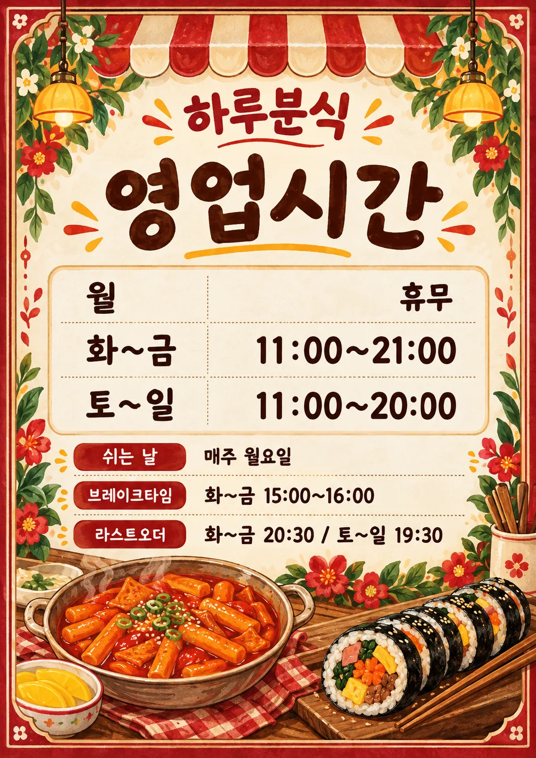
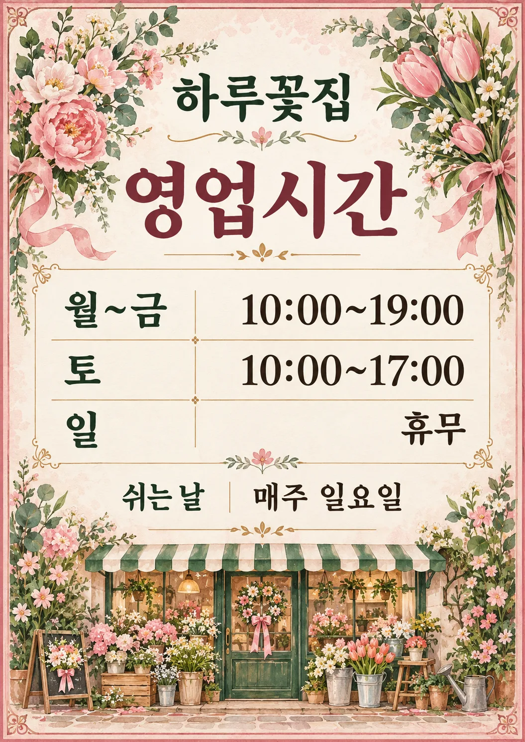
칸 채우기
- 1칸을 채워요
- 2복사 버튼을 눌러요
- 3GPT 채팅창에 붙여넣어요
- 4그대로 보내면 썸네일 예시처럼 나와요
- 5카드에 맞는 실제 사진을 같이 넣으면 그 사진이 반영돼요 — 배경 카드는 배경 사진, 인물 · 음식 카드는 그 사진 선택
프롬프트 원문 보기 3,425자
Generate this image now. Draw it directly - do not describe it, explain it, or ask questions.
Create a beautiful premium illustrated shop-door opening-hours sign, a finished flat print design. Output size 2480x3508 pixels, A4 portrait, 300dpi, print-ready poster. Use the selected canvas ratio. Fill the entire portrait canvas with a crafted decorative double border, subtle patterned paper and generous original hand-painted illustrations at the top corners and along the bottom, never a blank top or bottom third. Keep a clean light central panel for the schedule. This must feel like a charming boutique poster customers would photograph, with rich restrained ink colors and tactile illustration, never an office document. Shop name is large and bold near 8% height, heading very large near 18%, both readable at thumbnail size; reserve about 28%-65% for the table, 68%-83% for supplemental lines and 85%-97% for a substantial illustrated vignette. Adapt these regions to row count without crowding. All text safely inside 6% side margins. Decorations must never touch letters, numerals or table rules. Select the entire palette and substantial illustrations by Business: Cafe/카페/カフェ = warm coffee brown, caramel and cream, steaming ceramic coffee cup, coffee beans and coffee sprigs; Snack bar/분식/軽食店 = vivid tomato red, golden yellow and warm cream, appetizing tteokbokki in a bowl and sliced gimbap with chopsticks; Florist/꽃집/花屋 = blush pink, leafy green and ivory, lush painted flowers and leafy stems around the corners and a bouquet at the bottom; Salon/미용실/美容室 = plum, dusty rose and ivory, elegant scissors, comb and flowing ribbon; Local shop/동네 가게/地域のお店 = forest green, ochre and cream, striped storefront awning above and charming shopfront illustration below. If Business is empty or not selected, use tasteful ochre geometric botanical ornaments without an industry motif. Business names are internal only and must not be printed. No mockup, external frame, photograph, logo, watermark or extra text.
Schedule is a very clear two-column table with weekday labels left aligned and every value including the closed-day word right aligned to one identical right edge, identical baselines and tabular numerals. Each semicolon-separated input entry becomes one row, in supplied order, split on the first colon followed by space, never split time colons. Do not add table column headings. Table dominates center. Under it show supplied closed-days line and optional break and last-order lines, with small bold labels, all fully readable. Empty optional values remove both label and reserved space. Never invent hours, days or conditions; never convert time notation or expand grouped days. Copy every supplied character, digit, colon, tilde and space exactly. Before finishing compare each rendered row with the source. Render ONLY the heading, shop name, schedule rows, and supplied supplementary labels and values.
Heading: "영업시간"
Shop name: "【가게 이름】"
Schedule: "【요일별 영업시간】"
Closed days, label "쉬는 날": "【쉬는 날】"
Break, label "브레이크타임": "【브레이크타임】"
Last order, label "라스트오더": "【라스트오더】"
Business (internal): "【업종】"

[Final output format]
Output size 2480x3508 pixels, A4 portrait, 300dpi, print-ready poster.
This selected output format takes priority over any fixed canvas size or aspect ratio elsewhere in this template. Adapt the composition, text zones and margins to the selected canvas without stretching or cropping essential content. Device safe areas apply only when a device is selected. Never print these format instructions on the image.
결과 어땠어요?
이 카드도 많이 사용해요
쓰는 법 · 자주 묻는 것
문 앞에서 읽는 평소 시간표
카페 문 앞이나 분식집 계산대에 붙여 손님이 방문 시간을 확인하는 안내판입니다. 연휴 며칠의 휴무를 알리는 포스터와 달리, 평소 반복되는 요일별 영업시간을 왼쪽 요일·오른쪽 시간의 표로 보여 줍니다. 카페는 커피잔·원두와 따뜻한 갈색, 분식은 떡볶이·김밥과 빨강·노랑, 꽃집은 꽃·잎과 분홍·초록으로 꾸밉니다. 미용실은 가위·빗, 동네 가게는 차양·가게 그림을 씁니다. 테두리와 배경 무늬가 위아래까지 이어지고, 중앙의 밝은 시간표에는 장식이 겹치지 않습니다. 사진 없이 그림 AI에 완성된 프롬프트를 한 번 붙여 넣으면 안내판 한 장을 요청합니다.
꼭 채울 세 칸과 선택 칸
꼭 채우는 칸은 가게 이름·요일별 영업시간·쉬는 날, 3개입니다. 가게 이름에는 간판에 적힌 이름을 넣으세요. 요일별 영업시간은 요일: 시간을 한 묶음으로 쓰고 묶음 사이를 세미콜론으로 구분하세요. `월~금: 09:00~20:00; 토: 10:00~18:00; 일: 휴무`는 표의 세 행이 됩니다. 매일 다르면 일곱 요일을 각각 적고 같은 시간인 요일만 묶으세요. 시간의 콜론은 유지하며 행을 나누는 기호로 쓰지 않습니다.
쉬는 날에는 `매주 일요일`처럼 실제 조건을 적고 쉬는 날이 없으면 `연중무휴`를 넣으세요. 표와 휴무 조건은 서로 일치해야 합니다. 브레이크타임과 라스트오더는 선택이며, 비우면 제목·내용·빈 공간이 모두 빠집니다. `평일 14:00~15:00`처럼 적용 요일을 함께 적으세요. 주문 마감이 요일마다 다르면 `평일 19:30 / 토 17:30`처럼 조건과 시간을 함께 적습니다. 업종 단추는 그림과 전체 색을 함께 바꿉니다. 업종 이름은 출력하지 않습니다. 비우거나 고르지 않음을 선택하면 특정 업종 그림 대신 황토색 기하·식물 장식을 씁니다.
출력과 인쇄 확인
화면 비율은 공통 선택에서 정합니다. 문 앞에는 A4, 계산대에는 A5 용지로 출력하면 편합니다. A5가 비율 목록에 없으면 A4 그림을 A5 용지에 비율 유지로 축소하세요. 목록 표지의 2:3 비율은 A계열 용지와 다릅니다. 늘이거나 잘라내지 말고 여백을 둔 채 출력하세요. 실제 해상도와 읽히는 글자 크기는 시험 인쇄로 확인합니다.
요일 순서, 각 행의 시작·종료 시간, 휴무, 브레이크타임 적용 요일, 라스트오더를 입력값과 한 글자씩 대조하세요. 09와 19, 18과 16이 바뀌지 않았는지, 숫자 0과 8이 뭉개지지 않았는지 확인합니다. 요일과 시간이 같은 줄에 놓였는지도 보세요. 이 카드는 시간을 계산하거나 공휴일을 알아서 추가하지 않습니다. 밤을 넘겨 닫으면 `금~토: 18:00~다음 날 02:00`처럼 명확히 적으세요.
자주 묻는 것
- 정기 휴무가 없으면? 쉬는 날에 연중무휴를 적고 표에도 실제 영업하는 요일을 적으세요.
- 브레이크타임이 없는 꽃집도 되나요? 두 선택 칸을 비우면 표와 쉬는 날만 남고 같은 디자인으로 간격을 정리합니다.
- 글자가 틀리면? 해당 칸을 다시 확인하고 원래 프롬프트로 다시 생성하세요. 모든 글자가 맞는 결과만 게시하세요.
- 영어·일본어도 되나요? 언어판을 바꾸면 같은 여섯 칸과 배치로 현지 언어의 안내판을 요청합니다. 갤러리는 한국어 입력으로 생성한 예시입니다.