
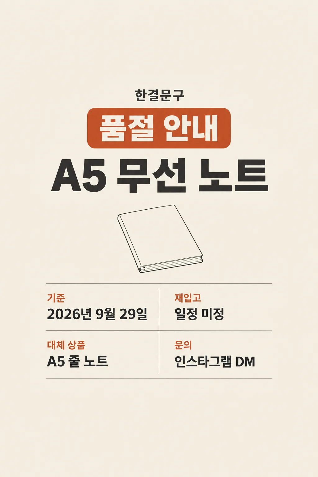
전체 · 인포그래픽/안내 · 매장 안내문
087상품 품절 안내
가게 사장님이 실제 품절 상품과 재입고 상태를 한 장으로 알려 손님 문의를 줄여요.
칸 채우기
- 1칸을 채워요
- 2복사 버튼을 눌러요
- 3GPT 채팅창에 붙여넣어요
- 4제품·인물 사진을 쓰려면 사진과 프롬프트를 둘 다 넣은 뒤에 보내요 선택
프롬프트 원문 보기 4,847자
Generate this image now. Draw it directly - do not describe it, explain it, or ask questions.
Output size 2480x3508 pixels, A4 portrait, 300dpi, print-ready poster.

[Purpose]
Make exactly ONE complete Korean sold-out-item notice that a small shop owner can post on Naver Place or Instagram and put beside an empty shelf. The owner's real shop name is "【가게 이름】". The unavailable item is exactly "【품절 상품】". This status was confirmed on "【기준 날짜】". The owner's exact restock status is "【재입고 상태】". Optional actual alternative is "【대체 상품】". Optional real inquiry route is "【문의 방법】". This notice exists to save a customer a wasted trip or fruitless search; it must be truthful and easy to read at small size. It is not a discount ad, back-in-stock promise, preorder form or a general menu card.

[Scene]
Create one fully painted 2:3 vertical notice. A large clean headline and the actual unavailable product name dominate. Use a restrained original line illustration of the generic product CATEGORY only if it can be drawn accurately from the provided item name; for stationery, a plain notebook outline is enough. If the name identifies a specific branded product or a product whose shape is unknown, use a simple empty shelf marker instead of inventing packaging. The secondary visual is a small calendar-outline or neutral status marker near the actual restock wording, never a fake date printed inside an icon. Use one warm off-white background, dark charcoal type and a muted rust-orange accent on the "품절" status. Ensure the item is treated respectfully: no broken product, trash or sad customer. The page itself is the finished sign, not a photo of a sign in a shop.

[Text layout]
Keep the upper 12% and lower 15% of the canvas free of essential words for website overlays. Around 15-23%, print the exact store name "【가게 이름】" once in clear modest type, not an invented logo. At 25-37%, print the strong headline "상품 품절 안내" or, if it helps the title fit better, a large "품절 안내" with no duplicated word. At 40-55%, print the owner-entered item name "【품절 상품】" much larger than any other product text. Nearby show the actual status date as "기준  【기준 날짜】" once; this is the date the shop entered, not the model's guessed current date. At 60-71%, print the restock status as a complete customer sentence: if value is "일정 미정", show "재입고 일정 미정"; if value is "재입고 예정 없음", show that exactly; if it is a supplied future date, show "재입고  【재입고 상태】" without changing the date or claiming it is guaranteed; if it requests confirmation, keep that wording. At 73-80%, show "대체 상품  【대체 상품】" only if entered, and clearly mark it as a separate ACTUAL available suggestion rather than a substitute silently shipped. At 80-84%, show "문의  【문의 방법】" only if entered. Optional lines each stand alone so a blank input removes its entire line without leaving a dummy box. The product and restock status remain readable from a few steps away; every entered phone number, handle, date and Hangul letter stays exact.

[Date and stock integrity]
Do not call the product sold out on any date other than the entered date. Do not automatically claim this information is valid today if the entered date is past; let the visible "기준" label make the time scope explicit. Do not compute a weekday from memory. If the restock text says "예정", preserve its planned nature rather than presenting it as a guaranteed arrival or saying customers may already order. If the status is "일정 미정", never invent a date. If it says "재입고 예정 없음", do not soften it into an implied future promise. Show a suggested alternative only if the owner supplied one; do not infer that a similar-looking product is in stock. Do not tell a customer to use a website, app, DM, phone or checkout unless that route is supplied. No stock counts, prices, reservations, purchase limits, delivery options, discounts, apology policy or sale conditions may be invented.

[Visual hierarchy and text rules]
First read: the item that is unavailable. Second read: when the notice was confirmed and whether a return date is known. Third read: any real alternative or contact method. If the product name is long, allow two large clean lines; do not truncate it or shrink it to microtype. The output should be legible on a shop shelf and in a Naver Place feed preview. Use crisp Korean sans-serif and a thin understated divider. Do not reproduce a brand logo, packaging, product photo, bar code, QR code, trademark artwork, store sign or fake contact detail. For food or drink items, do not invent a picture of the food; if a real food image is necessary, browse photographs to confirm its anatomy or use the simple shelf icon instead. Keep the background opaque to all edges and all essential text in the safe zone. No duplicate status, watermark, phone frame, separate slide, code or crop guide.

[Output]
Return the one finished image directly. No request for a next turn or additional editing.
이 카드도 많이 사용해요
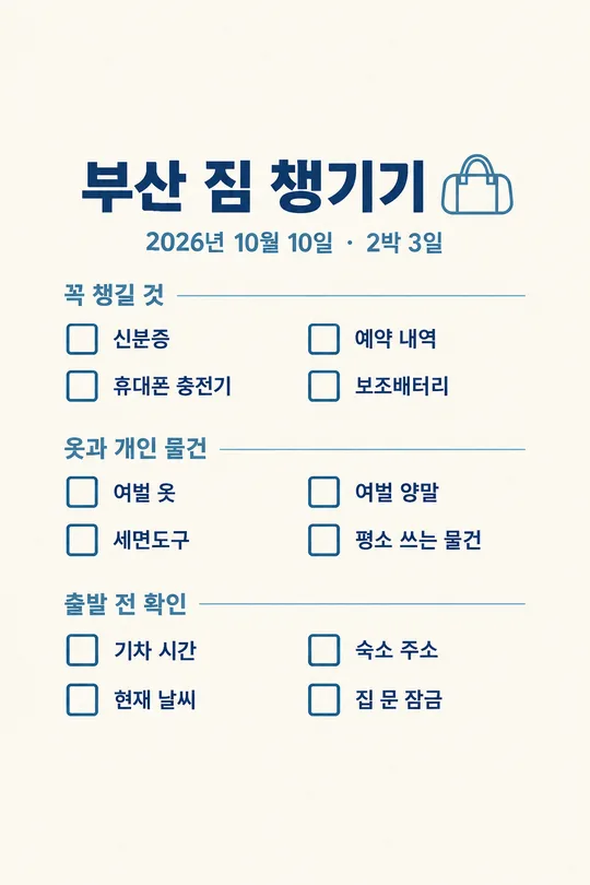
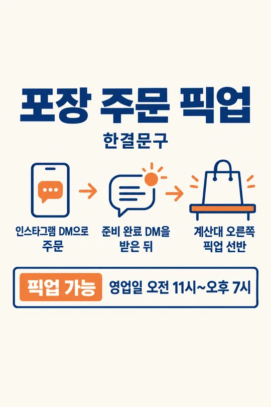
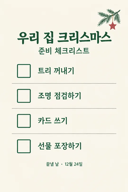
쓰는 법 · 자주 묻는 것
이런 때 쓰세요
찾는 손님이 많은 상품이 품절되었을 때, 빈 진열대 옆에 붙이고 네이버 플레이스 소식이나 인스타 가게 공지에도 올리는 한 장입니다. 상품 이름과 “언제 확인한 품절 정보인지”를 크게 보여 줍니다. 재입고 날짜가 미정이라면 그대로 미정이라고 쓰고, 이미 정해진 날짜가 있다면 예정이라는 조건을 유지합니다. 매번 문의에 답하기 전에 손님이 먼저 상황을 알 수 있어 유용합니다. 가격표나 일반 메뉴판과 달리, 지금 구매할 수 없는 상품 하나의 상태가 중심입니다.
칸 채우는 법
- 가게 이름은 실제 간판과 가게 소식에 쓰는 이름 그대로 적으세요. 예시 외에 누르면 들어가는 가짜 가게 이름은 두지 않았습니다.
- 품절 상품은 손님이 찾는 이름 그대로 적으세요. 색·용량·호수 같은 구별 정보가 중요하면 함께 적는 편이 좋습니다.
- 기준 날짜는 매장이 실제로 품절 상태를 확인한 날입니다. 나중에 재고가 바뀌면 이 날짜와 함께 새 이미지로 갱신하세요. 이 카드는 현재 날짜를 추측해 넣지 않습니다.
- 재입고 상태는 매장이 실제로 알고 있는 값만 적으세요. 아직 모르면 ‘일정 미정’, 들어오지 않을 예정이면 ‘재입고 예정 없음’처럼 정확히 쓰세요. 입고 예정일을 입력했다면 공급 상황에 따라 달라질 수 있는 ‘예정’을 빼지 않습니다.
- 대체 상품은 실제 매장에 있고 손님이 선택할 수 있을 때만 적으세요. 비우면 그 줄은 나오지 않습니다. GPT가 비슷한 상품을 임의로 추천하지 않습니다.
- 문의 방법도 실제로 응대하는 경로만 적으세요. 전화번호나 계정명이 필요하다면 그 값을 함께 적으세요. 비우면 문의 줄이 빠집니다.
한 번에 만드는 법
칸을 채우고 프롬프트를 무료 GPT에 한 번 붙여넣으세요. 결과는 상품명, 기준 날짜, 재입고 상태를 담은 완성 이미지 한 장입니다. 추가 앱에서 자르거나 번호를 붙일 필요가 없습니다. 상품 사진을 첨부하지 않아도 되며, 제품 모양을 확실히 모르면 단순한 선반 아이콘으로 처리합니다. 인쇄하거나 가게 소식에 올리기 전에 실제 재고를 다시 확인하세요.
그림이 나오면 꼭 볼 것
품절 상품의 색·규격·이름, 기준 날짜, 재입고 문구를 실제 정보와 대조하세요. 특히 “미정”이 날짜로 바뀌거나 “예정”이 확정처럼 바뀌면 게시하지 마세요. 대체 상품을 적었다면 정말 판매 가능한지도 확인해야 합니다. 문의 방법에 없는 계정이나 전화번호가 생겼다면 삭제해야 합니다. 하루 뒤에 재고가 바뀌었으면 예전 이미지를 그대로 두지 말고 내용을 고쳐 새 안내를 올리세요. 판매할 수 없는 상품에 주문 버튼이 있는 듯한 문구도 피하세요.
자주 묻는 것
- 재입고 날짜를 몰라도 되나요? 네. 재입고 상태 칸에 ‘일정 미정’이라고 적으면 됩니다.
- 여러 상품을 한꺼번에 넣나요? 이 카드는 손님이 찾는 상품 하나를 크게 알리는 용도입니다. 서로 다른 품절 상품은 각자 새 이미지로 만드는 편이 읽기 쉽습니다.
- 대체 상품을 꼭 적어야 하나요? 아니요. 실제로 판매 중인 대안이 없으면 비워 두세요.
- 기준 날짜는 왜 필요한가요? 품절은 바뀌는 정보여서 언제 확인한 안내인지 손님이 알아야 하기 때문입니다.