
전체 · 인포그래픽/안내 · 이용 방법 · 매장 안내문
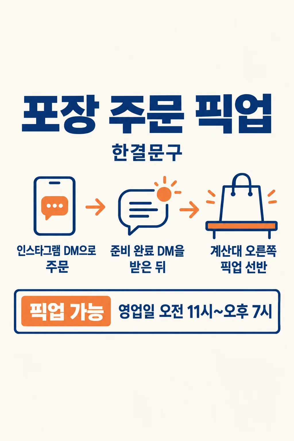
086포장 주문 픽업 안내
가게 사장님이 주문 방법과 찾는 곳·시간을 한 장으로 만들어 네이버 플레이스와 매장 픽업대에 붙여요.
칸 채우기
- 1칸을 채워요
- 2복사 버튼을 눌러요
- 3GPT 채팅창에 붙여넣어요
- 4제품·인물 사진을 쓰려면 사진과 프롬프트를 둘 다 넣은 뒤에 보내요 선택
프롬프트 원문 보기 4,840자
Generate this image now. Draw it directly - do not describe it, explain it, or ask questions.
Output size 2480x3508 pixels, A4 portrait, 300dpi, print-ready poster.

[Purpose]
Create exactly ONE complete Korean pickup notice for the owner of "【가게 이름】" to post as a Naver Place shop update or print beside the real pickup shelf. Customers must understand how to place a takeaway order, where to collect it, when collection is available, and what signal or time tells them to come. The exact owner-entered operating facts are: ordering route "【주문 방법】"; collection point "【픽업 장소】"; pickup availability "【픽업 가능 시간】"; when to arrive "【찾으러 오는 때】"; optional short line "【한마디】". Treat these values as the ONLY shop policy. This is a practical collection guide, not a reservation-only notice, general menu board, delivery advertisement or promotional discount poster.

[Scene]
Use a clean 2:3 full-bleed vertical information design. Build one large simple three-stop route that reads naturally from top to bottom: order, readiness/arrival cue, collect. Use an original phone-outline icon for an online order when appropriate, a small plain clock for the owner-supplied arrival cue, and a generic paper shopping bag at a pickup shelf. If the order method is in-store, use a simple speech icon instead of an app screen. The icons are not a literal interface and show no brand logo, app color, QR code, fake link, phone number or food. Beside the route place the owner's actual text in big aligned rows, and finish with the collection point and hours in a strong clearly separated block. Keep the three-stop route as a visual guide only; do not add steps or promises beyond the actual inputs. Use no food or drink photograph; this card can serve stationery, handmade goods, a bakery with generic bag imagery, or any shop without pretending to show its products.

[Text layout]
Reserve the top 12% and bottom 15% without essential text for site overlays. At 15-25%, print the bold headline "포장 주문 픽업" large enough to identify the notice from several steps away; beneath it put "【가게 이름】" once as a smaller owner label, not as a fake illustrated logo. Between 31% and 58%, lay out three readable instruction rows in this order: "주문  【주문 방법】"; "방문  【찾으러 오는 때】"; "픽업  【픽업 장소】". Interpret each label as a real customer action, not an input field name to paste awkwardly. If the entered sentence already includes the action, avoid doubling that word. The pickup place must be the clearest of the three because an arriving customer needs it immediately. At approximately 62-76%, draw a large clean hours panel with the exact text "픽업 가능  【픽업 가능 시간】". Do not translate "영업일" into specific weekdays and do not invent a closing time. Around 77-83%, show "【한마디】" only if supplied. If it says "알아서 골라줘", choose one short, original, neutral Korean courtesy line that does not promise instant readiness, a discount, delivery, a separate waiting time or stock availability; do not print the instruction phrase. Leave no empty optional-text box. All important lines must remain within the central safe area and readable on a phone or small A4 print.

[Style and hierarchy]
Choose a calm functional palette: warm white, deep ink blue and one muted orange accent on the route markers. The same colors work at a retail counter and in a Naver shop feed. Use crisp Korean sans-serif for all operational facts, with especially clear time digits and location wording. Do not use handwritten lettering for the hours or ordering route. Maintain consistent icon weight, generous text padding, thin route connectors and strong contrast. Make the route lively but subordinate to the owner's real words. The first read is the title, then the collection point, then how and when to order and arrive. This is the flat artwork itself, not a photographed sign, door mockup or phone frame. Keep the complete background opaque from edge to edge.

[Facts and text rules]
Spell the entered shop name and each operating instruction exactly. Do not infer an Instagram handle, a Kakao channel name, a phone number or a URL if not entered. Do not invent a minimum order, prepayment requirement, cancellation rule, pickup deadline, wait time, stock guarantee, weekend service, delivery zone, parking, food product, sale price or contact number. If "픽업 가능 시간" is broad, reproduce it without narrowing it; if the ordering route is broad, do not fabricate a clickable account. The generic bag must remain unbranded; no trademark, platform logo, product package, celebrity or mascot. Do not repeat a sentence in a heading and again in the body. No placeholder braces, gibberish, watermark, extra panels, separate images or cropping instructions.

[Output]
Return the finished image directly, exactly one. A customer should be able to read this one image and follow the shop's actual pickup process without another message, code run, carousel slide or assembly step.
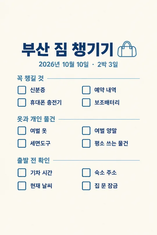
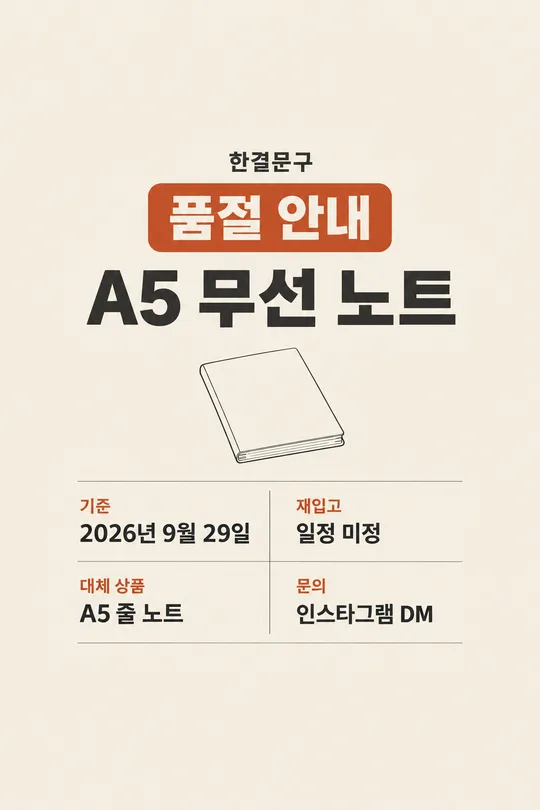
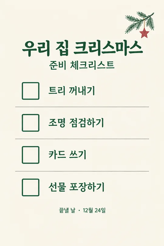
이 카드도 많이 사용해요
쓰는 법 · 자주 묻는 것
이런 때 쓰세요
포장 주문을 받는 가게에서 손님이 “어디서 주문해요?”, “언제 찾으러 가요?”, “가서 어디로 가야 해요?”를 반복해서 묻는다면 한 장으로 안내하세요. 사장님은 네이버 플레이스 새소식이나 인스타 가게 공지에 올리고, 같은 이미지를 픽업대 가까이에 붙일 수 있습니다. 예약제 운영 안내는 방문 예약 여부가 중심이고, 메뉴판은 상품과 가격이 중심입니다. 이 카드는 이미 주문한 물건을 어떻게 찾아가는지가 중심입니다. 상품 사진 없이도 쓸 수 있는 안내문이라 업종마다 실제 제품이 잘못 그려질 걱정이 적습니다.
칸 채우는 법
- 가게 이름은 간판과 온라인 가게 소식에서 쓰는 이름 그대로 적으세요. 보기 버튼에 가짜 가게 이름을 넣지 않았습니다.
- 주문 방법에는 실제로 주문을 받는 경로를 적으세요. 전화라면 전화번호까지, DM이라면 손님이 찾을 수 있는 계정 정보까지 함께 적는 편이 좋습니다. GPT가 없는 연락처를 만들지 않습니다.
- 픽업 장소에는 가게에 도착한 손님이 서야 할 정확한 지점을 적으세요. “매장 안”보다 “입구 오른쪽 픽업대”가 훨씬 도움이 됩니다.
- 픽업 가능 시간은 실제 운영하는 범위를 적으세요. 영업시간과 다를 수 있으니 손님이 물건을 받을 수 있는 시간으로 쓰세요.
- 찾으러 오는 때에는 준비 완료 알림을 받고 오는지, 주문할 때 안내받은 시간에 오는지 등 사장님이 실제로 운영하는 방식을 적으세요. 알림을 보내지 않는 매장이라면 그런 문구를 고르지 마세요.
- 한마디는 선택입니다. 직접 적거나 「알아서 골라줘」를 누르면 짧고 중립적인 안내를 더합니다. 할인이나 빠른 준비처럼 약속하지 않은 혜택은 쓰지 않습니다.
한 번에 만드는 법
칸을 채우고 프롬프트를 한 번 복사해 무료 GPT에 붙여넣으세요. 별도의 이미지 편집이나 코드가 필요하지 않습니다. 결과는 제목, 주문 경로, 찾아올 시점, 픽업 위치, 가능 시간이 한 장에 들어간 완성 안내문입니다. 글자가 충분히 큰 세로 이미지로 만들어 네이버 가게 소식에도 올리고 출력해서 픽업대에도 붙일 수 있습니다. 실제 계정 주소나 전화번호가 길다면 입력 칸에 정확히 적은 뒤 결과가 잘리지 않았는지 확인하세요.
그림이 나오면 꼭 볼 것
주문 방법에 실제 계정명·전화번호가 들어갔다면 한 글자씩 대조하세요. 픽업 장소가 문 옆인지 계산대 옆인지도 실제 동선과 맞아야 합니다. 오전·오후, 평일·주말, 시작·끝 시간이 바뀌면 손님이 헛걸음할 수 있습니다. 준비 완료 알림을 보내지 않는 가게에 알림이 온다고 쓰여 있다면 올리지 마세요. 가게에서 하지 않는 예약, 배달, 선결제, 할인 조건이 추가되지 않았는지도 확인하세요. 최종 이미지는 손님에게 바로 보여 줘도 이해되는지 휴대폰 크기로 읽어 보세요.
자주 묻는 것
- 음식 사진을 넣어야 하나요? 아니요. 이 카드는 주문과 픽업 동선을 알려 주는 안내문이라 상품 사진 없이 완성됩니다.
- 전화번호를 넣을 칸이 따로 있나요? 주문 방법 칸에 실제 주문 경로와 함께 적으세요. 쓰지 않으면 GPT가 임의로 만들지 않습니다.
- 영업시간과 픽업 시간이 달라도 되나요? 네. 픽업 가능 시간 칸에는 실제 물건을 받을 수 있는 시간만 적으세요.
- 한 장으로 바로 붙일 수 있나요? 네. 제목부터 장소와 시간까지 한 이미지에 들어갑니다.