
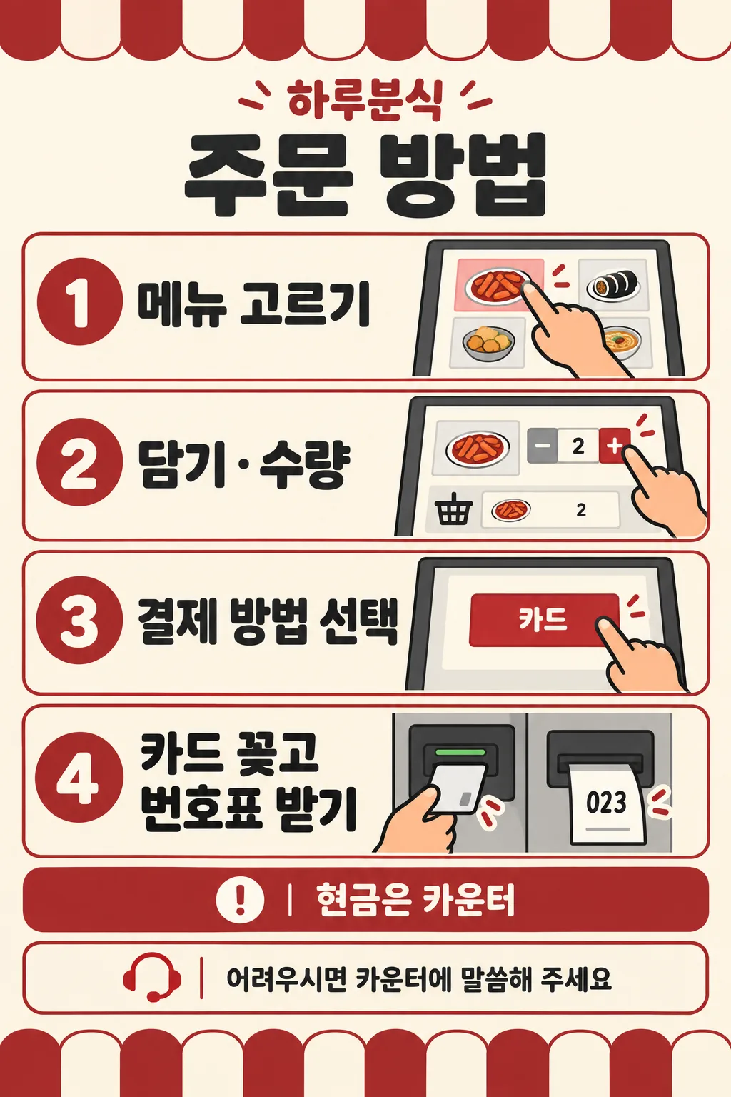
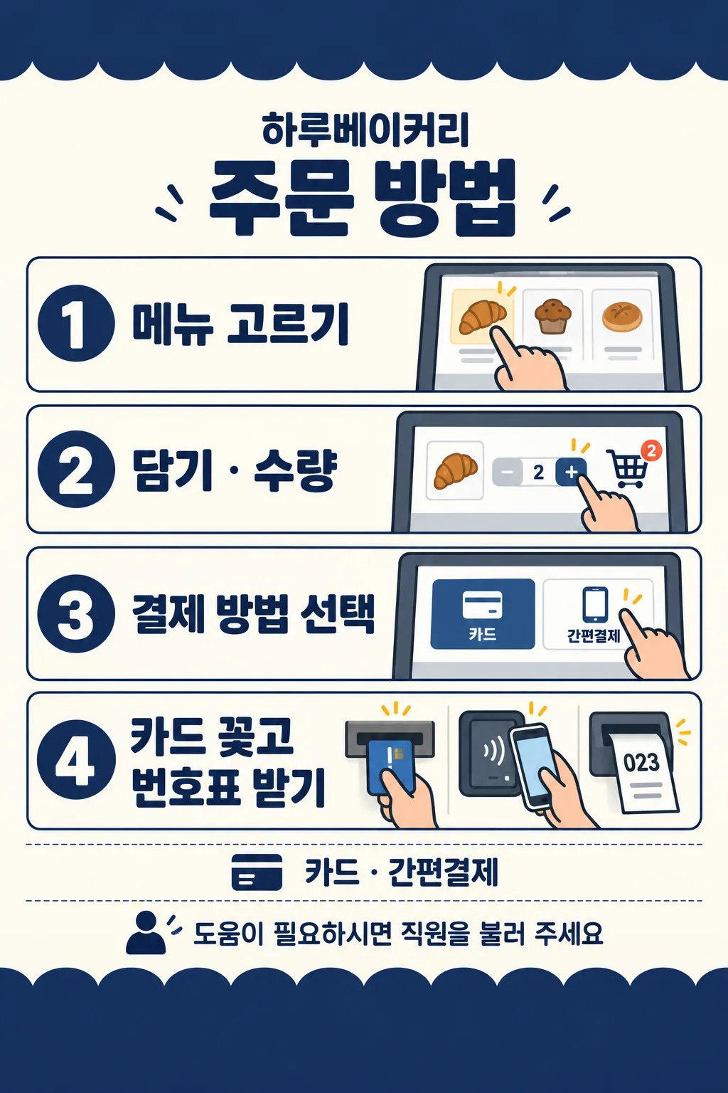
項目を入力
- 1項目を入力します
- 2コピーを押します
- 3GPTのチャットに貼り付けます
- 4そのまま送ると、サムネイルの例のような画像になります
- 5カードに合う実際の写真を一緒に入れると反映されます。背景カードなら背景の写真、人物・料理カードならその写真 任意
プロンプト全文を見る 3,973文字
Generate this image now. Draw it directly, do not explain or ask questions.
Create ONE finished flat kiosk ordering sign. 出力サイズは2480×3508ピクセル、A4縦、300dpiの印刷用ポスターにしてください。 Use the selected canvas ratio. Fill the canvas edge to edge with warm ivory, restrained accent bands and clean flat instructional illustrations. No wall, photographed paper, mockup or perspective. Bold dark sans lettering, large numbered accent circles, warm peach hands and consistent thick outlines. Keep every important word within 12%-85% height and 5% side margins. Top and bottom contain only simple awning-like ornaments. Put shop name and title at 13%-23%, four compact horizontal rows at 25%-72%, payment note at 74%-78%, help footer at 80%-84%. Each row: numbered circle left, large instruction center-left, substantial fictional screen and hand right. Wrap fourth instruction into two lines. Row1 finger touching a generic food tile; row2 finger pressing + next to a basket and quantity 2; row3 finger touching a payment button; row4 hand inserting an unbranded card into a dedicated card slot, with a numbered slip emerging from a SEPARATE printer. Never insert card in receipt slot. Use only original simplified fictional UI, no actual manufacturer design, logos or payment brands. Screen numbers, plus/minus and ticket 023 are permitted, no invented prices or menu names.
Resolve payment mode before drawing. First supplied option = cards only, row3 only one card button. Second option = card and mobile payment, row3 two buttons with the supplied generic card/mobile labels; row4 also a small generic phone tapping a separate reader, while retaining card insertion and order slip. Third option = cash at counter, kiosk screen only card button; payment note explicitly routes cash users to counter. Never illustrate cash insertion into kiosk. A custom payment note is copied exactly; show only card button unless it explicitly allows mobile payment. Do not invent supported payment methods. Empty payment defaults to first option. Empty shop removes its label and reflows header. Empty help uses supplied default help. If help is the localized automatic-choice option, use that same default. Custom help replaces default entirely; never print both.
Color choices in order: forest green/ivory, navy/ivory, brick red/ivory, charcoal/white. Empty color uses forest green/ivory. Same flat illustration style and layout for every choice. Color field never prints.
Print ONLY supplied shop, title, four instructions with numbers 1-4, resolved payment note, resolved help and required generic payment screen labels. Copy every character exactly. Check text character by character before finishing. No verification notes, watermark or sample label.
SHOP: "【店名】"
PAYMENT: "【支払い方法】"
HELP: "【最後の案内文】"
COLOR: "【色】"
Output language: ja. Title: 注文方法. Steps in order: メニューを選ぶ / 追加 · 数量を選ぶ / 支払い方法を選ぶ / カードを挿す · 番号券を受け取る.
Payment options in order: カードのみ / カード · 電子決済 / 現金はカウンターで. Screen labels: カード / 電子決済. Default help: お困りの際はカウンターにお声がけください. Automatic help choice: おまかせ.
Final layout rule: use a thick plain accent TOP band occupying 12% height and BOTTOM band occupying 15% height, both entirely blank. All shop, heading, four slim rows, payment and help must fit inside the central 73%. Shrink illustrations to fit. Resolve selected payment before drawing; the choice list is not a list of supported methods. Print the payment input exactly, with no added restrictions or words. First or third payment option absolutely forbids mobile-payment buttons or phone icons. Second option requires the phone-and-reader illustration in row4 alongside card insertion and order slip.

[Final output format]
出力サイズは2480×3508ピクセル、A4縦、300dpiの印刷用ポスターにしてください。
This selected output format takes priority over any fixed canvas size or aspect ratio elsewhere in this template. Adapt the composition, text zones and margins to the selected canvas without stretching or cropping essential content. Device safe areas apply only when a device is selected. Never print these format instructions on the image.
結果はどうでしたか?
こちらのカードも人気です
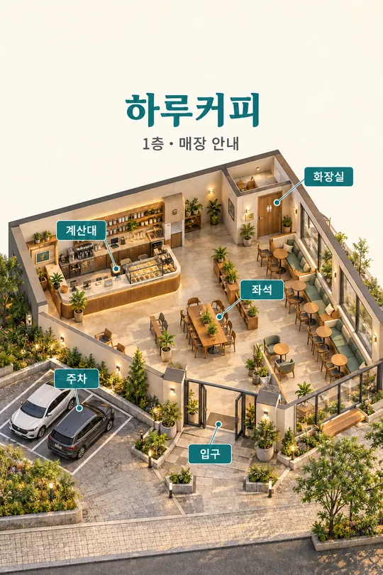
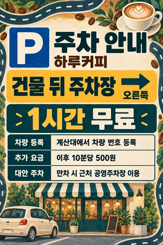
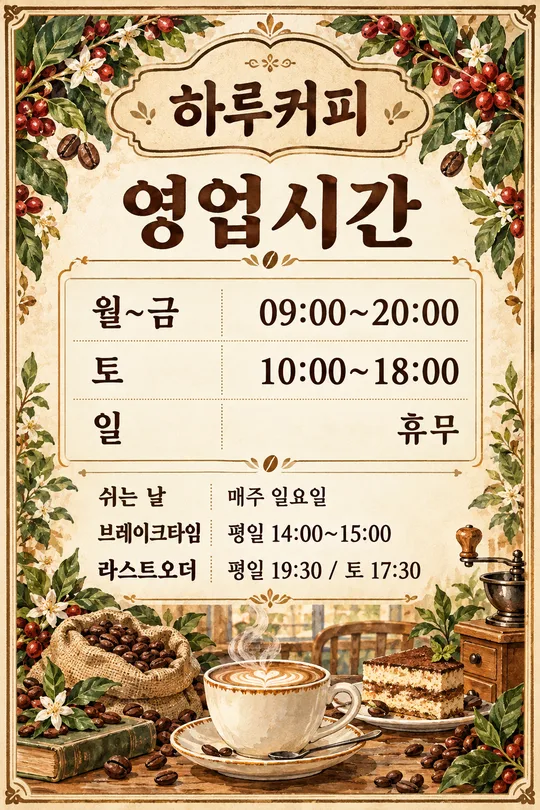
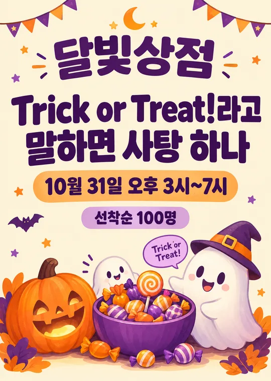
使い方・よくある質問
キオスクの横に貼る、注文方法の案内板一枚です。初めてのお客様がメニュー選びから番号券の受け取りまで進められるよう、四つの大きな番号と、指・画面のイラストを並べます。写真は不要です。完成したプロンプトを画像AIに一度貼り付け、平面の印刷用案内板を一枚作ります。
必須項目は1つ、支払い方法です。店名にはHaru CoffeeやHaru Bakeryのような実際の看板名を入れます。空欄なら店名の行を省きます。カードのみでは画面にカードボタン一つ、カード · 電子決済では一般的な二つの決済ボタンと最後の図にスマートフォンのタッチ動作を描きます。現金はカウンターでを選ぶとキオスクはカードボタンのみとなり、下の案内文で現金のお客様をカウンターへ案内します。機械に現金を入れる図は描きません。独自の支払い条件はそのまま表示し、対応していない方法は推測しません。空欄の支払い方法はカードのみになります。
最後の案内文は二つの文章、おまかせ、または自分で書いた文章から選べます。空欄とおまかせでは「お困りの際はカウンターにお声がけください」を使います。独自の文章は基本文を完全に置き換えます。色は緑・アイボリー、紺・アイボリー、れんが色・アイボリー、黒・白の四つです。空欄は緑となり、画風と四段階の配置は変わりません。
掲示前に四つの手順、店名、支払い案内、最後の案内文を一文字ずつ照合してください。カード挿入口と番号券の出口が別々に描かれ、ボタンが実際の決済方法と一致することを確認します。このカードはカードを挿して番号券を受け取る機械向けです。タッチ専用や番号券の出ない機械にはそのまま貼らないでください。カードを挿す指示はカード利用時の動作で、電子決済のお客様はスマートフォンの図に従います。操作順序が違う機械には別の案内板が必要です。
共通の比率選択でA4を選ぶと縦の印刷比率を指定できます。表紙とギャラリーは2:3でA4とは異なるため、比率を保って文字を切らずに印刷してください。試し刷りを実際の距離から読み、文字の誤りは入力を確認して再生成します。店名なしの共用案内板も作れます。変更できる文章は最後の案内文で、四つの手順は固定です。英語・日本語も四項目、三つの決済選択、三つの案内候補、四色と空欄動作を共通にしています。ギャラリーは韓国語の作例で、このプロンプトは日本語で出力します。