
すべて · 図解・案内 · 店舗案内
374店頭スタンド看板 — 遠くから読める三行ポスター
A型スタンド看板に差し込む平面ポスター一枚。店名、大きな一言、主役の商品一つで、通行人の二秒の視線に伝えます。
ChatGPT 無料 OK
項目を入力
- 1項目を入力します
- 2コピーを押します
- 3GPTのチャットに貼り付けます
- 4そのまま送ると、サムネイルの例のような画像になります
- 5カードに合う実際の写真を一緒に入れると反映されます。背景カードなら背景の写真、人物・料理カードならその写真 任意
プロンプト全文を見る 5,221文字
Generate this image now. Draw it directly; return one finished image only.
完成した2:3の縦型画像を1枚、1024×1536ピクセルで出力してください。重要な文字は上12%と下15%に置かないでください。

[Purpose]
Create one flat, full-bleed printable poster to insert into an A-frame pavement sign. Design for a two-second glance from about 3 metres when printed at an appropriate physical size. One hero product and at most THREE text lines; no menu list, launch brochure, event calendar, street scene, stand, frame, perspective mockup or sheet on a table. The chosen atmosphere changes the visual treatment only, never the result type or hierarchy.

[Inputs — these labels are internal]
SHOP: "【店名】"
HEADLINE: "【大きな一言】"
SUPPORT: "【短い補足】"
PRICE: "【価格】"
HERO: "【主役の商品】"
ATMOSPHERE: "【雰囲気】"

[Resolve text once]
If HEADLINE equals "おまかせ", derive one concise neutral product name in Japanese from HERO. Never infer newness, a special event, a discount, availability or any other business claim. Otherwise preserve HEADLINE verbatim. Do not paraphrase, translate or abbreviate supplied display strings.
Line 1 is SHOP exactly. Line 2 is the resolved HEADLINE exactly. Line 3 combines nonempty SUPPORT and PRICE with one separating space, or contains the one supplied value if the other is blank. If both are blank, omit line 3 completely and rebalance the composition. No fourth line, automatic item caption, extra currency sign, fabricated amount, badge or empty reserved space. HERO and ATMOSPHERE are never printed. Preserve every price digit, comma, decimal mark and currency symbol; never convert or calculate the amount. Use Japanese for generated lettering; supplied shop names such as Haru may remain as supplied.

[Distance-first hierarchy]
Keep the headline dramatically largest with thick intact strokes, high contrast and simple letter shapes. Set SHOP smaller but bold and easy to identify. The combined final line is secondary yet clearly readable. Use three single-line text bands in the upper half: SHOP around 15–22%, HEADLINE around 26–36%, SUPPORT/PRICE around 38–44% of canvas height. Keep important lettering clear of the top 12%, bottom 15% and about 8% side margins. Adapt these bands to the selected canvas ratio without clipping text. If supplied strings are long, fit each complete line using a clear condensed typeface and wider usable measure; never wrap into a fourth line or drop characters. Do not promise physical readability regardless of print size. Fill the lower half with one large coherent hero image extending toward the bottom, while leaving all lettering unobstructed. Paint the background to every canvas edge. No white outer border or product collage.

[Four atmosphere choices — interpret only the chosen value]
"手書き黒板": matte charcoal field, bright cream hand-lettering with fully continuous strokes and a single chalk-style hero illustration; texture stays quiet behind text.
"温かなイラスト": pale buttery cream or yellow ground, dark forest-green bold lettering and one warm painterly hero illustration, natural detail and restrained coral accents.
"すっきりした写真調": pale solid background, deep navy or charcoal crisp sans-serif text and one natural photographic product, realistic materials and soft grounded shadow.
"レトロ": warm cream field, bold burgundy retro sans-serif lettering, muted teal secondary ground and an original painted hero illustration with restrained orange accents. No distressed missing letter strokes.
Never combine the four treatments or print their names. Maintain strong dark/light contrast in every treatment.

[Hero accuracy]
Render only the named product, following the specified colour, portion, vessel or wrapping. Do not add unrelated products or invented ingredients. For food or drink, when web access is available inspect at least five real photographs of the exact product before generating; match its natural anatomy, portion, cooked texture and vessel without copying a photograph or its branding. Even illustration treatments must preserve real structure. A clear-glass iced Americano has diluted dark brown coffee with amber edge highlights, a complete glass rim and base, irregular wet ice floating near the surface and fine natural condensation; no milk, fruit or foamy latte cap unless explicitly supplied. No identical cloned food pieces, plastic gloss or impossible geometry. Do not invent health effects, ingredients, origin claims or sales conditions. This card supports ordinary non-alcohol products only; do not create an alcohol advertisement using it.

[Final proof]
Check every supplied character, punctuation mark and price digit against the input. Keep all consonants, vowels and final consonants intact. Output the artwork alone, with no instructions, verification notes, quotation marks, braces, watermarks, signatures, real brand logos or protected characters. One prompt produces one poster; no code, text-overlay workflow, cropping, compositing or manual retouching is required.

[Final output format]
完成した2:3の縦型画像を1枚、1024×1536ピクセルで出力してください。重要な文字は上12%と下15%に置かないでください。
This selected output format takes priority over any fixed canvas size or aspect ratio elsewhere in this template. Adapt the composition, text zones and margins to the selected canvas without stretching or cropping essential content. Device safe areas apply only when a device is selected. Never print these format instructions on the image.
結果はどうでしたか?
こちらのカードも人気です
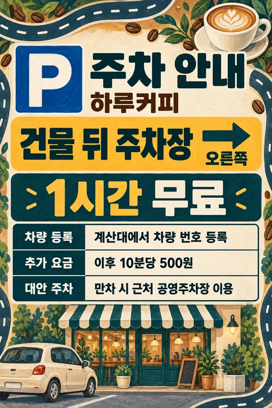
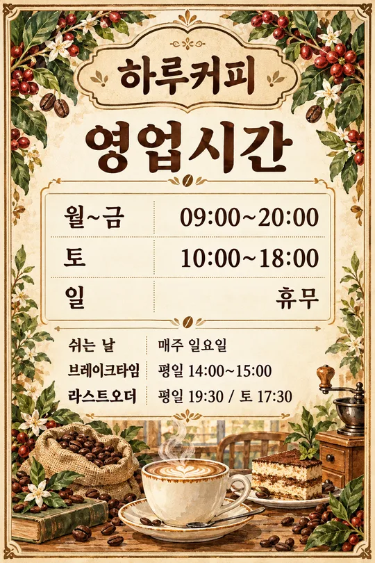
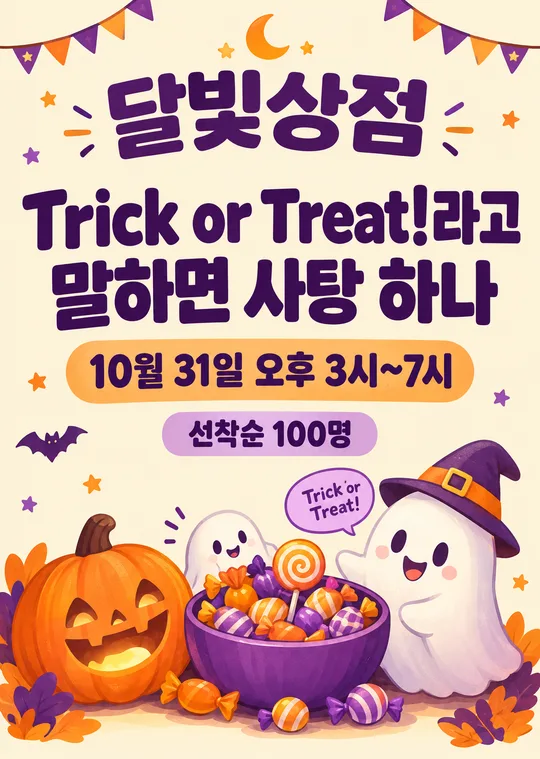
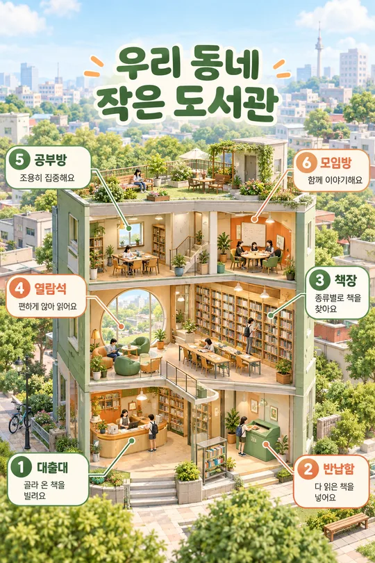
使い方・よくある質問
通りすがりの人に一つだけ伝える
A型スタンド看板に差し込む、印刷用の平面ポスター一枚を作ります。複数の商品と価格を並べるメニュー表とは異なり、大きな見出し一つと主役の商品一つに集中します。新商品の詳しい説明やイベント条件を詰め込むより、店の前で一目見て内容が伝わる短い案内に向いています。
入力する内容
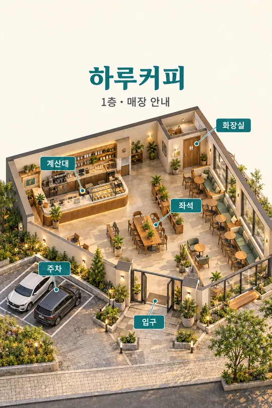
必須項目は四つです。店名には実際の名前、大きな一言には最初に読んでほしい文、主役の商品には絵にする対象、雰囲気には仕上がりの表現を選びます。表紙は韓国語のカフェ作例で、アイスコーヒー、補足と価格、すっきりした写真調の組み合わせです。商品は色と容器や包装まで書くと形を指定しやすくなります。商品説明は絵だけに反映し、余分な商品名として印字しません。
短い補足と価格は任意です。「一束」と「1,500円」を入れると、最後の一行を「一束 1,500円」にまとめます。片方だけならその値だけを表示し、両方とも空欄なら最後の行をなくします。補足に価格を重ねて書かないでください。「おまかせ」は商品の説明から短い呼び名を決めるだけで、新商品、割引、在庫などの事実を作りません。価格の例は日本語版用の例で、換算額ではありません。
雰囲気と掲載例
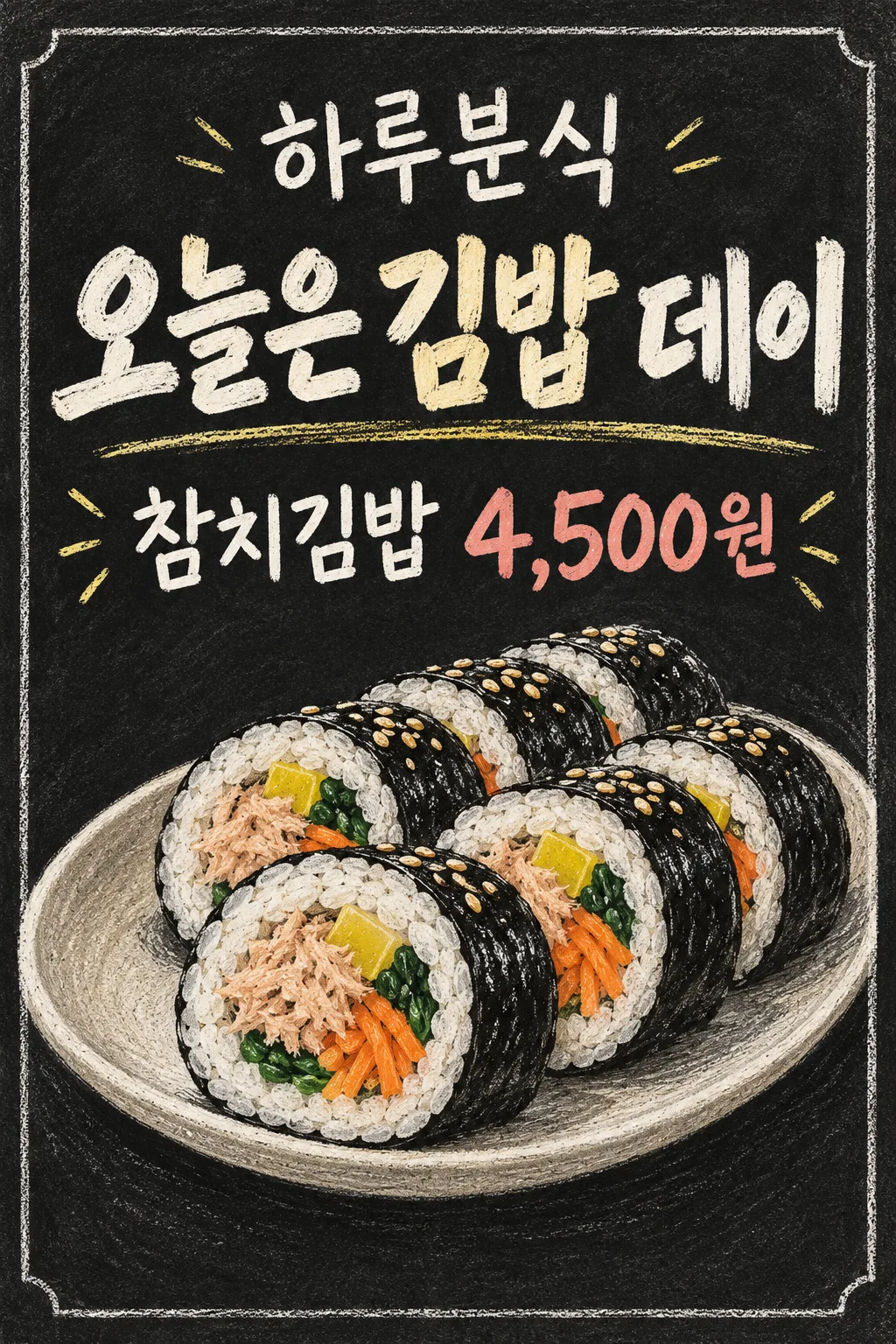
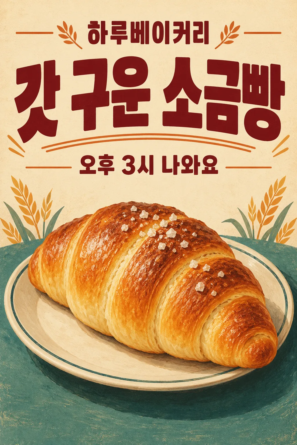
手書き黒板は暗い地と途切れない明るい文字、温かなイラストはクリーム色の地と柔らかな絵、すっきりした写真調は明るい単色の地と自然な商品写真、レトロは太い文字と少数の色で仕上げます。どれを選んでも平面ポスター一枚、文字は最大三行です。最初の掲載例は韓国語の軽食店です。キンパの日という見出し、ツナキンパの補足と元の韓国通貨で4,500の価格を、手書き黒板の表現で示します。二枚目は韓国語のベーカリーで、焼きたての塩パンと午後3時の焼き上がり案内をレトロで表現し、価格は空欄です。表紙と作例は業種・文言・雰囲気がすべて異なります。掲載画像は元の韓国語作例ですが、このページのプロンプトは日本語の文字と入力した価格をそのまま指定し、換算しません。
印刷前の確認
完成したプロンプトを画像AIへ一度貼り付けて、一枚の画像を生成します。店名、漢字や仮名、価格の数字と区切り記号を入力と照合してください。差し込み部分を測り、実際の大きさで印刷して3m離れて読めるか確かめます。画面の小さなプレビューだけで実物の読みやすさは保証できません。長い名前や文で文字が小さくなる場合は、入力文を短くして再生成します。指定文を勝手に省略したり切り取ったりはしません。画像の解像度と選んだ比率が印刷寸法に合うことも確認してください。
よくある質問
価格なしでも使えますか。価格欄を空にすれば、金額や空の価格枠を作りません。商品を複数入れられますか。この構成は主役一つ用です。看板の枠も出ますか。街路や枠を含めず、差し込み用の印刷物だけを作ります。文字の合成やコード実行は必要ありません。利用する画像サービスの料金と利用条件は、そのサービスで確認してください。