
전체 · 인포그래픽/안내 · 매장 안내문
374가게 입간판 — 3m 밖에서 읽히는 세 줄 포스터
가게 이름과 큰 문구, 대표 상품 하나로 만드는 A형 입간판 삽입용 포스터 — 지나가는 사람이 두 초 안에 읽도록
ChatGPT 무료 OK
칸 채우기
- 1칸을 채워요
- 2복사 버튼을 눌러요
- 3GPT 채팅창에 붙여넣어요
- 4그대로 보내면 썸네일 예시처럼 나와요
- 5카드에 맞는 실제 사진을 같이 넣으면 그 사진이 반영돼요 — 배경 카드는 배경 사진, 인물 · 음식 카드는 그 사진 선택
프롬프트 원문 보기 5,221자
Generate this image now. Draw it directly; return one finished image only.
Output exactly one finished 2:3 portrait image, 1024x1536 pixels. Keep all important text inside the central 73% of image height: leave the top 12% and bottom 15% free of essential lettering.

[Purpose]
Create one flat, full-bleed printable poster to insert into an A-frame pavement sign. Design for a two-second glance from about 3 metres when printed at an appropriate physical size. One hero product and at most THREE text lines; no menu list, launch brochure, event calendar, street scene, stand, frame, perspective mockup or sheet on a table. The chosen atmosphere changes the visual treatment only, never the result type or hierarchy.

[Inputs — these labels are internal]
SHOP: "【가게 이름】"
HEADLINE: "【큰 한 줄】"
SUPPORT: "【작은 한 줄】"
PRICE: "【가격】"
HERO: "【대표 상품】"
ATMOSPHERE: "【분위기】"

[Resolve text once]
If HEADLINE equals "알아서 골라줘", derive one concise neutral product name in Korean from HERO. Never infer newness, a special event, a discount, availability or any other business claim. Otherwise preserve HEADLINE verbatim. Do not paraphrase, translate or abbreviate supplied display strings.
Line 1 is SHOP exactly. Line 2 is the resolved HEADLINE exactly. Line 3 combines nonempty SUPPORT and PRICE with one separating space, or contains the one supplied value if the other is blank. If both are blank, omit line 3 completely and rebalance the composition. No fourth line, automatic item caption, extra currency sign, fabricated amount, badge or empty reserved space. HERO and ATMOSPHERE are never printed. Preserve every price digit, comma, decimal mark and currency symbol; never convert or calculate the amount. Use Korean for generated lettering; supplied shop names such as Haru may remain as supplied.

[Distance-first hierarchy]
Keep the headline dramatically largest with thick intact strokes, high contrast and simple letter shapes. Set SHOP smaller but bold and easy to identify. The combined final line is secondary yet clearly readable. Use three single-line text bands in the upper half: SHOP around 15–22%, HEADLINE around 26–36%, SUPPORT/PRICE around 38–44% of canvas height. Keep important lettering clear of the top 12%, bottom 15% and about 8% side margins. Adapt these bands to the selected canvas ratio without clipping text. If supplied strings are long, fit each complete line using a clear condensed typeface and wider usable measure; never wrap into a fourth line or drop characters. Do not promise physical readability regardless of print size. Fill the lower half with one large coherent hero image extending toward the bottom, while leaving all lettering unobstructed. Paint the background to every canvas edge. No white outer border or product collage.

[Four atmosphere choices — interpret only the chosen value]
"손글씨 칠판": matte charcoal field, bright cream hand-lettering with fully continuous strokes and a single chalk-style hero illustration; texture stays quiet behind text.
"따뜻한 일러스트": pale buttery cream or yellow ground, dark forest-green bold lettering and one warm painterly hero illustration, natural detail and restrained coral accents.
"깔끔한 사진형": pale solid background, deep navy or charcoal crisp sans-serif text and one natural photographic product, realistic materials and soft grounded shadow.
"레트로": warm cream field, bold burgundy retro sans-serif lettering, muted teal secondary ground and an original painted hero illustration with restrained orange accents. No distressed missing letter strokes.
Never combine the four treatments or print their names. Maintain strong dark/light contrast in every treatment.

[Hero accuracy]
Render only the named product, following the specified colour, portion, vessel or wrapping. Do not add unrelated products or invented ingredients. For food or drink, when web access is available inspect at least five real photographs of the exact product before generating; match its natural anatomy, portion, cooked texture and vessel without copying a photograph or its branding. Even illustration treatments must preserve real structure. A clear-glass iced Americano has diluted dark brown coffee with amber edge highlights, a complete glass rim and base, irregular wet ice floating near the surface and fine natural condensation; no milk, fruit or foamy latte cap unless explicitly supplied. No identical cloned food pieces, plastic gloss or impossible geometry. Do not invent health effects, ingredients, origin claims or sales conditions. This card supports ordinary non-alcohol products only; do not create an alcohol advertisement using it.

[Final proof]
Check every supplied character, punctuation mark and price digit against the input. Keep all consonants, vowels and final consonants intact. Output the artwork alone, with no instructions, verification notes, quotation marks, braces, watermarks, signatures, real brand logos or protected characters. One prompt produces one poster; no code, text-overlay workflow, cropping, compositing or manual retouching is required.

[Final output format]
Output exactly one finished 2:3 portrait image, 1024x1536 pixels. Keep all important text inside the central 73% of image height: leave the top 12% and bottom 15% free of essential lettering.
This selected output format takes priority over any fixed canvas size or aspect ratio elsewhere in this template. Adapt the composition, text zones and margins to the selected canvas without stretching or cropping essential content. Device safe areas apply only when a device is selected. Never print these format instructions on the image.
결과 어땠어요?
이 카드도 많이 사용해요
쓰는 법 · 자주 묻는 것
가게 앞에서 한 가지를 알릴 때
이 카드는 A형 세움 간판에 끼울 평면 포스터 한 장을 만듭니다. 메뉴판처럼 여러 상품을 나열하지 않고, 지나가는 손님에게 보여 줄 대표 상품 하나와 큰 문구 하나에 집중해요. 신메뉴를 자세히 소개하거나 행사 조건을 빼곡하게 적는 용도보다, 멀리서 보고 가게 쪽으로 시선을 돌리게 하는 짧은 안내에 맞습니다.
칸 채우는 법
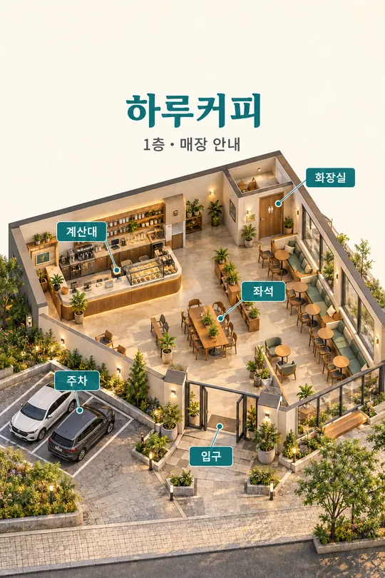
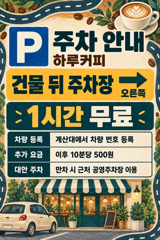
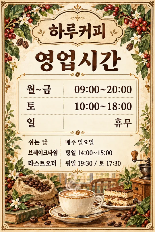
꼭 채울 칸은 4개예요. 가게 이름은 실제 상호, 큰 한 줄은 가장 먼저 읽혀야 할 문구, 대표 상품은 그림에 보여 줄 대상, 분위기는 바탕과 그림 표현을 정합니다. 표지는 하루커피 · 아이스 커피 · 한 잔 · 3,000원 · 투명 유리잔의 아이스 아메리카노 · 깔끔한 사진형 조합이에요. 대표 상품은 색과 담는 그릇이나 포장까지 적으면 형태를 잡기 쉽습니다. 메뉴 이름을 다시 글자로 추가하지 않고 그림으로만 보여 줍니다.
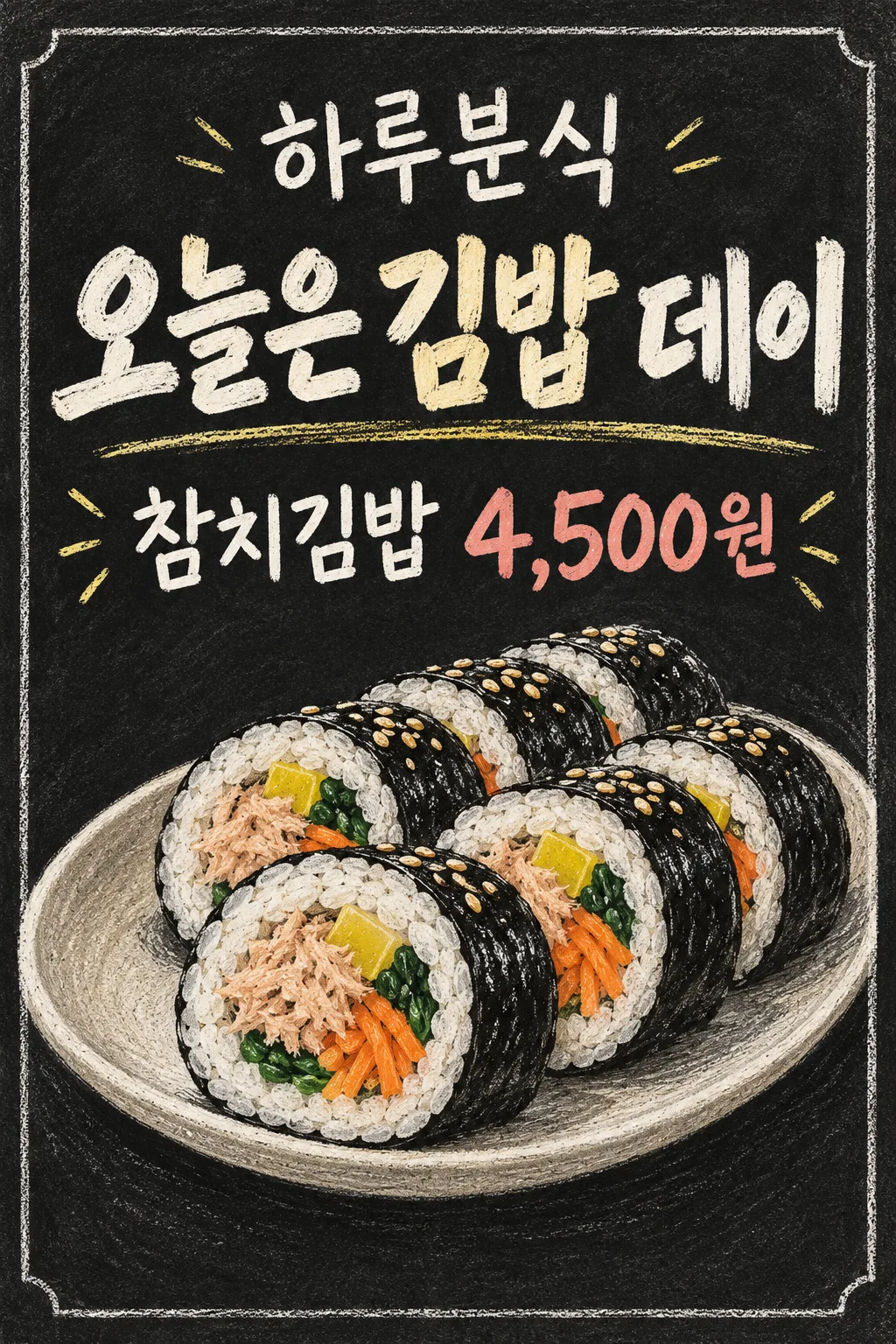
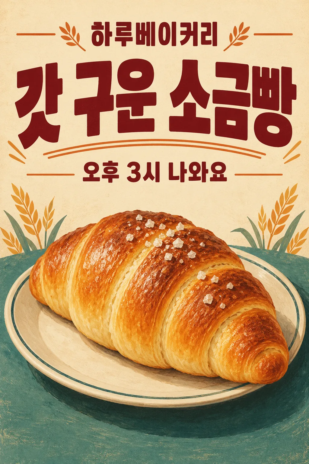
작은 한 줄과 가격은 선택이에요. 작은 한 줄에 참치김밥, 가격에 4,500원을 넣으면 마지막 줄은 ‘참치김밥 4,500원’으로 합쳐집니다. 베이커리 예시는 작은 한 줄에 ‘오후 3시 나와요’를 넣고 가격은 비워 안내 문장만 보여 줍니다. 둘 중 하나만 넣으면 그 값만 나오고, 둘 다 비우면 마지막 줄이 사라져요. 작은 한 줄에 가격을 반복해서 쓰지 마세요. 할인율, 재고, 영업시간, 혜택은 임의로 덧붙이지 않습니다. 큰 한 줄의 ‘알아서 골라줘’는 대표 상품에서 짧은 이름만 골라 주며, 신메뉴나 할인 사실을 만들어 내지 않아요.
분위기와 실제 예시
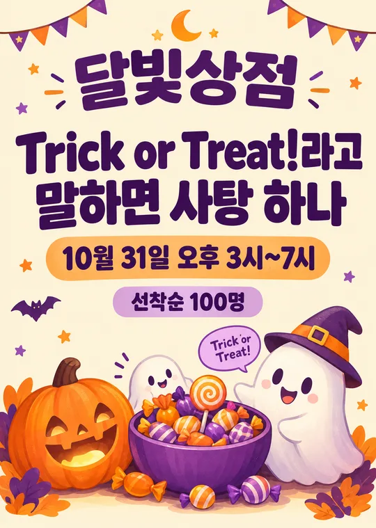
손글씨 칠판은 검은 바탕과 끊기지 않는 밝은 획, 따뜻한 일러스트는 크림색 바탕과 부드러운 그림, 깔끔한 사진형은 밝은 단색 바탕과 대표 상품 사진 표현, 레트로는 굵은 활자와 제한된 색을 씁니다. 모든 분위기에서 결과는 같은 평면 포스터 한 장이고 글은 최대 세 줄입니다. 카드 안 첫 예시는 하루분식 · 오늘은 김밥 데이 · 참치김밥 · 4,500원 · 접시에 담긴 참치김밥 · 손글씨 칠판입니다. 분필 질감과 칠판 테두리, 큰 분필 글씨로 구성했어요. 두 번째는 하루베이커리 · 갓 구운 소금빵 · 오후 3시 나와요 · 가격 비움 · 접시에 담긴 소금빵 · 레트로입니다. 표지와 두 예시는 업종·문구·분위기가 모두 다르고 꽃집 이미지는 제외했습니다.
인쇄 전에 확인하세요
그림 AI에 복사한 프롬프트를 한 번 붙여 넣으면 한 장이 나옵니다. 포스터에 코드 실행이나 글자 합성은 필요하지 않아요. 상호의 받침, 큰 문구, 가격의 숫자·쉼표·통화 단위를 원문과 대조하세요. 작은 출력이나 화면만 보고 실제 간판의 가독성을 보장할 수는 없습니다. 삽입부 치수를 재고 그 크기로 인쇄한 뒤 3m 떨어져 큰 문구가 먼저 읽히는지 확인하세요. 긴 상호나 문장이 작아지면 입력 문구를 줄여 다시 생성하는 편이 좋습니다. 자동으로 축약하거나 잘라 출력하지 않습니다.
자주 묻는 것
가격 없이도 되나요? 가격 칸을 비우면 숫자나 가격표를 만들어 넣지 않습니다. 상품을 여러 개 넣어도 되나요? 이 카드는 하나만 크게 보여 주므로 대표 상품 하나를 적어 주세요. 간판 프레임도 나오나요? 거리·프레임 없이 삽입용 인쇄물만 나옵니다. 생성 이미지의 해상도와 인쇄 비율이 원하는 치수에 맞는지도 확인하세요. 외부 서비스의 요금과 이용 권리는 해당 서비스에서 확인하세요.