
All · Infographics & guides · Store notices
374Pavement Sign Insert — Three Lines Readable from a Distance
A flat poster for an A-frame sign: one shop name, one bold message and one hero product, designed for a two-second glance.
ChatGPT Free OK
Fill in the fields
- 1Fill in the fields
- 2Copy the prompt
- 3Paste it into a GPT chat
- 4Send it as is and you get an image like the thumbnail example
- 5Attach a real photo that fits the card and it is used in the result: a background photo for background cards, a person or food photo for those cards Optional
Full prompt 5,313 characters
Generate this image now. Draw it directly; return one finished image only.
Output exactly one finished 2:3 portrait image, 1024x1536 pixels. Leave the top 12% and bottom 15% free of essential text.

[Purpose]
Create one flat, full-bleed printable poster to insert into an A-frame pavement sign. Design for a two-second glance from about 3 metres when printed at an appropriate physical size. One hero product and at most THREE text lines; no menu list, launch brochure, event calendar, street scene, stand, frame, perspective mockup or sheet on a table. The chosen atmosphere changes the visual treatment only, never the result type or hierarchy.

[Inputs — these labels are internal]
SHOP: "【Shop name】"
HEADLINE: "【Main message】"
SUPPORT: "【Short supporting line】"
PRICE: "【Price】"
HERO: "【Hero product】"
ATMOSPHERE: "【Atmosphere】"

[Resolve text once]
If HEADLINE equals "Choose for me", derive one concise neutral product name in English from HERO. Never infer newness, a special event, a discount, availability or any other business claim. Otherwise preserve HEADLINE verbatim. Do not paraphrase, translate or abbreviate supplied display strings.
Line 1 is SHOP exactly. Line 2 is the resolved HEADLINE exactly. Line 3 combines nonempty SUPPORT and PRICE with one separating space, or contains the one supplied value if the other is blank. If both are blank, omit line 3 completely and rebalance the composition. No fourth line, automatic item caption, extra currency sign, fabricated amount, badge or empty reserved space. HERO and ATMOSPHERE are never printed. Preserve every price digit, comma, decimal mark and currency symbol; never convert or calculate the amount. Use English for generated lettering; supplied shop names such as Haru may remain as supplied.

[Distance-first hierarchy]
Keep the headline dramatically largest with thick intact strokes, high contrast and simple letter shapes. Set SHOP smaller but bold and easy to identify. The combined final line is secondary yet clearly readable. Use three single-line text bands in the upper half: SHOP around 15–22%, HEADLINE around 26–36%, SUPPORT/PRICE around 38–44% of canvas height. Keep important lettering clear of the top 12%, bottom 15% and about 8% side margins. Adapt these bands to the selected canvas ratio without clipping text. If supplied strings are long, fit each complete line using a clear condensed typeface and wider usable measure; never wrap into a fourth line or drop characters. Do not promise physical readability regardless of print size. Fill the lower half with one large coherent hero image extending toward the bottom, while leaving all lettering unobstructed. Paint the background to every canvas edge. No white outer border or product collage.

[Four atmosphere choices — interpret only the chosen value]
"Handwritten chalkboard": matte charcoal field, bright cream hand-lettering with fully continuous strokes and a single chalk-style hero illustration; texture stays quiet behind text.
"Warm illustration": pale buttery cream or yellow ground, dark forest-green bold lettering and one warm painterly hero illustration, natural detail and restrained coral accents.
"Clean photography": pale solid background, deep navy or charcoal crisp sans-serif text and one natural photographic product, realistic materials and soft grounded shadow.
"Retro": warm cream field, bold burgundy retro sans-serif lettering, muted teal secondary ground and an original painted hero illustration with restrained orange accents. No distressed missing letter strokes.
Never combine the four treatments or print their names. Maintain strong dark/light contrast in every treatment.

[Hero accuracy]
Render only the named product, following the specified colour, portion, vessel or wrapping. Do not add unrelated products or invented ingredients. For food or drink, when web access is available inspect at least five real photographs of the exact product before generating; match its natural anatomy, portion, cooked texture and vessel without copying a photograph or its branding. Even illustration treatments must preserve real structure. A clear-glass iced Americano has diluted dark brown coffee with amber edge highlights, a complete glass rim and base, irregular wet ice floating near the surface and fine natural condensation; no milk, fruit or foamy latte cap unless explicitly supplied. No identical cloned food pieces, plastic gloss or impossible geometry. Do not invent health effects, ingredients, origin claims or sales conditions. This card supports ordinary non-alcohol products only; do not create an alcohol advertisement using it.

[Final proof]
Check every supplied character, punctuation mark and price digit against the input. Keep all consonants, vowels and final consonants intact. Output the artwork alone, with no instructions, verification notes, quotation marks, braces, watermarks, signatures, real brand logos or protected characters. One prompt produces one poster; no code, text-overlay workflow, cropping, compositing or manual retouching is required.

[Final output format]
Output exactly one finished 2:3 portrait image, 1024x1536 pixels. Leave the top 12% and bottom 15% free of essential text.
This selected output format takes priority over any fixed canvas size or aspect ratio elsewhere in this template. Adapt the composition, text zones and margins to the selected canvas without stretching or cropping essential content. Device safe areas apply only when a device is selected. Never print these format instructions on the image.
How did it turn out?
You may also like
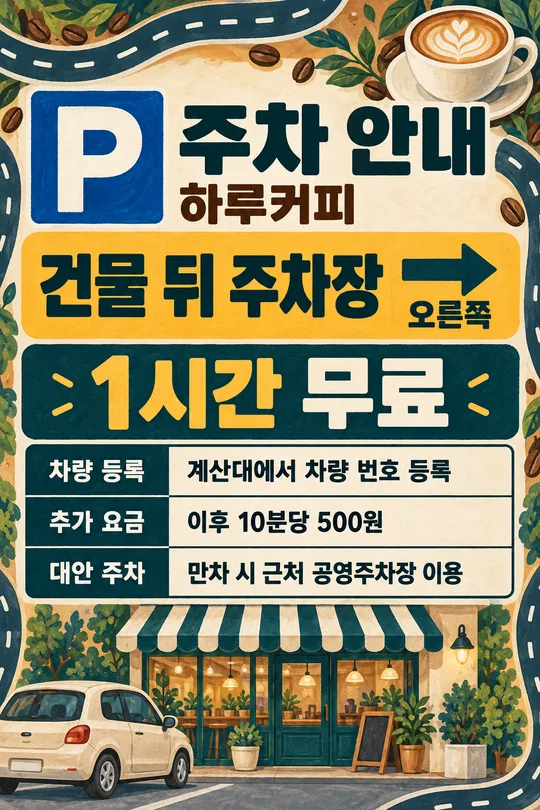
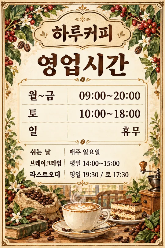
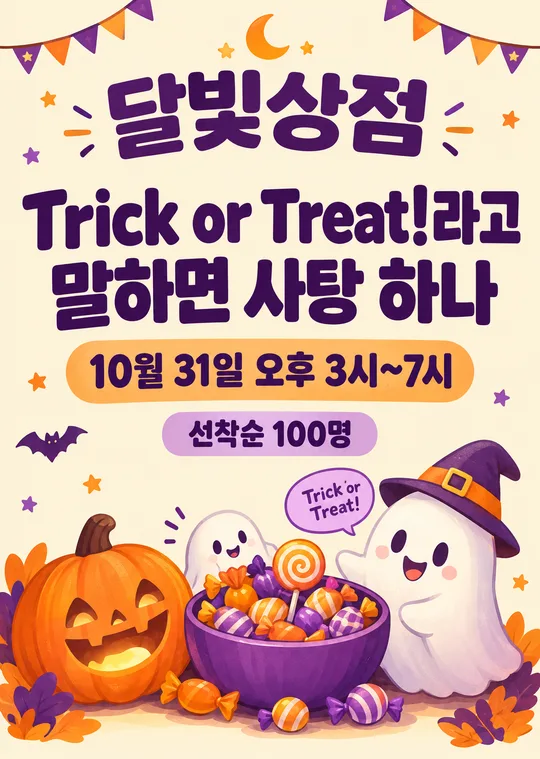
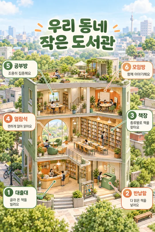
How to use it · FAQ
One message for people walking past
Make one flat printable insert for an A-frame pavement sign. It is meant to communicate a single offer quickly, with one large message and one hero product. A long menu belongs on a menu board; detailed launch information and event terms need their own space. Here, the hierarchy stays the same in every atmosphere: shop identity, dominant headline, optional combined supporting line and amount, then one large product image.
Filling the fields
Four fields are required: Shop name, Main message, Hero product and Atmosphere. Use the actual shop name and a concise headline. Describe the product's colour, vessel or wrapping rather than adding a list of items. The cover shows a Korean coffee-shop example with iced coffee, a supporting line and a price in Clean photography. The hero description controls the image and does not become an extra printed caption.
Short supporting line and Price are optional. One bouquet and $15.00 become the single line “One bouquet $15.00”. If only one value is supplied, print that value alone; if both are blank, omit the line. Keep the price out of the supporting field to avoid repeating it. Choose for me derives a short product name from the hero description without inventing a new-arrival claim, discount or stock promise. Enter actual prices; the example amounts are local examples, not currency conversions.
Atmospheres and examples
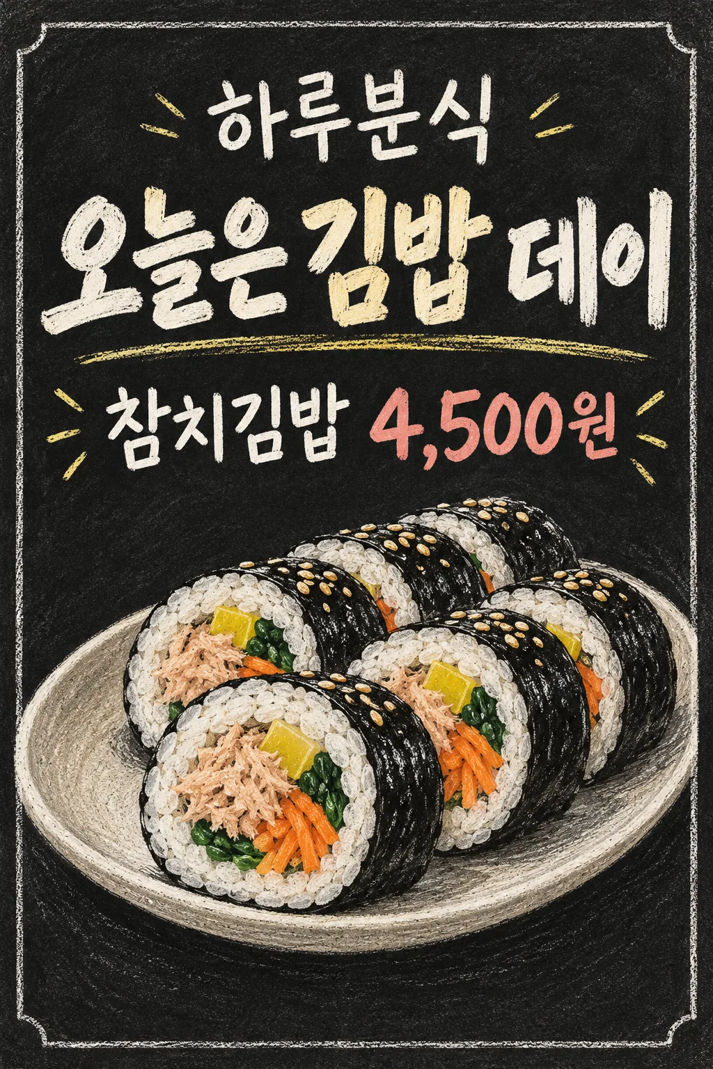
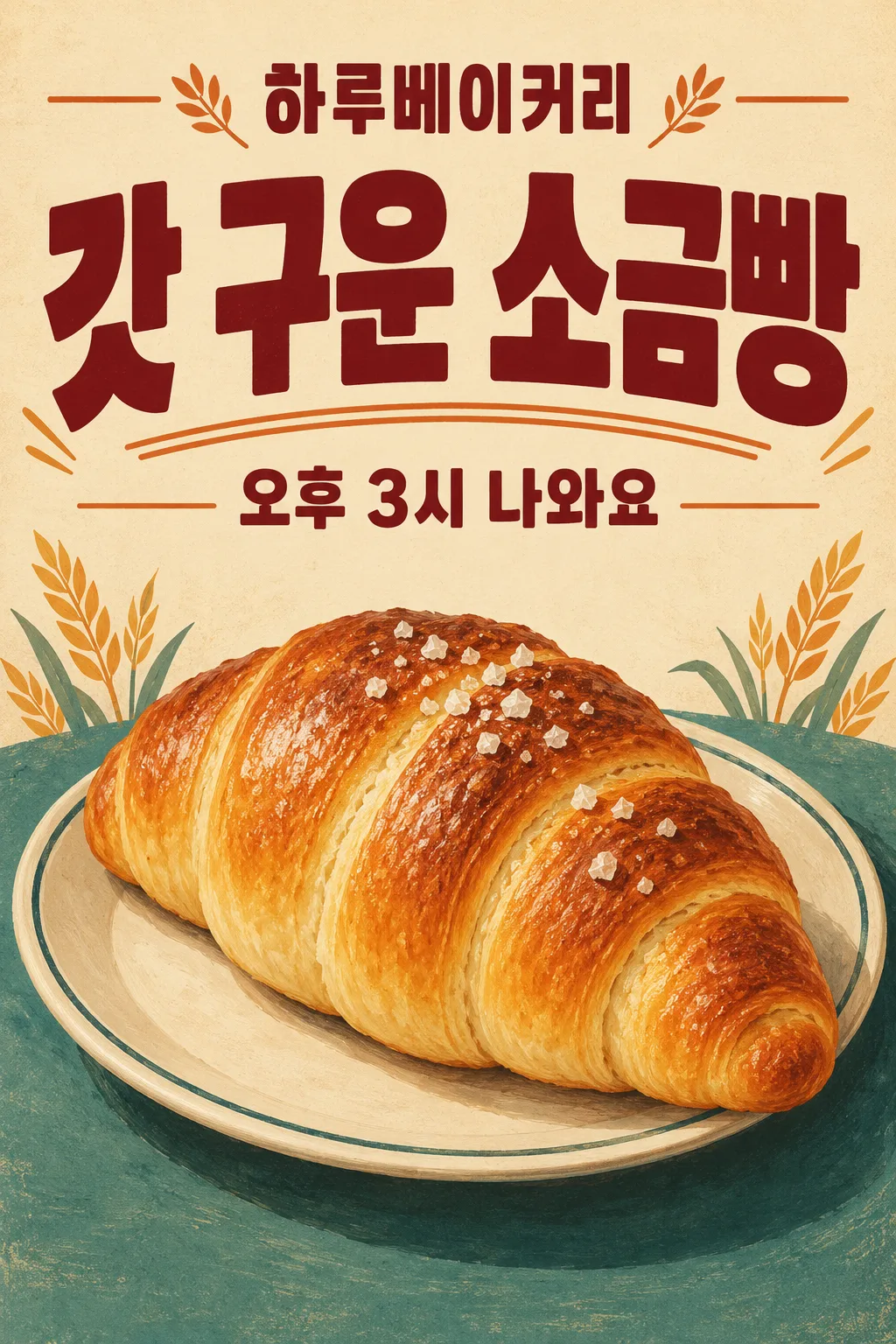
Handwritten chalkboard uses complete bright strokes on a matte dark field. Warm illustration uses a cream background and soft painted forms. Clean photography uses a pale solid field and one natural product photograph. Retro uses bold type and a restrained palette. Every choice still produces one flat poster with at most three text lines. The first gallery image shows a Korean snack shop: a gimbap-day headline, tuna gimbap as the supporting line and a price of 4,500 in the original Korean currency, in Handwritten chalkboard. The second shows a Korean bakery: freshly baked salt bread and a supporting line announcing 3 pm, with Price blank, in Retro. The cover and examples differ in business, wording and atmosphere. Gallery artwork keeps the original Korean text; this English prompt requests English lettering and the supplied price without conversion.
Printing and checking
Paste the completed prompt into an image AI once to request one image. Check the shop name character by character and compare every digit, decimal mark and currency symbol with the input. Measure the sign's insert area and check the print at that size from 3 metres away. A small screen preview cannot certify physical legibility. If a name or message becomes too small, shorten the input and generate again; the prompt must not silently abbreviate it. Confirm the file resolution and selected aspect ratio suit the intended print dimensions.
Common questions
Can I omit the price? Yes: a blank Price creates no invented amount or empty price badge. Can I show several products? This design is for one hero product. Does it include the stand? No stand or street scene is part of the finished insert. No text compositing or code execution is needed. Check the image service's fees and usage rights with that service.