
전체 · 광고/포스터 · 카페·디저트 · 신메뉴·신상품
151크루아상 출시 예고
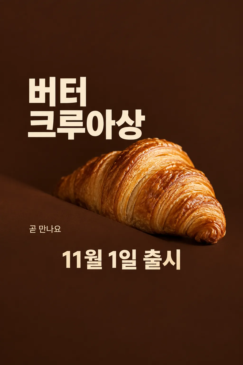
카페와 베이커리 사장님이 실제 크루아상 사진으로 출시일을 예고해 매장 입구와 인스타에 올려요.
칸 채우기
- 1칸을 채워요
- 2복사 버튼을 눌러요
- 3GPT 채팅창에 실제 판매할 크루아상 사진 1장을 올리고, 프롬프트를 같이 붙여넣어요
- 4실제 판매할 크루아상 사진 1장과 프롬프트가 둘 다 들어간 걸 보고 보내요
프롬프트 원문 보기 5,473자
Generate this image now. Draw it directly - do not describe it, explain it, or ask questions.
Output one landscape A3 poster, 420 x 297 mm, aspect ratio 1.414:1. Use the largest supported image resolution. Final print target is 4961x3508 pixels at 300dpi; keep all lettering at least 10 mm inside every paper edge. Preserve the wide composition and print-safe margins.

[Purpose]
Generate exactly ONE finished Korean croissant release teaser poster for a cafe or bakery. It announces one supplied product and one confirmed release date. The fixed design is a dramatic partial-reveal food photograph with large plain typography on warm dark brown. It is not a discount poster, menu board or advertisement for several bakery items. Output the final image directly with no code, follow-up, multiple pages or assembly. The viewer should first think that the actual bread looks delicious, then understand when it arrives.

[Scene]
Put ONE generously inflated croissant at the center-right, around 40–64% of the height. Its broad rounded middle and at least one tapered curled end remain clearly visible. A diagonal matte cocoa-colored foreground shade hides only the lower-left edge of the bread, no more than one fifth of its outline. This is a photographic reveal, not a silhouette of a flat roll. Keep the essential food structure exposed; do not cut the finished output into parts. No second croissant, drink, butter pat, tray full of cloned pastries or implied bundle. The backdrop is deep cocoa brown with warm directional bakery light. It fills the entire output canvas; do not show a poster held in a room or on a phone.

[Attached photo — mandatory]
Use the actual croissant photograph attached in this same message as the source of product identity, topping, filling, glaze, volume and shape. Preserve what this shop actually sells. Do not add almond flakes, chocolate, cream, melted cheese, garnish or branded packaging if absent from the photograph. Relight and arrange that ONE product without replacing it with generic AI bread. It has real laminated dough: a raised center, irregular thin curved flaky layers, slightly brittle toasted edges, subtle golden glaze and plausible puffed volume. Layer spacing is organic, never a perfectly repeating grid or wire mesh. A croissant is not a flattened waffle, geometric lattice, low hamburger bun or repeated stack of identical rings. Use appetizing close detail and warm light, not an invented steam cloud or wet plastic shine.

[Text layout and user facts]
Reserve the top 20% and bottom 25% as quiet brown background with no words. All important text remains between 21% and 74%. At 20–28%, print the store name once in clear restrained Korean lettering: "【가게 이름】". At 29–42%, print the exact product name in very large warm-cream type, at most two lines with no broken Korean word: "【크루아상 이름】". Place the photograph beside and below the name so lettering never covers the flaky surface. At 69–74%, put the exact date followed by one word in one large line: "【출시일】 출시". That date is the principal factual information; preserve the user's spelling and do not add a weekday, time, year or deadline not supplied. Confirm the current date internally if interpreting a date is necessary, but never silently move the user's launch day.
At 62–68% on the empty LEFT side only, write the user's short teaser: "【예고 문구】". If this is "알아서 골라줘", choose a short original invitation to anticipate the bread, 6–12 Korean syllables. Never print the instruction. Keep this line clearly subordinate to the name and release date. It may express anticipation, not a promise about stock, freshness schedule, ingredients, origin or a free gift.

[Style, hierarchy and text rules]
Use deep cocoa, warm cream and the real pastry's baked gold. Plain substantial typography, careful Korean spacing, soft believable shadows and crisp food focus. Hierarchy is one real pastry, its exact name and release date, then the store and short teaser. The teaser layout intentionally has no price field and no price. Do not invent a sale, quantity, reservation, purchase minimum, coupon, free delivery, limited stock, opening hours, award, nutrition benefit, organic claim or premium ingredient provenance. Print only the four supplied text elements; no field labels, logo, barcode, watermark, empty boxes, neon, starbursts, glowing outlines or extra captions. Return the single finished poster.
[Strict no-print geometry]
Keep the top 20% as completely empty dark cocoa with NO LETTERS, including no product headline. Leave the bottom 25% equally free of words. Do not enlarge the headline into that space. On a 1024x1536 sample: store name if supplied around y=310; product-name lettering wholly between y=420 and y=650; croissant mostly between y=660 and y=990; short teaser near y=1000 on the empty left; date wholly between y=1070 and y=1140. Compress the central composition to respect these limits. For other sizes scale these coordinates proportionally. The large upper blank area is intentional full-bleed background, not a frame. The bread remains plump, flaky and warmly lit.

[One occurrence per text element]
The shop name appears ONCE, the product name appears ONCE, the teaser appears ONCE, and the release-date line appears ONCE. Never repeat the teaser above and below the croissant. The region immediately above the date contains only blank background or food, never a second caption. Count the four text elements before delivering. If the shop name is omitted in a demonstration, there are exactly THREE text elements.

The bottom quarter of the canvas is intentionally pure dark brown: no words, no bread and no line there. Place the complete date above that empty bottom quarter, never at the lower edge.
이 카드도 많이 사용해요





쓰는 법 · 자주 묻는 것
이런 때 쓰세요
카페나 베이커리에서 새 크루아상을 판매하기 전에 출시일을 알릴 때 쓰세요. 매장 입구에 붙이거나 인스타 피드에 올리는 예고 포스터 한 장입니다. 실제 빵의 바삭한 겹과 부푼 몸통을 일부 보여 주면서 상품 이름과 출시일을 크게 놓습니다. 이미 판매 중인 메뉴의 가격을 알리는 심플 포스터와 달리, 출시를 기다리게 하는 티저 형식입니다. 다른 음식 업종과 한 카드에 섞지 않습니다.
칸 채우는 법
가게 이름은 실제 간판에 쓰는 이름을 적으세요. ‘크루아상 이름’은 사진 속 제품을 가게에서 부르는 이름으로 넣습니다. 버터 제품을 올렸다면 초코나 아몬드 제품 이름을 적지 마세요. 출시일에는 사장님이 확정한 날짜만 적습니다. 요일·시간·예약 마감은 자동으로 붙이지 않습니다. ‘예고 문구’는 직접 쓰거나 ‘알아서 골라줘’를 눌러 짧은 기대 문구를 받을 수 있습니다. 이 칸은 가격이나 행사 조건을 만드는 칸이 아닙니다.
실제 음식 사진이 꼭 필요해요
사진은 출시할 바로 그 크루아상을 찍은 것으로 준비하세요. 휴대폰으로 가까이 찍되 빵의 두께와 겹이 보이게 하세요. ① GPT 입력창에 사진 한 장을 올리고 아직 보내지 않습니다. ② 같은 입력창에 채운 프롬프트를 붙입니다. ③ 사진과 글이 함께 들어간 것을 확인하고 한 번 보내세요. 상품을 여러 개 늘어놓은 사진보다 빵 한 개가 선명한 사진이 이 부분 공개 구도에 잘 맞습니다. 다른 가게 사진을 내 상품처럼 쓰지 마세요.
그림이 나오면 꼭 볼 것
먼저 결과를 원본 사진과 나란히 보세요. 실제 빵보다 납작해지거나 같은 겹이 일정한 간격으로 반복되면 다시 받아야 합니다. 사진에 없던 크림·아몬드·초콜릿이 생기지 않았는지도 확인하세요. 가려진 부분은 일부여야 하며, 둥글게 부푼 몸통과 바삭한 결은 눈에 들어와야 합니다. 그다음 이름과 출시일을 한 글자씩 확인하세요. 날짜 아래에 선착순·한정 수량·무료 증정 같은 말이 생겼다면 입력하지 않은 조건입니다.
고치는 법
음식이 달라졌다면 글자만 고치지 말고 실제 사진을 더 선명하게 바꿔 사진과 원문을 함께 다시 보내세요. 상품명이 길어 글자가 작아지면 손님이 알아볼 공식 이름 범위에서 짧게 적습니다. 출시일이 바뀌면 그 칸을 고쳐 새 프롬프트로 완성본 한 장을 받으세요. 잘라 붙일 필요는 없습니다. 인쇄 전에는 확대 화면에서 날짜와 글자 가장자리를 확인하고, 사용하는 인쇄 크기에 맞는 화면 비율을 사이트에서 고르세요.
자주 묻는 것
- 사진 없이 만들 수 있나요? 실제 판매 상품을 보여 주는 카드라 사진이 필수입니다.
- 가격은 왜 없나요? 출시 예고에 집중하는 티저입니다. 가격과 할인 안내는 판매 단계의 다른 포스터에 넣으세요.
- 빵을 일부 가리는 것이 이미지 자르기인가요? 한 장 안의 고정 사진 구도입니다. 결과를 자르거나 여러 장으로 나누어 쓰지 않습니다.